|
||||||
 |
|
|||||
|
||||||
|
|
|||||
|
#1
 02-17-2025, 04:56 PM
|
||||
|
||||
|
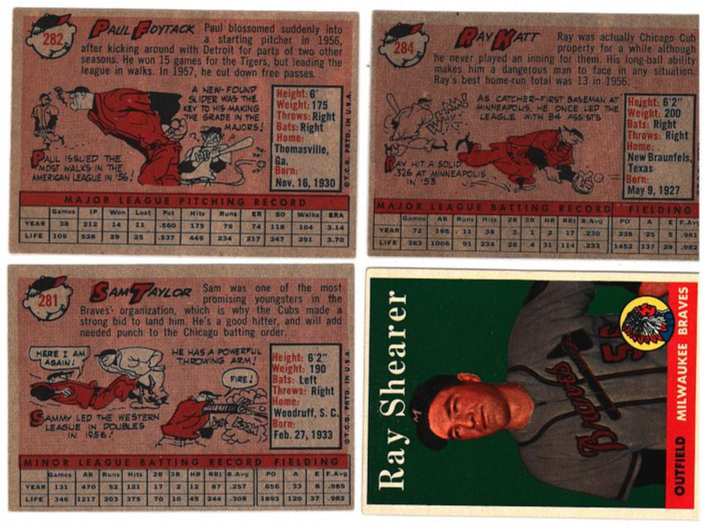
Is there a consensus on which set has the worst collection of player images? This, the Clemente, and many others makes me think 1973 might be the worst looking set of the bunch. Out of focus, dark, far away -- many look like zero effort was put into it.
__________________
__________________ � Collecting Indianapolis-related pre-war and rare regionals, Jim Thorpe, and other vintage thru '80s � Successful deals with Kingcobb, Harford20, darwinbulldog, iwantitiwinit, helfrich91, kaddyshack, Marckus99, D. Bergin, Commodus the Great, Moonlight Graham, orioles70, adoo1, Nilo, JollyElm, DJCollector1, angolajones, timn1, jh691626, NiceDocter, h2oya311, orioles93, thecapeleague, gkrodg00, no10pin, Scon0072, cmoore330, Luke, wawazat, zizek, bigfanNY Last edited by Brent G.; 02-17-2025 at 04:57 PM. 
|
|
#2
02-17-2025, 05:08 PM
|
||||
|
||||
|
Agree .. 1973
|
|
#3
02-17-2025, 05:13 PM
|
|||
|
|||
|
Easily 73 Topps. Its much like popular music that took inspiration from the 60s (like 72 Topps) but once heavy drugs took over it became unfocused and lazy. Perhaps thats a bit too deep but the production values were awful.
|
|
#4
02-17-2025, 05:14 PM
|
|||
|
|||
|
You're on to something with that assessment. At the same time, I love that set, as do so many others. If you like (admittedly grainy) action shots with lots of other players on the cards, this one is for you! The multi-player RCs are pretty awesome, though.
|
|
#5
02-17-2025, 05:20 PM
|
||||
|
||||
|
Funny, 1973 Topps actually has some of my favorite photos because of how unique they are. How often do you get to see scenes like this on a card? They might not be great likenesses - but it's fun seeing different aspects of the game. Much more interesting than some more recent sets which fall into ruts of boredom in which every hitter is shown hitting, every pitcher is shown pitching - and because of how blurry the backgrounds are and how careful the editing is, you can never see the crowd, the dugout, the umpires, random cars in a parking lot...
If all you care about seeing is the player's face (which is a valid attitude) then 1973 is not for you - but if you have more leeway... (Photos taken from tcdb.com)
__________________
I blog at https://adventuresofabaseballcardcollector.blogspot.com and https://universalbaseballhistory.blogspot.com Last edited by John1941; 02-17-2025 at 05:25 PM.
|
|
#6
02-17-2025, 05:22 PM
|
|||
|
|||
|
Quote:
|
|
#7
02-17-2025, 05:48 PM
|
||||
|
||||
|
73 rocks!
  
|
|
#10
02-17-2025, 06:42 PM
|
||||
|
||||
|
Can't locate the thread I did a long time ago about how cool the 1973 Topps set was with all of the (far from typically used) in-game action shots, but was able to locate the group of catchers (including airbrushed-jerseyed John Ellis playing first base) graphic I used to illustrate it...
1973catchers.jpg
__________________
All the cool kids love my YouTube Channel:
Elm's Adventures in Cardboard Land  https://www.youtube.com/@TheJollyElm Looking to trade? Here's my bucket: https://www.flickr.com/photos/152396...57685904801706 I was such a dangerous hitter I even got intentional walks during batting practice. Casey Stengel Spelling "Yastrzemski" correctly without needing to look it up since the 1980s. Overpaying yesterday is simply underpaying tomorrow. 
|
|
#11
02-17-2025, 06:53 PM
|
|||
|
|||
|
I'd say the ones the year after an expansion. Either head shots with no hats, or hats with hideous airbrushed new teams.
There are a few to choose from..... Butch.
__________________
Man proposes and God disposes. U.S. Grant, July 1, 1885 Completed: 1969 - 2000 Topps Baseball Sets and Traded Sets. Senators and Frank Howard fan. I collect Topps baseball variations -- I can quit anytime I want to.....I DON'T WANT TO.
|
|
#12
02-17-2025, 07:05 PM
|
||||
|
||||
|
Agree. look like football photos
Quote:
__________________
[FONT="Lucida Sans Unicode"]CampyFan39
|
|
#13
02-17-2025, 07:06 PM
|
||||
|
||||
|
Quote:
__________________
http://www.flickr.com/photos/calvindog/sets
|
|
#14
02-17-2025, 07:36 PM
|
||||
|
||||
|
Shooting a stationary target is quick, easy, and cheap. There are some good action shots, but others look like they either didn’t have the right camera equipment, didn’t know how to use it, and/or didn't bother trying again for a decent image.
__________________
__________________ � Collecting Indianapolis-related pre-war and rare regionals, Jim Thorpe, and other vintage thru '80s � Successful deals with Kingcobb, Harford20, darwinbulldog, iwantitiwinit, helfrich91, kaddyshack, Marckus99, D. Bergin, Commodus the Great, Moonlight Graham, orioles70, adoo1, Nilo, JollyElm, DJCollector1, angolajones, timn1, jh691626, NiceDocter, h2oya311, orioles93, thecapeleague, gkrodg00, no10pin, Scon0072, cmoore330, Luke, wawazat, zizek, bigfanNY Last edited by Brent G.; 02-17-2025 at 07:56 PM.
|
|
#15
02-17-2025, 07:50 PM
|
|||
|
|||
|
although I don't think it can own worst overall, there were some gems in 1958. along with this legendary one, I'd add Yogi and Mossi.
__________________
Get my new book Baseball Cards at the Edge of War, 1941: The Games, The Gum and The Glory
|
|
#16
02-17-2025, 08:10 PM
|
|||
|
|||
|
I like 1973 because there are a bunch of the behind home plate perspective photos, which are my favorites.

|
|
#17
02-17-2025, 08:23 PM
|
||||
|
||||
|
Quote:
 After Sticky Fingers of 1971 though, the Stones' sound acquired a certain characteristic sameness of sound. They have nonetheless released a lot of great tunes even in the past fifty years (too many tracks for me to bother to mention actually). 
__________________
That government governs best that governs least. Last edited by Balticfox; 02-17-2025 at 08:57 PM.
|
|
#18
02-17-2025, 08:24 PM
|
|||
|
|||
|
A photographer who worked for Topps during this era told me that Topps had strict film requirements, unfortunately that film, combined with the camera he used, wasn't so great for these action shots. Most of the photographers Topps used preferred the posed still shots.
I remember the George Scott card in 73 had a fake crowd background added in.
|
|
#19
02-17-2025, 08:32 PM
|
||||
|
||||
|
Quote:
__________________
__________________ � Collecting Indianapolis-related pre-war and rare regionals, Jim Thorpe, and other vintage thru '80s � Successful deals with Kingcobb, Harford20, darwinbulldog, iwantitiwinit, helfrich91, kaddyshack, Marckus99, D. Bergin, Commodus the Great, Moonlight Graham, orioles70, adoo1, Nilo, JollyElm, DJCollector1, angolajones, timn1, jh691626, NiceDocter, h2oya311, orioles93, thecapeleague, gkrodg00, no10pin, Scon0072, cmoore330, Luke, wawazat, zizek, bigfanNY
|
|
#20
02-17-2025, 08:54 PM
|
||||
|
||||
|
Quote:

__________________
That government governs best that governs least.
|
|
#21
02-17-2025, 09:17 PM
|
||||
|
||||
|
Quote:
Every time I think about putting together a '69 set, I start thinking about the horrible photography and put it off.
__________________
Working Sets: Baseball- T206 SLers - Virginia League (-1) 1952 Topps - low numbers (-1) 1953 Topps (-54) 1954 Bowman (-2) 1964 Topps Giants auto'd (-2)
|
|
#22
02-17-2025, 09:24 PM
|
||||
|
||||
|
Quote:
|
|
#24
02-18-2025, 12:06 AM
|
|||
|
|||
|
Quote:
If we are including the borders in the discussion, I think the 1962 and the 1972 are tied for the worst overall. The 1972 in particular just looks horrific.
|
|
#25
02-18-2025, 05:49 AM
|
||||
|
||||
|
Quote:

Last edited by OhioLawyerF5; 02-18-2025 at 05:50 AM.
|
|
#26
02-18-2025, 05:56 AM
|
|||
|
|||
|
Lot of bad years to choose from 58, 61, 69, 73. 69 especially is a shame as I really love the design and at age 7 it was one of the first sets I bought as a kid. And then there's the all-star cards which look quite nice, but most of them have actdion shots that aren't related to the subject of the card. https://www.sportscollectorsdaily.co...ews-all-stars/
__________________
My wantlist http://www.oldbaseball.com/wantlists...tag=bdonaldson Member of OBC (Old Baseball Cards), the longest running on-line collecting club www.oldbaseball.com
|
|
#27
02-18-2025, 08:01 AM
|
||||
|
||||
|
I suspect they went from 2 and 1/4 film to 35 mm, which led to those mid 70's awful quality photos - though I like the composition of the 73's.
I agree with the '69 set being terrible in that it largely copied photos from the year before or even much earlier. That combined with all the "black caps" makes the 69 set really pointless if you have the 67 and 68 sets. There's maybe a hundred 1969 cards that are even remotely interesting. s-l500.jpg
|
|
#28
02-18-2025, 08:32 AM
|
||||
|
||||
|
I used to really dislike the 1973's, but they've grown on me through the years. Now I like how weird and interesting their choice of photos was. Would be even better if it wasn't for that thick white border, which I've never liked about the set either.
Absolutely love the card of Terry Crowley barreling towards Thurman Munson, with the ball just coming into the frame. I'm going to have to go with the 1958's for worst. The horrible big heads (or little bodies) on the monochromatic backgrounds, along with the giant fonts. The ironic thing is it was probably a nightmare for the graphic designers to put together, compared to the beautiful, yet simple 1957's that came the year before.
__________________
* * WAR Hates Dante Bichette! * * So what is it good for? *
|
|
#29
02-18-2025, 08:54 AM
|
|||
|
|||
|
It's refreshing to see that I'm not alone in not particularly caring for the '58's. The backgrounds in the '57's are so much of what made that set both perfectly of its era yet timeless to collect. The colors pop magnificently and have aged so nicely over the decades. And the backgrounds work so well with the jerseys.
|
|
#30
02-18-2025, 08:57 AM
|
||||
|
||||
|
Quote:
__________________
Signed 1953 Topps set: 264/274 (96.35 %)
|
|
#31
02-18-2025, 09:12 AM
|
||||
|
||||
|
'73 Topps is my birth year set, and I've always been a bit conflicted by it. I only own a few cards from that set but recently it has grown on me due in part to all the weird camera angles and colors and an overall sense of self-awareness about perhaps being interested in cards from my own lifetime. I don't know if it makes sense to anyone else or not, but I have come to appreciate cards like '73 and '69 because they are so period specific. I'm a postwar collector who traditionally hasn't been interested in much of anything beyond about '65. However, even I have come to appreciate the airbrushing and some of the cheap parlor tricks used by Topps in the late 60s on into the 70s. However, I can see how collectors older than me might be completely turned off by these cards. Heck, I still have a ton of cards and sets from the 50s and 60s that I want, and I'm not certain when I'll put serious effort into the 70s.
|
|
#32
02-18-2025, 09:24 AM
|
||||
|
||||
|
I think 73 is prety sweet as it has a lot more action shots. The actual quailty can be a little rough/dark though? But I kinda like it.
__________________
~20 SUCCESSFUL BST (1 trade) on Net54
|
|
#33
02-18-2025, 09:33 AM
|
|||
|
|||
|
69 set has a special place in my heart. First real time I actively started collecting (I was 9 years old). I LOVE that set, but understand the reasons stated here.
And I have that set completed as a master set. When doing that with that set was affordable..... Cheers, Butch
__________________
Man proposes and God disposes. U.S. Grant, July 1, 1885 Completed: 1969 - 2000 Topps Baseball Sets and Traded Sets. Senators and Frank Howard fan. I collect Topps baseball variations -- I can quit anytime I want to.....I DON'T WANT TO.
|
|
#34
02-18-2025, 10:38 AM
|
|||
|
|||
|
Not a Topps set but I never liked the photography for the 1955 Bowman set. The television design aside, I've always thought the photo choices were extremely dull. Most of the same poses repeated over and over again with different players. Seems like everyone was either in their batting stance, had just swung the bat, or had their hands on their knees. Over and over and over again.
|
|
#35
02-18-2025, 10:42 AM
|
|||
|
|||
|
After 1957, which was the best designed of the Topps' sets, it just got worser.
The guys who did the book on gum cards back in the '70s said the '58 Bob Cerv looked like a gravy boat had landed on top of his head. Topps always had problems, the cards were too busy in the mid fifties, the same head shot would be used year after year and they were always airbrushed like a senior high school photograph. Let's face it, they were making these things for kids. Hurdy-gurdy worked and after '57, Topps got cute with the designs. You would think the point of the card would be to show off the player and the ball park background. The '57 of Elmer Valo has him pulling a bat out of the rack and there is a TV camera next to the dugout. It was like being there. And what's with no hats.
|
|
#36
02-18-2025, 10:51 AM
|
||||
|
||||
|
Quote:
Quote:
__________________
That government governs best that governs least. Last edited by Balticfox; 02-18-2025 at 01:32 PM.
|
|
#37
02-18-2025, 10:52 AM
|
|||
|
|||
|
Love that Valo. He signed one for me a long time ago. Wish I could say the same about the Paul Smith with the tower.
|
|
#38
02-18-2025, 10:54 AM
|
||||
|
||||
|
Quote:
__________________
That government governs best that governs least.
|
|
#39
02-18-2025, 11:48 AM
|
||||
|
||||
|
I dislike any of the sets with lots of capless head shots. To me, they are the worst baseball card photos. I like all of the action photos in the 1973 set, but agree that some of the photos could have been in better focus.
|
|
#40
02-18-2025, 12:47 PM
|
|||
|
|||
|
Quote:
|
|
#41
02-18-2025, 01:14 PM
|
||||
|
||||
|
Quote:
Source: https://nightowlcards.blogspot.com/2...opps-luis.html
__________________
I blog at https://adventuresofabaseballcardcollector.blogspot.com and https://universalbaseballhistory.blogspot.com Last edited by John1941; 02-18-2025 at 01:14 PM.
|
|
#42
02-18-2025, 02:14 PM
|
|||
|
|||
|
No hats were at times a fall back when players changed teams, there was epansion and when Marvin Miller made Topps blink about players' license fees
|
|
#44
02-18-2025, 02:46 PM
|
|||
|
|||
|
I thought the 1958 Topps set was pretty lame except for those All-Star cards. The Musial is a classic.
|
|
#45
02-18-2025, 03:24 PM
|
||||
|
||||
|
Quote:
__________________
I have done deals with many of the active n54ers. Sometimes I sell cool things that you don't see every day. My Red Schoendienst collection- https://imageevent.com/lucas00/redsc...enstcollection Last edited by Lucas00; 02-18-2025 at 03:25 PM.
|
|
#46
02-18-2025, 03:47 PM
|
|||
|
|||
|
Quote:
|
|
#48
02-18-2025, 04:35 PM
|
||||
|
||||
|
Being an expansion year certainly didn't help matters, and the 'dreadshots' were over-the-top plentiful.
Here's what you find with a "1969 Topps Padres" eBay search... 1969padresheadshots.jpg Very hard for a kid to get excited about all of the old man noggins coming out of packs that year.
__________________
All the cool kids love my YouTube Channel:
Elm's Adventures in Cardboard Land https://www.youtube.com/@TheJollyElm Looking to trade? Here's my bucket: https://www.flickr.com/photos/152396...57685904801706 I was such a dangerous hitter I even got intentional walks during batting practice. Casey Stengel Spelling "Yastrzemski" correctly without needing to look it up since the 1980s. Overpaying yesterday is simply underpaying tomorrow.
|
|
#49
02-18-2025, 04:57 PM
|
||||
|
||||
|
Quote:
__________________
Working Sets: Baseball- T206 SLers - Virginia League (-1) 1952 Topps - low numbers (-1) 1953 Topps (-54) 1954 Bowman (-2) 1964 Topps Giants auto'd (-2)
|
|
#50
02-18-2025, 04:58 PM
|
||||
|
||||
|
Quote:
Quote:
__________________
That government governs best that governs least.
|
 |
|
|
 Similar Threads
|
||||
| Thread | Thread Starter | Forum | Replies | Last Post |
| Which Topps issue has the worst centering? | frankhardy | Postwar Baseball Cards Forum (Pre-1980) | 29 | 01-09-2023 04:12 PM |
| Vote! Worst Topps produced set of the 50's | almostdone | Postwar Baseball Cards Forum (Pre-1980) | 60 | 12-27-2015 08:03 PM |
| Worst Topps card 1952-1979 | jason.1969 | Postwar Baseball Cards Forum (Pre-1980) | 37 | 11-09-2015 09:16 PM |
| Vote!! The worst Topps produced set of the 1970's | almostdone | Postwar Baseball Cards Forum (Pre-1980) | 17 | 07-23-2015 11:07 PM |
| 3 best. 3 worst Topps issues | kailes2872 | Postwar Baseball Cards Forum (Pre-1980) | 62 | 03-06-2014 05:34 AM |


 Linear Mode

