|
||||||
 |
|
|||||
|
||||||
|
|
|||||
|
|
|
#1
 02-18-2025, 08:32 AM
|
||||
|
||||
|
I used to really dislike the 1973's, but they've grown on me through the years. Now I like how weird and interesting their choice of photos was. Would be even better if it wasn't for that thick white border, which I've never liked about the set either.
Absolutely love the card of Terry Crowley barreling towards Thurman Munson, with the ball just coming into the frame. I'm going to have to go with the 1958's for worst. The horrible big heads (or little bodies) on the monochromatic backgrounds, along with the giant fonts. The ironic thing is it was probably a nightmare for the graphic designers to put together, compared to the beautiful, yet simple 1957's that came the year before.
__________________
* * WAR Hates Dante Bichette! * * So what is it good for?  * 
|
|
#2
02-18-2025, 08:54 AM
|
|||
|
|||
|
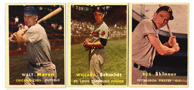
It's refreshing to see that I'm not alone in not particularly caring for the '58's. The backgrounds in the '57's are so much of what made that set both perfectly of its era yet timeless to collect. The colors pop magnificently and have aged so nicely over the decades. And the backgrounds work so well with the jerseys.
|
|
#3
03-08-2025, 12:52 PM
|
|||
|
|||
|
Long ago I did a run of Topps sets all the way back to 1956, but I could never bear to spend money on the 1958s - I kept putting it off. And then I started selling my sets to make money for prewar cards, and never did do it. On the other hand, The 1957 set is the only one I have always kept because it's so beautiful.
The comedown in Topps quality between these two years was horrendous! Quote:
Last edited by timn1; 03-08-2025 at 12:54 PM.
|
|
#4
03-14-2025, 10:36 AM
|
||||
|
||||
|
In further defence of the 1958 cards, they have the most whimsical and thus the best backs of any Topps Baseball set:
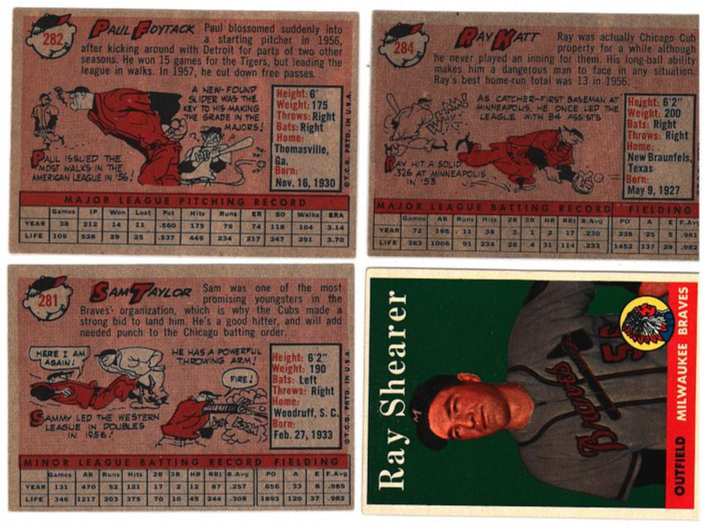 Plus the set includes the single best shot of one of my very favourite players:  
__________________
That government governs best that governs least. Last edited by Balticfox; 03-14-2025 at 10:41 AM.
|
|
#5
03-14-2025, 10:36 AM
|
||||
|
||||
|
Quote:
 And of course the Lucky Penny card (without which no 1957 Topps Baseball set is complete) takes the 1957 set over the top!  (Sadly not mine.) (Sadly not mine.)
__________________
That government governs best that governs least. Last edited by Balticfox; 03-14-2025 at 10:52 AM.
|
|
#6
03-14-2025, 11:38 AM
|
|||
|
|||
|
And a Lucky Penny to go with the card
 . And other inserts . And other inserts
|
|
#7
03-14-2025, 12:04 PM
|
||||
|
||||
|
Here's another vote for 1958 being the worst set in terms of aesthetics. Far too many boring head-shots and photos that all look the same. There are a few exceptions, but the vast majority of the '58 set is a snooze-fest.
__________________
Be sure to subscribe to my YouTube Channel, The Stuff Of Greatness. New videos are uploaded every week... https://www.youtube.com/@tsogreatness/videos
|
|
#8
03-14-2025, 12:43 PM
|
|||
|
|||
|
Someone mentioned the recycled head shots from 1954-56. Yes, that gets old in a hurry, but the action shots on the '56s are a bit of a saving grace most of the time. Definitely my favorite of those three years. That was the only vintage set I went after as a youngster, and I'm sure glad I did it when things were still cheap. Although I haven't collected unsigned cards in about 35 years, I will die with those '56s. I rarely look at them, but like knowing they're there. I'd have gone after the '57s as well, but had a kid-sized budget and just happened to land face first into the '56 Mantle via a trade, so the decision was almost made for me by that lone acquisition.
Last edited by BillyCoxDodgers3B; 03-14-2025 at 12:46 PM.
|
|
#9
03-15-2025, 06:19 PM
|
||||
|
||||
|
Quote:
And I love the actual Bazooka-Blony Lucky Penny and all the unnumbered insert cards! I actually need two Lucky Pennies as well as two "Lucky Penny"cards since these were also distributed with the Robin Hood cards in 1957 and I have a full set of these. And all those insert cards! Do you know how many different insert cards were distributed in 1957 Baseball packs? 
__________________
That government governs best that governs least.
|
|
#10
02-18-2025, 10:51 AM
|
||||
|
||||
|
Quote:
Quote:
__________________
That government governs best that governs least. Last edited by Balticfox; 02-18-2025 at 01:32 PM.
|
 |
|
|
 Similar Threads
|
||||
| Thread | Thread Starter | Forum | Replies | Last Post |
| Which Topps issue has the worst centering? | frankhardy | Postwar Baseball Cards Forum (Pre-1980) | 29 | 01-09-2023 04:12 PM |
| Vote! Worst Topps produced set of the 50's | almostdone | Postwar Baseball Cards Forum (Pre-1980) | 60 | 12-27-2015 08:03 PM |
| Worst Topps card 1952-1979 | jason.1969 | Postwar Baseball Cards Forum (Pre-1980) | 37 | 11-09-2015 09:16 PM |
| Vote!! The worst Topps produced set of the 1970's | almostdone | Postwar Baseball Cards Forum (Pre-1980) | 17 | 07-23-2015 11:07 PM |
| 3 best. 3 worst Topps issues | kailes2872 | Postwar Baseball Cards Forum (Pre-1980) | 62 | 03-06-2014 05:34 AM |


 Hybrid Mode
