|
||||||
 |
|
|||||
|
||||||
|
|
|||||
|
|
|
#1
 02-18-2025, 05:49 AM
|
||||
|
||||
|
Quote:

Last edited by OhioLawyerF5; 02-18-2025 at 05:50 AM. 
|
|
#2
02-18-2025, 05:56 AM
|
|||
|
|||
|
Lot of bad years to choose from 58, 61, 69, 73. 69 especially is a shame as I really love the design and at age 7 it was one of the first sets I bought as a kid. And then there's the all-star cards which look quite nice, but most of them have actdion shots that aren't related to the subject of the card. https://www.sportscollectorsdaily.co...ews-all-stars/
__________________
My wantlist http://www.oldbaseball.com/wantlists...tag=bdonaldson Member of OBC (Old Baseball Cards), the longest running on-line collecting club www.oldbaseball.com
|
|
#3
02-18-2025, 08:01 AM
|
||||
|
||||
|
I suspect they went from 2 and 1/4 film to 35 mm, which led to those mid 70's awful quality photos - though I like the composition of the 73's.
I agree with the '69 set being terrible in that it largely copied photos from the year before or even much earlier. That combined with all the "black caps" makes the 69 set really pointless if you have the 67 and 68 sets. There's maybe a hundred 1969 cards that are even remotely interesting. s-l500.jpg
|
|
#4
02-18-2025, 08:32 AM
|
||||
|
||||
|
I used to really dislike the 1973's, but they've grown on me through the years. Now I like how weird and interesting their choice of photos was. Would be even better if it wasn't for that thick white border, which I've never liked about the set either.
Absolutely love the card of Terry Crowley barreling towards Thurman Munson, with the ball just coming into the frame. I'm going to have to go with the 1958's for worst. The horrible big heads (or little bodies) on the monochromatic backgrounds, along with the giant fonts. The ironic thing is it was probably a nightmare for the graphic designers to put together, compared to the beautiful, yet simple 1957's that came the year before.
__________________
* * WAR Hates Dante Bichette! * * So what is it good for?  *
|
|
#5
02-18-2025, 08:54 AM
|
|||
|
|||
|
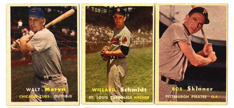
It's refreshing to see that I'm not alone in not particularly caring for the '58's. The backgrounds in the '57's are so much of what made that set both perfectly of its era yet timeless to collect. The colors pop magnificently and have aged so nicely over the decades. And the backgrounds work so well with the jerseys.
|
|
#6
03-08-2025, 12:52 PM
|
|||
|
|||
|
Long ago I did a run of Topps sets all the way back to 1956, but I could never bear to spend money on the 1958s - I kept putting it off. And then I started selling my sets to make money for prewar cards, and never did do it. On the other hand, The 1957 set is the only one I have always kept because it's so beautiful.
The comedown in Topps quality between these two years was horrendous! Quote:
Last edited by timn1; 03-08-2025 at 12:54 PM.
|
|
#7
03-14-2025, 10:36 AM
|
||||
|
||||
|
In further defence of the 1958 cards, they have the most whimsical and thus the best backs of any Topps Baseball set:
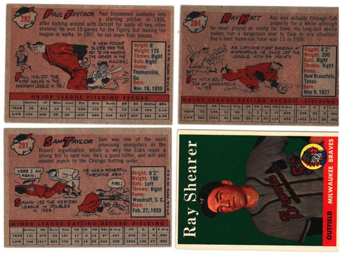 Plus the set includes the single best shot of one of my very favourite players:  
__________________
That government governs best that governs least. Last edited by Balticfox; 03-14-2025 at 10:41 AM.
|
|
#8
03-14-2025, 10:36 AM
|
||||
|
||||
|
Quote:
 And of course the Lucky Penny card (without which no 1957 Topps Baseball set is complete) takes the 1957 set over the top!  (Sadly not mine.) (Sadly not mine.)
__________________
That government governs best that governs least. Last edited by Balticfox; 03-14-2025 at 10:52 AM.
|
|
#9
02-18-2025, 10:51 AM
|
||||
|
||||
|
Quote:
Quote:

__________________
That government governs best that governs least. Last edited by Balticfox; 02-18-2025 at 01:32 PM.
|
|
#10
02-18-2025, 12:47 PM
|
|||
|
|||
|
Quote:
|
|
#12
02-20-2025, 06:17 PM
|
|||
|
|||
|
LOL Pete Rose would sign anything.
|
|
#13
02-22-2025, 10:28 AM
|
||||
|
||||
|
Quote:
__________________
Working Sets: Baseball- T206 SLers - Virginia League (-1) 1952 Topps - low numbers (-1) 1953 Topps (-54) 1954 Bowman (-2) 1964 Topps Giants auto'd (-2)
|
|
#14
02-22-2025, 10:56 AM
|
|||
|
|||
|
Regarding the 1973 Topps Reggie Jackson card, I think it was done as a joke.
In the book The Great American Baseball Card Flipping, Trading and Bubble Gum Book Topps honcho Sy Berger while interviewed mentioned that he was a really good friend of Reggie Jackson. My guess is that is why the Jackson photo was used, kind of a gotcha thing between two guys.
|
|
#15
02-22-2025, 12:11 PM
|
||||
|
||||
|
Quote:
When I was a little kid opening up packs my uncles bought me in 1978, that was THE card to get. 
__________________
* * WAR Hates Dante Bichette! * * So what is it good for? *
|
|
#16
02-22-2025, 01:10 PM
|
||||
|
||||
|
Quote:
__________________
__________________ � Collecting Indianapolis-related pre-war and rare regionals, Jim Thorpe, and other vintage thru '80s � Successful deals with Kingcobb, Harford20, darwinbulldog, iwantitiwinit, helfrich91, kaddyshack, Marckus99, D. Bergin, Commodus the Great, Moonlight Graham, orioles70, adoo1, Nilo, JollyElm, DJCollector1, angolajones, timn1, jh691626, NiceDocter, h2oya311, orioles93, thecapeleague, gkrodg00, no10pin, Scon0072, cmoore330, Luke, wawazat, zizek, bigfanNY Last edited by Brent G.; 02-22-2025 at 01:27 PM.
|
|
#17
02-20-2025, 06:21 PM
|
||||
|
||||
|
Quote:
For that reason, I question the authenticity of your source of information.
|
 |
|
|
 Similar Threads
|
||||
| Thread | Thread Starter | Forum | Replies | Last Post |
| Which Topps issue has the worst centering? | frankhardy | Postwar Baseball Cards Forum (Pre-1980) | 29 | 01-09-2023 04:12 PM |
| Vote! Worst Topps produced set of the 50's | almostdone | Postwar Baseball Cards Forum (Pre-1980) | 60 | 12-27-2015 08:03 PM |
| Worst Topps card 1952-1979 | jason.1969 | Postwar Baseball Cards Forum (Pre-1980) | 37 | 11-09-2015 09:16 PM |
| Vote!! The worst Topps produced set of the 1970's | almostdone | Postwar Baseball Cards Forum (Pre-1980) | 17 | 07-23-2015 11:07 PM |
| 3 best. 3 worst Topps issues | kailes2872 | Postwar Baseball Cards Forum (Pre-1980) | 62 | 03-06-2014 05:34 AM |


 Hybrid Mode
