|
||||||
 |
|
|||||
|
||||||
|
|
|||||
|
#1
 07-26-2021, 08:33 PM
|
|||
|
|||
|
I've seen this concept used in other forums, and it's usually a fun discussion. It's a simple idea, list 4 sets, that fit the four criteria above. If you feel up to it, you can explain your choices, but that's up to you.
Overrated - 1952 Topps. Good set, but it doesn't belong in the same stratosphere as t206 or 1933 Goudey. A lot of mediocre cards, a lot of missing stars, and maybe the most airbrushed set of all time. Underrated - 1950 Bowman. Has all the original great art that was recycled for the iconic 1951 Bowman set. Favorite - 1953 Bowman. No set captures the golden age of baseball better than Least Favorite - 1968 Topps. Wood paneling sucks 
|
|
#2
07-26-2021, 09:04 PM
|
|||
|
|||
|
Overrated - 1957 Topps, card size reduced to save money as soon as the competition was bought, quality of photography is pretty poor on many cards. Still like it, not a classic.
Underrated - 1961 Fleer, many unique images and an American flag centric design on a tour of Baseball's history. Favorite - 1953 Topps, it's art. Least Favorite - 1973-1974; 1976-1980 Topps, very bland and uninspired designs, Topps on lazy mode. 1949 Leaf is right up there, absolutely horrible production quality on an illegal set even though it is popular and revered. There are many minor and regional issues worse.
|
|
#3
07-26-2021, 09:07 PM
|
|||
|
|||
|
Overrated: 56 topps. Less interesting than 54/55 yet derivative of both. Everyone but me is Gaga over this set.
Underrated: 76 Topps. Gets no love but a much better design and more cohesive than the acid trip 75 set that everyone seems to adore. Favorite: Can I say 41 Playball? If not Ill go 71 topps but its a blanket photo finish among 5 or 6 contenders. Least Favorite: 68 Topps is a good choice.
|
|
#4
07-26-2021, 10:02 PM
|
||||
|
||||
|
I'll play
I'm going to do a Topps Test / Misc Issue version of this game. Overrated - 1973 Topps 1953 Reprints. They are only a reprint of the picture...not the entire card. They are kind of hard to find though. Underrated - 1955 Topps Hocus Focus (small). It's not that pretty of a card....but I say it is underrated because not many collectors even know they exist. I have the Harvey Haddix and the Wally Moon and there aren't many in existence. Favorite - 1968 Topps 3D. I absolutely love my Curt Flood. Least Favorite - 1974 Topps Action Emblems. It's not even the real team logos. Generic baseball players on each card. How did I do, you test issue guys?
|
|
#5
07-26-2021, 10:19 PM
|
|||
|
|||
|
Overrated: 1948 Leaf. I have already blasted these too often, and you've given an excuse to do it again. Children's drawings, terrible poses, sometimes horrible color. The fact that these compete right with T206, '33 Goudey, and '52 Topps for top hobby reverence is absurd.
Underrated: 1971 Topps. Like the risk of having the black border. And the photography, and how just when you think that you've seen the same pose a few too many times...a nice action shot appears. Favorite: 1950 Bowman. There's something about the background of the illustrations (combined with no facsimile signature, name, or anything else on the front) that has made these my favorite mini works of art Least favorite: 1964 Topps. Everything is just so dull to me, even the backs. Nothing about the set to spark any interest (design, photos, rookie cards, value, anything)
|
|
#6
07-26-2021, 10:55 PM
|
||||
|
||||
|
Fun idea; the marry screw kill game for card nerds.
I will do the single player/single card version. Overrated: Thurman Munson 1971 Topps. Kills me to say so but his card prices do not accurately reflect his value as a player. Had he not taken lessons at the Richie Valens Flight School he'd be Ted Simmons. Underrated: Larry Doby 1954 Bowman. The Buzz Aldrin of integration had just as rough a road as 42 but none of the accolades, yet was just as important to ending racial bias in baseball; if he fails, who knows when the AL tries again given that it took over a decade to break the last color line. The fact that you can buy nice copies of his 1950s cards for about the same as Billy Martin is a crime.  Least Favorite: 1968 Topps Mantle. I am Sick of the Mick. Really. And this set sucks. The burlap borders and bland photography, blech. Favorite: 1980 Topps Nolan Ryan. A nice, crisp set and a great action photo of Ryan at his peak. Great subtle integration of team colors into the card, last Angels card. FWIW, the most exciting player of my youth. 
__________________
Read my blog; it will make all your dreams come true. https://adamstevenwarshaw.substack.com/ Or not... Last edited by Exhibitman; 07-26-2021 at 11:00 PM.
|
|
#7
07-27-2021, 12:01 AM
|
||||
|
||||
|
Overrated: 1952 Topps. A lot of the cards look alike, and the card in it everyone goes Gaga over isn’t even Mantle’s rookie.
Underrated: 1951 Bowman. It has the great artwork of the 1950 set but with names on it so I don’t have to guess who each common is. Favorite: 1953 Topps. Fell in love with the artwork the first time I had one in hand. Least favorite: 1962 Topps. The wood grain borders have always looked dated. I didn’t like them in the 1955 Bowman set, or in the 1987 Topps either.
__________________
Signed 1953 Topps set: 264/274 (96.35 %) Last edited by egri; 07-27-2021 at 07:20 AM.
|
|
#8
07-27-2021, 05:49 AM
|
||||
|
||||
|
Overrated: T206. There, I said it. Boring, bland white bordered design. Everybody and their brother collects it.
Underrated: T205. Beautiful, bold design with bios and stats on the backs. Smaller size, and a collector doesnt need to buy four Cobbs to complete it (like T206). Favorite: 1956 Topps. More HOFers than any other Topps set. Horizontal design looks great in 8-pocket pages. Least favorite: 1968-70 Topps. Boring, bland, and just plain ugly designs (in that order). Sent from my SM-G950U using Tapatalk
|
|
#9
07-27-2021, 06:00 AM
|
||||
|
||||
|
Quote:

|
|
#10
07-27-2021, 07:04 AM
|
|||
|
|||
|
Quote:
|
|
#11
07-27-2021, 07:44 AM
|
|||
|
|||
|
Overrated - Anything with the words, refractor, atomic refractor, super duper atomic refractor, 1 of 1, serial numbered, intentional variations etc.
Underrated - 1963 Fleer Favorite - T3 Turkey Red - just a beautiful set. Least Favorite - Anything 1981 and later. Last edited by philliesfan; 07-27-2021 at 08:20 AM.
|
|
#12
07-27-2021, 08:42 AM
|
||||
|
||||
|
Overrated: 1953 Topps. I know the artwork on this set is beautiful, but it has never appealed to me. In some ways, the artwork is what turns me off. I wasn't born in 1953, but when I view this set through a kid's eyes, I just don't get the appeal. If I was a kid in 1953, I would have chosen Bowmans all day over Topps.
Underrated: 1974 Topps. Admittedly, this is the first year I collected so I am a little biased. However, I truly think this set is underrated because of the great action shots. Again, looking at this set again as an 8-year-old, I absolutely loved the action shots. I would argue that the Ryan, Reggie, and Seaver cards are some of the best action shots ever. Favorite: 1975: Pure 70's Least Favorite: Take your pick of any of the 60's sets that included the "no cap" poses. Totally boring to me.
__________________
Happy Collecting Ed
|
|
#13
07-27-2021, 09:02 AM
|
|||
|
|||
|
Quote:
The 68 3D are amazing. My favorite But the 73 reprints overrated ? I did not know anyone rated them highly. How can anyone fathom a set where 3 of the 8 players in the set are incorrectly identified 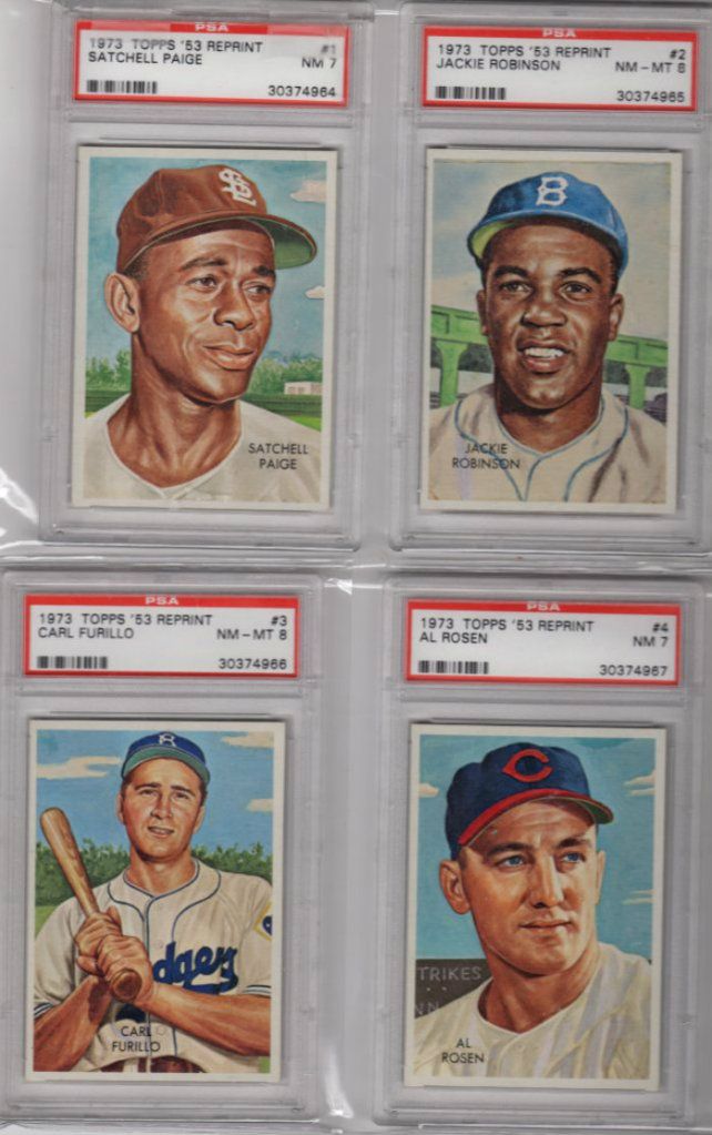 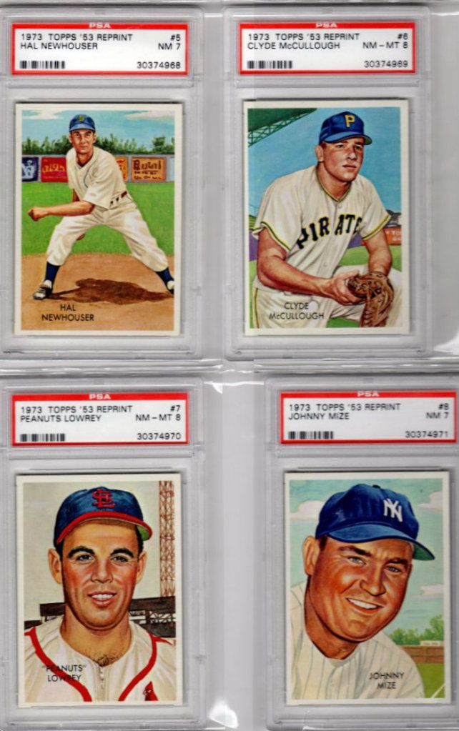
Last edited by ALR-bishop; 07-27-2021 at 01:13 PM.
|
|
#14
07-27-2021, 09:46 AM
|
||||
|
||||
|
Great thread...lots of great opinions, some I agree, some disagree...that's what makes this hobby so great.
Overrated - I'm going to go with the 53 Topps. I currently am putting this set together and do completely understand the "art" perspective which no doubt has a great aesthetic...but I have just never been excited about any one card. I tend to like ANY 53 that isn't a simple head shot...the Gene Woodling and of course the Willie Mays cards and type poses look great. I appreciate this set, just feels a little overrated from my experience. Underrated - My favorite post war set changes often but one set has always stood out for me consistently and that is the 1966 Topps. Love the design, the cards just pop to me and the color on the back is clear and organized. Great representations of HOFers...decent rookie crop...and of course what I love the most is the high numbers. Everyone talks about the 67 Highs, and deservedly so...but some of those 66's are quite a challenge. I just wish one of the HOF rookie cards landed in the high numbers, would have been a game changer...but...where is Steve Carlton? Favorite - As said, this changes often for me and I'm sure if I see this post 5 years from now I'll have a different answer. Currently my favorite is either 54 or 67 Topps. Both classic designs, both have just awesome rookies that define the HOF, and both are still heavily collected. The 54s are missing some key players but the rookies more than make up for that. 67 has the highs which has a cult following (I never stop buying/collecting the high numbers). Only issue with 67 is the total miss on Mantle. Terrible card, easily his worse...in a year of such clean photography and classic poses, wow, miss. Can you imagine if Mantle was the SP Rocky Colavito 580...both pose and high number? That's a $1k card right there... Least Favorite - This one is easy for me. 1958 Topps. I have never liked it...the back grounds, all the head shots, just looks all over the place. I decided out of order to attack this set a short while ago...for about a week I thought maybe I had missed the boat all these years...then...I couldn't wait to finish as I was totally bored. Thankfully there was no high number premiums, the rookie cards outside of Cepeda are terrible, and I know everyone likes the AS cards but the fact they are triple printed takes the zeal out of them to me. Boring set and now that I own one, the least binder that I go and grab to look at. Hope this thread keeps going...love seeing everyones perspective!
__________________
John Otto 1963 Fleer - 1981-90 Fleer/Donruss/Score/Leaf Complete 1953 - 1990 Topps/Bowman Complete 1953-55 Dormand SGC COMPLETE SGC AVG Score - 4.03 1953 Bowman Color - 122/160 76% Last edited by Harliduck; 07-27-2021 at 09:48 AM.
|
|
#15
07-27-2021, 11:48 AM
|
||||
|
||||
|
Overrated: 1959 Topps (Sorry, Don). The player image is consigned to a small bullseye-type circle ("There he is! In that small circle! Yeah, right there!!") I also don't care for the e.e. cummings type lower-case lettering for the player's name. Names have capital letters! Deal with it!
 Underrated: 1991 Topps (Sorry, everybody else). I only have the Desert Shield set, but if I squint real hard and try and pretend that there isn't a picture of a palm tree on the front of my card, I can sort of intuit what the regular issue set might look like. Gorgeous! There's a nice mix of action photos and non-action photos (can't think of a name for those). 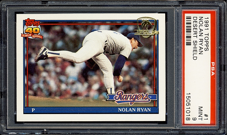 Favorite: 1969 Topps Supers. Nuff said. 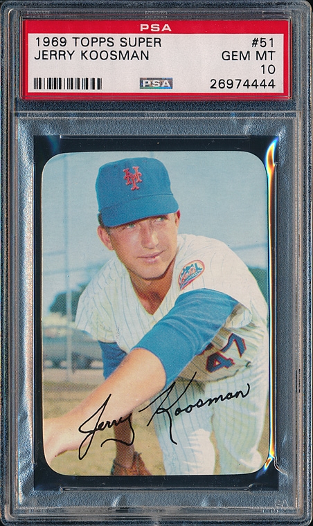 Least Favorite: 1958 Topps and 1973 Topps (it's a tie). Ick.  
|
|
#16
07-27-2021, 01:04 PM
|
|||
|
|||
|
You were doing real well Bob until the 1959 nonsense. Wait until Don catches up with you in Chicago.
I am a fan of 1991. How many cards would it take to have a master 1991 Topps set, including the Desert Shield cards ? The 1969 Supers are indeed super. My 2nd favorite Topps set
|
|
#17
07-27-2021, 02:50 PM
|
||||
|
||||
|
Quote:

|
|
#18
07-27-2021, 02:59 PM
|
|||
|
|||
|
Close
|
|
#20
07-27-2021, 06:19 PM
|
||||
|
||||
|
Overrated - 1952 Topps. Bad artwork that is hopelessly lost somewhere between the worlds of photo and illustration so is really neither. Horrendous production quality, even for the day. Rides high primarily on strength of a single overrated card of an overrated player.
Underrated - No nominee here Favorite - 1967 Topps. I love the clean design, quality of the photos, star and rookie selection, and even the challenging high numbers. Least favorite - 3-way tie between Topps 1958 (just plain boring and ugly) & 1960 (someone with no notion of typography ate a box of crayons then vomited them up as this baseball card design (sorry 1960 lovers!)) and any Heritage-type or reprint set (the ultimate lazy design copout. Nothing more incongruous, uncreative, and unsurprising than placing modern photos on retread designs from a completely different era)
__________________
Ungraded Topps sets in progress ------------------------ 1971 573/752 - 76% - NM+ 1975 307/660 - 47% - NMMT 1968 273/598 - 46% - NM+ 1969 241/664 - 36% - NM+ 1974 235/728 - 32% - NM+ 1957 129/411 - 31% - NM ------------------------ All 6 1758/3813 - 46% Also looking to buy (non-sport) pre-1970 beer cans and pre-1950 beer advertising
|
|
#21
07-27-2021, 09:26 PM
|
||||
|
||||
|
Quote:
Exactly.....No one rates them highly....and they are still overrated!   I don't hate them....I actually love test issues and misc Topps stuff, even that set. I had a hard time picking an overrated one. My least favorite was easy though. Last edited by frankhardy; 07-27-2021 at 09:28 PM.
|
|
#22
07-27-2021, 09:40 PM
|
||||
|
||||
|
Overrated - 1952 & 1953 Topps. Two of the ugliest sets ever made. 1952 has awful colorized black & white photos. 1953 has mostly terrible paintings that don't look like the player.
Underrated - 1955 Topps. By far the best Topps set of the 50s. 1956 gets all the love, but it was just a copy of 1955 and not as nice. Favorite - 1965 Topps. Just the best design and photography of all Topps sets. Least Favorite - 1949 Leaf. Very poor design and the fact that the cards were skip numbered, it feels like the set would always be incomplete. I put together a run of Topps and Bowman sets, but had no desire to collect Leaf.
|
|
#23
07-27-2021, 10:11 PM
|
|||
|
|||
|
Overrated - 1975: Not fond of colored borders generally and the fact there is no standard pattern for each team made organizing your collection by team (as many of us did as kids) frustrating. Honorable Mention: 1962.
Underrated - Tie...1974 and 1976: Each has a nice, colorful design pattern and features good photos and nice action shots. Honorable mention: 1980. Favorite - 1978: My first set; Love the cursive team names, the action photos and the overall appearance. Honorable mention (tie): 1967, 1972 Least Favorite - 1971: I'm gonna say it - I think the black borders suck. Some consider it a classic, others a nightmare, and I think where you fall on that spectrum is directly related to how much money you have to spend trying to assemble a nice looking set. A couple years ago I updated my set, replacing about 150 cards that were rough around the edges - literally - and finding versions with nice looking borders was both tough and costly. Dishonorable mention: 1968; what were they thinking?
|
|
#24
07-27-2021, 10:54 PM
|
||||
|
||||
|
Quote:
 Quote:
 scan isn't the best... Quote:
 
__________________
Read my blog; it will make all your dreams come true. https://adamstevenwarshaw.substack.com/ Or not... Last edited by Exhibitman; 07-27-2021 at 11:04 PM.
|
|
#25
07-28-2021, 02:41 AM
|
||||
|
||||
|
Quote:
Sent from my iPhone using Tapatalk
__________________
COLLECTING BROOKLYN DODGERS & SUPERBAS
|
|
#26
07-28-2021, 04:38 AM
|
|||
|
|||
|
Quote:
|
|
#27
07-28-2021, 10:57 AM
|
||||
|
||||
|
Overrated: 1954 Topps. Ive posted this many times. I look at sets as to how I would have received them as a kid enjoying his hobby and his sport at the time. This set has hideous player selection, is stuffed full of old men coaches, and lacks most all players of the AL Champ Indians team that won 111 games. As ten year-olds or whatever, we would not have yet appreciated or foreseen the greatness of Henry Aaron, Al Kaline and Ernie Banks the only saving graces from the set. I get the contract dispute with Bowman as a cause, but cmon man.
Dishonorable mention: 1975 Topps. Loud colors for their own sake, not coordinated by team, were a turnoff for me. Many of us sorted by team and it was great to have the color coordination as was found in 66, 68, 69, 71, 72 and 74, which were during the primary years of my collecting. Underrated: 1974 Topps, 1966 Topps. I really like the designs of these two. As others mentioned, the 74s have some really great shots. Favorite: 1966 Topps. My first year of collecting probably has much to do with it. Too bad Topps had not come to grips with the fact that the Yankees cannot be in the World Series every year so they omitted, that one year only, what would have been a great W.S. subset. Also unfortunate that Angels and Braves were mostly hatless due to team/city name changes. Still, the set is so clean and crisp, IMHO, that it ranks numero uno for me. Least favorite. 1978 Topps. Hate most everything about it. Too many cards, and the design looks like it came from a kid who realized his homework assignment was due in 30 minutes and he had to come up with something. Script team names and a little baseball with abbreviated position. Theres simple, and then theres lazy.
__________________
Now watch what you say, or they'll be calling you a radical, a liberal, oh, fanatical, criminal Won't you sign up your name? We'd like to feel you're acceptable, respectable, presentable, a vegetable If we are to have another contest in the near future of our national existence, I predict that the dividing line will not be Mason and Dixon's but between patriotism and intelligence on the one side, and superstition, ambition and ignorance on the other.- Ulysses S. Grant, 18th US President.
|
|
#28
07-28-2021, 11:28 AM
|
|||
|
|||
|
Overrated: 1954 Topps. A trio of iconic players' rookie cards but I absolutely hate the missing top border.
Underrated: 1963 Fleer. Yes, no major rookie in the set aside from Wills, but the player representation couldn't be better. Missing Mantle but does contain most of the greatest players of the era. In my opinion it has a great image selection too. Favorite: 1959 Topps. Gorgeous cards, common and star alike. Least Favorite: Hate the 1962 Topps set.
|
|
#29
07-28-2021, 11:52 AM
|
|||
|
|||
|
Overrated: 1952 Topps. It's amazing how cachet clouds vision.
Underrated: 1963 Fleer. Clean, attractive alternative with some big stars. I also like 1984 Fleer for its streamlined "Scandinavian" design. Favorite: 1954 Topps? 1952 Bowman? Least Favorite: 1961 Topps. zzzzzzzzzzz
|
|
#30
07-28-2021, 12:25 PM
|
||||
|
||||
|
Quote:

__________________
Read my blog; it will make all your dreams come true. https://adamstevenwarshaw.substack.com/ Or not...
|
|
#31
07-28-2021, 09:27 PM
|
||||
|
||||
|
Overrated: 1971 Topps.
The folks in Duryea, PA had no business handing out a black bordered set to kids. So short-sighted. You look at them wrong, and the cards start turning white. Just a ridiculously poor move. Find a random stack of cards from any other year, and there's a good chance some (a lot) of them will look nice. Find a stack of 71's in your closet, and it doesn't matter how nice the action shots are, each and every card will have white rounded corners and edges and look like deteriorated garbage. However, in the graded card world we live in today, the set skyrockets to one of my most favorites ever, but that's simply because with the cards sitting in their protective prisons, there's no chance now of them deteriorating right before my eyes. Underrated: 1960 Topps. This set grew on me so much, so quickly that I started a thread about it a couple of years ago. It's definitely one that needs to be re-examined by the haters. https://www.net54baseball.com/showthread.php?t=270971 Favorite: 1972 Topps (hands down). Also love 1965 and think 1974 was a beautiful stroke of genius, with the mix of colors and all the terrific action shots. Near perfection. Least Favorite: 1959 Topps. For the love of god, who at Topps said, "You know what, let's squeeze each picture into a tiny circle and eliminate a huge portion of the image area by blocking it out with wall of color!!"??????
__________________
All the cool kids love my YouTube Channel:
Elm's Adventures in Cardboard Land https://www.youtube.com/@TheJollyElm Looking to trade? Here's my bucket: https://www.flickr.com/photos/152396...57685904801706 I was such a dangerous hitter I even got intentional walks during batting practice. Casey Stengel Spelling "Yastrzemski" correctly without needing to look it up since the 1980s. Overpaying yesterday is simply underpaying tomorrow.
|
|
#32
07-29-2021, 08:01 AM
|
||||
|
||||
|
I'll stick in the 50s as that is my favorite card decade
Overrated - 1952 Topps. Underrated - 1954 Johnston Cookies Aaron. Couldn't think of one set, so I named a card Least favorite - 1958/1959 Topps .... toss up. Both equally boring Favorite - 1952 Bowman and 1957 Topps toss up. I do think that the 57 Snider is one of the best cards ever made 1957 duke.jpg
__________________
Neal Successful transactions with Brian Dwyer, Peter Spaeth, raulus, ghostmarcelle, Howard Chasser, jewishcollector, Phil Garry, Don Hontz, JStottlemire, maj78, bcbgcbrcb, secondhandwatches, esehobmbre, Leon, Jetsfan, Brian Van Horn, MGHPro, DeanH, canofcorn, Zigger Zagger, conor912, RayBShotz, Jay Wolt, AConte, Halbig Vintage and many others https://www.youtube.com/@Coach_Neal
|
|
#33
07-29-2021, 09:42 AM
|
|||
|
|||
|
Neal- shocked to see you have no more sense than Bib Fisk when it comes to 1959
|
|
#34
07-29-2021, 03:06 PM
|
||||
|
||||
|
Quote:
I know some people absolutely love the set, but to me it's meh.
__________________
Neal Successful transactions with Brian Dwyer, Peter Spaeth, raulus, ghostmarcelle, Howard Chasser, jewishcollector, Phil Garry, Don Hontz, JStottlemire, maj78, bcbgcbrcb, secondhandwatches, esehobmbre, Leon, Jetsfan, Brian Van Horn, MGHPro, DeanH, canofcorn, Zigger Zagger, conor912, RayBShotz, Jay Wolt, AConte, Halbig Vintage and many others https://www.youtube.com/@Coach_Neal
|
|
#35
07-29-2021, 03:16 PM
|
||||
|
||||
|
Quote:
__________________
Four phrases I have coined that sum up today's hobby: No consequences. Stuff trumps all. The flip is the commoodity. Animal Farm grading.
|
|
#37
07-29-2021, 03:35 PM
|
||||
|
||||
|
Quote:
__________________
Four phrases I have coined that sum up today's hobby: No consequences. Stuff trumps all. The flip is the commoodity. Animal Farm grading.
|
|
#38
07-29-2021, 05:29 PM
|
|||
|
|||
|
Overrated - 1954 Topps. They look like they are all miscut.
Underrated - 1964 Topps - Simple and east to sort by team. Least Favorite - 1975 Topps - Ugh! Favorite 1965 Topps edges out 1967 Topps - 1965 is what baseball cards should look like. Great design. Mike
|
|
#39
07-29-2021, 05:50 PM
|
|||
|
|||
|
Peter--- I love the 59 set but Gibson in pink was not a highlight.
Packs---agree the F Robinson is a highlight
|
|
#40
07-29-2021, 07:06 PM
|
||||
|
||||
|
Overrated Any high grade issue in a PSA holder with gaps between the card and the inner rails.
Underrated 1968 Topps this set gets quite a bit of hate because of the borders. It has a great lineup, though, with cards such as: the Nolan Ryan rookie; Tom Seaver 2nd year; All-Star cards, League Leaders, player combos like Managers Dream; Mantle, Clemente, Aaron, Mays, etc. Least Favorite 1963 Topps Pete Rose Plenty for me not to like: this issue was heavily counterfeited early on, which led teenage me to avoid it like the plague; I dont care for floating head cards; and Petes lifetime ban further soured me on this card. Favorite 1956 Topps tremendous player selection, large sized cards, horizontal orientation, multiple player images on front, cartoons on the back. I like every design element of this set.
__________________
Eric Perry Currently collecting: T206 (137/524) 1956 Topps Baseball (199/342) "You can observe a lot by just watching." - Yogi Berra
|
|
#41
07-29-2021, 08:52 PM
|
||||
|
||||
|
Overrated: Anything Mickey Mantle, 62 topps green tints
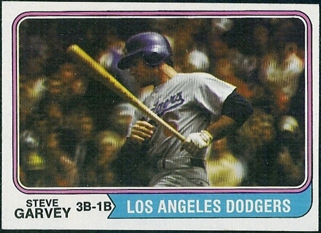
Underrated Sets: 1921 Exhibits, 1958 Hires Underrated Cards: Venezuelan Favorite Sets: t205, 1934-35 Diamond Stars Favorite Cards: 1953B Peewee Reese, 1974T Steve Garvey Least Favorite Sets: 1939 Play Ball, 1948 Bowman Sent from my iPhone using Tapatalk
__________________
COLLECTING BROOKLYN DODGERS & SUPERBAS
|
|
#42
07-30-2021, 08:33 AM
|
||||
|
||||
|
Quote:
 Me too. Another among the reviled sets that I love: 
__________________
Read my blog; it will make all your dreams come true. https://adamstevenwarshaw.substack.com/ Or not...
|
|
#43
07-30-2021, 07:28 PM
|
||||
|
||||
|
Overrated Any graded cards. Are you a card collector, or an investment broker?
Underrated 1962 Topps. Folks are turned off by the wood paneled fronts and Halloween backs, weird occasional green tint, and out of focus photos. I seriously collected cards out of wax packs 1967 to 1972. Then someone bequeathed me a stack of 1962s. I thought and still think they were gorgeous. Least Favorite 1952 and 1953 Topps, especially the WAY overrated 1952 and 1953 Mantle. I find the artwork cartoonish and hideous. I can't believe that rational thinking folks go totally ga-ga over these. Favorite t205 and 1953 Bowman color. I think these are the two most beautiful cards of all-time, hands down. 1962 Topps is an honorable mention favorite as well.
|
|
#44
07-31-2021, 04:54 AM
|
||||
|
||||
|
Quote:
The artwork is so good! 1973 Topps 53 Reprint- Clyde McCulough error PSA-8.5.jpg1973 Topps 53 Reprints - JOHNNY MIZE SGC-96.jpg
__________________
. "A life is not important except in the impact it has on others lives" - Jackie Robinson If you have a chance to make life better for others and fail to do so, you are wasting your time on this earth.- Roberto Clemente Last edited by clydepepper; 07-31-2021 at 04:55 AM.
|
|
#45
07-31-2021, 08:37 AM
|
||||
|
||||
|
Janowicz was indeed the first Heisman winner with a baseball card as far as I can tell.
__________________
Read my blog; it will make all your dreams come true. https://adamstevenwarshaw.substack.com/ Or not...
|
|
#46
07-31-2021, 09:37 AM
|
|||
|
|||
|
Can you imagine being old and bald and saying to your grandson that it is you on that card and the kid saying well its not your name
|
|
#47
07-31-2021, 09:43 AM
|
||||
|
||||
|
Quote:
|
|
#48
07-31-2021, 09:49 AM
|
|||
|
|||
|
Overrated 1952 Topps
Underrated 1954 Bowman Favorite 1957 topps Least 1962 topps
|
|
#49
07-31-2021, 10:21 AM
|
||||
|
||||
|
Overrated: 1954 topps.
I think the artwork is fine, I don't like how the cards are cut however and nothing outside of Aaron is particularly interesting to me from the set. I think Bowman's 1954 set is far superior. Underrated: 1952 Berk Ross. I love this set of cards. It has a hell of a selection of players, and even though prices have climbed a bit, It's not too well known of a set so it's still affordable. Favorite: 1954 Red Heart and 1951 Bowman Very hard to choose the favorite, so I chose two. 1952 topps is up there for me as well, especially since I started working on the set but the artwork from the 1954 Red Heart and 1951 Bowman puts them both above the 1952 set for me. Least Favorite: 1955 Bowman Solely because we were robbed of a Mantle in the beautiful 1955 art style, and while the tv set has grown on me, I still can't bring myself to fully like it.
__________________
Successful Deals With: charlietheexterminator, todeen, tonyo, Santo10fan Bocabirdman (5x), 8thEastVB, JCMTiger, Rjackson44 Republicaninmass, 73toppsmann, quinnsryche (2x), Donscards.
|
|
#50
07-31-2021, 10:24 AM
|
|||
|
|||
|
Quote:
|
 |
|
|
 Similar Threads
|
||||
| Thread | Thread Starter | Forum | Replies | Last Post |
| Which Play Ball set is your favorite, and which one is your least favorite? | brianp-beme | Net54baseball Vintage (WWII & Older) Baseball Cards & New Member Introductions | 17 | 02-20-2019 03:18 PM |
| Which regular issue Topps set is your favorite/least favorite. | Cardboard Junkie | Postwar Baseball Cards Forum (Pre-1980) | 32 | 03-18-2013 12:14 PM |
| overrated and underrated | Touch'EmAll | Watercooler Talk- ALL sports talk | 25 | 09-24-2012 01:26 PM |
| Show your favorite card in your not so favorite holder | Archive | Net54baseball Vintage (WWII & Older) Baseball Cards & New Member Introductions | 12 | 05-06-2008 12:38 PM |
| What are your favorite cards of your favorite players? | Archive | Net54baseball Vintage (WWII & Older) Baseball Cards & New Member Introductions | 47 | 04-13-2002 05:12 PM |


 Linear Mode

