|
||||||
 |
|
|||||
|
||||||
|
|
|||||
|
|
|
#1
 07-27-2021, 09:02 AM
|
|||
|
|||
|
Quote:
The 68 3D are amazing. My favorite But the 73 reprints overrated ? I did not know anyone rated them highly. How can anyone fathom a set where 3 of the 8 players in the set are incorrectly identified 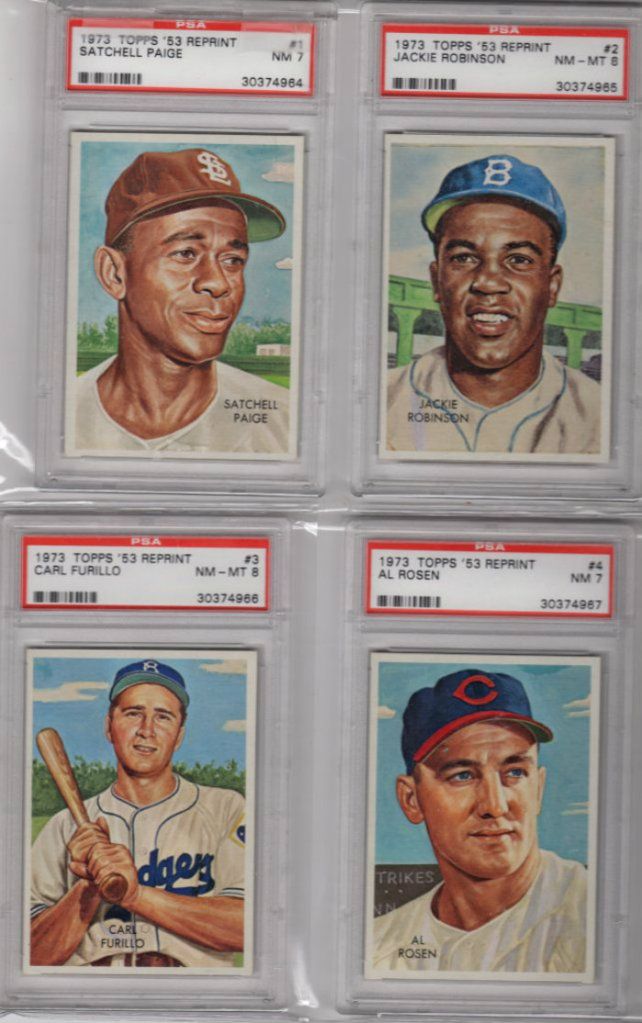 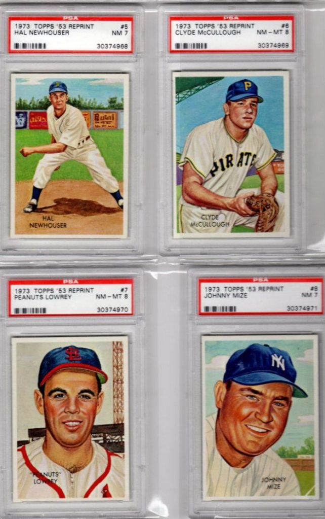
Last edited by ALR-bishop; 07-27-2021 at 01:13 PM. 
|
|
#2
07-27-2021, 09:46 AM
|
||||
|
||||
|
Great thread...lots of great opinions, some I agree, some disagree...that's what makes this hobby so great.
Overrated - I'm going to go with the 53 Topps. I currently am putting this set together and do completely understand the "art" perspective which no doubt has a great aesthetic...but I have just never been excited about any one card. I tend to like ANY 53 that isn't a simple head shot...the Gene Woodling and of course the Willie Mays cards and type poses look great. I appreciate this set, just feels a little overrated from my experience. Underrated - My favorite post war set changes often but one set has always stood out for me consistently and that is the 1966 Topps. Love the design, the cards just pop to me and the color on the back is clear and organized. Great representations of HOFers...decent rookie crop...and of course what I love the most is the high numbers. Everyone talks about the 67 Highs, and deservedly so...but some of those 66's are quite a challenge. I just wish one of the HOF rookie cards landed in the high numbers, would have been a game changer...but...where is Steve Carlton? Favorite - As said, this changes often for me and I'm sure if I see this post 5 years from now I'll have a different answer. Currently my favorite is either 54 or 67 Topps. Both classic designs, both have just awesome rookies that define the HOF, and both are still heavily collected. The 54s are missing some key players but the rookies more than make up for that. 67 has the highs which has a cult following (I never stop buying/collecting the high numbers). Only issue with 67 is the total miss on Mantle. Terrible card, easily his worse...in a year of such clean photography and classic poses, wow, miss. Can you imagine if Mantle was the SP Rocky Colavito 580...both pose and high number? That's a $1k card right there... Least Favorite - This one is easy for me. 1958 Topps. I have never liked it...the back grounds, all the head shots, just looks all over the place. I decided out of order to attack this set a short while ago...for about a week I thought maybe I had missed the boat all these years...then...I couldn't wait to finish as I was totally bored. Thankfully there was no high number premiums, the rookie cards outside of Cepeda are terrible, and I know everyone likes the AS cards but the fact they are triple printed takes the zeal out of them to me. Boring set and now that I own one, the least binder that I go and grab to look at. Hope this thread keeps going...love seeing everyones perspective!
__________________
John Otto 1963 Fleer - 1981-90 Fleer/Donruss/Score/Leaf Complete 1953 - 1990 Topps/Bowman Complete 1953-55 Dormand SGC COMPLETE SGC AVG Score - 4.03 1953 Bowman Color - 122/160 76% Last edited by Harliduck; 07-27-2021 at 09:48 AM.
|
|
#3
07-27-2021, 11:48 AM
|
||||
|
||||
|
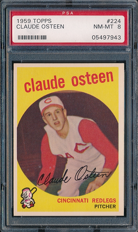
Overrated: 1959 Topps (Sorry, Don). The player image is consigned to a small bullseye-type circle ("There he is! In that small circle! Yeah, right there!!") I also don't care for the e.e. cummings type lower-case lettering for the player's name. Names have capital letters! Deal with it!
 Underrated: 1991 Topps (Sorry, everybody else). I only have the Desert Shield set, but if I squint real hard and try and pretend that there isn't a picture of a palm tree on the front of my card, I can sort of intuit what the regular issue set might look like. Gorgeous! There's a nice mix of action photos and non-action photos (can't think of a name for those). 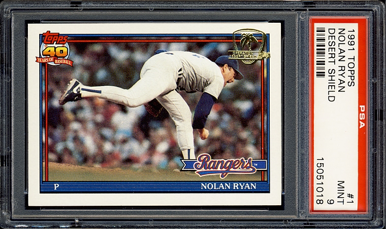 Favorite: 1969 Topps Supers. Nuff said. 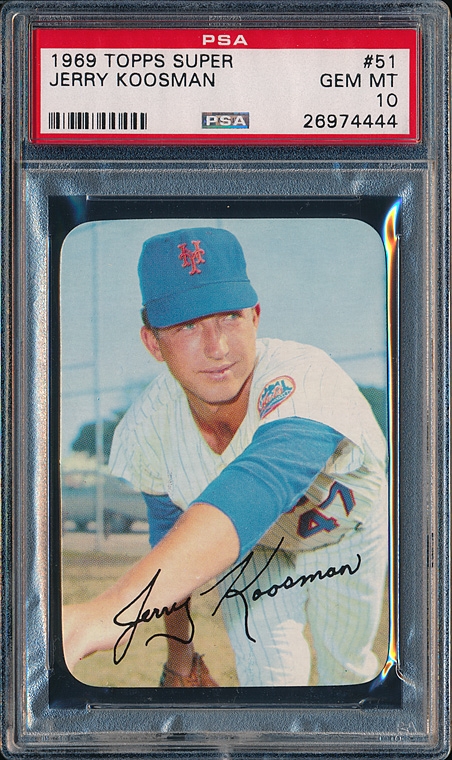 Least Favorite: 1958 Topps and 1973 Topps (it's a tie). Ick.  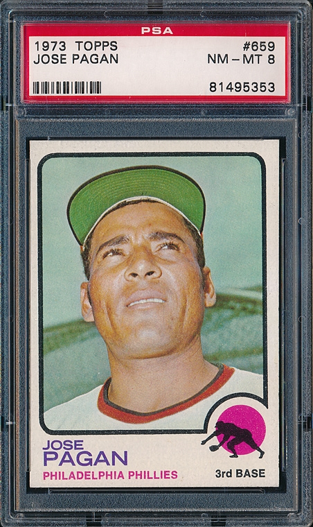
|
|
#4
07-27-2021, 01:04 PM
|
|||
|
|||
|
You were doing real well Bob until the 1959 nonsense. Wait until Don catches up with you in Chicago.
I am a fan of 1991. How many cards would it take to have a master 1991 Topps set, including the Desert Shield cards ? The 1969 Supers are indeed super. My 2nd favorite Topps set
|
|
#5
07-27-2021, 02:50 PM
|
||||
|
||||
|
Quote:

|
|
#6
07-27-2021, 02:59 PM
|
|||
|
|||
|
Close
|
|
#8
07-27-2021, 09:26 PM
|
||||
|
||||
|
Quote:
Exactly.....No one rates them highly....and they are still overrated!   I don't hate them....I actually love test issues and misc Topps stuff, even that set. I had a hard time picking an overrated one. My least favorite was easy though. Last edited by frankhardy; 07-27-2021 at 09:28 PM.
|
|
#9
07-27-2021, 09:40 PM
|
||||
|
||||
|
Overrated - 1952 & 1953 Topps. Two of the ugliest sets ever made. 1952 has awful colorized black & white photos. 1953 has mostly terrible paintings that don't look like the player.
Underrated - 1955 Topps. By far the best Topps set of the 50s. 1956 gets all the love, but it was just a copy of 1955 and not as nice. Favorite - 1965 Topps. Just the best design and photography of all Topps sets. Least Favorite - 1949 Leaf. Very poor design and the fact that the cards were skip numbered, it feels like the set would always be incomplete. I put together a run of Topps and Bowman sets, but had no desire to collect Leaf.
|
|
#10
07-27-2021, 10:11 PM
|
|||
|
|||
|
Overrated - 1975: Not fond of colored borders generally and the fact there is no standard pattern for each team made organizing your collection by team (as many of us did as kids) frustrating. Honorable Mention: 1962.
Underrated - Tie...1974 and 1976: Each has a nice, colorful design pattern and features good photos and nice action shots. Honorable mention: 1980. Favorite - 1978: My first set; Love the cursive team names, the action photos and the overall appearance. Honorable mention (tie): 1967, 1972 Least Favorite - 1971: I'm gonna say it - I think the black borders suck. Some consider it a classic, others a nightmare, and I think where you fall on that spectrum is directly related to how much money you have to spend trying to assemble a nice looking set. A couple years ago I updated my set, replacing about 150 cards that were rough around the edges - literally - and finding versions with nice looking borders was both tough and costly. Dishonorable mention: 1968; what were they thinking?
|
|
#11
07-31-2021, 04:54 AM
|
||||
|
||||
|
Quote:
The artwork is so good! 1973 Topps 53 Reprint- Clyde McCulough error PSA-8.5.jpg1973 Topps 53 Reprints - JOHNNY MIZE SGC-96.jpg
__________________
. "A life is not important except in the impact it has on others lives" - Jackie Robinson If you have a chance to make life better for others and fail to do so, you are wasting your time on this earth.- Roberto Clemente Last edited by clydepepper; 07-31-2021 at 04:55 AM.
|
|
#12
07-31-2021, 08:37 AM
|
||||
|
||||
|
Janowicz was indeed the first Heisman winner with a baseball card as far as I can tell.
__________________
Read my blog; it will make all your dreams come true. https://adamstevenwarshaw.substack.com/ Or not...
|
|
#13
07-31-2021, 09:37 AM
|
|||
|
|||
|
Can you imagine being old and bald and saying to your grandson that it is you on that card and the kid saying well its not your name
|
|
#14
07-31-2021, 09:43 AM
|
||||
|
||||
|
Quote:
|
|
#15
07-31-2021, 09:49 AM
|
|||
|
|||
|
Overrated 1952 Topps
Underrated 1954 Bowman Favorite 1957 topps Least 1962 topps
|
|
#16
07-31-2021, 10:21 AM
|
||||
|
||||
|
Overrated: 1954 topps.
I think the artwork is fine, I don't like how the cards are cut however and nothing outside of Aaron is particularly interesting to me from the set. I think Bowman's 1954 set is far superior. Underrated: 1952 Berk Ross. I love this set of cards. It has a hell of a selection of players, and even though prices have climbed a bit, It's not too well known of a set so it's still affordable. Favorite: 1954 Red Heart and 1951 Bowman Very hard to choose the favorite, so I chose two. 1952 topps is up there for me as well, especially since I started working on the set but the artwork from the 1954 Red Heart and 1951 Bowman puts them both above the 1952 set for me. Least Favorite: 1955 Bowman Solely because we were robbed of a Mantle in the beautiful 1955 art style, and while the tv set has grown on me, I still can't bring myself to fully like it.
__________________
Successful Deals With: charlietheexterminator, todeen, tonyo, Santo10fan Bocabirdman (5x), 8thEastVB, JCMTiger, Rjackson44 Republicaninmass, 73toppsmann, quinnsryche (2x), Donscards.
|
|
#17
07-31-2021, 10:24 AM
|
|||
|
|||
|
Quote:
|
|
#18
07-31-2021, 05:30 PM
|
|||
|
|||
|
Quote:
")
|
|
#19
08-11-2021, 10:47 AM
|
|||
|
|||
|
I don't have one favorite set, but I do have favorites. And I could choose other sets for some of these.
That being said: Overrated: I'm going to say, Topps cards after 1974. When the '74's came out, I thought to myself, "Yeah well, they're nice enough, but they're too similar to the '73's with the white border". I stopped collecting after '74. While 1975 was a little different, Topps got into this white border thing. There wasn't enough of a difference really, in my opinion, between the sets. One could kind of make that argument about 1954 - 1956, and to some degree 1968-69. But the white border thing just went on and on. They got too generic. Underrrated: The 1968 Topps set. I have a sentimental feeling about the set, because it was the first I really collected. I had collected a little bit in previous years, but '68 I really amassed a lot of cards. I wish I could describe the feeling that I got from looking at all the different cards. MLB was all new to me and each card had a feeling about it. From looking at the blue of the Dodgers team and the colors of the Pirates team card, to the cards of Herman Franks and Alvin Dark. I loved the backs of those cards as well. Oh, Ed Mathews has 509 home runs...he must be good! Each card was a world unto itself. The burlap borders were just fine with me, thank you very much. Favorite: There are so many great sets. As I said, I could never just pick one. At this moment I'm feeling the 1969 Topps. I could also have put this under "Underrated". What an amazing design, and the pictures - they got them so right. The set is sort of an offshoot of the 1968 set, but it sort of clarifies that set. Again, some of the photos are great. The World Series run from that year was also one of their best, if not their best. Least favorite: 1962 Topps. I was just never into the wood grain border thing. The cards are somber and not uplifting at all. If I had been collecting then, I would have been hoping and waiting for a better design the next year! Last edited by jgannon; 08-12-2021 at 10:01 AM.
|
 |
|
|
 Similar Threads
|
||||
| Thread | Thread Starter | Forum | Replies | Last Post |
| Which Play Ball set is your favorite, and which one is your least favorite? | brianp-beme | Net54baseball Vintage (WWII & Older) Baseball Cards & New Member Introductions | 17 | 02-20-2019 03:18 PM |
| Which regular issue Topps set is your favorite/least favorite. | Cardboard Junkie | Postwar Baseball Cards Forum (Pre-1980) | 32 | 03-18-2013 12:14 PM |
| overrated and underrated | Touch'EmAll | Watercooler Talk- ALL sports talk | 25 | 09-24-2012 01:26 PM |
| Show your favorite card in your not so favorite holder | Archive | Net54baseball Vintage (WWII & Older) Baseball Cards & New Member Introductions | 12 | 05-06-2008 12:38 PM |
| What are your favorite cards of your favorite players? | Archive | Net54baseball Vintage (WWII & Older) Baseball Cards & New Member Introductions | 47 | 04-13-2002 05:12 PM |


 Hybrid Mode
