|
||||||
 |
|
|||||
|
||||||
|
|
|||||
|
#1
 01-13-2012, 03:10 PM
|
||||
|
||||
|
What do you think are some ugly pre WWII cards? I for one think just about every card made from 1916-1932 as ugly issues or boring, like those exhibits and strip cards. Goudey Wide pens are also ugly and boring.

|
|
#2
01-13-2012, 03:41 PM
|
||||
|
||||
|
Some of the cards in the 1916-1932 era are neat.....Beauty is in the eye of the beholder though. I will admit some of them are ugly too, such as a few of the 1920's W cards and a few of the R cards, though most of those are a few years later.....but again, some of that era are so butt ugly they are almost attractive because of it.
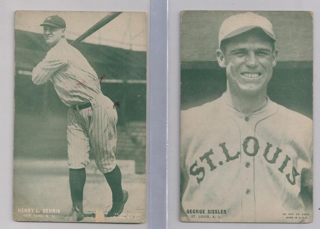
How can anyone who collects vintage not like this D381? 
__________________
Leon Luckey www.luckeycards.com
|
|
#3
01-13-2012, 03:46 PM
|
||||
|
||||
|
Well, if we're talking ugly, Honus Wagner might not be the face to show if you're trying to convince someone otherwise.
Good thing he could crush a baseball, cause I don't think he was going to become a male model.
__________________
*************************************** Looking for '48 Bowman and '69 Topps Basketball
|
|
#4
01-13-2012, 03:57 PM
|
||||
|
||||
|
Quote:
 but it's a neat baseball card. but it's a neat baseball card.
__________________
Leon Luckey www.luckeycards.com
|
|
#5
01-13-2012, 03:58 PM
|
||||
|
||||
|
I am in love with lithograph beauties so much that I just can't find anything special about black and white cards accept for N172, N173, N175, N300 and E107 which I am in awe of. Leon you are right on, beauty is in the eye of beholder. Cards like E107 or N300 could be defined as bland but they are loaded with history and rarity it makes them beautiful to me. I just do not have any interest in 1916-1932 cards, so that makes them ugly and dull to me, but to someone else they are as good as gold. I am also exclusively into the main mass produced sets and there were none from 1916-1932.
|
|
#6
01-13-2012, 04:04 PM
|
|||
|
|||
|
I've always disliked the 1888 SF Hess Newsboys cards. Someone just paid $488 for an SGC 20 on eBay. Sure, they're pretty neat looking cards but I can't imagine paying nearly $500 for a card of a guy who played on his company's baseball team.
|
|
#7
01-13-2012, 04:05 PM
|
||||
|
||||
|
I personally never got anything out of strip cards. I guess they would get my vote.
|
|
#8
01-13-2012, 04:10 PM
|
|||
|
|||
|
I think that the exhibit cards are great.
I believe that T207's fall into that category, not very colorful, not great assortment of stars, etc. Many of the strip card issues would also fall into that category but there are a couple of nice ones, W590 & W504 come to mind. Last edited by bcbgcbrcb; 01-13-2012 at 04:11 PM.
|
|
#9
01-13-2012, 04:41 PM
|
||||
|
||||
|
Quote:
Last edited by 4815162342; 01-13-2012 at 04:42 PM.
|
|
#10
01-13-2012, 05:49 PM
|
|||
|
|||
|
It's hard to pick any prewar cards as boring. The big black and white cards, the goudey fine pens and that sort don't do much for me.
But I like stuff with fairly primitive art or printing as much as the really nice litho stuff, so lots of cards fit. I even like the MP Co cards. Steve B
|
|
#11
01-13-2012, 06:25 PM
|
||||
|
||||
|
I don't like the strip cards at all, although I know many people do.
Also, I know the E91 series isn't pretty, but I love collecting it!
__________________
My collection: http://imageevent.com/vanslykefan
|
|
#12
01-13-2012, 11:05 PM
|
||||
|
||||
|
I, for one, really like the b & w, real-photo cards much more than the colorful, artist-rendition cards. If I were a set collector, my top focus would be on the M101-4/5 set (I also love the different ad backs of this set). So many of the deadball-era stars are in this set!
Val
|
|
#13
01-14-2012, 12:20 AM
|
|||
|
|||
|
Ugly? Most W-cards in my opinion. The exceptions being W502, W503, W504 and W590 as well as 1915 Unc (both versions).
On another level, the E91 sets I consider the doll collection. They don't look like the players. They are just dolls in baseball uniforms.
|
|
#14
01-14-2012, 01:58 AM
|
||||
|
||||
|
[QUOTE=Brian Van Horn;956131]Ugly? Most W-cards in my opinion. The exceptions being W502, W503, W504 and W590 as well as 1915 Unc (both versions).
On another level, the E91 sets I consider the doll collection. They don't look like the players. They are just dolls in baseball uniforms.[/QUOT Indeed they do look like dolls, that is a great comparison. 
|
|
#15
01-14-2012, 06:58 AM
|
||||
|
||||
|
Poor art and detail
Small stature Poor condition Thus Cheap prices
|
|
#16
01-14-2012, 09:34 AM
|
||||
|
||||
|
I can't think of any pre-war issue that I find ugly is the way Topps cards in the 70s became, but mind-numbingly boring, off the top of my head: Maple Crispettes, the ice creams (Yuengling, Tharps, Harrington), York Caramels
|
|
#17
01-14-2012, 01:02 PM
|
|||
|
|||
|
Quote:
|
|
#18
01-14-2012, 08:20 PM
|
||||
|
||||
|
Glad you asked! Hangs down, actually it's not even close, the ugliest set of all-time has got to be the W517! This set is down-right repulsive!!! Makes me puke! Who in their right mind would ever commission a set like this???
picture99 619.jpg What an awful set. First of all it's not a lithograph, nor was it ever inserted into a tobacco product. Then to make matters worse, a dreadful dull ho-hum strip set. Yeah, I'm falling asleep as well. Okay, so the W517 is chuck full of nuts loaded with hall of famers. So what of it.............just because Bo Derek got the leading role in a movie, that never made her a ten. picture99 620.jpg Yeah it's got variations, but have you seen the print quality??? Disgusting, distressing, and mostly dreadful! picture99 621.jpg Sure, it comes in a rainbow of colors (purple, red, b&w, sepia, etc) but now I'm beginning to insult your intelligence. Didn't we already learn that colors will fade! picture99 622.jpgpicture99 624.jpg Thank you thread starter and moderator dude for letting me vent. I actually feel much better and in a small way I'm now a better person. So if you should ever see an unsightly W517 on eBay, don't even bother to take a peek, your money will be better spent on a Sammy Sosa RC. Lovely Day... Last edited by iggyman; 01-14-2012 at 08:29 PM.
|
|
#20
01-14-2012, 10:37 PM
|
||||
|
||||
|
Ig, my old pal...
You convinced me, I will not collect the W517 cards. Now, i may pick up a HOFer or two, but I promise to only get the guys who have been panned as not worthy HOFers. You know that set has several of the 30's players who should have never been HOFers (so I have heard) and the set itself is ugly and boring. And my York Caramels are ugly too ...although I think I will hang onto them, just so no one else has to suffer with them. Whew...that was close  
__________________
Thanks! Brian L Familytoad Ridgefield, WA Hall of Fame collector. Prewar Set collector. Topps Era collector. 1971 Topps Football collector.
|
|
#21
01-15-2012, 01:13 AM
|
||||
|
||||
|
Gee wow some defensivness I am detecting about collectors like myself not liking 1916-1932 era cards because they are dull. I did not think I would be thought of as less intelligent because I do not collect from this era or find them interesting. I do not see how INTELLIGENCE plays into having a preferrence in what kind of cards one collects.

|
|
#22
01-15-2012, 03:01 AM
|
||||
|
||||
|
So I should just collect Sammy Sosa Rookie cards because I do not prefer to collect this era of cards that do not interest me, how does that happen?? What does Sammy Sosa have to do with vintage? Gee I must be DUMB because I do not prefer to collect from this era and I wanted to see if anyone felt the same way as me, wow that makes me STUPID.
Stupid me needs colors to make me happy I guess. I guess appreciating the fine art of litograph over a BW photgraph makes me dumber, wow that sucks, I think I need to grow a bigger brain now.
|
|
#23
01-15-2012, 06:49 AM
|
||||
|
||||
|
I guess you didn't like IGGY's wisenheimer response...
Sepia toned cards? Good for colorblind dogs... Photo cards are so boring, no originality The Real cards are Half-tone color lithographs, otherwise known as ARTWORK. An example of real art : 
|
|
#24
01-15-2012, 08:56 AM
|
||||
|
||||
|
Quote:
Wisenheimer: Someone always making feeble wisecracks, who laughs at his/her own jokes and is generally deserving of severe and painful punishment. That guy is up there thinking we are all listening to his puerile crap, such a wisenheimer. Yikes! I thinks I would prefer to have my intelligence questioned . Okay, truth be told, that definition fits me to a tee. Zach, please don't take it so personally. I was just having some fun, nothing more. In hindsight, perhaps it was at your expense, but I also kinda' mentioned Leon so you wouldn't feel so lonely. Plus, there is nothing wrong with drumming-up interest in W517's, just in case you see them on the B/S/T page (NOT!). In all seriousness your thread is spot-on. Come on man, nobody could ever have any qualms with it, your premise is painfully accurate. There are a bunch of really ugly sets from the 1916-1932 era, which is a darn shame but is the obvious truth. If I must confess, I really really really think that those cartoonish "Big Head" strips that Leon collects are unpleasant to look at and whenever I see one they make me a little bit queezy. Lovely Day... Last edited by iggyman; 01-15-2012 at 08:57 AM.
|
|
#26
01-15-2012, 10:37 AM
|
||||
|
||||
|
Quote:

__________________
Check out my YouTube Videos highlighting VINTAGE CARDS https://www.youtube.com/channel/UCbE..._as=subscriber ebay store: kryvintage-->https://www.ebay.com/sch/kryvintage/...p2047675.l2562
|
|
#27
01-15-2012, 11:15 AM
|
||||
|
||||
|
Quote:
. I should stay off commenting on saturday nights late, the cocktails loosen the tongue (or keyboard typing). It's all good I am too new here so I need to get to know everybody still.
|
|
#28
01-15-2012, 12:01 PM
|
|||
|
|||
|
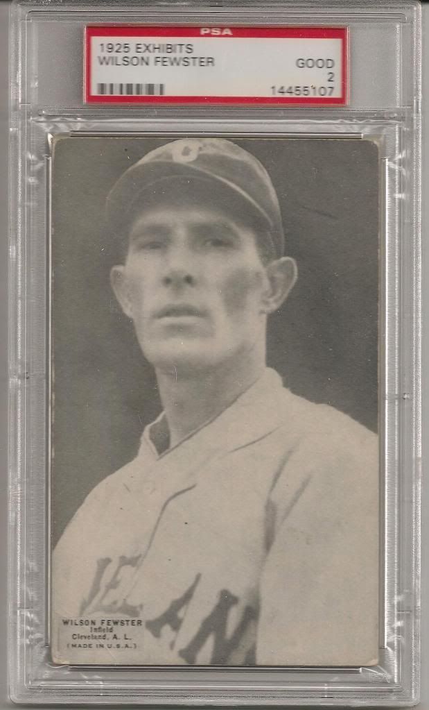
My entire collection falls into that time frame. I agree strip cards are ugly but Exhibits are great. Ok maybe Mr Fewster is not the best example.
|
 |
|
|


 Linear Mode

