|
||||||
 |
|
|||||
|
||||||
|
|
|||||
|
|
|
#1
 08-29-2011, 12:19 PM
|
||||
|
||||
|
Eddie Bennett! Wow! Finally getting some recognition!

|
|
#2
08-29-2011, 03:49 PM
|
||||
|
||||
|
David,
To my client, few get MORE recognition than Mr. Bennett!  Graig
__________________
Check out my baseball artwork: www.graigkreindler.com www.twitter.com/graigkreindler www.facebook.com/graigkreindler
|
|
#4
09-06-2011, 03:46 PM
|
||||
|
||||
|
I'm a little late to the Ruth discussion here, but wanted to voice my own opinion... I personally like the "quick" version better than the meticulous versions. At the end of the day, simply stated, I guess it comes down to personal preference. The "roughness" to the quick Ruth is personally appealing, and given the choice of the two - I would take that one.
__________________
For information on baseball-related cigarette and tobacco packs, visit www.baseballandtobacco.com. Instagram: @vintage_cigarette_packs
|
|
#5
09-07-2011, 12:52 PM
|
||||
|
||||
|
Thanks for weighing in, Jon! I think that in the end, that was something that my agent really liked about it, too. To this day, I'm still unsure what his intentions are with it, or whether he wants me to do anymore, but I suppose we'll see. For now, I just have to see where my hand takes me. Or something.
Jim, you bring up something that I've been wrestling with for a while now. I think that having a shallow depth of field can really make things pop, though I can't decide whether it's for the reason I want them to. I think that George (and in similar ways, Phillip) Burke was a master at that sort of thing with his photographs, as the clarity in his portraits is second to none. But at the same time, his backgrounds really end up being almost indiscernible, which is the big reason his work is so life-like (and recognizable). At the same time, when you look at his work, there's no doubt that it's a photograph - the background elements he plays with to make the portraits pop look the way they do because of his lens. I think the same thing would probably have to happen to my stuff, which I don't know if I'm after, as I would love the viewer to not necessarily think that it was a photograph (then again, what WOULD they think it came from?). So, if I can find a happy medium, then I think I'd get less headaches. It all comes down to edge, value and chroma control in the end, something I'm still trying to improve upon as much as possible. Anywho, here's another one I just got back from the photographers: 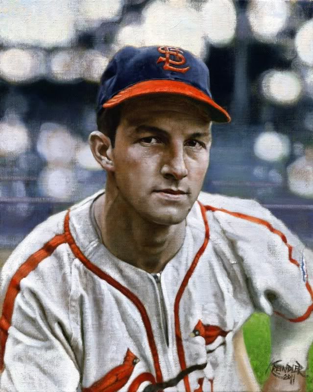 Stan Musial, 1942 Thanks again for all of the great replies, everyone. Graig
__________________
Check out my baseball artwork: www.graigkreindler.com www.twitter.com/graigkreindler www.facebook.com/graigkreindler
|
|
#6
10-18-2011, 09:29 PM
|
||||
|
||||
|
Hey all,
I guess it's been a while since I've posted anything! Well, there is a good amount of new stuff going on, but I can't post it all quite yet, as I'm waiting to get something back from the photographers. This shot of the Babe from Comiskey in 1918 is one I can share now, though: 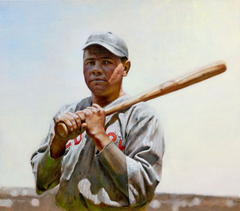 I've been working on this on Tuesdays for the past two weeks or so, as it's something I'm carving away at in a class I'm taking at my alma mater. Since doing so, I think I've been able to make some nice jumps in learning about subtle stuff, though it's probably nuance that not many will notice. To me however, it makes all the difference. Always gotta keep pushing!!! Anywho, the photo was from my iPhone, so it's a little grainy - sorry about that. Hope you enjoy! Graig
__________________
Check out my baseball artwork: www.graigkreindler.com www.twitter.com/graigkreindler www.facebook.com/graigkreindler
|
 |
|
|
 Similar Threads
|
||||
| Thread | Thread Starter | Forum | Replies | Last Post |
| 68 Topps 3D Easel | Archive | Postwar Baseball Cards Forum (Pre-1980) | 1 | 04-22-2008 03:17 PM |


 Hybrid Mode
