|
||||||
 |
|
|||||
|
||||||
|
|
|||||
|
#301
 05-26-2011, 10:00 PM
|
||||
|
||||
|
Wow!

|
|
#302
05-26-2011, 10:06 PM
|
||||
|
||||
|
I am partial to the older guys...
That Ruth is awesome. It will look so fantastic when it is done.
__________________
My signed 1934 Goudey set(in progress). https://flic.kr/s/aHsjFuyogy Other interests/sets/collectibles. https://www.flickr.com/photos/96571220@N08/albums My for sale or trade photobucket album https://flic.kr/s/aHsk7c1SRL
|
|
#304
05-28-2011, 10:51 AM
|
||||
|
||||
|
Quote:
No offense to the artist's work below as he does his thing(is also very talented and seemingly has a rather large following) but man...the difference is just undeniable IMO. You are simply leaps and bounds above the rest and the best Graig. The kicker is, you are not even finished. Thus, I assume the glaze has not even been applied for the final POP!!!?? JUST SPECTACULAR. http://www.lelands.com/Auction/Aucti...rthur-K-Miller
__________________
[I]"When you photograph people in colour you photograph their clothes. But when you photograph people in B&W, you photograph their souls." ~Ted Grant Www.weingartensvintage.com https://www.facebook.com/WeingartensVintage http://www.psacard.com/Articles/Arti...ben-weingarten ALWAYS BUYING BABE RUTH RED SOX TYPE 1 PHOTOGRAPHS--->To add to my collection Last edited by Forever Young; 05-28-2011 at 10:57 AM.
|
|
#305
05-28-2011, 03:56 PM
|
||||
|
||||
|
Wowzas, guys. Thanks so much for the extremely kind words. I hope ya still feel that way when these badboys are done!
Graig
__________________
Check out my baseball artwork: www.graigkreindler.com www.twitter.com/graigkreindler www.facebook.com/graigkreindler
|
|
#306
05-28-2011, 06:44 PM
|
||||
|
||||
|
Quote:
I have to agree with the above statement. There certainly does seem to be a higher level of lifelike quality in Graig's paintings than the one that is is the Lelands auction. Someday I hope to won a real Kreindler but by time i am able to afford one the originals will be way out of my price range!! Once again Graig....great work.
|
|
#308
06-02-2011, 04:02 PM
|
||||
|
||||
|
Hey guys,
So, the YES Network just put this guy on their website: http://web.yesnetwork.com/media/vide...nt_id=15459541 YOWZAS!! Seven and a half minutes? Holy canoli! Anywho, if you guys have some time, check it out, and certainly, feel free to pass it along to anyone who might be interested. And of course, thank you SO much Joey Auriemma and Christa Robinson for showing an interest in me and making me look somewhat cool (I think). Oh, and so this post has some paintin' stuff on it, here's an in-progress of Mr. Nolan Ryan, circa 1969: 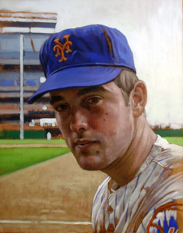 Hope everyone's well! Graig
__________________
Check out my baseball artwork: www.graigkreindler.com www.twitter.com/graigkreindler www.facebook.com/graigkreindler
|
|
#309
06-02-2011, 06:21 PM
|
||||
|
||||
|
Quote:
Thanks for posting this! 
|
|
#310
06-02-2011, 08:41 PM
|
||||
|
||||
|
Graig,
As usual you continue to deliver outstanding image after outstanding image. It's just amazing. Scott, Is that one yours? Have you finally succumbed to the power the Dark Side? It sure does look great. Mark
__________________
My signed 1934 Goudey set(in progress). https://flic.kr/s/aHsjFuyogy Other interests/sets/collectibles. https://www.flickr.com/photos/96571220@N08/albums My for sale or trade photobucket album https://flic.kr/s/aHsk7c1SRL
|
|
#311
06-02-2011, 10:50 PM
|
||||
|
||||
|
Quote:
I wish!!! Unfortunately, Mr. Ryan must be for someone else.... Congrats to whoever comissioned it! Scott
|
|
#312
06-02-2011, 11:05 PM
|
||||
|
||||
|
Thanks, guys.
Actually, the Ryan isn't spoken for. I just saw the image, really loved it, and jumped straight to canvas. Um, canvas on board, that is. So, with some spare hours, I just tried my best to tackle it (I always seem to be working on these smaller guys in-between the larger ones). Anywho, coming from a Ryan aficionado like you Scott, your sentiments are very much appreciated!!  Graig
__________________
Check out my baseball artwork: www.graigkreindler.com www.twitter.com/graigkreindler www.facebook.com/graigkreindler Last edited by GKreindler; 06-02-2011 at 11:06 PM.
|
|
#313
06-05-2011, 04:30 PM
|
|||
|
|||
|
I really wish I could get prints of some of your finished works. I'd have a heck of a time narrowing it down to what I could afford even as prints but it would be a lot of fun.
__________________
Cards Wanted: -I like HoF beaters 1928 Shonen Kulubu Ruth and/or 1929 Churchman's Ruth T206 Cy Young - glove shows http://s241.photobucket.com/home/woundedduck/allalbums
|
|
#314
06-06-2011, 10:32 AM
|
||||
|
||||
|
Hey Graig -
I'm sure this has been brought up earlier but, I was watching "Boys in the Hall - Bob Feller" last night narrated by Tom Brokaw and immediately recognized that great artwork behind his head. Even before they showed your name in the credits I told my wife that I know exactly who must have done those paintings! The legend continues to grow!! Rob M.
|
|
#315
06-06-2011, 10:42 AM
|
||||
|
||||
|
Good eye, Rob! I've had some really nice luck over the past month in regards to visibility. The guys who were producing the show allowed me to come by to see the paintings and watch Brokaw do his thing. That man is an absolute freak of nature - I swear he went through each intro/outro in one take (maybe one or two with more than the first take). Either way, he had such presence, and was the consummate professional.
So yeah, anybody who has FSN or MSG+, the show 'The Boys in the Hall' airs on Sunday nights (I think at 7:30 PM). I know they also rebroadcast the shows on both networks pretty regularly. The first episode with Duke Snider was wonderful, as was Feller's. I think Killebrew is next? Also, going back to visibility thing, the YES Network made this guy live a few days ago: http://web.yesnetwork.com/media/vide...nt_id=15459541 Please excuse my new double chin. Aside from that, I thought it was a pretty awesome feature. Hopefully, it'll yield some good things! Graig
__________________
Check out my baseball artwork: www.graigkreindler.com www.twitter.com/graigkreindler www.facebook.com/graigkreindler Last edited by GKreindler; 06-06-2011 at 10:44 AM.
|
|
#318
06-07-2011, 10:59 AM
|
||||
|
||||
|
Thanks, guys!!
__________________
Check out my baseball artwork: www.graigkreindler.com www.twitter.com/graigkreindler www.facebook.com/graigkreindler
|
|
#319
06-07-2011, 12:24 PM
|
|||
|
|||
|
Graig,
Great stuff as usual and nice piece on yesnetwork! I was reading the latest issue of Memories and Dreams the other night when I immediately thought of you. On P.22 there is a picture of Roger Maris sitting atop the dugout steps that instantly struck me as an incredible image for a painting. http://www.hozinc.com/memdreams3/ Arghhh! If only I wasn't in the middle of $15K in unexpected expenses over the last few weeks I'd be very seriously considering commisioning it. Houses and kids! Why do they have to be so full of surprises and so dang expensive? 
|
|
#320
06-15-2011, 09:58 AM
|
||||
|
||||
|
I LOVE that shot of Maris, always have. They're a few other ones taken of him that were probably from that same day, and they'd be equally as fun to paint.
Luckily, I don't know the expenses brought on by having kids, well at least, not yet...but man, this whole rent thing is VERY overrated. It's like a quick punch to the gut at the end of every month. Anywho, here are three other small guys I've been working on (when I need breaks from the bigger canvases): 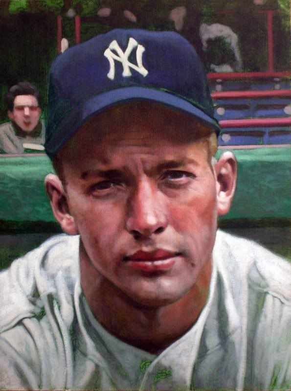 Mickey Mantle, 1951, 9" x 12"  Ernie Banks, 1955, 11" x 14" 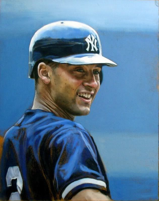 Derek Jeter, 2000, 11" x 14" DJ's closest to being finished, but they all have a ways to go before I can call it a day... Hope y'all enjoy! Graig
__________________
Check out my baseball artwork: www.graigkreindler.com www.twitter.com/graigkreindler www.facebook.com/graigkreindler Last edited by GKreindler; 06-15-2011 at 09:58 AM.
|
|
#322
06-17-2011, 04:08 PM
|
||||
|
||||
|
I didnt realize any of his work have been put up for auction...
I am curious, Graig, when your artwork is put of for auction what are your feelings about that? Do you feel a sense of pride? A sense of betrayal because the original purchaser sold it off? Maybe a sense of wonder in that your work is getting a wider acclaim to be able to be included in high end auctions? I think I would have very mixed feelings if it was me...I am just curious how you feel!
|
|
#323
06-17-2011, 05:32 PM
|
||||
|
||||
|
Andrew,
It's a mixed bag of emotions, really. I mean, there's no sense of betrayal when someone decides to go that route. Obviously, I'd love it if the client would love the piece forever and never part with it, but I do understand that people can 'fall out of love' with things, especially with pieces of their collections. So, when someone wants to move on and go elsewhere, I totally understand. When it comes to my feelings on actually having my work in the auctions, well, it's really complicated. Honestly, I don't even know if I can articulate or verbalize those emotions. For now, let's just say it's a pretty mixed bag, with most of me not being into the idea. Yeah. I'll see if I can explain myself a little better after some thinking. Graig
__________________
Check out my baseball artwork: www.graigkreindler.com www.twitter.com/graigkreindler www.facebook.com/graigkreindler
|
|
#324
06-17-2011, 05:35 PM
|
||||
|
||||
|
I was surprised as well. I was thrilled at the prospect of potentially winning it, but it felt weird to see it in Lelands. Plus, they gave it a rather lackluster photo... a very small image within the Catalogue. There's a lot of other artwork in there (that I felt was not as nice), which received more exposure.
I actually missed Graig's Koufax the first two times through, and was hoping the small pic would translate to a more affordable price. It had 6 bidders at the time it was withdrawn. 
|
|
#325
06-19-2011, 06:57 PM
|
||||
|
||||
|
Mark,
Yeah, I wasn't terribly pleased with the photo either. That was the first thing that caught my eye in the listing, and I just couldn't understand why they didn't just email me and ask for a scan or something. Granted, they may have wanted to show the frame and all, but still, it could have been represented better. Now, the thing about that that bothers me the most is that those who are perusing the auction and haven't seen my work would have nothing to go by but that photo. In other words, the painting will only seem as good as its reproduction, which in this case, isn't so great. I guess that's why it's so important for me to have everything shot professionally. Even though it costs an arm and a leg, it's worth it to have peace of mind about my portfolio - I get to control how and what people see in that regard. If the painting stayed and was photographed correctly, I think it could have made the consignor and Lelands more money. Alright, I'm off my soap-box. So, here's what I was working on earlier today: 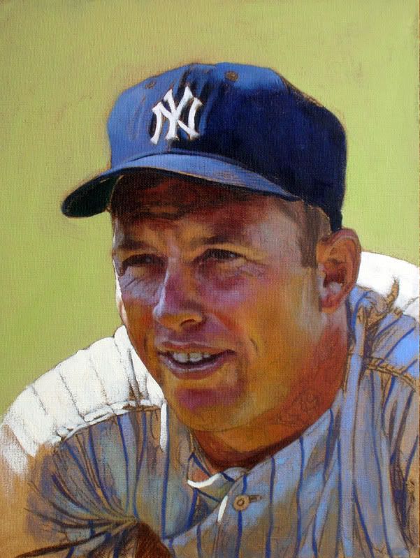 I figured since Mantle is my father's all-time favorite, he was a good subject to tackle today. Or something. I've only got a few hours in, but I like what I'm seeing thus far. Hope everyone had a wonderful Father's Day! Graig
__________________
Check out my baseball artwork: www.graigkreindler.com www.twitter.com/graigkreindler www.facebook.com/graigkreindler
|
|
#326
06-19-2011, 07:44 PM
|
||||
|
||||
|
I am NOT an artist but I can certainly appreciate extraordinary work when I see it and I can only imagine how frustrating it must be to see one 's own artwork that is a result of hundreds of hours of time be given less than stellar exposure like the Lelands auction did. I just never understood why, when selling a significant piece extreme care does not go into showing the piece off. I mean lets face it, we are not talking about a 500 dollar Stan Musial card here, this is a significant painting that required more work to showcase than what was put into it.
For the consignor and the artist this must be very frustrating.
|
|
#327
06-19-2011, 08:11 PM
|
||||
|
||||
|
Maybe that's why it was withdrawn? The picture and overall representation were severely lacking.
Also... thanks Graig for your perspective. Any and all of us Net54 guys who saw it in Lelands' Catalogue were probably wondering what you were thinking/feeling.
|
|
#328
06-22-2011, 11:16 AM
|
||||
|
||||
|
Hey guys,
Just got this one back from the photographers. It still needs a little color tweaking, but hope ya dig it: 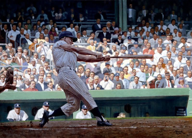 Now, back to work!! Graig
__________________
Check out my baseball artwork: www.graigkreindler.com www.twitter.com/graigkreindler www.facebook.com/graigkreindler
|
|
#329
06-29-2011, 01:56 PM
|
||||
|
||||
|
Hey guys,
Got these three back today as well. The Collins was posted before, but I had to make some slight adjustments and rephotograph it. Anywho, I hope you guys enjoy 'em: 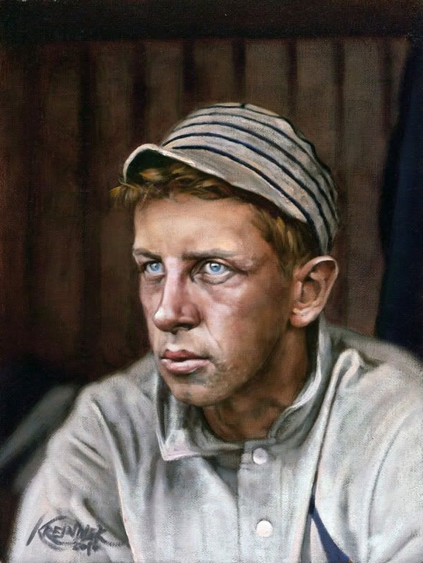 Eddie Collins, 1909, 9" x 12" 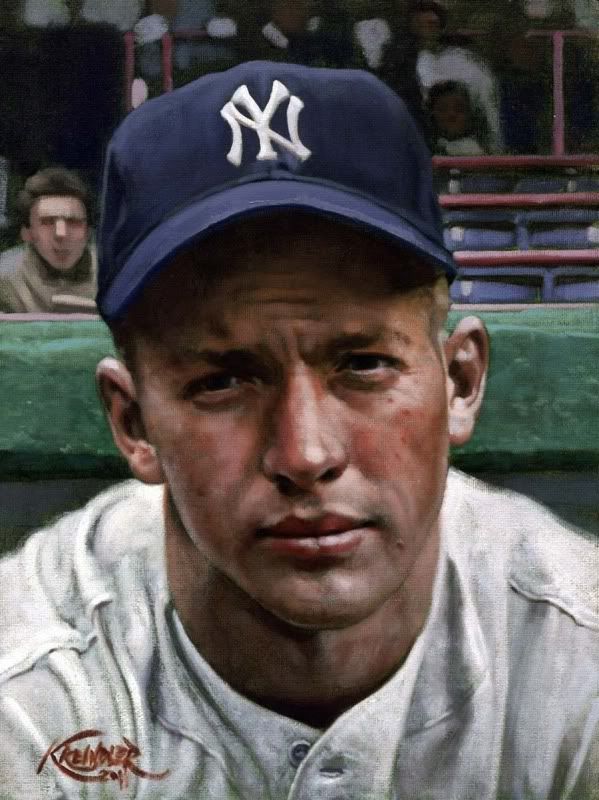 Mickey Mantle, April 14, 1951, 9" x 12" 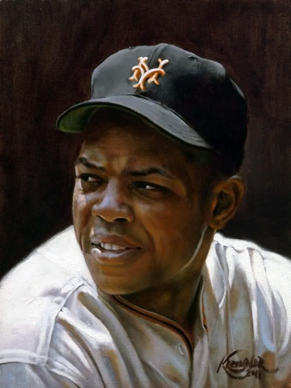 Willie Mays, 1955, 9" x 12" Hope everyone is having a wonderful week! Graig
__________________
Check out my baseball artwork: www.graigkreindler.com www.twitter.com/graigkreindler www.facebook.com/graigkreindler
|
|
#330
06-29-2011, 05:29 PM
|
||||
|
||||
|
Absolutely love that Willie Mays Painting! The lighting/shadowing on his face and cap are incredible. Such amazing depth to that one... I amost expect him to start talking!
But what is Mantle so sad about? Any info about the circumstances related to that pose? He looks like he needs some Zoloft 
|
|
#331
06-29-2011, 06:39 PM
|
|||
|
|||
|
Quote:
I agree.......... The Willie is alive and The Mick does look sad.
|
|
#333
06-29-2011, 08:57 PM
|
||||
|
||||
|
Thanks for the comments, guys. I'm glad you dig them.
What I really liked about this particular Mantle image was the fact that he DID look rather troubled. It dates to the series of exhibition games against Brooklyn before the start of the '51 season - I'm sure many of you have seen those waist-up shots of DiMaggio and Mickey posing together, smiling uncomfortably. I think I just fell in love with the idea that when this photograph was taken, Mickey was just this scared 19-year old, who was supposed to become a great Yankee legend from the get-go. From Ruth to Gehrig to DiMaggio to the Oklahoma Kid. I can't even imagine what kind of pressure he must have felt, especially with the NY media and Casey bragging on him for past year or so. Combine that with his ever-present, yearning desire to live up to his Father's expectations, I think you have a really powerful (and tragic) character. I guess I just wanted it to emote something a little darker than I normally go for. But of course, that's just how I look at it...'cause I'm weird. Graig
__________________
Check out my baseball artwork: www.graigkreindler.com www.twitter.com/graigkreindler www.facebook.com/graigkreindler Last edited by GKreindler; 06-29-2011 at 11:02 PM.
|
|
#334
07-18-2011, 01:34 PM
|
||||
|
||||
|
Hey guys,
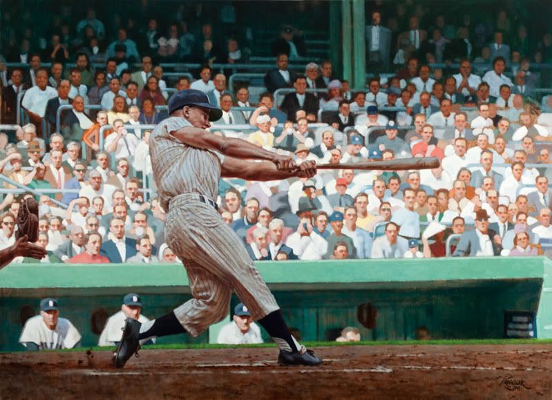
Here's one I just got back from the photographers. Well, not the actual painting yet, but the scan. Right. 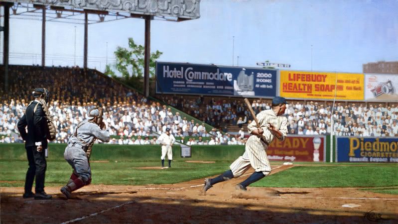 It was for a fellow board member, and depicts Babe Ruth exploding out of the batter's box during a June 25, 1920 game against the Red Sox. I seem to have a lot of imagery from this game, so when all is said and done, it will be cool to have a lot of different pieces from one particular event. Or at least, I think it will be cool. Anywho, hope everyone's keeping cool today (especially you NYers). Any comments/critiques/problems/tomatoes are, as always, appreciated. Now, back to work!! Graig
__________________
Check out my baseball artwork: www.graigkreindler.com www.twitter.com/graigkreindler www.facebook.com/graigkreindler
|
|
#335
07-18-2011, 07:11 PM
|
|||
|
|||
|
The painting is great. I really like the way you have Babe out of the shadows and into the sun light. I did not realize that "The Great Bambino" could dig out the box that fast................................
Your work is amazing...... When looking at the piece, I feel like I am at the game. Jerry
|
|
#336
07-18-2011, 10:04 PM
|
||||
|
||||
|
Thanks a lot, Jerry!
In actuality, Babe was pretty fast at this point in his career. He was no Cobb, but in the early to mid 1920s, he was averaging around 10-15 stolen bases. He was definitely a different beast then, way before he had that big belly! Either way, I'm really pleased you like it! Graig
__________________
Check out my baseball artwork: www.graigkreindler.com www.twitter.com/graigkreindler www.facebook.com/graigkreindler
|
|
#337
07-18-2011, 10:32 PM
|
||||
|
||||
|
Check out how many times the Babe stole home.
|
|
#338
07-18-2011, 11:00 PM
|
|||
|
|||
|
I've enjoyed reviewing your work, but this one is at a different level for me. It's beautiful light, and you've really captured it. I find that my eye lingers on the umpire and catcher after taking in the action of the Babe, the colorful signage, and the crowd. Those two figures are just so well rendered -- they pop in a subtle way. Great work!
|
|
#339
07-18-2011, 11:02 PM
|
||||
|
||||
|
Nobody does light like Graig. (Except, perhaps, Rembrandt.)
|
|
#340
07-19-2011, 11:42 AM
|
||||
|
||||
|
Wow, thanks so much, guys. The movement in the picture-plain you described was really what I was hoping for: the eyes go to Ruth first, then the umpire and catcher, and then through the background. I can't really say that it was completely planned, being that this all comes from one specific photograph and all, but I definitely tried to make the more important objects seem a bit more resolved and further refined than the others.
But by far, my favorite part to do was relate the shadow on the dirt to everything else. Having the umpire and catcher sliver into the sunlight was one of favorite parts of the photo to begin with, so I'm glad I got to play with it. Also, there were some great little details in there that I embellished a bit, like the fresh white ball in the umpire's hand, as well as some of the kicked-up dirt by Babe's feet. Overall, I'm definitely pleased with it, and hopefully the client will be as well! And David, let it be known that I couldn't wash Rembrandt's brushes - that man was a mutant genius. But your sentiment made my heart warm. Thank you. Graig
__________________
Check out my baseball artwork: www.graigkreindler.com www.twitter.com/graigkreindler www.facebook.com/graigkreindler
|
|
#341
07-19-2011, 04:20 PM
|
|||
|
|||
|
Any idea if you'll start making limited edition prints available for future work?
__________________
Cards Wanted: -I like HoF beaters 1928 Shonen Kulubu Ruth and/or 1929 Churchman's Ruth T206 Cy Young - glove shows http://s241.photobucket.com/home/woundedduck/allalbums
|
|
#342
07-20-2011, 10:02 AM
|
||||
|
||||
|
Hey Woundedduck,
As of now, they're no plans to do any prints, lithos or giclees. If we do start thinking about doing something like that, I'll certainly let you guys know. I will, however, run another contest on my Facebook fan page at some point in the future, with the winner taking away another free painting. I'm not sure exactly when it will happen, and how I'll run the contest, but I'm thinking that this time, the painting will be bigger than 9" x 12"...but yeah, just some food for thought! Graig
__________________
Check out my baseball artwork: www.graigkreindler.com www.twitter.com/graigkreindler www.facebook.com/graigkreindler
|
|
#343
07-20-2011, 03:10 PM
|
||||
|
||||
|
If you run another Facebook contest would there be any way to rig it so i will win?? LOL
Looking forward to the contest and seeing more of your work!! Your stuff is amazing!
|
|
#344
07-20-2011, 05:44 PM
|
||||
|
||||
|
Thanks again, Andrew.
I don't know if I'll be able to rig anything for the contest, but in my head, it might involve something similar to last time, and then something completely random - all for two different paintings. Yikes. But again, still in the VERY early planning stages... Graig
__________________
Check out my baseball artwork: www.graigkreindler.com www.twitter.com/graigkreindler www.facebook.com/graigkreindler
|
|
#345
08-03-2011, 11:27 AM
|
||||
|
||||
|
Hey guys,
Here are a few more that I've been working on over the past few weeks. Some of them are closer to being finished than others, but hopefully by the time I get back from Chicago, they'll all be finished that following week...or Dean might have my head. As usual, please excuse the cruddy photography! 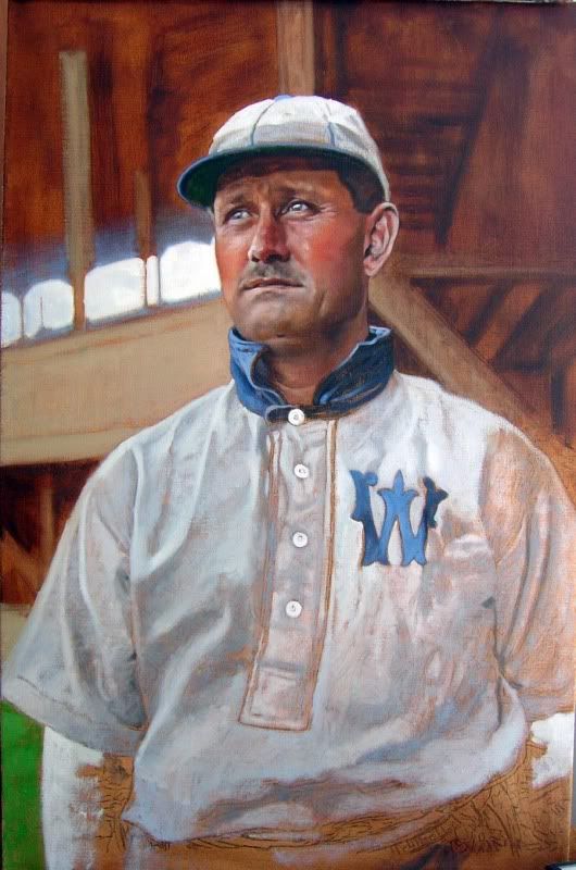 Ed Delahanty, 1903 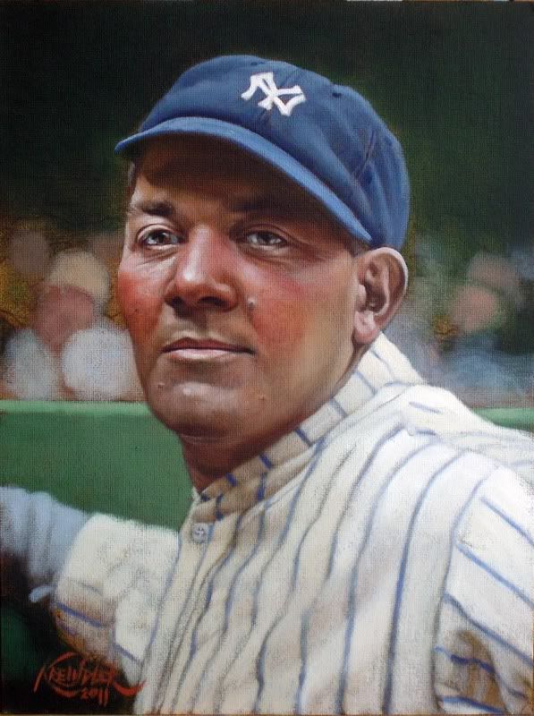 Pat Collins, 1927 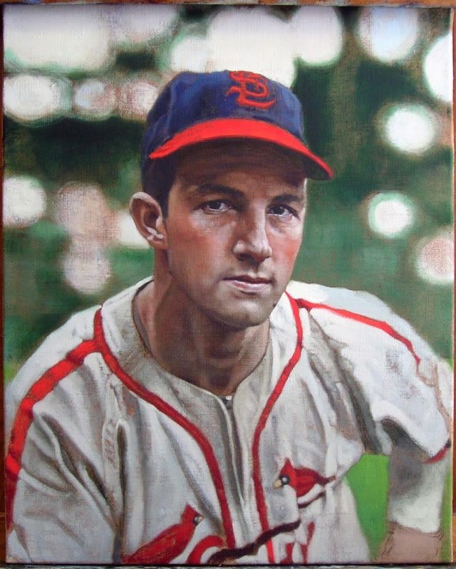 Stan Musial, 1942 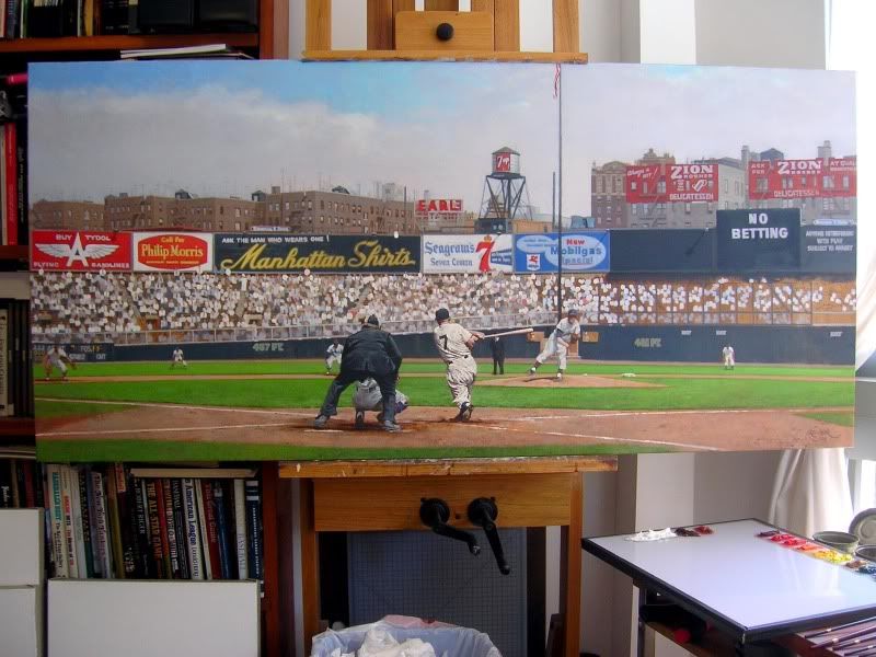 Mickey Mantle, 1955 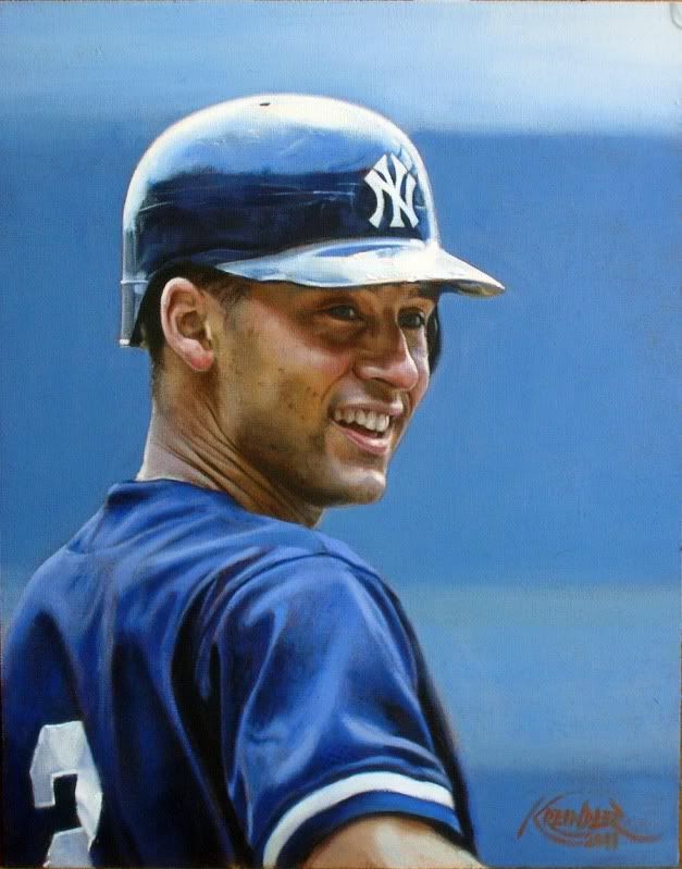 Derek Jeter, 2000 Anywho, hope you dig 'em. Feel free to throw any questions/crits my way! See y'all in Chicago! Graig
__________________
Check out my baseball artwork: www.graigkreindler.com www.twitter.com/graigkreindler www.facebook.com/graigkreindler
|
|
#346
08-06-2011, 06:55 AM
|
||||
|
||||
|
Last night at the Net54 dinner I had the honor of meeting Graig and his friends. It was certainly the highlight of the dinner. I am strictly into selling cards and I don't usually read the posts in the memorabilia forum. So, last night was the first time I ever heard anything about Graig. Both he and his friends showed me his work which they had photos of on their phones. I was amazed at the quality of workmanship that went into every detail of that picture. It wasn't about the player in the picture, it was just the capture of the moment in each shot. I felt like the picture came alive.
I never in a million years thought that I would write a post about art, but after speaking with Graig and seeing his work, I am a convert. I hope that one day, I will be able to hang his art in my house. For now, I will display his business card. BTW, he's a nice guy.
|
|
#347
08-08-2011, 08:34 AM
|
||||
|
||||
|
Aww, Howard, that was all really nice of you to say - seriously, thank you. I very much enjoyed talking with you as well, even if it was only brief. And I must say, I figured my friends would have scared you off long before you actually left - they're definitely on the silly side.
I really did have a wonderful time at the Net54 dinner, especially since I was able to meet and chat with so many lovely people from both sides of the boards. The fact that they all had the love of the hobby in common was the best part. It's not often I can make a reference to Ed Delahanty and have anyone know who the heck I'm talking about. So, It makes me that much more stoked for Baltimore's version. Hopefully for that one, I'll actually be exhibiting, but I guess we'll just have to wait see... Graig
__________________
Check out my baseball artwork: www.graigkreindler.com www.twitter.com/graigkreindler www.facebook.com/graigkreindler
|
|
#348
08-09-2011, 03:23 PM
|
|||
|
|||
|
Hey Graig,
Absolutely love your work! It has inspired me to start painting some vintage. Going to do a Robinson, Williams and Mantle one next, all separate ones though. Love the work, Absolon Last edited by AbsolonMoreau; 08-09-2011 at 03:24 PM.
|
|
#349
08-09-2011, 03:23 PM
|
|||
|
|||
|
Double Post, please delete.
Last edited by AbsolonMoreau; 08-09-2011 at 03:24 PM.
|
|
#350
08-24-2011, 09:34 AM
|
||||
|
||||
|
Hey all,
So, since I joined this board a couple of years back, you guys have always been so wonderful to me with your encouraging words and support. All of it is appreciated more than you know. Because of all of that, I feel a lot more comfortable showing you guys my work than I do with others. Which is why I wrote this post. Ever since meeting me in 2007, Dean, my agent, had been suggesting for a while that I try doing a quick, loose painting at some point, just to see what the results would be. He wanted something that didn't have the same attention to detail and was more expressive. Well, I finally took him up on the idea a few months back, and came out with this: 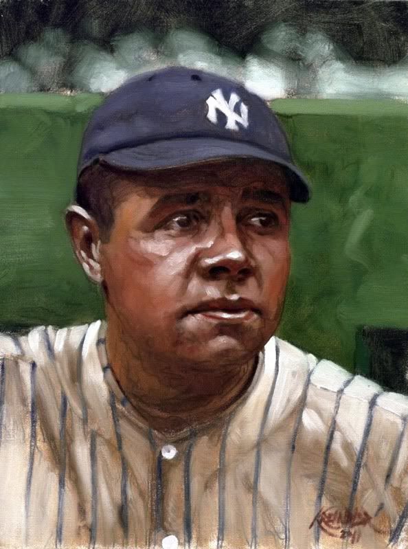 Babe Ruth, 1922 He went bananas over it. He thought that I captured something in his eyes that he described as 'real emotion.' I told him that it wasn't my doing, but Conlon's (as it was based from his photograph), but he insisted that I had something special here. Anywho, I was wondering if some of you might be willing to lend your thoughts about this little study. Be they good, bad, indifferent, comparable to the 'finished works', or whatever, I would just really love to hear from you. Any feedback you can provide is greatly appreciated. As usual, you guys rock. Thanks, Graig
__________________
Check out my baseball artwork: www.graigkreindler.com www.twitter.com/graigkreindler www.facebook.com/graigkreindler
|
 |
|
|
 Similar Threads
|
||||
| Thread | Thread Starter | Forum | Replies | Last Post |
| 68 Topps 3D Easel | Archive | Postwar Baseball Cards Forum (Pre-1980) | 1 | 04-22-2008 03:17 PM |


 Linear Mode

