|
||||||
 |
|
|||||
|
||||||
|
|
|||||
|
#201
 10-07-2010, 12:41 AM
|
||||
|
||||
|
Don't make me start that Pennock...

__________________
Check out my baseball artwork: www.graigkreindler.com www.twitter.com/graigkreindler www.facebook.com/graigkreindler 
|
|
#202
10-07-2010, 01:01 AM
|
||||
|
||||
|
Quote:
__________________
Check out my aging Sell/Trade Album on my Profile page HOF Type Collector + Philly A's, E/M/W cards, M101-6, Exhibits, Postcards, 30's Premiums & HOF Photos "Assembling an unfocused collection for nearly 50 years." Last edited by HRBAKER; 10-07-2010 at 01:03 AM.
|
|
#204
10-26-2010, 02:37 PM
|
||||
|
||||
|
Hey guys,
Here's the latest for those of you keeping score! Jackie stealing home against Andy Seminick during the first game of a doubleheader between Brooklyn and Philadelphia on July 2, 1950. That was a mouthful. Hope you dig it! Graig 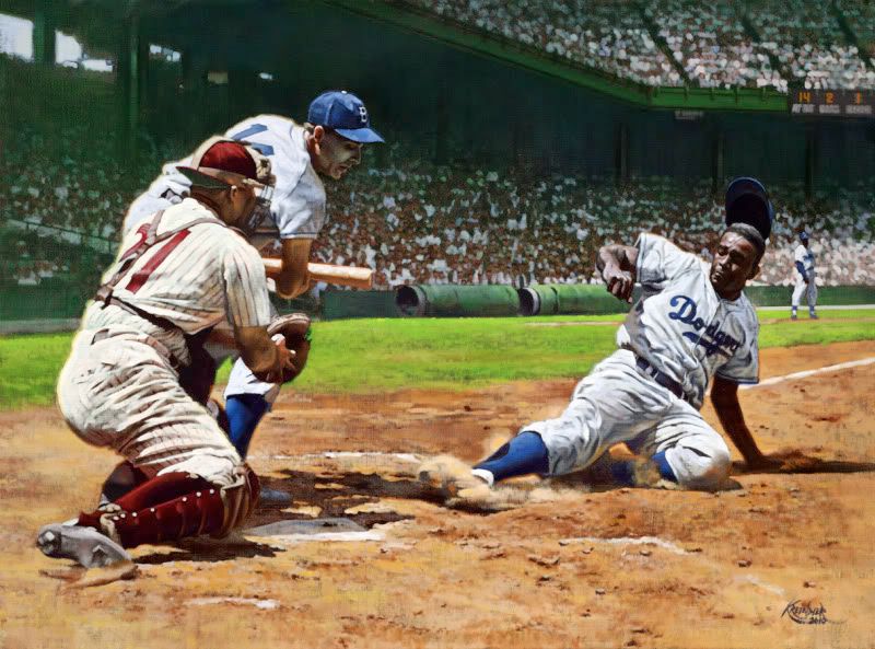
__________________
Check out my baseball artwork: www.graigkreindler.com www.twitter.com/graigkreindler www.facebook.com/graigkreindler
|
|
#205
10-26-2010, 03:58 PM
|
||||
|
||||
|
That's a gorgeous JR. Where's the Gil McDougal you said you were working on?
Bobby Shantz in the future? Do the Vera just for that Scooby Doo reference alone. I bet he spent all night working on that line. :-) DanC P.S: GK, BH was sent yesterday.
__________________
An ignorant person is one who doesn't know what you have just found out---Will Rogers Last edited by danc; 10-26-2010 at 03:58 PM.
|
|
#207
11-28-2010, 06:38 PM
|
||||
|
||||
|
Hey all,
I figure it's been more than a month since I posted something last on here, so I thought I'd give it a whirl for those of you who are still tuned in. I got these three 9"x12"s back from the photographers a couple of weeks ago. The Gehrig dates from '27, the DiMag from '36 and the Feller from '37. All of them originate from that master of disaster, Charles M. Conlon. 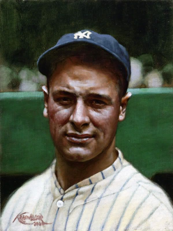 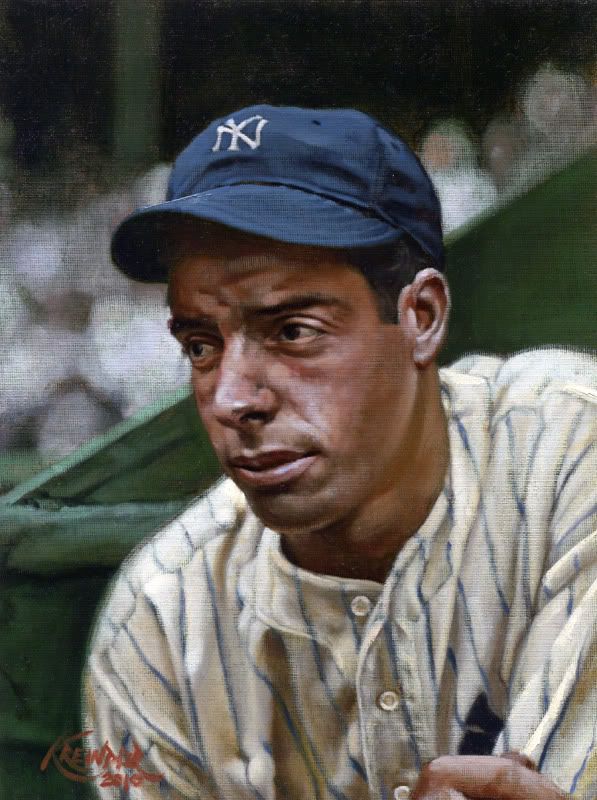 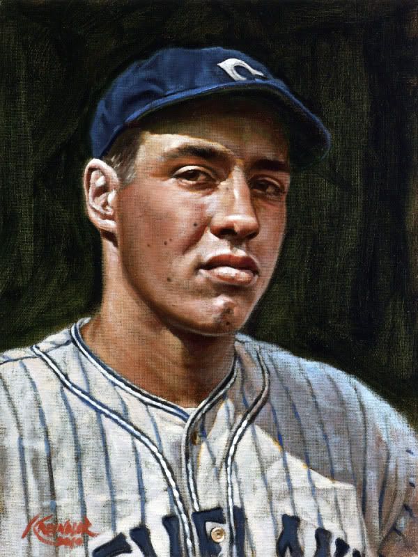 I also have a bunch of larger ones in progress, but I'll have to post them later when the studio is a bit cleaner and I can actually get them onto the easel to take photos of 'em. Some of them are even commissions from fellow board members. Woot! Oh, and if you want to keep track of any painting stuff, I regularly update my Facebook page - http://www.facebook.com/home.php?ref...GraigKreindler Hope everyone had a wonderful Thanksgiving weekend! Graig
__________________
Check out my baseball artwork: www.graigkreindler.com www.twitter.com/graigkreindler www.facebook.com/graigkreindler Last edited by GKreindler; 11-28-2010 at 06:53 PM.
|
|
#208
11-28-2010, 08:13 PM
|
||||
|
||||
|
nice job again Graig. Out of a personal preference, I prefer your action ones that show more of the stadium. Nothing against your close ups but for me your strongest with the wide action shots. Looking forward to seeing the ones your working on and for gods sake make a Hal Chase!

|
|
#209
11-28-2010, 08:31 PM
|
||||
|
||||
|
Quote:
__________________
M@tt McC@arthy I collect Hal Chase, Diamond Stars (PSA 5 or better), 1951 Bowman (Raw Ex or better), 1954 Topps (PSA 7 or better), 1956 Topps (Raw Ex or better), 3x5 Hall of Fame Autographs and autographed Perez Steele Postcards. You can see my collection by going to http://www.collectorfocus.com/collection/BigSix.
|
|
#210
11-28-2010, 10:05 PM
|
||||
|
||||
|
Thanks for your thoughts, Sean. I actually really enjoy doing those action shots the most, as like you, I love being able to see the ballpark. Man, if I could do one of those a month, I'd be super happy. Maybe I really need to start trying.
But yeah, the small ones are ultra-satisfying too. Thankfully, those images only go on the smaller panels, so in a way, I think of them like baseball cards - profile pictures, I guess. At the same time, they're not as tough to research as some of those other paintings, so they're a nice break from everything. Regarding Chase, I've always loved this shot from '05. Though smiling, I always thought he looked kinda devilish.  Graig
__________________
Check out my baseball artwork: www.graigkreindler.com www.twitter.com/graigkreindler www.facebook.com/graigkreindler
|
|
#211
11-28-2010, 11:08 PM
|
|||
|
|||
|
incredibly beautiful work!!!
I love that you choose the master of disaster as your photographer. I have the Conlon Paskert,Mowrey,Moeller, and L. Tannehill and they're displayed on one of my many(thankfully) office walls. all the best, barry
|
|
#212
11-29-2010, 07:29 AM
|
||||
|
||||
|
Thank you so much, Barry!!
I'd love to see shots of those Conlons, if you have them. Especially the Tannehill.
__________________
Check out my baseball artwork: www.graigkreindler.com www.twitter.com/graigkreindler www.facebook.com/graigkreindler
|
|
#213
11-29-2010, 01:24 PM
|
|||
|
|||
|
beautiful art work thanks for sharing
|
|
#214
11-29-2010, 04:56 PM
|
||||
|
||||
|
Thanks for the compliments, Romeo!
This one needs another day or two, but it's almost there. Commissioned by a fellow board member, this is based off of another one of Conlon's beautiful pieces. I'm pretty sure this dates back to '25. 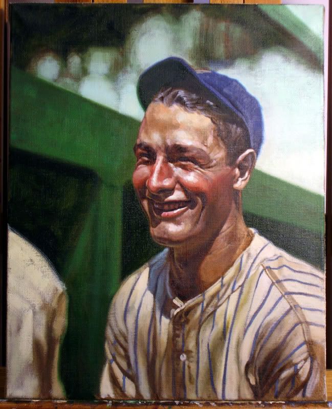 As usual, my photography stinks. Hope ya dig it anyways! Graig
__________________
Check out my baseball artwork: www.graigkreindler.com www.twitter.com/graigkreindler www.facebook.com/graigkreindler
|
|
#216
11-29-2010, 06:48 PM
|
||||
|
||||
|
Because of the angle, I'd probably only keep a sliver of the ballpark at the bottom of the canvas. I think the sky would just frame his head perfectly. I do have some other shots of him from a little further back though, mostly fielding first base, with much more of the ballparks showing through.
__________________
Check out my baseball artwork: www.graigkreindler.com www.twitter.com/graigkreindler www.facebook.com/graigkreindler
|
|
#217
11-29-2010, 11:08 PM
|
|||
|
|||
|
graig,
i'd love to show you but this ole dinosaur never learned to scan( barry sloate and i are the last of this pitiful breed methinks). i surely wouldn't know how to do it now since they're on the office walls! the tannehill is the photo behind the T206 tannehill (no L); the paskert if the photo behind the T3 paskert cincinnati; mowrey and moeller are just beauts. the first i won in legendary 2009; the other 3 i won in the B&L auction late this year. again, i do love your work!!!!!! best, barry
|
|
#219
11-30-2010, 10:56 AM
|
||||
|
||||
|
Barry, I've always loved that Tannehill shot. It depicts him after casually tossing the ball, right? Conlon was so amazing at capturing shots like that. Even though I love the game action shots and all, seeing the guys casually tossing before a game is really cool. It's as much a part of a game as any image could be.
Sean, I have indeed. The only problem with this image is that because of the angle of the photograph, as well as the direction of the sunlight, it would be very hard to place any deadball era ballpark in the background that wouldn't sit pretty low to the bottom of the canvas. It would probably be best to find another Chase shot if you wanted to see more of the ballpark backdrop. Then again, I could just extend his body down to the knees, and you could see more that way...
__________________
Check out my baseball artwork: www.graigkreindler.com www.twitter.com/graigkreindler www.facebook.com/graigkreindler
|
|
#221
11-30-2010, 01:04 PM
|
||||
|
||||

__________________
Check out my baseball artwork: www.graigkreindler.com www.twitter.com/graigkreindler www.facebook.com/graigkreindler
|
|
#222
11-30-2010, 10:38 PM
|
|||
|
|||
|
you are correct. it is that casual tannehill.
i've been drawn to it for the same reasons you elucidate. keep up the great work. best, barry
|
|
#223
12-18-2010, 04:05 PM
|
||||
|
||||
|
Please tell me you won this one and are going to paint it. I was the under bidder and had I won I was going to give it to you and insist you paint it
speaker.jpg http://cgi.ebay.com/ws/eBayISAPI.dll...K%3AMEWAX%3AIT Last edited by milkit1; 12-18-2010 at 04:06 PM.
|
|
#224
12-19-2010, 04:42 PM
|
||||
|
||||
|
Have a look at this pic Graig...I know you're a Yankee fan ( not your fault ),this shoould be your next "on the easel" project...
http://cgi.ebay.com/MICKEY-MANTLE-WH...item5d2ca5ab08
__________________
"Baseball was, is and always will be to me the best ballgame in the world"...BR
|
|
#225
12-19-2010, 04:49 PM
|
||||
|
||||
|
Heres another good one...
http://cgi.ebay.com/MICKEY-MANTLE-CA...item5d2cb2290e
__________________
"Baseball was, is and always will be to me the best ballgame in the world"...BR
|
|
#226
12-19-2010, 05:42 PM
|
||||
|
||||
|
Sean, that Speaker shot would be cool indeed. I have a feeling I would drive myself absolutely bonkers trying to get all of the right colors and what not for that painting. I wonder if it's still around?
Brandon, both of those shots are wonderful. The only problem is, that particular seller isn't so great. He/she gets all of those photos from Internet screen-shots, and every single one I've ordered from them has been beyond pixelated. I do, however, have a nice scan of the first one from a Marvin Newman book...
__________________
Check out my baseball artwork: www.graigkreindler.com www.twitter.com/graigkreindler www.facebook.com/graigkreindler
|
|
#228
12-19-2010, 09:33 PM
|
|||
|
|||
|
Just wanted to say that your work is amazing. Hopefully one day I may be able to afford one of them! They are so realistic!!!
|
|
#229
12-20-2010, 08:39 AM
|
||||
|
||||
|
Thank you so much for those compliments, Darren!! I'm really glad you dig the work.
And Sean, surreal indeed. I have a feeling that one day, some random commission will require me to do something like this, and I can picture myself combing the country to see if the painting still exists. And I'd probably love every single second of it.
__________________
Check out my baseball artwork: www.graigkreindler.com www.twitter.com/graigkreindler www.facebook.com/graigkreindler
|
|
#231
01-10-2011, 07:09 PM
|
||||
|
||||
|
Hey guys,
Thought I'd start this bad-boy up again, as I just got a bunch of paintings back from the photographers. The majority of them are on the smaller side, as I've been working a lot on these smaller guys when I take breaks from the large canvases. I guess because they're a little less involved, they are a bit quicker to get done.  Honus Wagner, 1909 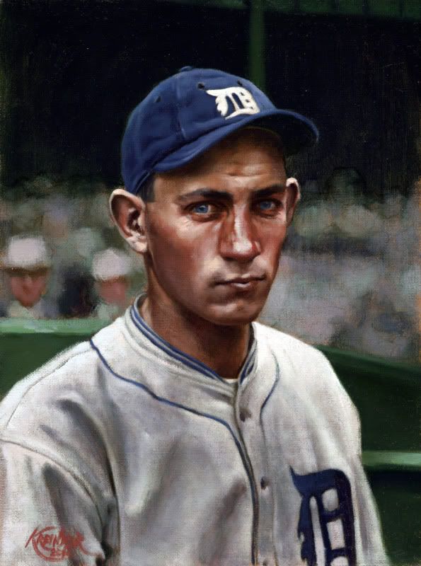 Charlie Gehringer, 1925 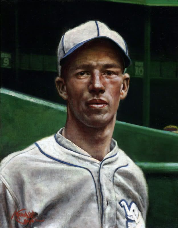 Lefty Grove, 1925 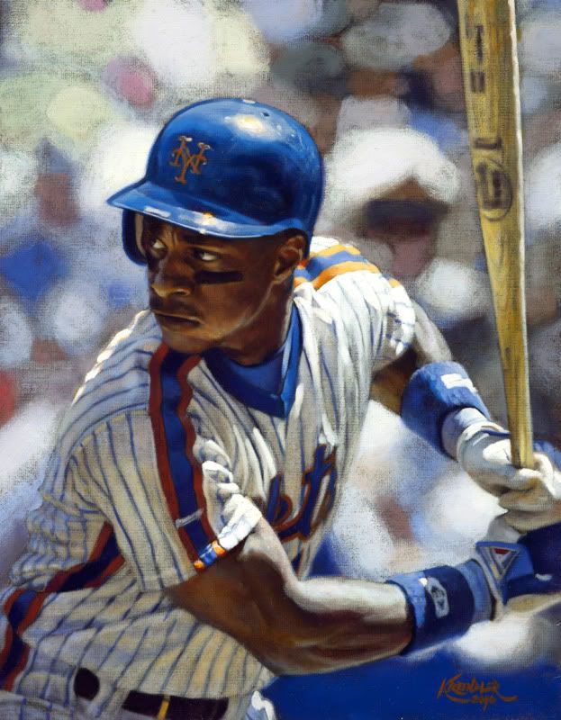 Darryl Strawberry, 1987 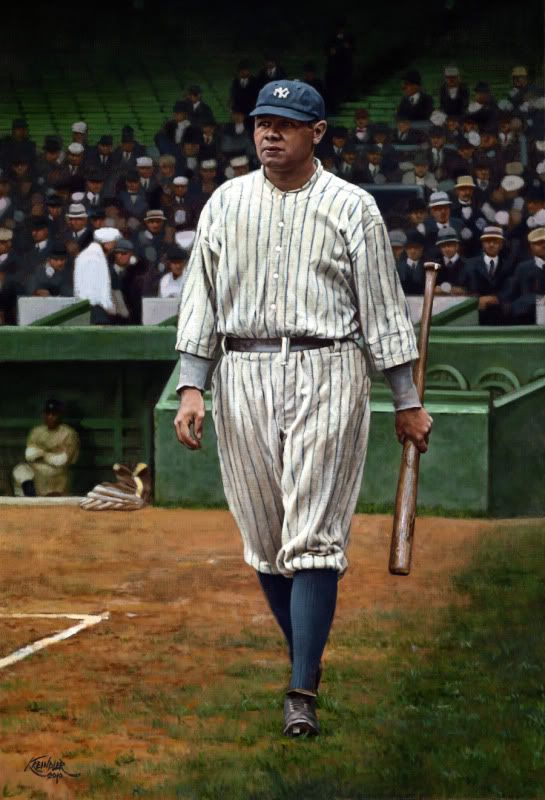 Babe Ruth, 1922 I have about five more that need to be photographed in the next week too, so I'll post those when they come back into the studio. Also, I have a ton of in-progress stuff that I can post if anyone's interested. And if not, that's cool too. Hope y'all enjoy! Graig PS: Oh, and if you want to follow what I'm doing a little more closely, become a fan on Facebook! http://www.facebook.com/GraigKreindler
__________________
Check out my baseball artwork: www.graigkreindler.com www.twitter.com/graigkreindler www.facebook.com/graigkreindler
|
|
#234
01-11-2011, 03:56 PM
|
||||
|
||||
|
Thanks a lot, guys!!!
I'll have to take some photos of the in-progress stuff tomorrow, as my camera seems to be a little bit on the fritz. Being that I'm so bad with it to begin with, maybe I should just cut my losses and throw it into the street... Graig
__________________
Check out my baseball artwork: www.graigkreindler.com www.twitter.com/graigkreindler www.facebook.com/graigkreindler
|
|
#235
01-11-2011, 06:08 PM
|
||||
|
||||
|
If I could paint like you I would throw my camera away
|
|
#236
01-12-2011, 09:47 AM
|
||||
|
||||
|
Quote:
__________________
[I]"When you photograph people in colour you photograph their clothes. But when you photograph people in B&W, you photograph their souls." ~Ted Grant Www.weingartensvintage.com https://www.facebook.com/WeingartensVintage http://www.psacard.com/Articles/Arti...ben-weingarten ALWAYS BUYING BABE RUTH RED SOX TYPE 1 PHOTOGRAPHS--->To add to my collection
|
|
#237
01-12-2011, 09:58 AM
|
||||
|
||||
|
and nice Ruth BTW..
__________________
[I]"When you photograph people in colour you photograph their clothes. But when you photograph people in B&W, you photograph their souls." ~Ted Grant Www.weingartensvintage.com https://www.facebook.com/WeingartensVintage http://www.psacard.com/Articles/Arti...ben-weingarten ALWAYS BUYING BABE RUTH RED SOX TYPE 1 PHOTOGRAPHS--->To add to my collection
|
|
#238
01-12-2011, 10:21 AM
|
||||
|
||||
|
Quote:
|
|
#239
01-12-2011, 12:59 PM
|
||||
|
||||
|
Quote:
. Just giving Graiger the grief he deserves for being my friend.
__________________
[I]"When you photograph people in colour you photograph their clothes. But when you photograph people in B&W, you photograph their souls." ~Ted Grant Www.weingartensvintage.com https://www.facebook.com/WeingartensVintage http://www.psacard.com/Articles/Arti...ben-weingarten ALWAYS BUYING BABE RUTH RED SOX TYPE 1 PHOTOGRAPHS--->To add to my collection
|
|
#240
01-12-2011, 01:26 PM
|
||||
|
||||
|
Congratulations on your Ruth, Ben - I'm jealous.
I still can't get over that Strawberry. It's insane - it may even be on par with the Mathewson Graig did.  I've logged into Net54 more in one week than I ever have, just to look at that Strawberry painting again. I'm not trying to embarrass you, Graig! Those mid-80s Mets jerseys really pop on the canvas though - love to see one of Orosco kneeling on the mound, flinging his glove into the air, or of Knight trotting home at the end of Game 6.
|
|
#241
01-12-2011, 01:45 PM
|
||||
|
||||
|
Quote:
|
|
#242
01-12-2011, 02:26 PM
|
||||
|
||||
|
Quote:
__________________
[I]"When you photograph people in colour you photograph their clothes. But when you photograph people in B&W, you photograph their souls." ~Ted Grant Www.weingartensvintage.com https://www.facebook.com/WeingartensVintage http://www.psacard.com/Articles/Arti...ben-weingarten ALWAYS BUYING BABE RUTH RED SOX TYPE 1 PHOTOGRAPHS--->To add to my collection
|
|
#243
01-12-2011, 06:21 PM
|
||||
|
||||
|
Oh, believe me, Dynarl, Ben gets his.
And Jacksons, you're making me blush. Thank you for your kind words. Hopefully you'll feel the same about your up-and-comer... I have to agree with you on those Mets jerseys. Those mid-80s togs were absolutely amazing. And coming from a Yankee fan, this is not the easiest thing in the world to say, but I always thought he looked best in blue and orange. Graig
__________________
Check out my baseball artwork: www.graigkreindler.com www.twitter.com/graigkreindler www.facebook.com/graigkreindler
|
|
#244
01-18-2011, 11:55 PM
|
||||
|
||||
|
Hey all,
Just got these back from the photographers, too: 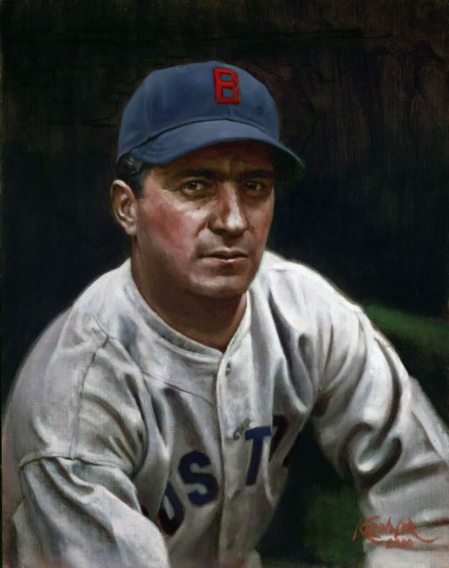 Moe Berg, 1935 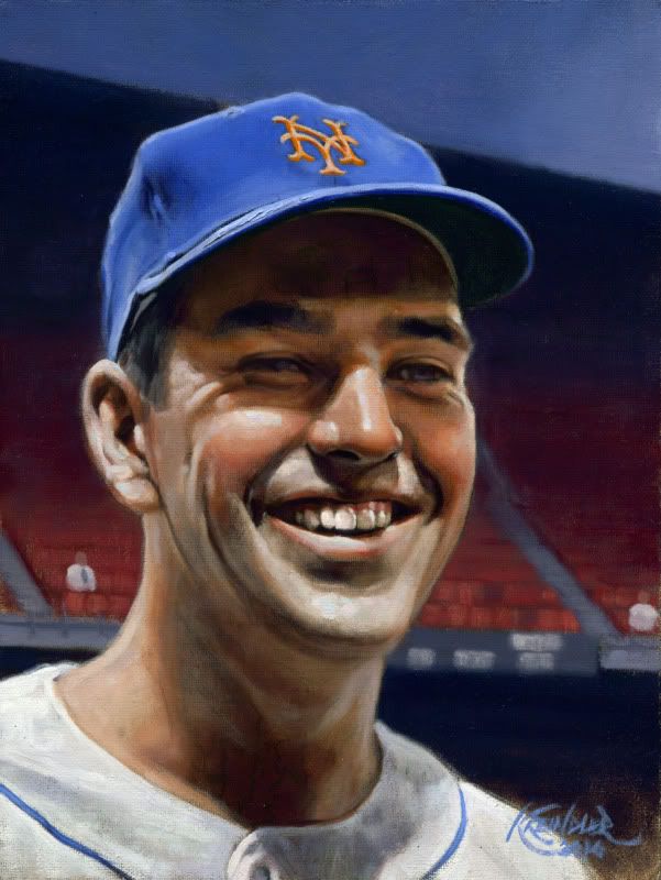 Ed Kranepool, 1963 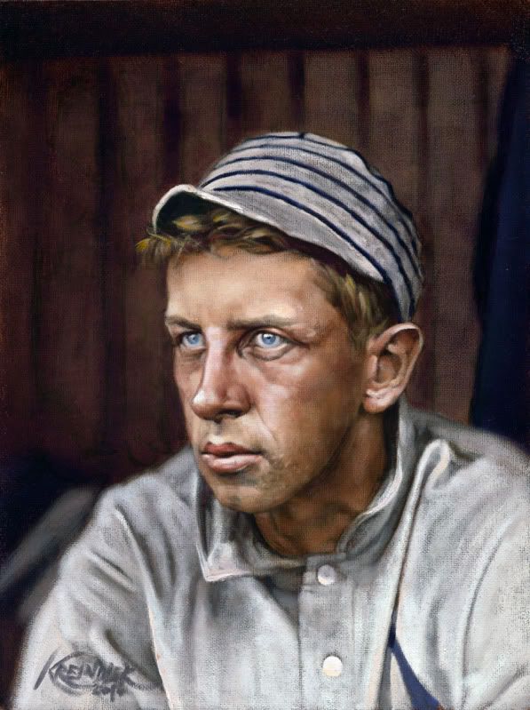 Eddie Collins, 1909 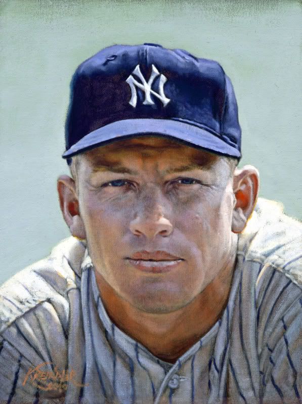 Mickey Mantle, 1956 A motley crew/crue indeed. The Mantle is actually a redo, as the original was...ahem...lost. Not cool. Anywho, I would love to hear any thoughts you want to throw my way, especially with the Collins. That one had somewhat of a different quality of light that I've not painted before, and I'm not terribly sure that I was successful. Boo. I hope you like all four, but I'll settle for three. Actually, I'll settle for one. Graig
__________________
Check out my baseball artwork: www.graigkreindler.com www.twitter.com/graigkreindler www.facebook.com/graigkreindler
|
|
#245
01-19-2011, 07:45 AM
|
|||
|
|||
|
Graig, you are a man of many talents, or at least one extreme talent!
I always look for new postings from you, because they are simply amazing. So the first Mantle was "lost"?  Is it by any chance now part of the Barry Halper collection? Is it by any chance now part of the Barry Halper collection? Since you specifically asked about the Collins, I absolutley love it. The only thing that bothers me or seems eerie, is that when I look at it, it appears to me that Collins' left eye is looking directly into my eyes but his right eye seems to be loking over my left shoulder. It could just be me. Or were Collins' eyes actually that way? If so, then you certainly captured it. And thanks for the Berg. It reminds me that I was reading "The Catcher Was A Spy" while on vacation a few year ago and hadn't finished it when vacation was over. I really need to pick that up again. Somehow that painting seems to capture the essence of what I know about him and his life.
|
|
#246
01-19-2011, 08:55 AM
|
||||
|
||||
|
Graig,
The Mantle is Spectacular, as is the Strawberry you posted last week. They look just like pictures. The other three are excellent as well. I'm not sure what you don't like about the Collins. I think it captures him quite nicely. BTW, the picture is in the mail tomorrow. Mark
__________________
My signed 1934 Goudey set(in progress). https://flic.kr/s/aHsjFuyogy Other interests/sets/collectibles. https://www.flickr.com/photos/96571220@N08/albums My for sale or trade photobucket album https://flic.kr/s/aHsk7c1SRL
|
|
#247
01-19-2011, 09:24 AM
|
||||
|
||||
|
Graig - they are all fantastic.
I'd love to know how you determine exact eye, hair color, etc. for these deadballers. Is this through literary research, or is it maybe assumed by the shade of these attributes in b/w photographs? Eddie Collins' eyes are haunting. How did you know he had such light colored eyes? BTW - sorry to hear about the Mantle redo - the second one looks just as good as the first, though, if not better.
|
|
#248
01-19-2011, 02:17 PM
|
||||
|
||||
|
Thanks for all of your comments, guys - I really appreciate the honest feedback.
timzcardz, it's funny you should mention that...um...just kidding. But really, I'm a bit upset that I never got to do this kind of stuff when Barry was still around and active. It really would have been wonderful to meet him if I ever had the chance. Also, thanks for the comments on the Collins painting. His eyes seem to be pretty consistent with the photograph, I think. But, it's definitely possible that I could have been a little off. I'm really still debating, so I'll have to give it another look or six. Mark, you da man. Thank you. And from what Dean tells me, your painting should be going out quite soon. jacksons, thanks for the kind words again, especially regarding the Mantle. I blame Dean. Let's leave it at that. Regarding the eye colors, it's all done with research, mostly through books and magazines. Sometimes, though ti can be tough, I have to guess based on the approximate value of the person's iris compared to the retina. Even that can't be exact though. The feeling with Collins that I was trying to go for was just what you mentioned - having a focal point in his eyes. The light I was trying to achieve was to be reflected from outside of the dugout for the most part. In other words, in the dark dugout, I wanted Collins' head to peer out and seem to glow. And in such a case, it seemed that his blue eyes would appear almost crystalline. You may notice that on a bright day with cloud cover, the pigment in a person's eyes will be really chromatic, sometimes even more so than with direct light from the sun. I guess that was really the effect I was trying for. Graig
__________________
Check out my baseball artwork: www.graigkreindler.com www.twitter.com/graigkreindler www.facebook.com/graigkreindler
|
|
#249
01-19-2011, 03:26 PM
|
||||
|
||||
|
Hi, never posted but always admired. Greg, you are the best and most talented sports artist I have ever seen. That Berg is amazing, like he is actually sitting there, and the Mantle is just as incredible. I really think you captured the intensity of a young baseball hero in the making. The other 2 are nice but the Berg and Mantle really seem to come to life in my opinion. I don't come to this side often but when I do I always search out the posts of your artwork. You are truly a gifted artist. When I win the lottery, you'll be the first to know it!
__________________
I Remember Now. 
|
|
#250
01-19-2011, 04:36 PM
|
||||
|
||||
|
Graig,
I think that the Collins is fabulous. That along with the Baker are my faves of all of your incredible work, an A's bias not doubt showing through. Because after all how could you pick really? Keep up the good work. Jeff
__________________
Check out my aging Sell/Trade Album on my Profile page HOF Type Collector + Philly A's, E/M/W cards, M101-6, Exhibits, Postcards, 30's Premiums & HOF Photos "Assembling an unfocused collection for nearly 50 years."
|
 |
|
|
 Similar Threads
|
||||
| Thread | Thread Starter | Forum | Replies | Last Post |
| 68 Topps 3D Easel | Archive | Postwar Baseball Cards Forum (Pre-1980) | 1 | 04-22-2008 03:17 PM |


 Linear Mode

