|
||||||
 |
|
|||||
|
||||||
|
|
|||||
|
|
|
#1
 05-15-2009, 12:05 PM
|
||||
|
||||
|
Quote:
After posting about how the heavier color moves from the bottom to the top of the card last night and giving it a lot of thought I'm now wondering if it's just a resistance issue. If the ink in the T206 process took the path of least resistance and there was a varying amount of ink used in the application, a color such as the dark green (or dark blue) would show up always on the area meant for the heaviest amount of ink, and less often for the area meant for the least amount of that color. I haven't had the chance to look at as many examples of other T206's as I have the Ritchey but I think there are other cards that have variances but just not to the degree of the Ritchey, or with a contrast as noticeable as the Dove. Here are a couple of Marquard Hands At Thighs that have a similar background to Ritchey with a noticeable difference in the amount of dark green (or dark blue) ink. Again not as big a variance as Ritchey. 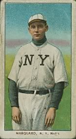 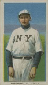
Last edited by Abravefan11; 05-15-2009 at 12:07 PM. Reason: Grammar 
|
|
#2
05-15-2009, 01:25 PM
|
|||
|
|||
|
Interesting work,Tim.
Looking back at your initial post, I do think that your point that the Ritchey dove card is not a definitive variation stands unswervingly. Your point that 'in the end I think it's simply a matter of print quality,' also is strong, although the definition of print quality may not be so simple now and may need to be fleshed out in response to the various 'speculations'/'theories' regarding multiple plates, new plates, ink distribution, resistance, etc. Admittedly, the corroborative data for these 'speculations'/ 'theories' is still very much fluid and in process and very difficult to use for fleshing out. Moving from the speculative/anecdotal to corroborative data may well require that most efficacious Zanidakean tool of the trade: survey. best, barry
|
|
#3
05-15-2009, 01:25 PM
|
|||
|
|||
|
Interesting work,Tim.
Looking back at your initial post, I do think that your point that the Ritchey dove card is not a definitive variation stands unswervingly. Your point that 'in the end I think it's simply a matter of print quality,' also is strong, although the definition of print quality may not be so simple now and may need to be fleshed out in response to the various 'speculations'/'theories' regarding multiple plates, new plates, ink distribution, resistance, etc. Admittedly, the corroborative data for these 'speculations'/ 'theories' is still very much fluid and in process and very difficult to use for fleshing out. Moving from the speculative/anecdotal to corroborative data may well require that most efficacious Zanidakean tool of the trade: survey. best, barry
|
|
#4
05-15-2009, 08:59 PM
|
||||
|
||||
|
Thanks Barry.
I'm extremely confident that all Ritchey cards were intended to have the same design and that all of the cards I have seen show this. It's just a matter of print quality as to how prominent certain features like the Dove stand out. Now figuring out what caused the great variance in this particular card and better understanding the printing process is another matter all together. As with many T206 issues there is always more to be learned.
|
 |
|
|


 Hybrid Mode
