|
||||||
 |
|
|||||
|
||||||
|
|
|||||
|
|
|
#1
 05-14-2009, 07:19 AM
|
|||
|
|||
|
Tim - very interesting. I always thought the CW was that the printing quality on the later runs was less then on the previous ones.

|
|
#3
05-14-2009, 07:56 AM
|
||||
|
||||
|
I would imagine that like the Ritchey, the Matty halo would be more pronounced on cards with a darker green bottom.
|
|
#4
05-14-2009, 08:03 AM
|
||||
|
||||
|
Jamie-
I too thought there may be more colors to the printing process, but I wasn't able to find anyone else that thoughts so. So I used the 6 color process when looking at the cards that seems to be the consensus for now as to how the cards were produced. If there were additional colors that changes things. I still think there is a correlation between the dark green grass and dark blue clouds on the Ritchey. I think the same color application produced both.
|
|
#5
05-14-2009, 08:31 AM
|
|||
|
|||
|
My experience with observing several cards of Ritchey with these backs......
Piedmont 150 Sovereign 150 Sweet Cap 150 HINDU EPDG ....is that the doves are not visible in the pale blue sky. Although, under magnification, some of these cards have a very faint hint of the doves. The cards of Ritchey with...... PIEDMONT 350 Sweet Cap 350 Old Mill ....clearly show the doves. I attribute this phenomena to a better quality of Blue (and other) ink(s) used in the printing of 350 Series cards in 1910. TED Z
|
|
#6
05-14-2009, 08:38 AM
|
||||
|
||||
|
Ted-
My Piedmont 150 shows the Doves are present, just not as bold. An even better example of the Piedmont 150 is the one that sold in the recent Legendary Auction. 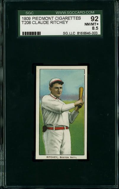 And if you think the difference is in the blue ink, do you not agree that there is a correlation between the dark green and clouds on the cards? Last edited by Abravefan11; 05-14-2009 at 08:43 AM.
|
|
#7
05-14-2009, 09:06 AM
|
|||
|
|||
|
JAMIE
You noted...... "I have often read that the T206 printing process contained six colors -- the ones you mentioned. I've always wondered where this theory comes from." Joseph Palmer Knapp (founder of the American Lithographic Co.) was an innovative force in the Lithographic printing industry and in 1895 he got a patent for his "6 cylinder color process". This process greatly improved the quality of color lithography; and I'd guess that Knapp employed it in the printing of all their sports and non-sports cards during the period of 1909 to 1916. TIM As I noted......although, under magnification, some of these cards (150 series) have a very faint hint of the doves. It appears as if the doves have always been part of the sky effect. And, their visibility is a function of printing inks. I arrange my T206 sets in a binder separating the successive series. And, I can tell you that by doing this, it becomes very obvious that the 350 series cards have a richer BLUE quality about them (than the 150 series cards). TED Z
|
|
#8
05-14-2009, 09:10 AM
|
||||
|
||||
|
Tim, the Legendary P150 Ritchey that you've posted raises an interesting set of possibilities.
In the REA Piedmont Plank thread I tried to explain a bit about how T206 printing plates were probably created (check out mkdltn's excellent posts as well). I won't post all of that again, but in a thumbnail, based on commercial lithographic processes circa 1910, it was a very simple procedure to create a production printing plate that included more than one copy of the same card -- hence the vertical column layout that seems to have predominated. The same processes also would have made it very simple to have any particular card be printed from multiple production plates. So for example, Claude Ritchey may have been printed from 2 or 3 or 4 or more printing plates, each having different configurations of cards but all containing Claude Ritchey or a column of Claude Ritcheys. I've come to believe that most T206s appeared on more than one printing plate in exactly this way. Many folks on this board are trying to figure out front-back combinations of T206 cards and are looking for correspondences between brands -- Ted several times has shown us his great sets of American Beauty, Broad Leaf, Carolina Brights, and Drum cards all having the same player on the front. But to some extent all of us who are interested in these correspondences are knocking our heads against a wall. There just aren't many clean rules of the kind that say, well, if a 350 series card can be found with EPDG, then it can also be found with Old Mill and Tolstoi. If cards only appeared on one printing plate, we'd see more of these kind of rules with regard to brand distribution. That we do not see that makes me believe that most T206s were indeed printed from multiple printing plates. To circle back to Ritchey, the variations in Dark Blue ink and "doves" and grass may not just be because of variations in ink levels with one printing plate. The variations may also be across several printing plates that included Ritchey, and across series (150 and 350) and the timeline of production. That there's a Piedmont 150 Ritchey with strong "doves" and plenty of Piedmont 150 Ritcheys with no doves at all seems to me to support this multiple plate theory.
|
|
#9
05-14-2009, 10:20 AM
|
|||
|
|||
|
Tim C,
I love seeing this Ritchey discussion! Great thread. I got into Ritchey so much some years back after the lengthy epdg discussion involving the doves among other things that I framed a Fan Craze Game box with the Fan Craze Ritchey affixed to the bottom and placed it in the middle of my office wall. ********** That SGC 92 Ritchey 150 Pied which you display does show a striking dove---a real beauty. It certainly makes me bend toward Jamie's multiple plate contention. I must admit that the part of me that wants to clear up T206 mysteries doesn't want to entertain this contention. Yet, Jamie's point that 'there's a Pied 150 Ritchey with strong doves and plenty of PIed 150 Ritchey's with no doves at all seems to me to support the multiple plate theory' cannot be swept away. And perhaps most disturbingly and even hauntingly accurate is Jamie's "there just aren't many clean rules...:
|
|
#10
05-14-2009, 01:11 PM
|
||||
|
||||
|
The multiple plate theory could very well be true. I'm not sure I'm 100% on board with it, but it definitely sounds good.
I would note that of all the examples of Ritchey's I have looked at, that only a few 150's show the Doves as strongly as the Legendary card I posted earlier. They are not the norm, but there are many Piedmont and Sweet Cap 150's with faint dark blue that you can see and show the Dove's were meant to be there all along. Along the same lines there are Piedmont 350's (note mine in the group of 9) where the Dove's don't show. However they are not the norm in the 350 series. I would suggest that the 150's that show the Dove's strongly were the best of the best. Maybe the first cards run off of just cleaned plates or something along those lines. When the 350 series begun ALC may have had some quality control review, cleaned up some of the images, improved ink quality, or even created new plates. For whatever reason this improvement brought out the Dove's though occasionally they would still not show up. I would consider these the very low end of the 350 run. If there was a greater variation in the 150 or even 350 series I would lean more towards the multiple plate theory. But the cards are pretty consistent with a few exceptions. Thanks for the imput from everyone so far. Last edited by Abravefan11; 05-14-2009 at 01:13 PM.
|
|
#11
05-14-2009, 01:56 PM
|
|||
|
|||
|
My 4 cards of Ritchey (three 150 Series and an EPDG) do not show even a hint of the the "dove's sky". Your theory,
Jamie, of multiple plates of a given T206 Subject, I think has a lot of merit. Another thought I might add.....American Litho. printed 1000's of Ritchey's during the 150 series press runs in 1909. As these plates wore, they replaced them with new plates somewhere along this process as they extended Ritchey into the 350 series press runs in 1910. These new plates included the "dove's sky". ![[linked image]](http://i603.photobucket.com/albums/tt113/zanted86/a4t206ritchey150.jpg) ![[linked image]](http://i603.photobucket.com/albums/tt113/zanted86/b4t206ritchey150.jpg ) TED Z
|
|
#13
05-16-2009, 07:47 PM
|
||||
|
||||
|
Craig, great card. Thanks for posting it. The pressman absolutely nailed the registration.
Well, the conundrum seems to be why most 150 versions of the card have no doves at all or only very light ones while most 350 versions of the card have quite obvious doves. I think the key word there is "most." If it were all one way or all the other, theories and guesses would be easier to prove.
|
|
#14
05-14-2009, 07:56 AM
|
||||
|
||||
|
Tim, nice post.
I have often read that the T206 printing process contained six colors -- the ones you mentioned. I've always wondered where this theory comes from. I've looked at a lot of T206s under magnification, and the oft-repeated yellow-black-brown-blue-dark green-red set of colors just doesn't match up. I haven't examined Ritchey specifically, but if I looked at it I'd expect to see:
Looking at your Ritchey examples, it looks to me like the main printing difference between the 150 series and 350 series examples is in the Dark Blue ink layer. In the 150s, it's limited to the lower portion of the grass, Dark Blue over Yellow creating the darker green (whereas Light Blue over Yellow creates the lighter green grass). In the 350 series examples, the Dark Blue has been expanded, occupying much more of the grass section in the lower part of the card (more dark green grass) and extending up into the sky (creating the dark sky around the "doves"). This was a change done on the Dark Blue printing plate. Jamie
|
 |
|
|


 Hybrid Mode
