|
||||||
 |
|
|||||
|
||||||
|
|
|||||
|
#2951
 10-11-2024, 11:35 AM
|
|||
|
|||
|
I have not come across the Aker with even less of the white streak. I have looked but have yet to be in the right place at the right time.
And I have never seen the Aker star constellation, nice pick up Al! Nice collection of Stromsters Sir!! Butch
__________________
Man proposes and God disposes. U.S. Grant, July 1, 1885 Completed: 1969 - 2000 Topps Baseball Sets and Traded Sets. Senators and Frank Howard fan. I collect Topps baseball variations -- I can quit anytime I want to.....I DON'T WANT TO. 
|
|
#2952
10-11-2024, 02:51 PM
|
||||
|
||||
|
Thanks for sharing your collection Larry. You have some there I was not aware of. Below is my known list (how I classify them) of variances on the Strommiester (With your new ones added)
SB = Side Burn - No SB color, regular card - No SB color, various donuts around "E" in Padres - No SB color, White donut in position box - No SB color, 2 donuts in brown top, 1 donut right side ear level - No SB color, yellow donut by right ear - No SB color, Red donut by top white left corner and Yellow donut Right side by boarder - No SB color, Red donut by top white left corner only - Multi color with Pink around SB, Pink line under "E" with boarder break - Multi color with Pink around SB, Pink line under "E" with boarder break. Red donut left of P in Padres - Multi color with Pink around SB, Pink line under "E" with boarder break. Blue/Purple donut edge of cap left side - Multi color with Pink around SB, Pink line under "E" with boarder break. Donut between E & S Padres - White SB, White line under "E" with boarder break. Blue mark to the right of cap - White SB, White line under "E" with boarder break. No Blue mark - White SB with light pink around white, White/Pink line under "E" with boarder break - White SB with heavy pink around white, White/Pink line under "E" with boarder break. Red donut between E and S of Padres - Green, Orange around green SB Yellow line under "E" with No boarder break and Yellow fish eye left of hat - Green, Orange around green SB Yellow line under "E" with boarder break and Yellow fish eye left of hat - Green SB No line under "E" and Blue donut top left by boarder, Blue spot by cap - Green SB No line under "E" and Blue spot by cap - Green SB No line under "E" and Blue spot by cap & blue mark left of nose - Green SB No line under "E" and 2 Blue donuts by cap - Green SB No line under "E" and Blue donut by cap. Red/Green donut on right eye - Green SB No line under "E" and Blue donut by cap. Red/Green donut on right eye. Yellow donut right of ear - Green SB No line under "E" and No Blue donut - Green SB No line under "E" and No Blue donut, White donut on "A" in Padres Johnny
|
|
#2953
10-11-2024, 03:44 PM
|
|||
|
|||
|
John,
Thank you for your Stromonster list. Time for me to get busy with mine now. Regards, Butch
__________________
Man proposes and God disposes. U.S. Grant, July 1, 1885 Completed: 1969 - 2000 Topps Baseball Sets and Traded Sets. Senators and Frank Howard fan. I collect Topps baseball variations -- I can quit anytime I want to.....I DON'T WANT TO.
|
|
#2954
10-11-2024, 08:00 PM
|
||||
|
||||
|
Quote:
|
|
#2955
10-12-2024, 04:56 PM
|
||||
|
||||
|
Hi Butch & Larry have fun putting your lists together. If you find a version I do not have listed, when time permits send me a pic and I can update my list. If we work together I am sure we could put a definitive list together.

|
|
#2956
10-12-2024, 05:11 PM
|
|||
|
|||
|
Quote:
CQCQCQCQCQCQCQ DE Butch.
__________________
Man proposes and God disposes. U.S. Grant, July 1, 1885 Completed: 1969 - 2000 Topps Baseball Sets and Traded Sets. Senators and Frank Howard fan. I collect Topps baseball variations -- I can quit anytime I want to.....I DON'T WANT TO.
|
|
#2957
10-13-2024, 10:33 AM
|
|||
|
|||
|
Does anyone know if any of the Strom variants can be found in the 1975 Mini set. ? Or for that matter anyone have other variants from that set. I have never done much looking but think I have only a couple of variants with my 75 Mini set. Actually have more with my smaller 85 Topps Mini set
|
|
#2958
10-13-2024, 10:36 AM
|
|||
|
|||
|
Al,
Of all the Strom's I have come across, I have not seen any mini's that have had the blob. I believe, but have no proof, that the mini's were printed in another factory. Butch
__________________
Man proposes and God disposes. U.S. Grant, July 1, 1885 Completed: 1969 - 2000 Topps Baseball Sets and Traded Sets. Senators and Frank Howard fan. I collect Topps baseball variations -- I can quit anytime I want to.....I DON'T WANT TO.
|
|
#2959
10-14-2024, 02:11 PM
|
|||
|
|||
|
My Strom's. One could say I suffer from OBCD.....Obsessive Brent Compulsive Disorder. Me and the voices in my head are good with this though.
The first two pages are what I consider all different variations that I have come across during my quest. The one with the tiny white dot by his eye is a one off. At least so far it is. The rest I believe are repeatable. Some seem easier to get than others. For me, the white variation seems to be the most easiest to come by. Others may differ with this observation. I have not detailed the differences as much as others here but this is what I have. Orange and Green - Blob left side of face White White dot by left eye Base with blob by hat Light Orange and Green Orange and Green Pink and White Orange and Green - blob left side of hat Green Green and red-green bullseye Pink and White with Scribble #1 Pink and White with Scribble #2: I believe there are two different scribble patterns. That is why I mention #1 and #2. And the latest: White with pink line across the bottom of the white blob The other two pictures are doubles. I could not tell when I bought them if they were different until I had them in hand. Then I could see that it was a dupe of what I have already. Again....totally unscientific. But, I believe these are all different. Larry, your list is much better detailed and if you have no problems with it, I'd like to adopt it for my Stromonster gathering. ; - )
__________________
Man proposes and God disposes. U.S. Grant, July 1, 1885 Completed: 1969 - 2000 Topps Baseball Sets and Traded Sets. Senators and Frank Howard fan. I collect Topps baseball variations -- I can quit anytime I want to.....I DON'T WANT TO. Last edited by butchie_t; 10-14-2024 at 02:17 PM.
|
|
#2960
10-14-2024, 02:12 PM
|
|||
|
|||
|
Brent Strom Dupes
__________________
Man proposes and God disposes. U.S. Grant, July 1, 1885 Completed: 1969 - 2000 Topps Baseball Sets and Traded Sets. Senators and Frank Howard fan. I collect Topps baseball variations -- I can quit anytime I want to.....I DON'T WANT TO.
|
|
#2961
10-14-2024, 05:30 PM
|
||||
|
||||
|
Great post Butch. Made some updates to my list. Some clarification for my sake as we know classifcation can mean differents things. When you indicate:
Pink and White with Scribble #1 & 2 Do you mean the scribble is the center color or (scribble) on the SB? Johnny
|
|
#2962
10-14-2024, 06:42 PM
|
|||
|
|||
|
Quote:
Update: Scribble pattern by the SB. Butch
__________________
Man proposes and God disposes. U.S. Grant, July 1, 1885 Completed: 1969 - 2000 Topps Baseball Sets and Traded Sets. Senators and Frank Howard fan. I collect Topps baseball variations -- I can quit anytime I want to.....I DON'T WANT TO. Last edited by butchie_t; 10-14-2024 at 10:15 PM.
|
|
#2963
10-14-2024, 09:56 PM
|
|||
|
|||
|
Someone needs to get a copy of these last several posts to Brent Strom
|
|
#2964
10-14-2024, 10:27 PM
|
||||
|
||||
|
Who would have thought Strom has a Wiki page. Upon reading I see "Since 1992, Strom has served as the pitching coach for the Tucson Toros, Houston Astros, the Kansas City Royals" I grew up in Tucson and saw the Toros play many times, however this was way before Strom assignment.
Butch, I can not confirm the two different scribble patterns as I only have one copy.
|
|
#2966
10-20-2024, 12:48 PM
|
|||
|
|||
|
Quote:
1) The bottom left corner can be complete, be rounded and missing a small piece, or have two small squiggly lines extending for it 2) Black lines come with the light black dashing extending down at an angle like on the top card, be straight and dark, or not exist at all. 3) The yellow block can be present or not present. There seem to be multiple combinations of these facts, not just the 3 I have.
|
|
#2968
10-26-2024, 10:11 PM
|
||||
|
||||
 1966 O-Pee-Chee - [Base] #183 - Checklist [Poor to Fair] Courtesy of COMC.com Print bleed on top and bottom, obscuring the card number, since the ball should have white coloring inside. 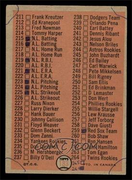 1966 O-Pee-Chee - [Base] #183 - Checklist [POOR] Courtesy of COMC.com
__________________
-- PWCC: The Fish Stinks From the Head PSA: Regularly Get Cheated BGS: Can't detect trimming on modern SGC: Closed auto authentication business JSA: Approved same T206 Autos before SGC Oh, what a difference a year makes.
|
|
#2970
11-19-2024, 02:17 PM
|
|||
|
|||
|
Can't remember if its appeared in this thread and search is picking up a ton of results for "Cloyd Boyer" that aren't right, but here's 1952 Topps #280 Cloyd Boyer, with the magenta striping at bottom border RPD.
Boyer happens to complete my 1-310 basic set except for... Willie Mays. Great ")
|
|
#2971
11-19-2024, 04:16 PM
|
|||
|
|||
|
I think Dale may have posted it either in this thread or the 52 Gallery thread. I picked one up after seing that post. Scarce but recurring
|
|
#2972
11-19-2024, 04:24 PM
|
|||
|
|||
|
Quote:
|
|
#2973
11-19-2024, 04:32 PM
|
|||
|
|||
|
At least more than me
|
|
#2975
12-02-2024, 08:17 PM
|
||||
|
||||
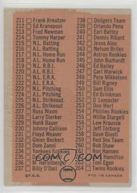
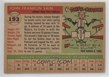 1955 Topps - [Base] #193 - High # - Johnny Sain Courtesy of COMC.com Recurring print error: incomplete circle on back around card number.
__________________
-- PWCC: The Fish Stinks From the Head PSA: Regularly Get Cheated BGS: Can't detect trimming on modern SGC: Closed auto authentication business JSA: Approved same T206 Autos before SGC Oh, what a difference a year makes.
|
|
#2976
12-04-2024, 07:16 AM
|
|||
|
|||
|
Quote:
|
|
#2977
12-04-2024, 10:58 AM
|
|||
|
|||
|
I collected most of the variants i have at a time I was blissfully unaware of the fact some were actually related. Guys like Cliff and you explained a lot of them
Last edited by ALR-bishop; 12-04-2024 at 02:46 PM.
|
|
#2979
12-05-2024, 06:36 AM
|
|||
|
|||
|
a couple others from 1965
1965_551.jpg 1965_587_top.jpg 1965_598_top_line.jpg And from series 6, on the reverse 1965_515_BL.jpg Truthfully, I didn't really notice these until I was studying my 1968 cards, where this pattern is prevalent. I then went back to other years to discern if it had occurred before. Cliff then educated me about the practice. 1968_3_top_line.jpg
|
|
#2983
12-28-2024, 10:53 AM
|
|||
|
|||
|
Quote:
Butch
__________________
Man proposes and God disposes. U.S. Grant, July 1, 1885 Completed: 1969 - 2000 Topps Baseball Sets and Traded Sets. Senators and Frank Howard fan. I collect Topps baseball variations -- I can quit anytime I want to.....I DON'T WANT TO.
|
|
#2984
12-28-2024, 02:27 PM
|
|||
|
|||
|
Quote:
|
|
#2986
01-13-2025, 04:09 PM
|
|||
|
|||
|
It is recurring
|
|
#2987
01-13-2025, 04:12 PM
|
||||
|
||||
|
Quote:
|
|
#2989
01-17-2025, 11:03 AM
|
|||
|
|||
|
Good one Greg, but ironically after checking my set I need to normal one
|
|
#2990
01-19-2025, 02:13 PM
|
|||
|
|||
|
Quote:
1955 has been my set of the week, trying to clean up my personal checklist for it. Such a great design. The two stocks (white vs. cream, and the cream is coarser to the touch. Difficult to tell apart in scans, but much easier in hand) for the first series/sheet cards really complicate the 'known' variations/RPD's/whatever-people-want-to-call-them. My copy of #2 Ted Williams that I've had for a long time is thankfully the no dots in signature variation, with a white back. Does anyone have this variation with the cream stock? I'm not certain all the variations affect both stocks, and pedantically cataloguing them might provide production clues as to whether they were done simultaneously or if they represent 2 distinct print runs of the first 'series'. Carey, Sullivan, Terwilliger, Conley, Grim, Jackie, Moon et al. I'm also working on.
|
|
#2991
01-19-2025, 02:40 PM
|
|||
|
|||
|
Here's another example of what I mean. #67 Wally Moon comes with a red dot above his first name in the signature, or no dot, which is long known. Are there 3 or 4 copies to collect though? Here I have the :
Red dot, cream stock No dot, cream stock No dot, white stock Does a red dot, white stock exist? I hope the stock difference comes through the Net54 photo limitations. 1955 is not one of the easiest stock differences to tell but there are two of the for the first series cards, usually not too hard to tell in hand and they feel different too. Difficult, oft impossible to tell from scans and eBay listings where the appearance of difference often comes from scanner settings, making it difficult for me to be positive a card is one stock or the other without getting it in hand. A number of the other defects/differences in the first series 1955's are genuine variations, cropping differences, changes to the signatures, etc.
|
|
#2992
01-19-2025, 02:54 PM
|
|||
|
|||
|
And here is one that is partially new, on 1955 Topps #80 Bob Grim.
Grim had a wonderful season as a rookie in 1954, going 20-6. Like Jackie Robinson, Grim is known to come with 2 versions of the logo, with the team logo cut off at the top and left or appearing fine. In truth, it's not just the logo - the cards are different cropping everywhere. Looks at his cap, his chin, and it's evident there is a sizing difference and moving of the picture everywhere, like happened the next year with a number of cards as well. I believe there are actually 3 versions though, before we get to the stock differences. At bottom is the version with the team logo's black border circle oviously cut off at left and top. In the middle though, one can see the top border is barely there, and flattened. At top, the top black border of the team outline is 90% complete. The top and middle cards also have very, very slight differences in the position of the top of Grim's hat relative to the white border. Exciting? No. 3 different cropping variations? I think so. Now these 3 may be 6 if all were done with both stocks. There are likely at least 5 as the main cropping difference come from different slot placements on a sheet. EDIT: None of the Grim's I've had have ever had a dot over the "I" in his autograph. Has anyone seen one? Several other cards have variations here so it may be a variation on Bob's card as well. Last edited by G1911; 01-19-2025 at 02:58 PM.
|
|
#2993
01-19-2025, 03:21 PM
|
|||
|
|||
|
Here's another one my personal checklist is getting complicated on. 1955 Topps #20 Andy Carey. Carey is known as one of the other crop cards, with the team logo cut or complete at the top.
To start, I think there are actually 3 distinctly different crop versions of the team logo. Full gap at top (bottom), almost a gap with the thinnest part of the top black circle being almost missing (middle) and almost complete (top). Second, I believe there are deeper complications with the coloring. The middle card here has the left half of the logo being pink instead of red. Now this is usually nothing, just representative of light ink or fading or light modification, but a ton of Carey's online are clearly this exact same pattern with a pink left half of the logo. It occurs frequently across the different croppings. I think there is something more than fading going on here, it is quite strange that a significant percentage of Carey's would have the exact same precise pattern of red fading on part of the logo in only this exact spot. Third, there is a pinky purple sheet mark next to the logo on the bottom card that is off center. This is recurring. This bottom copy also has a yellow splotch at bottom right of the red name box, not sure if recurring. The middle card has a white obstruction streak running from top border to the portrait cap. Also do not know if recurring yet.
|
|
#2994
01-20-2025, 03:26 PM
|
|||
|
|||
|
I did not do the gray and whites for 1956 but this is what I have for variants, all recuring
1 Williams..dot on i or not 2 Fowler Topps in the red on back 14 Finnegan missing top line on logo 26 Groat...same as Finnegan 29 Wehmeir..truncated logo, no dot on i and * on back by Life, and white spot in logo 30 Powers...missing top circle of logo border 31 Spahn...same as Powers 34 Terwilliger...partial logo from Groat card...plus this guy was a tank man in WW 2 and after his tank was hit on Saipan had to outrun a enemy tank on foot 50 Robinson....truncated logo 54 Limmer...gap on left side of logo 56 Jablonski...blob on N in his name 67 Moon..red dot on i 70..Rosen...truncated logo like Herm and Jackie 80 Grimm...missing top of circle in logo 81 Conley...distortion in headress in logo ( scarce recuring fish eye) 106 Sullivan...all kinds of different dots on i 118 Purkey...blue v green mark on shoulder 137 Elliot..4 different version of last line of bio and the copyright 144 Almalfitano...blue line in left front border 145 Valo..wavy red right border at bottom 161 Tanner...white y in Daffy on back 174 Minarcin...bite out of black right bottom border 177 Robertson...missing part of red stat box on back 193 Sain..missing part of circle on ball on back Last edited by ALR-bishop; 01-20-2025 at 03:31 PM.
|
|
#2995
01-21-2025, 05:49 PM
|
|||
|
|||
|
Quote:
34 Terwilliger also has cropping variations of the logo or changes to the very top of it (I think 3 in total). I did not know he outran a tank! 137 - I believe there are 5 (?) with the 'extra' being that the "in '53" version comes with the top of the 5 damaged, or actually fully complete. 145 Valo has a "280" or ".280" batting average, that I think somebody found in this thread. It's an obstruction blocking a small area of the print, rather than a correction made to the type.
|
|
#2996
01-22-2025, 10:09 AM
|
|||
|
|||
|
After recount I do have 5 Elliotts including the damaged 5 version which I think may be the toughest.
May have to look for the Terwilliger logo. On of mine has a flattened area at top of logo rather that rounded. Are there some with gaps ? On Valo my version with the wavy front righ bottom border is missing the . in 280 Last edited by ALR-bishop; 01-22-2025 at 10:32 AM.
|
|
#2997
01-22-2025, 12:31 PM
|
|||
|
|||
|
I had this one as a result of the lower right bar being somewhat cut off, like Minarcin, only less so.
One of these has the .280 BA without the dot on the reverse. Last edited by Sliphorn; 01-22-2025 at 12:41 PM. Reason: Adding pnoto
|
|
#2998
01-22-2025, 02:14 PM
|
|||
|
|||
|
I know this is baseball cards, but this is variation in the 1956 Topps set. Both varieties are on COMC and eBay, so they are easy to get. You can see the yellow block on the lower right of the card front.
|
|
#2999
01-22-2025, 03:14 PM
|
|||
|
|||
|
Thomas--good to hear from you. My defective Valo is llike yours and is missing the dot before 280 on the back as well
|
|
#3000
01-22-2025, 06:56 PM
|
|||
|
|||
|
For 145 Valo, I did not know (thank you guys) about the front name box defect.
My version of .280 and 280 are both fully printed in the red name box. A smidgeon of the corner of the "2" in the "280" version is missing, if you look closely. Last edited by G1911; 01-22-2025 at 06:56 PM.
|
 |
|
|
 Similar Threads
|
||||
| Thread | Thread Starter | Forum | Replies | Last Post |
| 1966 Topps High # Print Variations | 4reals | Postwar Baseball Cards Forum (Pre-1980) | 9 | 04-27-2014 07:05 PM |
| Are these variations or print defects? | savedfrommyspokes | Postwar Baseball Cards Forum (Pre-1980) | 16 | 02-09-2013 12:52 PM |
| Well known print defects. Do variations exist without? | novakjr | Postwar Baseball Cards Forum (Pre-1980) | 9 | 01-28-2011 05:32 PM |
| Finally confirmed - d311 print variations exist! ("bluegrass" variations) | shammus | Net54baseball Vintage (WWII & Older) Baseball Cards & New Member Introductions | 8 | 09-03-2010 08:58 PM |
| Wanted: T206 Print Variations and Errors | Archive | Tobacco (T) cards, except T206 B/S/T | 1 | 01-04-2007 08:23 PM |


 Linear Mode

