|
||||||
 |
|
|||||
|
||||||
|
|
|||||
|
|
|
#1
 10-27-2022, 06:45 AM
|
|||
|
|||
|
Much older cards were sometimes done with multiple layers of similar colors, but that was pretty much out by the late 40's. Nearly everything you'll see postwar is just CMYK. None of those are missing, so it's down to if it's fading or not.
Yellow seems about right. Blue Seems a bit light Black/gray Shouldn't fade and looks about right Red is obviously light. Red can fade readily for a lot of the colorants, so fading wouldn't be a surprise. But here, we have an extra complication. (Don't we always?  ) )Note how blue and red are in registration with each other. And how yellow and black are in registration with each other. That's a sign that a 2 color press was used. Pretty cool. Red and blue both being from the same pass and both being light makes me lean towards the sheet it was from being used for press setup. Adjusting the registration and ink levels. Probably an early pass, when the plate wasn't fully inked, and registration hadn't been fully adjusted. Of course, it's possible that red and blue fade more readily than yellow and black on 49 bowmans. 
|
|
#2
10-30-2022, 10:58 AM
|
|||
|
|||
|
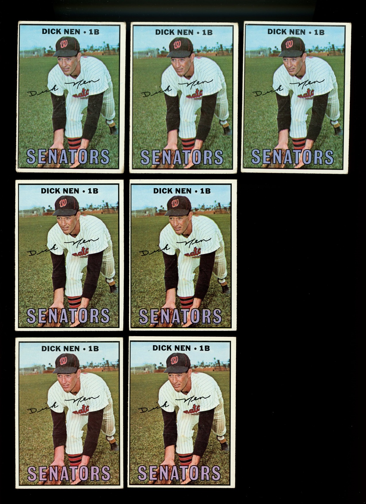
Saw the 1967 Nen variation thread and checked my cards. I don't have the missing position variation, but I did have 7 copies of the card and noticed what looks like three different printings, with color differences. In the top row, the Senators team name is darker, almost blue, the sky is darker blue and the image of Nen is a bit muddy. In the second row, Senators is more purple, sky is lighter blue, image is clearer. In the third row, Senators is almost pink, sky is almost white, and image is very clear though a lot lighter.
 Also notices on Checklist #361 card, the backs can be found in tan or white. 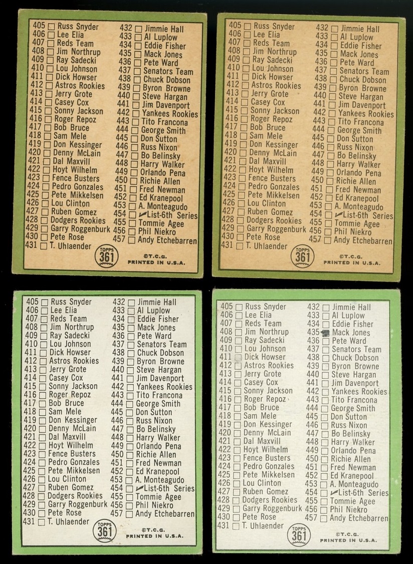
|
|
#3
10-30-2022, 01:33 PM
|
|||
|
|||
|
I think you can find differences in all the 67 checklists, but on 361 the only 2 I have involve those same back color differences. Anyone have other differences ?
|
|
#4
10-30-2022, 05:07 PM
|
|||
|
|||
|
Quote:
Mike Web capture_30-10-2022_192544_.jpeg Last edited by mikemb; 10-30-2022 at 05:31 PM.
|
|
#5
10-30-2022, 06:04 PM
|
||||
|
||||
|
Check out this thread I started many moons ago about 1967 checklist variations...
https://www.net54baseball.com/showthread.php?t=207639
__________________
All the cool kids love my YouTube Channel:
Elm's Adventures in Cardboard Land  https://www.youtube.com/@TheJollyElm Looking to trade? Here's my bucket: https://www.flickr.com/photos/152396...57685904801706 I was such a dangerous hitter I even got intentional walks during batting practice. Casey Stengel Spelling "Yastrzemski" correctly without needing to look it up since the 1980s. Overpaying yesterday is simply underpaying tomorrow. 
|
|
#6
10-31-2022, 02:54 PM
|
|||
|
|||
|
That was a very helpful thread Darren. I had forgotten about it. I did find the front difference you point out on the two different color backs I have. The Clemente with the darker line under his chin and mark by his ear occurs on my whiter version
I am sure this print defect has shown up here somewhere before. A friend would like to know if our print experts have a theory on how both the white letters and the mark below his lips may have occurred 
Last edited by ALR-bishop; 10-31-2022 at 03:02 PM.
|
|
#7
11-08-2022, 03:23 PM
|
||||
|
||||
|
Another cloud variation card....two different recurring copies with clouds behind the bat, on one copy the cloud almost reaches the helmet, the other doesn't.
|
|
#8
12-06-2022, 06:42 AM
|
|||
|
|||
|
|
 |
|
|
 Similar Threads
|
||||
| Thread | Thread Starter | Forum | Replies | Last Post |
| 1966 Topps High # Print Variations | 4reals | Postwar Baseball Cards Forum (Pre-1980) | 9 | 04-27-2014 06:05 PM |
| Are these variations or print defects? | savedfrommyspokes | Postwar Baseball Cards Forum (Pre-1980) | 16 | 02-09-2013 11:52 AM |
| Well known print defects. Do variations exist without? | novakjr | Postwar Baseball Cards Forum (Pre-1980) | 9 | 01-28-2011 04:32 PM |
| Finally confirmed - d311 print variations exist! ("bluegrass" variations) | shammus | Net54baseball Vintage (WWII & Older) Baseball Cards & New Member Introductions | 8 | 09-03-2010 07:58 PM |
| Wanted: T206 Print Variations and Errors | Archive | Tobacco (T) cards, except T206 B/S/T | 1 | 01-04-2007 07:23 PM |


 Hybrid Mode
