|
||||||
 |
|
|||||
|
||||||
|
|
|||||
|
|||||||
 |
|
|
Thread Tools | Display Modes |
|
|
|
#1
 04-17-2022, 08:50 AM
|
|||
|
|||
|
Quote:

|
|
#2
04-17-2022, 03:01 PM
|
|||
|
|||
|
Quote:
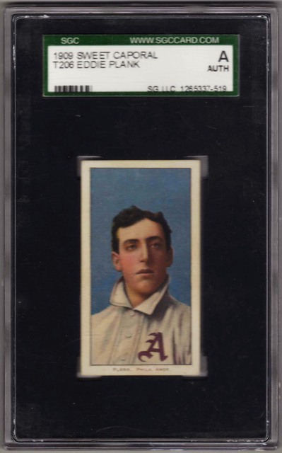
Chris Four corners of my Plank were restored. I've no problem with that. I waited years to acquire this Plank to complete my SWEET CAPORAL Factory #30 set. That is what I love about completing sets. You have certain goals to attain. I've a nice-looking image. And I don't mind that it is graded an "A". Hey, an "A" in this case = "Affordable". The closest comparable image to Plank in the 150/350 series is Crandall. The majority of the Crandall cards have a lighter blue colored background. And, a few others have a darker blue background similar to my Plank.    TED Z T206 Reference . Last edited by tedzan; 04-18-2022 at 10:05 PM. Reason: Corrected typo.
|
|
#4
04-17-2022, 08:58 PM
|
|||
|
|||
|
Alot of things can affect color or how we perceive it. The perception bit is more on modern cards, but can affect T206s a little.
The plates do wear over time, and on a large print run may be used until the quality of the image becomes unacceptable. A century plus after the fact it's almost impossible to tell if a difference is plate wear or something else. The worn plates (actually thick stone slabs) were then resurfaced and and the next job or the same would be laid out with transfers printed from a master plate. Most other tings mentioned may aslo contribute to the appearance being different. Inking levels, how the press operator that day mixed the ink, how much water was used to dampen the plate, and how much it did or did not dry between wetting and inking. The makeup of the inks could also be different. Many inks were a colorant in a hardening base. Some bases harden glossy, others are less glossy. And the years around 1910 were also times of change from natural dyes and colorants to chemical ones which were less expensive. Bright red is probably cochineal, the pink probably one of the chemical colorants. One of the biggest reasons is one we've occasionally touched on, that the art and halftones were reworked between the 150s and 350s. If you look at the scans Pat posted, you can see some small but clear differences between the 150's and 350's. On Davis, where his hip shows on the right - the halftone dot pattern is very solid on the 150, and faint on the 350. There are also differences in where the undrlying colors like light blue, gray and peach appear under the halftone on the uniform. On Dooin, the halftone is very solid on the left side of the face on 150. The lines indicating the jersey opening are more well defined compared to the 350. The P on the uniform is halftone on the 150, but more solid on the 350. That difference could be plate wear or water/inking levels. But it could also be a difference in the masters. Crandall has lots of differences. And looking at the lower right, the two 150's are also different from each other. In general, the black layer on the 350's is less opaque than on the 150's. This may be a change from carbon (either lampblack or carbonblack) as the colorant to a chemical colorant. And that change may be why they changed the halftones between series.
|
|
#6
04-18-2022, 08:07 AM
|
||||
|
||||
|
Another difference between some of the 150/350's is the captions, A lot of the 350 captions are thicker/heavier than the 150's, some are subtle like Ball and others are quite noticeable like J.J. Clarke
[IMG]  [/IMG] [/IMG][IMG] 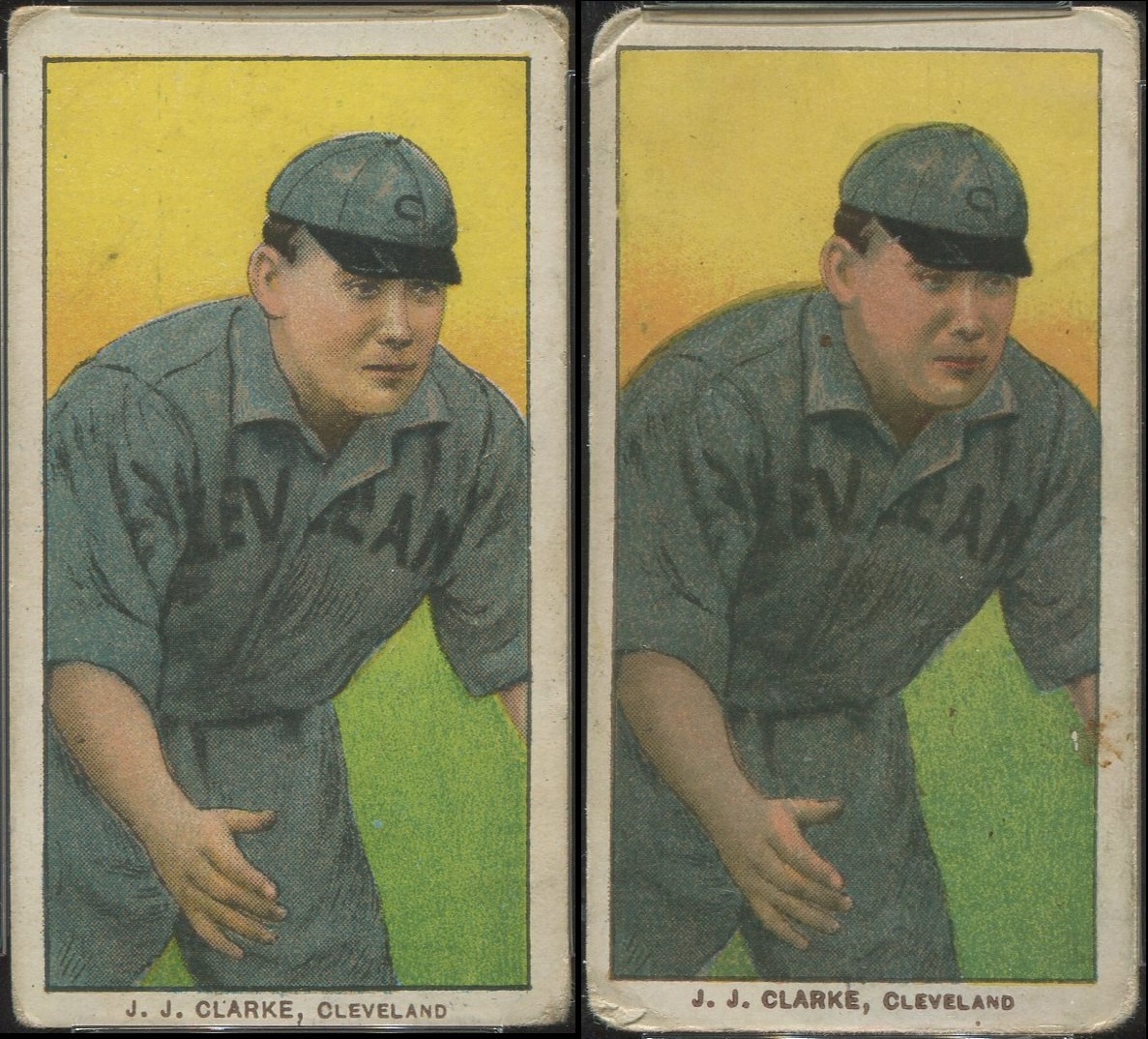 [/IMG] [/IMG]
|
|
#7
05-04-2022, 05:28 AM
|
||||
|
||||
|
I don't know if the difference is because of a change in the way the 350's were printed compared to the 150's or if it has to do with the layers of colors on each particular subject but the magenta shift on the Gilbert also shifted the Red on his belt, sleeves, collar, and hat but it didn't on the Ritchey.
The Schlei and Gilbert are PD150's and the Ritchey is a PD350. [IMG]  [/IMG] [/IMG]
|
|
|
|
 Similar Threads
|
||||
| Thread | Thread Starter | Forum | Replies | Last Post |
| T206 Wagner and Plank - They both didn't want their image on Tobacco cards | mrvster | Net54baseball Vintage (WWII & Older) Baseball Cards & New Member Introductions | 55 | 03-21-2022 03:46 PM |
| FS: Lot of 4 Charlie Hemphill Broken Plate examples | Gradedcardman | T206 cards B/S/T | 0 | 03-24-2019 03:44 PM |
| Wanted - Eddie Plank Original Wire Photo or Other Interesting Eddie Plank Item | Bengfield | Baseball Memorabilia B/S/T | 0 | 12-13-2016 05:15 PM |
| CollectorFocus Image Quality | mintacular | Net54baseball Vintage (WWII & Older) Baseball Cards & New Member Introductions | 0 | 04-13-2012 10:15 AM |
| Broken Image Links | Archive | Net54baseball Vintage (WWII & Older) Baseball Cards & New Member Introductions | 5 | 03-06-2008 05:59 PM |


 [/IMG]
 [/IMG]
 [/IMG]
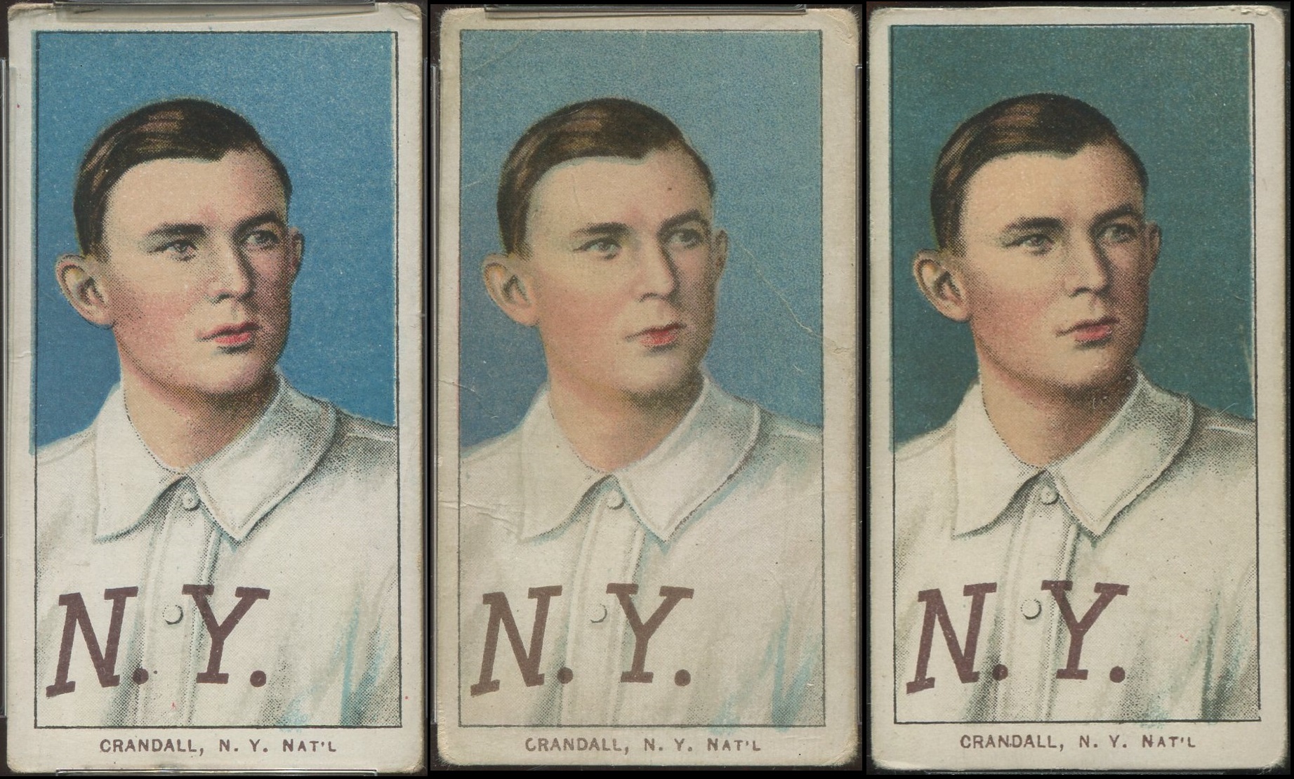 [/IMG]

 Hybrid Mode
