|
||||||
 |
|
|||||
|
||||||
|
|
|||||
|
|
|
#1
 02-22-2021, 05:19 PM
|
||||
|
||||
|
Get 'Em While They're Hot...
The 1961 Topps Mickey Mantle All Star #578 High Number is just a card you 'need' to grab if one becomes available at a relatively decent price in this insane market. The 1963 Topps Juan Marichal #440 is the embodiment of 'meaninglessly' OC cards. Because of the colored bottom borders in that set, when an image is pushed up a bit, it really doesn't matter at all aesthetically, as it may on a white bordered card. The 1967 Topps Willie Mays #200, has an obvious gum stain on back, but 'Sey Hey' cards are on a steep incline, so I felt good about grabbing this one before things get even more batsh*t crazy. And the 1971 Topps andy kosco (sic) #746 is a jet black, sharp cornered high number, so who the heck cares about that 'off' centering... 
__________________
All the cool kids love my YouTube Channel:
Elm's Adventures in Cardboard Land  https://www.youtube.com/@TheJollyElm Looking to trade? Here's my bucket: https://www.flickr.com/photos/152396...57685904801706 I was such a dangerous hitter I even got intentional walks during batting practice. Casey Stengel Spelling "Yastrzemski" correctly without needing to look it up since the 1980s. Overpaying yesterday is simply underpaying tomorrow.  
|
|
#2
02-23-2021, 06:43 AM
|
||||
|
||||
|
Quote:
__________________
Postwar stars & HOF'ers. Currently working on 1956, '63 and '72 Topps complete sets. Last edited by jchcollins; 02-27-2021 at 09:18 PM.
|
|
#3
03-10-2021, 05:12 PM
|
||||
|
||||
|
A stain upon the silence...
The 1959 Topps Luis Aparicio #310 is what I call an "Opportunity Accost" - unexpectedly coming across a card and knowing if you dont buy it at that price, the next person who sees it will undoubtedly jump on it. It's nicely centered and there are very, very minor (and easily-ignored) gum stains on the back. Before the internet existed, just seeing a 1963 Fleer Checklist was a fantastical experience, the embodiment of rarity. Nowadays, it still holds a great deal of that same magic for many of us. The (air quotes) "off center" 1965 Topps Clete Boyer #475, is an 'ancient' relic I remember from my youth. One of my brother's friends gave us a stack of very old cards (I assumed he gave up collecting so he could learn guitar and start landing chicks??) and a round-cornered Boyer with another Yankee I had never heard of, Tom Tresh (whose name obviously made me laugh), were a part of it. And the 1972 Topps Nolan Ryan #595 is a beautiful looking (read as 'no tilt,' and ignore the Mets uniform with the airbrushed abomination of a hat), quickly escalating card... 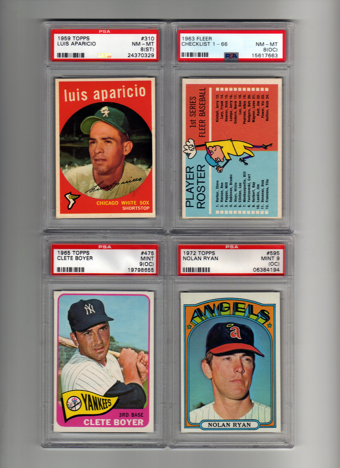
__________________
All the cool kids love my YouTube Channel:
Elm's Adventures in Cardboard Land https://www.youtube.com/@TheJollyElm Looking to trade? Here's my bucket: https://www.flickr.com/photos/152396...57685904801706 I was such a dangerous hitter I even got intentional walks during batting practice. Casey Stengel Spelling "Yastrzemski" correctly without needing to look it up since the 1980s. Overpaying yesterday is simply underpaying tomorrow.
|
|
#4
03-23-2021, 04:17 PM
|
||||
|
||||
|
Overpaid my welcome...
When I bought most of these, the prices might have been considered relatively 'stupid,' but I knew a month later they would look like sweet bargains, so I grabbed up each of them. The centering on the 1961 Topps Ernie Banks #350 ain't be bothering me none, as there's a decent amount of white space on all four sides. The 1968 Topps 3-D Jim Lonborg is just an awesome rarity to behold. The stain is easily-ignored gum/wax(?) on its blank back. I'll take that qualifier any day of the week. This card is beautiful, and Topps really dropped the ball by not pursuing this avenue of cards. Packs of these guys would've flown off the shelves, the way boxes of Corn Flakes did for Kellogg's instead. The (pretty nicely centered for this card) 1969 Topps Pete Rose #120, is what I call "leggy." If there's a future group sub, I'm going to bust him out and work away the 'invisible' gum/wax with some panty hose for a re-submit. And the 1974 Topps Tom Seaver #80 (somewhat awkward tilt aside) is just one of my all-time favorite cards, showing the grunt-filled follow-through of 'Tom Terrific' at Shea on a sunny day with a capacity crowd cheering him on, probably during my Mets' push to the World Series in 1973 (and the John 'The Hammer' Milner cameo makes my heart smile every time)... 
__________________
All the cool kids love my YouTube Channel:
Elm's Adventures in Cardboard Land https://www.youtube.com/@TheJollyElm Looking to trade? Here's my bucket: https://www.flickr.com/photos/152396...57685904801706 I was such a dangerous hitter I even got intentional walks during batting practice. Casey Stengel Spelling "Yastrzemski" correctly without needing to look it up since the 1980s. Overpaying yesterday is simply underpaying tomorrow. Last edited by JollyElm; 03-24-2021 at 02:04 PM.
|
|
#6
03-23-2021, 04:55 PM
|
||||
|
||||
|
Quote:
1961banksmvp485front.jpg1961banksmvp485back.jpg It's either due to the speck of white to the right of his eyes or the tiny bit of black invading the the left corner of the green diamond on back. I just don't get it...but it's still a beautiful card. Edited to add: other common 'print defects' are things such as print lines, or erroneous color shifts and whatnot.
__________________
All the cool kids love my YouTube Channel:
Elm's Adventures in Cardboard Land https://www.youtube.com/@TheJollyElm Looking to trade? Here's my bucket: https://www.flickr.com/photos/152396...57685904801706 I was such a dangerous hitter I even got intentional walks during batting practice. Casey Stengel Spelling "Yastrzemski" correctly without needing to look it up since the 1980s. Overpaying yesterday is simply underpaying tomorrow. Last edited by JollyElm; 03-23-2021 at 06:24 PM.
|
|
#7
03-24-2021, 09:14 AM
|
||||
|
||||
|
Quote:
__________________
Postwar stars & HOF'ers. Currently working on 1956, '63 and '72 Topps complete sets.
|
 |
|
|
 Similar Threads
|
||||
| Thread | Thread Starter | Forum | Replies | Last Post |
| How is this jackie certified by JSA | EYECOLLECTVINTAGE | Autograph Forum- Primarily Sports | 7 | 03-06-2017 06:49 AM |
| I'm the least qualified to judge, but... LOL!! | ZenPop | Net54baseball Vintage (WWII & Older) Baseball Cards & New Member Introductions | 4 | 04-13-2016 08:20 AM |
| PSA/DNA certified | footlong | Autograph Forum- Primarily Sports | 3 | 08-06-2015 11:22 AM |
| A Qualified Peeve | frankbmd | Net54baseball Vintage (WWII & Older) Baseball Cards & New Member Introductions | 23 | 12-18-2014 08:43 PM |
| PSA Question re: "MK" Qualified | Archive | Net54baseball Vintage (WWII & Older) Baseball Cards & New Member Introductions | 12 | 03-24-2006 10:37 AM |


 Hybrid Mode
