|
||||||
 |
|
|||||
|
||||||
|
|
|||||
|
|
|
#1
 03-24-2019, 09:03 PM
|
||||
|
||||
|
My wife and I visited the MET in 2007 and I had a look at the Burdick exhibit. It was not exactly a thrill. Just a dozen or so framed groupings of cards and no other ancillary displays in an out-of-the-way hallway. The layperson might think it was cool but my guess is the average guy here would be underwhelmed. I understand they change out the cards every so often, and maybe it has been improved but I don't know.

__________________
David McDonald Greetings and Love to One and All Anything is possible if you don't know what you're talking about. Last edited by Kawika; 03-24-2019 at 10:04 PM. 
|
|
#2
03-25-2019, 04:14 AM
|
|||
|
|||
|
I saw the main collection many times in the 1980's and 90's, and it was easy to get an appointment. But as has been pointed out, people have stolen things from it over the years. It's too bad it's no longer available for viewing. Burdick would not have been happy about that.
|
|
#3
03-25-2019, 06:37 AM
|
||||
|
||||
|
Quote:
https://www.metmuseum.org/art/collec...asc&perPage=20 Heres 12,253 of his baseball cards: https://www.metmuseum.org/art/collec...seball%20cards And 540 of his T206 cards here: https://www.metmuseum.org/art/collec...earchField=All Including his Plank: https://www.metmuseum.org/art/collection/search/413206 And his Magie error: https://www.metmuseum.org/art/collection/search/413530 And a messed up color pass Cobb: https://www.metmuseum.org/art/collection/search/413043 He had a bunch of missing color scraps! Amazing... https://www.metmuseum.org/art/collection/search/413542 https://www.metmuseum.org/art/collection/search/413429 https://www.metmuseum.org/art/collection/search/414040 https://www.metmuseum.org/art/collection/search/413580 https://www.metmuseum.org/art/collection/search/413609 https://www.metmuseum.org/art/collection/search/413589 https://www.metmuseum.org/art/collection/search/414042
__________________
Galleries and Articles about T206 Player Autographs www.SignedT206.com www.instagram.com/signedT206/ @SignedT206 Last edited by T206Collector; 03-25-2019 at 02:28 PM.
|
|
#4
03-25-2019, 07:01 AM
|
||||
|
||||
|
going to NYC next week and planning on visiting Burdick collection. I have an appointment I believe to see some of the actual binders. Will let you know how (if) it goes.
There are tons of pictures in that digitized Met site. I went down the rabbit hole for a few hours a couple times on that site..........still a lot unscanned or missing but there's tons of great stuff there..........sports and nonsports....... Last edited by autograf; 03-25-2019 at 07:05 AM.
|
|
#5
03-25-2019, 07:23 AM
|
|||
|
|||
|
So you can't make an appointment to view it anymore? That's so sad. I did so in the late 1989 on a class trip to NYC. Guard stayed in the room with me the whole time. It was amazing.
__________________
Check out https://www.thecollectorconnection.com Always looking for consignments 717.327.8915 We sell your less expensive pre-war cards individually instead of in bulk lots to make YOU the most money possible! and Facebook: https://www.facebook.com/thecollectorconnectionauctions
|
|
#6
03-25-2019, 07:42 AM
|
|||
|
|||
|
Quote:
|
|
#7
03-25-2019, 08:42 AM
|
||||
|
||||
|
Quote:
|
|
#8
03-25-2019, 09:43 AM
|
||||
|
||||
|
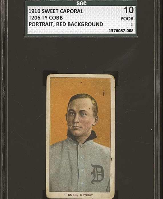
Thanks for the links Paul! Cool cards. I think the Cobb is sun-faded, not a messed up color pass.
Quote:
__________________
Collection: https://www.flickr.com/photos/132359235@N05/sets/ For Sale: https://www.flickr.com/photos/132359...7719430982559/ Ebay listings: https://www.ebay.com/sch/harrydoyle/...p2047675.l2562
|
|
#9
03-25-2019, 11:59 AM
|
||||
|
||||
|
If that's a color fade, it is quite uniform and straight across the top. But, maybe so...
__________________
Galleries and Articles about T206 Player Autographs www.SignedT206.com www.instagram.com/signedT206/ @SignedT206
|
|
#10
03-25-2019, 12:26 PM
|
||||
|
||||
|
I think it was pinned up on a board in the sun and there was another card (or something) across the top that blocked the sun. If you look at the top left corner you can see the yellow is way brighter above the fade line than it is below it. Funky card though.
__________________
Collection: https://www.flickr.com/photos/132359235@N05/sets/ For Sale: https://www.flickr.com/photos/132359...7719430982559/ Ebay listings: https://www.ebay.com/sch/harrydoyle/...p2047675.l2562
|
|
#11
03-25-2019, 01:06 PM
|
||||
|
||||
|
Just as an FYI for those who may not have seen it, below is a link to a post I wrote a couple of years ago about the origins of the Burdick collection. Burdick announced in the December 1, 1947 Card Collectors Bulletin that he was donating his card collection to the Metropolitan Museum of Art, and over the next couple of years he began organizing his cards and sending them to the museum, while also soliciting help from CCB readers to fill in gaps in the collection. Many people sent him cards and even whole sets that he didn't have, so that while Burdick's personal collection was the core, the collection now at the Met is really a collaborative effort, with many cards contributed by other collectors. Everyone in the hobby realized that this was a big deal, and they wanted the collection to be as complete as possible. Below the link I've included two of Burdick's CCB articles, the first from the April 1, 1948 issue and the second from the October 1, 1948 issue, illustrating the support he was getting from the hobby.
http://www.net54baseball.com/showthread.php?t=240887 April 1, 1948 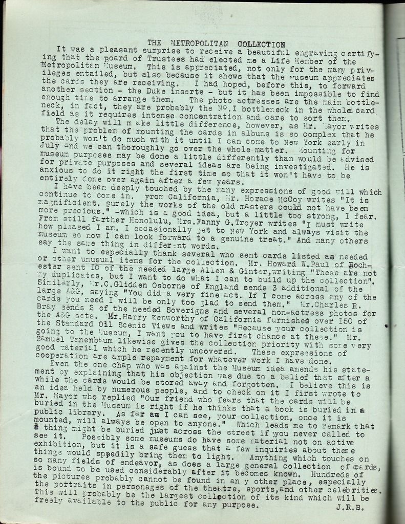 October 1, 1948 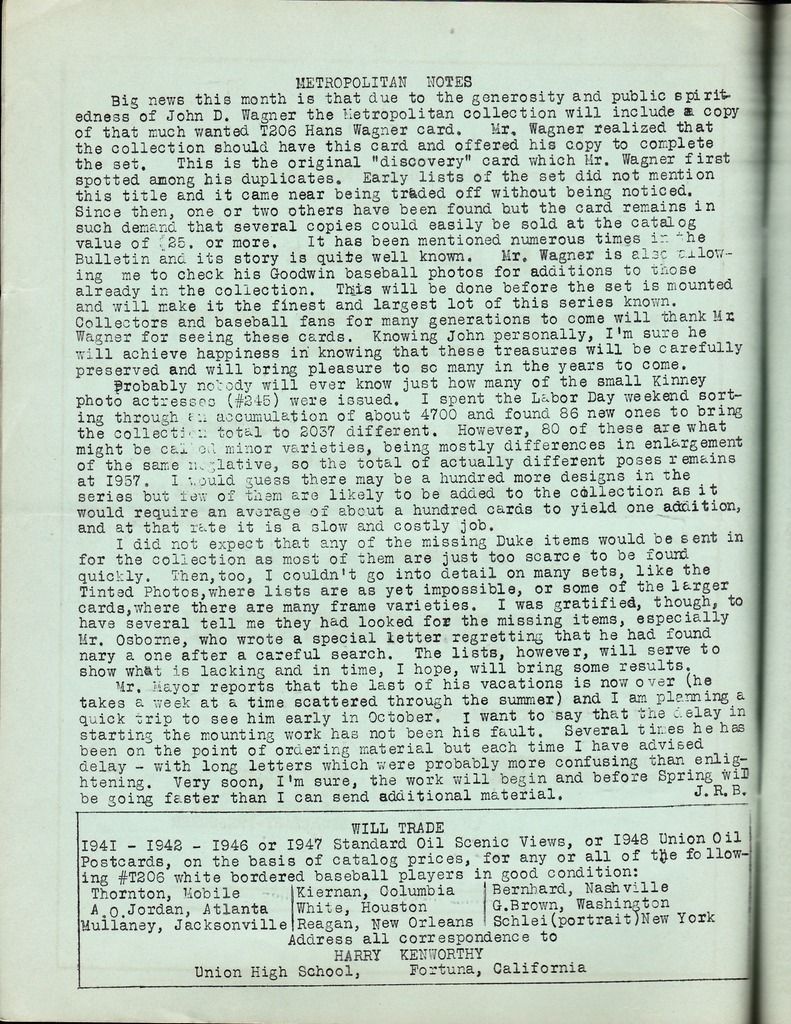
|
|
#12
03-26-2019, 05:30 PM
|
||||
|
||||
|
Quote:
__________________
Galleries and Articles about T206 Player Autographs www.SignedT206.com www.instagram.com/signedT206/ @SignedT206
|
|
#13
03-26-2019, 07:34 AM
|
||||
|
||||
|
If you look closely on the top of the Cobb, you can see the red rectangle area is shifted to the right. On the upper left corner there is a slight gap of just light orange near the black border line, and in the upper left the red extends past the border line into white border. Looks like it must have been a print anomally.
__________________
Er1ck.L. ---D381 seeker http://www.flickr.com/photos/30236659@N04/sets/
|
|
#14
03-26-2019, 07:45 AM
|
||||
|
||||
|
I love the line in there about the T206 Wagner, that says it's in such demand, that several copies could easily be sold at $25 or more. Jeez...
Last edited by HercDriver; 03-26-2019 at 07:45 AM.
|
|
#15
03-26-2019, 03:07 PM
|
||||
|
||||
|
I disagree, I think the top left is yellow, not orange. And the evidence is that the red and the orange on the upper left are perfectly aligned, which is because they are the same layer. For the upper left corner to actually be orange, the border of the orange pass would have to be non-linear and shoot way left at the top, which it didn't do because that isn't how the printing worked. The fact that the yellow is shifted left explains why there is a light pink slice down the right --- the yellowless red on the right faded to pink, the red and the yellow overlap faded to orange, and the yellow on the left faded to a lighter yellow. The second card posted just shows that there are two sun-faded Cobbs.
 Fun discussion, even if we are derailing this thread a bit.  Quote:
__________________
Collection: https://www.flickr.com/photos/132359235@N05/sets/ For Sale: https://www.flickr.com/photos/132359...7719430982559/ Ebay listings: https://www.ebay.com/sch/harrydoyle/...p2047675.l2562
|
|
#16
03-26-2019, 12:28 PM
|
||||
|
||||
|
Quote:
__________________
Postwar stars & HOF'ers. Currently working on 1956, '63 and '72 Topps complete sets. Last edited by jchcollins; 03-26-2019 at 12:29 PM.
|
|
#18
03-26-2019, 02:46 PM
|
||||
|
||||
|
Back in 2004 I got into the collection for research. Here is what I posted here about the visit:
Getting into the collection is like getting into the white house. You announce yourself at the front desk of the museum, where they check your ID and call up to the prints department to verify your appointment. You are issued a pass for the library and given directions. The library room of the prints department is behind a locked door. You ring a doorbell and they buzz you into the antechamber, where they take your bags, coat (if you haven't checked it), camera, pens, etc., and you have to produce your ID again, fill out a card with your info, and read and sign a page-long rules and regulations list. Once all that is done, they lead you into the reading room. The reading room looks just like the reading room in any library; a couple of big tables with chairs. Only in this reading room, attendants hover and you cannot pull books at will from the shelves. The attendant sets up a velvet placemat in front of you and (because the collection is housed in books) two velvet covered bolsters on either side of the mat. The book is placed inside this rig so that it never lays flat, only in a "V". You have to know exactly what you want to see and you more or less have to direct the curators to the proper volumes. Burdick wrote and printed a guide to the collection (it is in the same typeface and paper as the ACC, so I know it was printed) breaking up the collection by volume. If you are not very up on your nomenclature, you are dead in the water. For example, Book 202 is described as "A&G 1-48, 63-65" (not exactly, just as an example) and that's all the detail you get from Burdick. I tried to pre-arrange my viewing by sending them exact set names and numbers I wanted. The head curator told me that they could only ID about half of the sets ahead of time. I was able to locate the rest inside of two minutes just by viewing the book and knowing manufacturer and ACC designation (more on the lack of knowledge of the caretakers later). Once they know what to get, they go fetch it for you. They roll in a cart with the books of the cards you want to see and they place a book in front of you. You are not allowed to touch the cards (obviously) or to have more than one book at a time. You can turn the pages yourself. Remember that this entire collection is one guy's stuff, arranged by him. The poor bastard sat there for three years pasting down this stuff, and you could see that as he went on, he got less and less interested in tabbing things. By the time you get into the later albums, there are virtually no tabs at all, which made finding sets a bit of a challenge. The paramount ground rule I was told of was "no looking at baseball cards." They were very adamant about this. However, the disorganization of the collection is such that you have to look through albums to get to certain sets, meaning that I had to look at baseball sets to find the boxing sets I was there to study, which led to a kind of funny incident. I was looking for the E211 set (York Caramel boxing) and had to go through an untabbed volume loaded with every E card you could think of to do it. The curator came over and said "you are looking at baseball cards." I said "no, I am looking for the E211 set of boxing cards." I started to describe what I was looking for, her eyes glazed over, and I had to keep going. What a shame... In terms of my research, the collection was very useful. I was able to verify the existence of many cards, found many uncatalogued variations, and was able to flesh out some checklists. Oddly enough, however, Burdick was very spotty on certain sets. He had only 1 T229 Pet/Kopec card and only 2 E211 York Caramel cards. Now for the fun stuff you all might appreciate: Owing to the organizational issues, I was able to view some of the OJ's, CJ's, E cards, and T cards. It is obvious that Burdick cared more about completion than condition. Cards range all over the place from poor to near mint. The OJ's I saw were organized by team, with an added section of miscellaneous cards, and averaged ex. The CJs were gorgeous--obviously a near mint set. Most of the T cards were strong ex to ex-mt. The T227 Cobb was stellar ex-mt. The Fatimas had lots of cracks and creases. Burdick also had two of the Fatima style PC backed cards, but in a different book--he obviously did not consider them to be Fatimas. The common E cards from the 1920s were all razor sharp sets. The E210 set was all over the place, from poor to ex, mostly vg. The great shame of it all was that every card was friggin glued down, very firmly. the CJ Jackson was obviously an "8" when it was put into place, but is poor now. I was surprised and saddened by how little the curators knew about the cards (as I said above, they could not even find many of the sets I needed because they did not know Burdick's nomenclature and when I tried to talk cards with them, they obviously had no idea what I was saying). It was sad as well to see just how under-utilized and under-catalogued the cards were. Burdick did a monumental job of collecting and mounting these cards, but a crappy job of cataloguing and indexing them. There are albums with literally nothing to define what is in them other than a single line entry. It appears that no work has been done to see what is in this collection over the last 40 years. In the boxing cards alone, I found literally dozens of unknown cards and variations that have been sitting there for 40 years, ready to be discovered. The head curator even admitted at the end of my visit that they don't know much about the collection. Consequently, a very valuable and very useful resource sits mostly unused and "unloved" in albums in the bowels of the museum. The trip was an absolutely amazing experience. Burdick's collection is unparalleled and priceless. It also was a thrill to see his writing and his notations right there on the pages he mounted, and to see what he was thinking when organizing the ACC.
__________________
Read my blog; it will make all your dreams come true. https://adamstevenwarshaw.substack.com/ Or not...
|
|
#19
03-27-2019, 01:22 PM
|
||||
|
||||
|
Quote:
__________________
Postwar stars & HOF'ers. Currently working on 1956, '63 and '72 Topps complete sets.
|
|
#20
04-16-2019, 04:22 PM
|
|||
|
|||
|
thanks for this. i live right near the Met and it's so disappointing to see voluminous amounts of "crap" displayed in the Met (rows of silverware and wood carvings and glassware, etc.. maybe someone cares about this stuff, but its very uninteresting to look at), and they care little about, know so little about, and show so little publicly of this amazing collection. makes me very sad and angry!!
Quote:
|
|
#21
03-26-2019, 09:31 PM
|
||||
|
||||
|
Quote:
Way ta Turn, A Good ting Bad Guys... (oN the Other hand!?) Adam, thanks fir the grand writeup! I remember reading it and wanting to go. (Yeah, its been awhile However, if Your free next month, maybe we could meet in New York and use your Creds ta get us All iN!!!! Sorry, i got a lil excited dare... And as for as the Mr. Cobb goes, i've learn'd a bit ago I gotta Look at the Card iN me Hand! (Not the Other Hand... ThiS Hand (Bryan, Sell me your Jennings Ghost
__________________
Life's Grand, Denny Walsh
|
 |
|
|
 Similar Threads
|
||||
| Thread | Thread Starter | Forum | Replies | Last Post |
| Burdick Collection | steve_a | Net54baseball Vintage (WWII & Older) Baseball Cards & New Member Introductions | 30 | 12-20-2015 04:23 PM |
| Online Burdick Collection | Pat R | Net54baseball Vintage (WWII & Older) Baseball Cards & New Member Introductions | 8 | 04-09-2015 04:27 PM |
| CCB - Burdick and His Collection | gnaz01 | Net54baseball Vintage (WWII & Older) Baseball Cards & New Member Introductions | 4 | 08-25-2014 04:31 PM |
| Has anyone seen Burdick's collection? | Matthew H | Net54baseball Vintage (WWII & Older) Baseball Cards & New Member Introductions | 22 | 07-12-2010 01:54 AM |
| Burdick Collection Visit | Archive | Net54baseball Vintage (WWII & Older) Baseball Cards & New Member Introductions | 22 | 07-21-2004 12:27 PM |


 Hybrid Mode
