|
||||||
 |
|
|||||
|
||||||
|
|
|||||
|
|
|
#1
 07-31-2017, 09:28 PM
|
||||
|
||||
|
Speaking of Brooks Robinson, I've never liked his 57 Topps rookie card either. Its just way too orange. The background is entirely orange sky, which seems to be reflecting off his face and making him look orange too. And the orange bird on his hat to top it off. That card needs more color other than orange!!!
__________________
My blog about collecting cards in Japan: https://baseballcardsinjapan.blogspot.jp/ 
|
|
#2
07-31-2017, 09:32 PM
|
||||
|
||||
|
Quote:
|
|
#5
08-01-2017, 03:15 AM
|
||||
|
||||
|
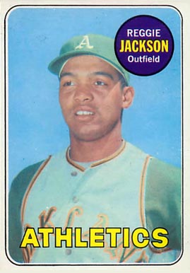
Speaking of Reg, I have hated this shot since I first opened a pack and saw it in 1973. Man, that is some toothless old man looking ugliness happening there
s-l1600-15.jpg
__________________
All the cool kids love my YouTube Channel:
Elm's Adventures in Cardboard Land  https://www.youtube.com/@TheJollyElm Looking to trade? Here's my bucket: https://www.flickr.com/photos/152396...57685904801706 I was such a dangerous hitter I even got intentional walks during batting practice. Casey Stengel Spelling "Yastrzemski" correctly without needing to look it up since the 1980s. Overpaying yesterday is simply underpaying tomorrow. 
|
|
#6
08-05-2017, 12:34 PM
|
||||
|
||||
|
Quote:
__________________
Leon Luckey www.luckeycards.com
|
|
#7
08-01-2017, 08:30 PM
|
||||
|
||||
|
Quote:
OsFan - I agree about the 69 Reggie too. With that one the colors in it just aren't strong enough. Back in the early 90s I used to go to this outdoor flea market that was held on Sundays in the summer. There was this one dealer who put all his best cards for sale face up on the table. By the end of the summer all of his best cards were brutally sun faded and nobody bought from him anymore (yet for some reason he kept putting them out there in the sun every Sunday....) A Reggie rookie card that is pack fresh looks like one of that guy's cards, the colors in the photo are so dull the card looks like its been left in the sun all summer.
__________________
My blog about collecting cards in Japan: https://baseballcardsinjapan.blogspot.jp/ Last edited by seanofjapan; 08-01-2017 at 08:36 PM.
|
|
#8
08-05-2017, 02:18 PM
|
|||
|
|||
|
[QUOTE=seanofjapan;1686186]Yes, I totally agree, the smile on his face is great. I just can't get over the orange though!
Back in the early 90s I used to go to this outdoor flea market that was held on Sundays in the summer. There was this one dealer who put all his best cards for sale face up on the table. By the end of the summer all of his best cards were brutally sun faded and nobody bought from him anymore (yet for some reason he kept putting them out there in the sun every Sunday....) ----------------------------------------------------------------------------------- Sean, you've reminded me of a similar, sad memory. Back in the early 90s, there was this card shop in a South Bend, Indiana mall, right in front of a Montgomery Ward's. Eventually, he got moved to a back area of the Ward's, where his store had all kinds of natural light.... Yup, each day the searing sun just blazed away at his wares. I remember he had a mid-grade Stan Musial Red Man Tobacco card, which he proudly displayed for sale, as one of his vintage pieces. After a few months in the new shop's location, Stan the Man's regal red color began to turn pink. It made me sick to look at that once beautiful card. Maybe the chap's monthly rent was much cheaper at that part of Ward's. I think the blazing sun torched his business. He sold coins and cards, after concentrating on coins. After that ultraviolet ray concentration on his cards, he went back to strictly selling cards. In his defense, stamps and cards are high maintenance, and proper planning is essential. I will never forget that pink Musial. --- Brian Powell Last edited by brian1961; 08-05-2017 at 02:20 PM.
|
 |
|
|
 Similar Threads
|
||||
| Thread | Thread Starter | Forum | Replies | Last Post |
| ugly (IMO) Ruth | w7imel | Autograph Forum- Primarily Sports | 20 | 08-19-2014 11:36 PM |
| More Popular: 71 or 75 BB | mintacular | Postwar Baseball Cards Forum (Pre-1980) | 12 | 11-08-2013 10:34 PM |
| and the ugly | Matthew80 | Postwar Baseball Cards Forum (Pre-1980) | 21 | 12-16-2012 09:17 PM |
| Popular set, but... WHY!? | Archive | Net54baseball Vintage (WWII & Older) Baseball Cards & New Member Introductions | 4 | 10-10-2007 12:07 AM |
| They`re Ugly I Know, But...... | Archive | Pre-WWII cards (E, D, M, etc..) B/S/T | 0 | 08-10-2005 06:28 PM |


 Hybrid Mode
