|
||||||
 |
|
|||||
|
||||||
|
|
|||||
|
|
|
#1
 03-31-2016, 07:56 AM
|
|||
|
|||
|
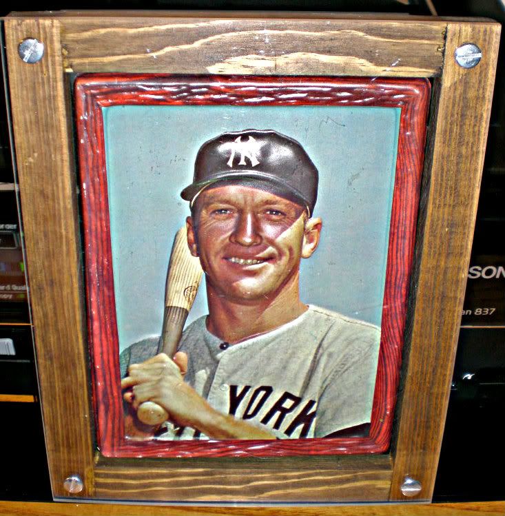
1967 topps
__________________
Look for our show listings in the Net 54 Calendar section 
|
|
#2
03-31-2016, 09:10 AM
|
|||
|
|||
|
|
#3
03-31-2016, 09:46 AM
|
|||
|
|||
|
Best: Going regular issue only... #1) 55 Bowman - I don't understand why prople don't appreciate this card more. Great color; Iconic card design; Mick looks like a teenager; and look at that upper body strength. This is the one card where Mick looks like a guy that can hit 500 foot HRs. #2) 1965 - Assuming the card in question is centered. Great color; Clean, crisp photo; Great card design; Mick looks like a beast following through with his swing. #3) I'd list 1956 #1, but the portrait doesn't really look like Mantle (he looks kinda goofy). Everything else about '56 is spectacular.
Ugliest: #1) 1967, by far; #2) 1959 - Mick looks kinda whimpy in this one. #3) 1968 - looks too much like 1966 (which I think is one of the better looking Mantles). '66 is cool because of the Yankee Stadium backdrop; '68 is flat out boring. Most Overrated: #1) 1957 Topps - Everybody loves the '57 set, but boy, that Mantle card is dark, drab, and virtually colorless. Ugly as heck. #2) 1953 Bowman - I think the 53B gets so many votes for "Best Mick Card" because everybody loves the 53B set. But Mick is one of the uglier cards in that set. Picture is cropped poorly. Little color; Picture is kinda drab compared to the other 53B's. #3) 1961 - Picture always seems kind of fuzzy; color isn't great; Ugly card design; People love this card for the year it represents, but it is kinda ugly.
|
|
#4
03-31-2016, 06:40 PM
|
||||
|
||||
|
Quote:
|
|
#5
03-31-2016, 09:23 PM
|
||||
|
||||
|
Quote:
__________________
Neal Successful transactions with Brian Dwyer, Peter Spaeth, raulus, ghostmarcelle, Howard Chasser, jewishcollector, Phil Garry, Don Hontz, JStottlemire, maj78, bcbgcbrcb, secondhandwatches, esehobmbre, Leon, Jetsfan, Brian Van Horn, MGHPro, DeanH, canofcorn, Zigger Zagger, conor912, RayBShotz, Jay Wolt, AConte, Halbig Vintage and many others https://www.youtube.com/@Coach_Neal
|
|
#6
03-31-2016, 09:45 PM
|
||||
|
||||
|
Ben, I'm with you. The 1960 Post is my favorite. Here's mine.
|
|
#7
03-31-2016, 10:56 PM
|
||||
|
||||
|
54 Red Heart
& 56 Topps Edit to add: nobody has shown a pic of their red heart. Anybody got one to share?
__________________
Actively collecting Carl Yastrzemski ! Also 1964 & 68 Topps Venezuelans Last edited by DBesse27; 03-31-2016 at 10:57 PM.
|
|
#8
04-01-2016, 07:57 AM
|
|||
|
|||
|
1957 Ghost card is a great card and kinda cool as a conversation piece.

__________________
Collect Vikings, Twins, Vintage HOF and also Off-Center vintage. ***A journey of a 1,000 miles begins with a single card! -Cardfusious Mostly PC with some for trade page: [https://www.flickr.com/photos/187700522@N03/ Recent positve trades with: Brian Van Horn, frank bmd, nkesterke09, ajg, esehombre, mrmantlecollector, KC Doughboy, gregr2,bn2cardz, sycks22 Last edited by tjenkins; 04-01-2016 at 08:03 AM.
|
 |
|
|
 Similar Threads
|
||||
| Thread | Thread Starter | Forum | Replies | Last Post |
| What is your favorite mantle card ? | g_vezina_c55 | Postwar Baseball Cards Forum (Pre-1980) | 29 | 11-30-2013 12:36 AM |
| Mickey Mantle Auto'd My Favorite Summer | ullmandds | Autographs & Game Used B/S/T | 12 | 10-24-2012 09:37 PM |
| favorite mantle item | Archive | Postwar Baseball Cards Forum (Pre-1980) | 5 | 06-16-2008 08:24 PM |
| Show your favorite card in your not so favorite holder | Archive | Net54baseball Vintage (WWII & Older) Baseball Cards & New Member Introductions | 12 | 05-06-2008 12:38 PM |
| Favorite Mel Ott card? | Archive | Net54baseball Vintage (WWII & Older) Baseball Cards & New Member Introductions | 20 | 03-03-2007 07:56 AM |


 Hybrid Mode
