|
||||||
 |
|
|||||
|
||||||
|
|
|||||
|
|
|
#1
 01-20-2016, 12:11 PM
|
||||
|
||||
|
Quote:
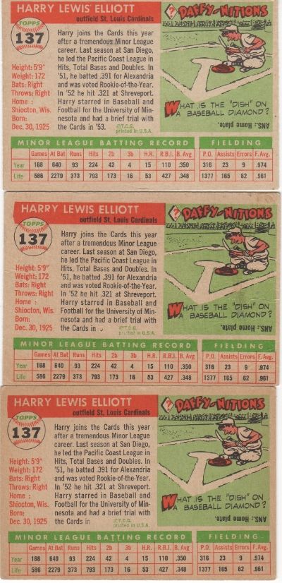
If you check eBay there are a few with a green Bloch in the same spot . 
|
|
#3
01-21-2016, 08:54 AM
|
|||
|
|||
|
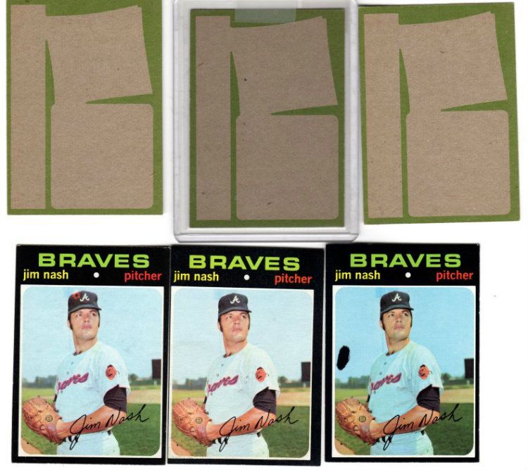
Claude--It looks to be the common version, it may be harder to find one without it
|
|
#4
01-21-2016, 09:58 AM
|
|||
|
|||
|
some of my vintage oddities.
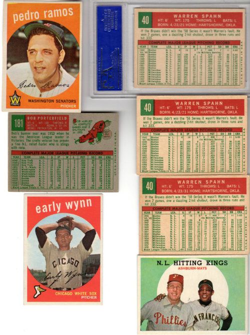
1. Mathews with white streak over shoulder 2. Killebrew w/flame to the left of his cap 3. Maris w/print shift: red in team banner 4. Trammell missing a lot of color 5. Munson RC that got no yellow print on obverse
|
|
#5
01-21-2016, 10:02 AM
|
|||
|
|||
|
Ben---do you think the Munson resulted from light exposure ?
|
|
#6
01-21-2016, 11:39 AM
|
||||
|
||||
|
Quote:
|
|
#7
01-22-2016, 03:55 AM
|
|||
|
|||
|
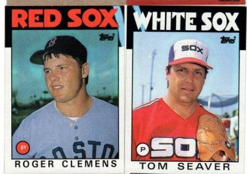
ALR-bishop, those are some amazing finds. The '57s and the Kingman are my favorites. Where did you get the '86 Seaver blue streak? I sold mine a couple of years ago on ebay and have been looking for another ever since.
|
|
#9
01-21-2016, 10:03 AM
|
|||
|
|||
|
1. reverse of Munson RCs (my guess is the back went through the yellow inking twice, hence none on the front)
2. Schmidt obverse 3. Schmidt no name on back, greened out 4. Richard obverse 5. similar to the Schmidt, and was found in the same small collection
|
|
#10
01-21-2016, 10:11 AM
|
|||
|
|||
|
Neat Schmidt card
|
|
#12
01-21-2016, 10:18 AM
|
|||
|
|||
|
1. Seaver with pink dot on color
2. another '76 green bleed back 3. Brett with a bruise on forehead (lefthand card). Maybe something like the '73 Kaline band-aid (wishful thinking)? 4. Menke reverse, card on right has small circle below the 1963 at the end of the text box and just above the top of the stat border. 5. Earl Campbell RC with ink blotch (i'm fairly confident it's a printing flaw and not after market damage)
|
|
#14
01-21-2016, 10:44 AM
|
|||
|
|||
|
 |
|
|
 Similar Threads
|
||||
| Thread | Thread Starter | Forum | Replies | Last Post |
| 1966 Topps High # Print Variations | 4reals | Postwar Baseball Cards Forum (Pre-1980) | 9 | 04-27-2014 06:05 PM |
| Are these variations or print defects? | savedfrommyspokes | Postwar Baseball Cards Forum (Pre-1980) | 16 | 02-09-2013 11:52 AM |
| Well known print defects. Do variations exist without? | novakjr | Postwar Baseball Cards Forum (Pre-1980) | 9 | 01-28-2011 04:32 PM |
| Finally confirmed - d311 print variations exist! ("bluegrass" variations) | shammus | Net54baseball Vintage (WWII & Older) Baseball Cards & New Member Introductions | 8 | 09-03-2010 07:58 PM |
| Wanted: T206 Print Variations and Errors | Archive | Tobacco (T) cards, except T206 B/S/T | 1 | 01-04-2007 07:23 PM |


 Hybrid Mode
