|
||||||
 |
|
|||||
|
||||||
|
|
|||||
|
|
|
#1
 01-02-2016, 06:42 PM
|
|||
|
|||
|
I like both of them. If I were going to receive one of the two sets, I would go with the 1957 set. It is more iconic. But there are two prime differences. 1957 is loaded with Rookies with good value. The second reason is the rarer mid-range numbers. These are kind of hard to find.
1956 is a really nice set and you can't go wrong with the stars in it, but the 1957 Brooks Robinson has strong value and is always in high demand. Throw onto that the rookies of Tony Kubek, Frank Robinson, Rocky Colavito, Bobby Richardson and a few others and this set is loaded with rookies. As well, the Berra-Mantle card is also well sought after.
__________________
Member of OBC (Old Baseball Cards), the longest running on-line collecting club www.oldbaseball.com 
|
|
#2
01-02-2016, 07:10 PM
|
||||
|
||||
|
1957 for me by a WIDE margin.
__________________
Check out my aging Sell/Trade Album on my Profile page HOF Type Collector + Philly A's, E/M/W cards, M101-6, Exhibits, Postcards, 30's Premiums & HOF Photos "Assembling an unfocused collection for nearly 50 years."
|
|
#3
01-03-2016, 10:25 AM
|
||||
|
||||
|
Here's something else I'll add:
The 1957 Topps card backs are probably the best looking card back ever created for a Topps set. The red and blue is the perfect color scheme for gray stock cards (84 and 91 was the only other time red and blue was used and they look good too). Many of the card backs from the 50's-80's are little better looking than a newspaper article. The card number in the baseball, while not unique, is a perfect design. Not to mention the text and standard cartoon. Plus, 1957 was the first year for the innovative lifetime stats. 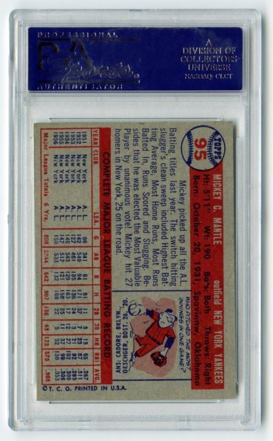
|
|
#5
01-03-2016, 05:40 PM
|
||||
|
||||
|
Quote:
__________________
Prewar Cubs. Postwar stars & HOF'ers. Currently working on 1956, '63 and '72 Topps complete sets. Last edited by jchcollins; 01-03-2016 at 05:42 PM.
|
|
#6
01-03-2016, 08:05 PM
|
|||
|
|||
|
Once again, thanks for everyones input. I hope to put hands on the sets this coming friday, to really look every card over, and make a decision.
I do have one question, as I've seen the term come up a few times: Registered. ("the pictures being registered and as clean as possible") What does "registered" mean?
|
|
#7
01-03-2016, 09:44 PM
|
||||
|
||||
|
"Registered" means the colors line up properly. I'm not a printing expert, but as I understand it, each of the primary colors is printed separately on the card. Sometimes, one of the colors is offset a bit from the others, making the picture look blurry or double-visioned.
Back to your original question, I would definitely pick the 56 set. In my opinion, it is one of the most beautiful card designs ever produced. Plus it has Jackie Robinson, Bob Feller and Phil Rizzuto. You lose out on a few rookies, but you can pick up other cards of all of those guys for fairly cheap. To me, there's something nice about having cards of guys like Jackie and Feller that date the set to an earlier era. On the down side, the set does have fewer cards than the 57 set and does not have the two nice group cards that you'll find in the 57 set.
|
|
#8
01-03-2016, 09:51 PM
|
||||
|
||||
|
The "pictures" are actually printing, with each color overlaying the previous color. In other words, each sheet goes through several printing stages where yellow is printed, then green, then red, etc. (not necessarily in that order)
If the sheet is slightly out of alignment between prints, then the colors will be slightly out of "register". In other words, the "picture" will look blurry.
|
|
#9
01-04-2016, 08:09 AM
|
|||
|
|||
|
 |
|
|
 Similar Threads
|
||||
| Thread | Thread Starter | Forum | Replies | Last Post |
| FS 125 Different 1957 Topps Most in NM Condition You Choose! | Northviewcats | 1950 to 1959 Baseball cards- B/S/T | 1 | 09-28-2015 11:56 AM |
| FS 1956 and 1957 Topps Mantle PSA 7 PSA 3 and PSA 2 | jjcollects | 1950 to 1959 Baseball cards- B/S/T | 1 | 05-21-2015 08:03 PM |
| SEEKING: 1956 & 1957 Topps Ted Williams | MattyC | 1950 to 1959 Baseball cards- B/S/T | 1 | 04-26-2015 07:49 PM |
| 1956 Topps Rizzuto GB PSA 7, 65 Clemente transfer 1957 Berra EX 57 Reese EX 66 Mays | Zact | 1950 to 1959 Baseball cards- B/S/T | 6 | 11-15-2013 07:19 PM |
| Looking for 1953, 1954, 1955, 1956, 1957, 1958, & 1959 Topps PSA 6s | Archive | 1950 to 1959 Baseball cards- B/S/T | 1 | 12-31-2008 01:44 PM |


 Hybrid Mode
