|
||||||
 |
|
|||||
|
||||||
|
|
|||||
|
|
|
#1
 06-23-2015, 06:44 PM
|
||||
|
||||
|
Quote:
")

|
|
#2
06-24-2015, 08:44 PM
|
||||
|
||||
|
I decided to check out the other Brooksie checklist I know of, 1969 #504, and I found there is a variation there. It is so frickin' subtle that it almost doesn't even count, but there is a slight difference in the cropping of the image.
 The easiest way to see it is by focusing on the edge of his hat brim at far right. On some/most versions of this card it touches the black, circular border. On a smaller number of these cards it falls short of reaching the border. If you concentrate on the image I created here, you can see how the picture is shifted very slightly upward and to the right. Look at the dark shadow on his jersey to the right of his chin and the upper left and right portions of his hat (as well as the top of the Orioles logo). The spacing in these areas changes between the two versions.
__________________
All the cool kids love my YouTube Channel:
Elm's Adventures in Cardboard Land  https://www.youtube.com/@TheJollyElm Looking to trade? Here's my bucket: https://www.flickr.com/photos/152396...57685904801706 I was such a dangerous hitter I even got intentional walks during batting practice. Casey Stengel Spelling "Yastrzemski" correctly without needing to look it up since the 1980s. Overpaying yesterday is simply underpaying tomorrow. 
|
|
#3
06-26-2015, 04:54 PM
|
|||
|
|||
|
Darren---I think there may be 4 different fronts, the three you posted and one where the blue is even at the white but does not extend into it...or not as far
Last edited by ALR-bishop; 06-26-2015 at 05:02 PM.
|
|
#4
06-26-2015, 06:18 PM
|
||||
|
||||
|
Quote:
I've examined that difference before, but to me it's just a printing anomaly with regard to the registration of the color plates. The cyan/blue isn't perfectly aligned, but Topps didn't make any purposeful changes to the printing plates like the other versions, which show true differences.
__________________
All the cool kids love my YouTube Channel:
Elm's Adventures in Cardboard Land https://www.youtube.com/@TheJollyElm Looking to trade? Here's my bucket: https://www.flickr.com/photos/152396...57685904801706 I was such a dangerous hitter I even got intentional walks during batting practice. Casey Stengel Spelling "Yastrzemski" correctly without needing to look it up since the 1980s. Overpaying yesterday is simply underpaying tomorrow.
|
|
#5
06-27-2015, 09:05 AM
|
|||
|
|||
|
Darren, you are a card. I am sure Topps worked very hard to get all of these versions just so.
|
|
#6
06-28-2015, 02:47 PM
|
|||
|
|||
|
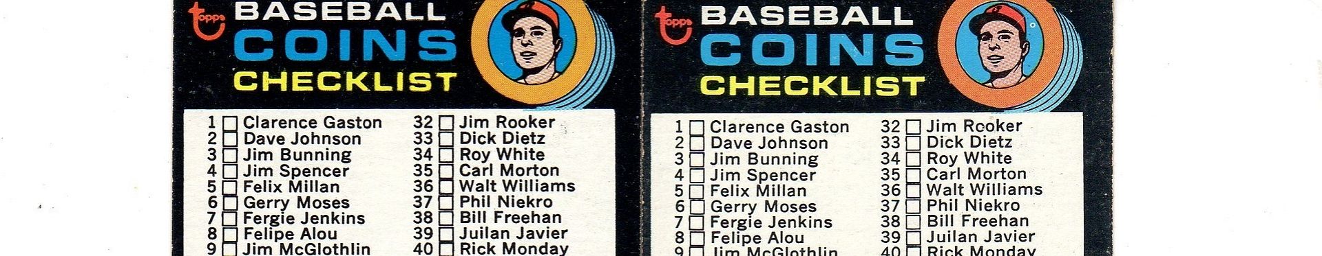
As you look through the cropping pictures go back and forth, notice the height of the checklist boxes relative to the card numbers. All part of the cropping differences.
I have never seen a variation in the first series 1972 CL, card #4. I suspect it is because it was part of a 132 card series. The first series did include the 2nd series checklist but the 1st CL was not double printed. Ditto for the 1973 BB set of 660--five series of 132. The decision by Topps to not double print the first series or show a preview CL of the next series was followed shortly by a shift to a full release of cards vs series by series. Whether or not that started in 1974 or 1973 has been oft debated here.
|
|
#7
06-28-2015, 04:38 PM
|
|||
|
|||
|
Thanks for chipping in Carlton
|
 |
|
|
 Similar Threads
|
||||
| Thread | Thread Starter | Forum | Replies | Last Post |
| 1967 Topps Baseball #500 Marichal variation | variation-man | 1950 to 1959 Baseball cards- B/S/T | 3 | 08-20-2014 08:47 PM |
| 1967 Phillies Rookies Variation | Gr8Beldini | Postwar Baseball Cards Forum (Pre-1980) | 2 | 10-03-2013 04:16 PM |
| New Minor 1967 Variation | JollyElm | Postwar Baseball Cards Forum (Pre-1980) | 3 | 08-22-2013 03:11 PM |
| 1967 Master Reference File of Packard Bell's 1967 sponsorship of the L.A. Dodgers | Archive | Net54baseball Sports (Primarily) Vintage Memorabilia Forum incl. Game Used | 0 | 05-25-2008 05:46 PM |
| 1967 Master Reference File of Packard Bell's 1967 sponsorship of the L.A. Dodgers | Archive | Baseball Memorabilia B/S/T | 0 | 05-25-2008 05:44 PM |


 Hybrid Mode
