|
||||||
 |
|
|||||
|
||||||
|
|
|||||
|
|
|
#1
 08-28-2014, 01:11 PM
|
||||
|
||||
|
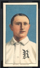
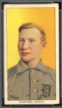
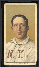
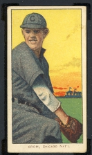
His eyes were close together. And his ears stuck out.
__________________
Net 54-- the discussion board where people resent discussions.  My avatar is a sketch by my son who is an art school graduate. Some of his sketches and paintings are at https://www.jamesspaethartwork.com/ 
|
|
#2
08-28-2014, 01:18 PM
|
||||
|
||||
|
You have posted your assesment often, but I went ahead and fixed it for you.
 Quote:
__________________
https://www.flickr.com/photos/bn2cardz/albums
|
|
#3
08-28-2014, 01:19 PM
|
||||
|
||||
|
You have posted your assesment often, but I went ahead and fixed it for you.
Quote:
__________________
https://www.flickr.com/photos/bn2cardz/albums Last edited by bn2cardz; 08-28-2014 at 04:24 PM.
|
|
#4
08-28-2014, 01:20 PM
|
||||
|
||||
|
You have posted your assesment often, but I went ahead and fixed it for you.
Quote:
__________________
https://www.flickr.com/photos/bn2cardz/albums
|
|
#5
08-28-2014, 01:24 PM
|
||||
|
||||
|
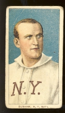
What happened to Cobb's neck!?!?!?!
Why do his shoulders begin at his ear lobes?!?!?!
__________________
Galleries and Articles about T206 Player Autographs www.SignedT206.com www.instagram.com/signedT206/ @SignedT206
|
|
#6
08-28-2014, 01:31 PM
|
||||
|
||||
|
Quote:
__________________
Galleries and Articles about T206 Player Autographs www.SignedT206.com www.instagram.com/signedT206/ @SignedT206
|
|
#7
08-28-2014, 01:42 PM
|
||||
|
||||
|
Love this t206-t206 smackdown. Then again I haven't lived through it 14 times already.
|
|
#8
08-28-2014, 01:47 PM
|
|||
|
|||
|
I love the T205's - the vignettes on the back are hilarious. Love the different ads, colors. Put in the camp of "let's postpone liftoff until I have my set".
I do like the variety of poses in the T206.
|
|
#10
08-28-2014, 02:31 PM
|
||||
|
||||
|
Less artistic liberties were taken with the portraits in T206 than T205. And Tinker looks WAY cooler than Ace Ventura. More like THE WOLVERINE!!!
__________________
Galleries and Articles about T206 Player Autographs www.SignedT206.com www.instagram.com/signedT206/ @SignedT206
|
|
#12
08-28-2014, 06:33 PM
|
|||
|
|||
|
Thought about this for a while.... I am partial to t205s but I don't think it will be them. The stars just aren't that attractive, the cobb and johnson and young are 3 of the worst cards in the set, the pictures are too small and the quality of the cobb and young are off. This coming from a t205 fanboy. It won't be the 06's either, set is too big and already has press so it would've happened by now. My verdict? 1932 us caramel. Blazing color, amazing player selection, low numbers, smallish set.
|
|
#13
08-28-2014, 07:16 PM
|
||||
|
||||
|
Yeah, U.S. Caramel a good pick. I would also mention similarly tough and with tons of stars--and better looking--the George C. Millers. I think they are climbing already. Maybe not enough of them to draw wide action.
|
|
#14
08-28-2014, 08:04 PM
|
||||
|
||||
|
Quote:

__________________
Leon Luckey www.luckeycards.com
|
|
#15
08-28-2014, 08:09 PM
|
|||
|
|||
|
Quote:
I'm drooling it is an awesome example, but cobb in my opinion deserved a better portrait, Mathewson's is of a much higher artistic quality. Last edited by Econteachert205; 08-28-2014 at 08:10 PM.
|
|
#16
08-28-2014, 08:18 PM
|
||||
|
||||
|
Quote:
__________________
Leon Luckey www.luckeycards.com
|
|
#17
08-28-2014, 08:52 PM
|
||||
|
||||
|
Quote:
__________________
Net 54-- the discussion board where people resent discussions. My avatar is a sketch by my son who is an art school graduate. Some of his sketches and paintings are at https://www.jamesspaethartwork.com/
|
|
#18
08-29-2014, 04:30 AM
|
|||
|
|||
|
I'm coming around on cobb but if you compare the 06 and 05 portraits of cobb, Johnson and young, to me it's a no brainer. Whereas Mathewson, Marquard, bresnahan and other hofers the 05s compare much better, but yes beauty is in the eye of the beholder. Peter those cards are amazing, particularly love grove.
Last edited by Econteachert205; 08-29-2014 at 04:31 AM.
|
|
#19
08-29-2014, 04:40 AM
|
||||
|
||||
|
Anyone know why even most of the better grade 1932 Caramels tend to look slightly "dirty" on borders and back? Something about the paper stock?
|
|
#20
08-29-2014, 06:35 AM
|
||||
|
||||
|
Quote:
__________________
Net 54-- the discussion board where people resent discussions. My avatar is a sketch by my son who is an art school graduate. Some of his sketches and paintings are at https://www.jamesspaethartwork.com/
|
 |
|
|


 Hybrid Mode
