|
||||||
 |
|
|||||
|
||||||
|
|
|||||
|
#1
 02-27-2013, 06:36 PM
|
|||
|
|||
|
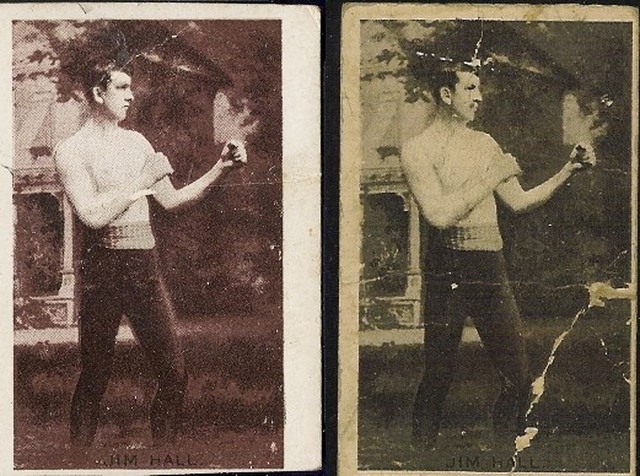
Not sure if Rob posted it when he had it, but I think this t207 is interesting. Looks like it might be missing a red...the t206 guys must love it. Looks like he's missing a glove on the light one.
Mac 
|
|
#2
02-27-2013, 06:53 PM
|
||||
|
||||
|
I think the one on the right actually looks better. His face is clearer and looks more realistic as opposed to the other.
Just an observation and opinion. 
__________________
I Remember Now. 
|
|
#3
02-27-2013, 07:18 PM
|
||||
|
||||
|
Neat card, could definitely be missing a few ink layers.
__________________
T206 gallery
|
|
#4
02-27-2013, 07:19 PM
|
|||
|
|||
|
Neat card. Looks like it's missing red ink or a buff layer. Thanks for sharing.
__________________
T206 518/518
|
|
#6
02-27-2013, 09:10 PM
|
||||
|
||||
|
I had that one for awhile before I've noticed it and I also had a Davis that looked the same. Pretty neat.
Mac got a pretty good price on that one! Rob
|
|
#7
02-28-2013, 11:14 AM
|
||||
|
||||
|
Interesting. The extra art overlays on some cards with photographic bases really made them less attractive overall. Look at these N310s; the one on the right is missing nearly all of the ink passes:
__________________
Read my blog; it will make all your dreams come true. https://adamstevenwarshaw.substack.com/ Or not...
|
 |
|
|
 Similar Threads
|
||||
| Thread | Thread Starter | Forum | Replies | Last Post |
| 52 Topps Oddity | Robextend | Postwar Baseball Cards Forum (Pre-1980) | 2 | 12-09-2009 09:06 PM |
| that's odd.....your fave oddity | Archive | Net54baseball Vintage (WWII & Older) Baseball Cards & New Member Introductions | 9 | 04-20-2009 09:25 PM |
| Printing oddity | Archive | Net54baseball Vintage (WWII & Older) Baseball Cards & New Member Introductions | 3 | 05-28-2006 04:47 PM |
| T206 Oddity | Archive | Net54baseball Vintage (WWII & Older) Baseball Cards & New Member Introductions | 4 | 09-09-2005 10:30 AM |
| Mastro oddity | Archive | Net54baseball Vintage (WWII & Older) Baseball Cards & New Member Introductions | 4 | 08-13-2003 10:32 AM |


 Linear Mode

