|
||||||
 |
|
|||||
|
||||||
|
|
|||||
|
|
|
#1
 09-19-2012, 07:42 AM
|
||||
|
||||
|
Wow, thank you so much for all of the kind words, everybody. Really. I'm super pleased with this response to Van Haltren!! It may sound a little weird, but I'm really glad I'm able to bring someone like him out of the cobwebs of history. Apparently, he was really some kind of player - a borderline Hall of Famer, even.
Mark, players back then really did have a different look to them. You can just tell that they lived hard lives. I guess back then, baseball, though seemingly a kind of circus act and off the beaten path of life, really was an escape from the mines and mills that still littered the country. Someone like Van Haltren came from the old school, where I guess things really were pretty wild and maybe even a bit less organized. Though, regardless, it's amazing to think that George was hobnobbing with people like Amos Rusie, John Montgomery Ward, and Cap Anson. And they were his contemporaries!! Mike, I really hope something is in the works regarding a book. My agent sometimes keeps quiet about that sort of stuff, mainly because he knows that I can get overexcited pretty easily, and when stuff happens to fall through (which does indeed happen), I get pretty upset. I guess sometimes it's tougher for me to take things in stride. Either way, Jurinko's first book was pretty awesome. I would kill to have as much work done as him - that's a whole lifetime there! I haven't purchased his second book yet. And no worries on the typo - I get it all the time! Lance, I think that the softness in the background is pretty common for portraits, especially of that era. And then again, it all really depends on the photographer. Someone like George Burke carried that sort of technique on for the rest of his career, and boy did he really push it. And I guess with someone like Bain, you're getting a bit more information and detail in the back. I guess it kinda depends on the image, but I'll try to adjust things according in a painting, sometimes adding a tiny bit of dimension to things, or touches of atmosphere here and there. If nothing else, it adds a bit of interest to a background that's as plain as the one in the Van Haltren image. With something like a portrait, I definitely like pushing that juxtaposition too, as there isn't a heck of a lot of room for showing a great depth of field. Scott, I'm glad to say I know you too! I just wish we could have really chatted in Baltimore. Do you have any plans of making it out to Chicago? Jason, thanks so much!!! That orange-like yellowish touch coming from the left was the most fun to play with, especially when I tried to get it touching off on his skin and jersey. Thanks again, everybody. Graig
__________________
Check out my baseball artwork: www.graigkreindler.com www.twitter.com/graigkreindler www.facebook.com/graigkreindler 
|
|
#3
09-19-2012, 08:01 AM
|
||||
|
||||
|
Thanks a lot, Mike! I won't lie, sometimes I feel like I'm regressing when it comes to this stuff, so I'm glad you feel that way!
Graig
__________________
Check out my baseball artwork: www.graigkreindler.com www.twitter.com/graigkreindler www.facebook.com/graigkreindler
|
|
#4
09-19-2012, 09:29 AM
|
||||
|
||||
|
Pretty new to this forum and just saw this thread for the first time today. Truly fantastic work Graig! Now someone pass me the popcorn.
__________________
Always looking for Bob Gibson and Stan Musial. http://www.ebay.com/usr/shopvarsitycollectibles Twitter: @VarsityCollect
|
|
#5
09-19-2012, 11:50 AM
|
||||
|
||||
|
Quote:
Looking at your early work and at the most recent is is clear to me that your talent is becoming more refined. Dont get me wrong as I love the early works but it just seems that the more work you do the better your detail becomes. Keep it up!
|
|
#6
10-10-2012, 05:24 PM
|
||||
|
||||
|
Hey guys,
I had a question for y'all. So, I started this 16" x 20" a week or so ago: 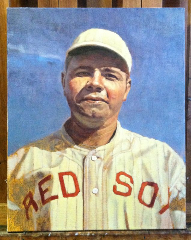 And don't worry it's not finished, but it's still gonna be a golden hour thing, with the sun low on the horizon. But I digress... The image was from a photo sold in one of Legendary's auctions months ago, and if you remember, was purchased by that Jake fella (I think). 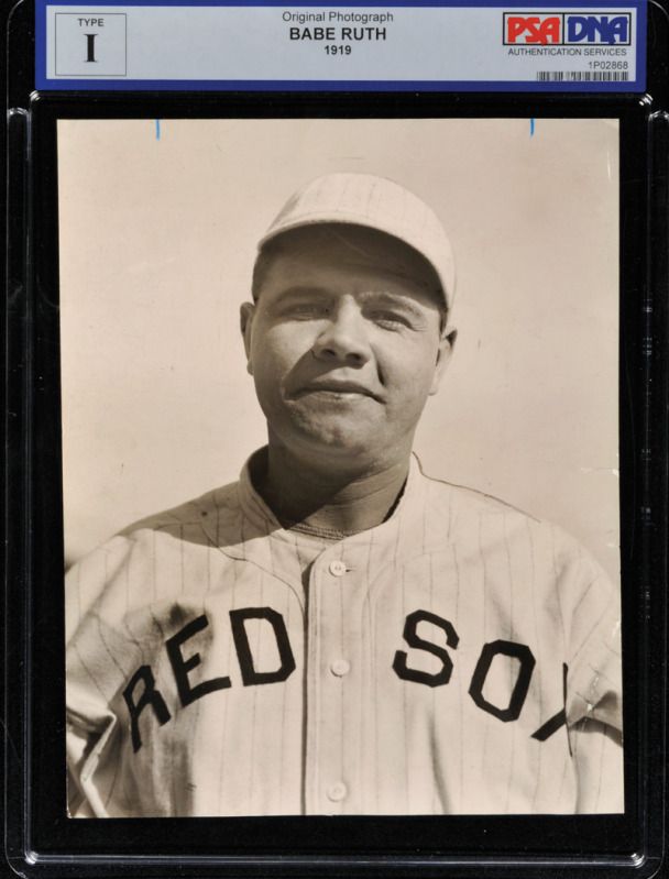 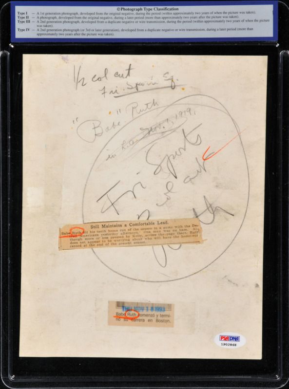 What I was wondering was, have any of you ever seen this image before that particular auction? It was entirely new to me, and I was just trying to see if I could narrow down a correct date for it. I'm pretty sure the heading from the auction was incorrect with the 1915-18 date, as I'm pretty darn sure that the Red Sox uniforms didn't have that style lettering until 1919, and despite what the description says, I'm pretty sure they had pinstripes as well. I was hoping to get a bit more specific than 1919, though. I checked baseball-reference to look up whatever games Boston played in '18 or '19, as they were the only ones in which Ruth hit more than 10 homers. And of course, I couldn't find any contest against Detroit that included Ruth's 10th homer - he hit that one on July 10 against the Browns. Am I crazy? And really, if there is an obvious thing I overlooked, feel free to chime in. I mean, even if it was a correct month, it would really help me for whatever narrative I end up writing. And of course, if it's an exact date, then that would be perfect. Anywho, any help that y'all can provide is GREATLY appreciated. Thanks, Graig
__________________
Check out my baseball artwork: www.graigkreindler.com www.twitter.com/graigkreindler www.facebook.com/graigkreindler Last edited by GKreindler; 10-10-2012 at 06:01 PM.
|
|
#7
10-10-2012, 06:21 PM
|
||||
|
||||
|
I'm no expert on Red Sox uniforms, Graig, but it says "1919" on the PSA label.
|
|
#8
10-10-2012, 06:51 PM
|
||||
|
||||
|
According to Dressed to the Nines website, the Red Sox wore that style in 1916,1917 & 1918. By 1919 the pinstripes were gone.
http://exhibits.baseballhalloffame.o...splay+uniforms
|
 |
|
|
 Similar Threads
|
||||
| Thread | Thread Starter | Forum | Replies | Last Post |
| 68 Topps 3D Easel | Archive | Postwar Baseball Cards Forum (Pre-1980) | 1 | 04-22-2008 03:17 PM |


 Hybrid Mode
