|
||||||
 |
|
|||||
|
||||||
|
|
|||||
|
|
|
#1
 01-12-2011, 02:26 PM
|
||||
|
||||
|
Quote:
__________________
[I]"When you photograph people in colour you photograph their clothes. But when you photograph people in B&W, you photograph their souls." ~Ted Grant Www.weingartensvintage.com https://www.facebook.com/WeingartensVintage http://www.psacard.com/Articles/Arti...ben-weingarten ALWAYS BUYING BABE RUTH RED SOX TYPE 1 PHOTOGRAPHS--->To add to my collection 
|
|
#2
01-12-2011, 06:21 PM
|
||||
|
||||
|
Oh, believe me, Dynarl, Ben gets his.
And Jacksons, you're making me blush. Thank you for your kind words. Hopefully you'll feel the same about your up-and-comer... I have to agree with you on those Mets jerseys. Those mid-80s togs were absolutely amazing. And coming from a Yankee fan, this is not the easiest thing in the world to say, but I always thought he looked best in blue and orange. Graig
__________________
Check out my baseball artwork: www.graigkreindler.com www.twitter.com/graigkreindler www.facebook.com/graigkreindler
|
|
#3
01-18-2011, 11:55 PM
|
||||
|
||||
|
Hey all,
Just got these back from the photographers, too: 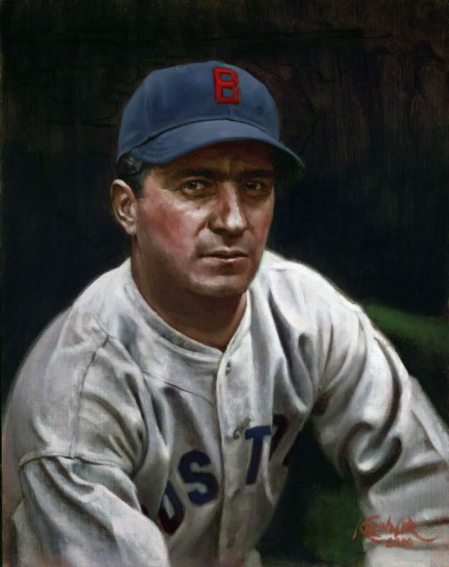 Moe Berg, 1935 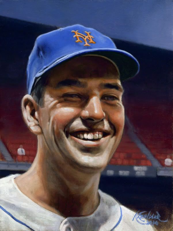 Ed Kranepool, 1963 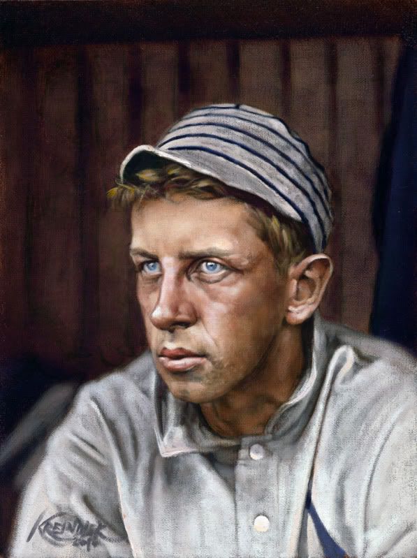 Eddie Collins, 1909 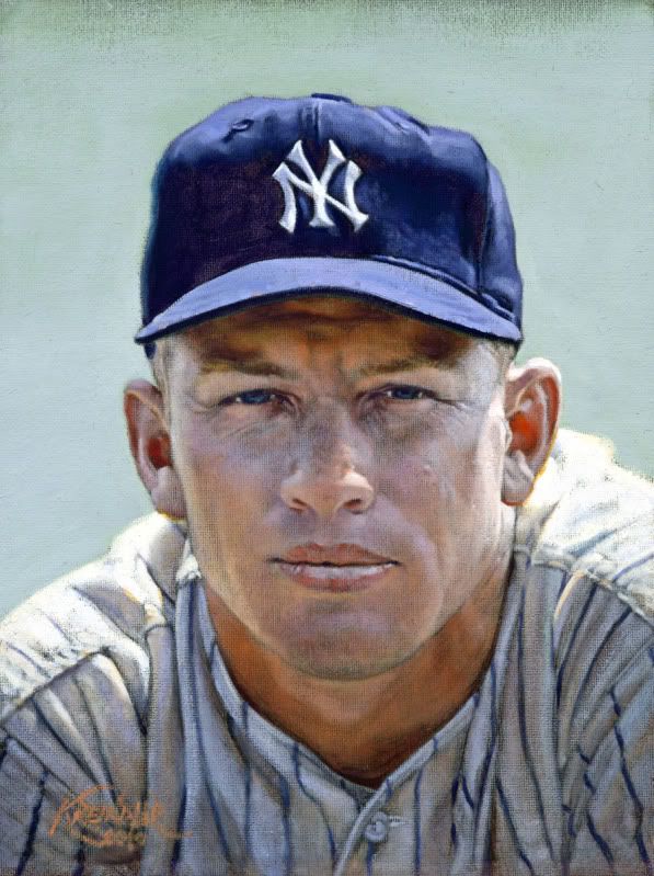 Mickey Mantle, 1956 A motley crew/crue indeed. The Mantle is actually a redo, as the original was...ahem...lost. Not cool. Anywho, I would love to hear any thoughts you want to throw my way, especially with the Collins. That one had somewhat of a different quality of light that I've not painted before, and I'm not terribly sure that I was successful. Boo. I hope you like all four, but I'll settle for three. Actually, I'll settle for one. Graig
__________________
Check out my baseball artwork: www.graigkreindler.com www.twitter.com/graigkreindler www.facebook.com/graigkreindler
|
|
#4
01-19-2011, 07:45 AM
|
|||
|
|||
|
Graig, you are a man of many talents, or at least one extreme talent!
I always look for new postings from you, because they are simply amazing. So the first Mantle was "lost"?  Is it by any chance now part of the Barry Halper collection? Is it by any chance now part of the Barry Halper collection? Since you specifically asked about the Collins, I absolutley love it. The only thing that bothers me or seems eerie, is that when I look at it, it appears to me that Collins' left eye is looking directly into my eyes but his right eye seems to be loking over my left shoulder. It could just be me. Or were Collins' eyes actually that way? If so, then you certainly captured it. And thanks for the Berg. It reminds me that I was reading "The Catcher Was A Spy" while on vacation a few year ago and hadn't finished it when vacation was over. I really need to pick that up again. Somehow that painting seems to capture the essence of what I know about him and his life.
|
|
#5
01-19-2011, 08:55 AM
|
||||
|
||||
|
Graig,
The Mantle is Spectacular, as is the Strawberry you posted last week. They look just like pictures. The other three are excellent as well. I'm not sure what you don't like about the Collins. I think it captures him quite nicely. BTW, the picture is in the mail tomorrow. Mark
__________________
My signed 1934 Goudey set(in progress). https://flic.kr/s/aHsjFuyogy Other interests/sets/collectibles. https://www.flickr.com/photos/96571220@N08/albums My for sale or trade photobucket album https://flic.kr/s/aHsk7c1SRL
|
|
#6
01-19-2011, 09:24 AM
|
||||
|
||||
|
Graig - they are all fantastic.
I'd love to know how you determine exact eye, hair color, etc. for these deadballers. Is this through literary research, or is it maybe assumed by the shade of these attributes in b/w photographs? Eddie Collins' eyes are haunting. How did you know he had such light colored eyes? BTW - sorry to hear about the Mantle redo - the second one looks just as good as the first, though, if not better.
|
|
#7
01-19-2011, 02:17 PM
|
||||
|
||||
|
Thanks for all of your comments, guys - I really appreciate the honest feedback.
timzcardz, it's funny you should mention that...um...just kidding. But really, I'm a bit upset that I never got to do this kind of stuff when Barry was still around and active. It really would have been wonderful to meet him if I ever had the chance. Also, thanks for the comments on the Collins painting. His eyes seem to be pretty consistent with the photograph, I think. But, it's definitely possible that I could have been a little off. I'm really still debating, so I'll have to give it another look or six. Mark, you da man. Thank you. And from what Dean tells me, your painting should be going out quite soon. jacksons, thanks for the kind words again, especially regarding the Mantle. I blame Dean. Let's leave it at that. Regarding the eye colors, it's all done with research, mostly through books and magazines. Sometimes, though ti can be tough, I have to guess based on the approximate value of the person's iris compared to the retina. Even that can't be exact though. The feeling with Collins that I was trying to go for was just what you mentioned - having a focal point in his eyes. The light I was trying to achieve was to be reflected from outside of the dugout for the most part. In other words, in the dark dugout, I wanted Collins' head to peer out and seem to glow. And in such a case, it seemed that his blue eyes would appear almost crystalline. You may notice that on a bright day with cloud cover, the pigment in a person's eyes will be really chromatic, sometimes even more so than with direct light from the sun. I guess that was really the effect I was trying for. Graig
__________________
Check out my baseball artwork: www.graigkreindler.com www.twitter.com/graigkreindler www.facebook.com/graigkreindler
|
 |
| Thread Tools | |
| Display Modes | |
|
|
 Similar Threads
|
||||
| Thread | Thread Starter | Forum | Replies | Last Post |
| 68 Topps 3D Easel | Archive | Postwar Baseball Cards Forum (Pre-1980) | 1 | 04-22-2008 03:17 PM |


 Hybrid Mode
