|
||||||
 |
|
|||||
|
||||||
|
|
|||||
|
#1
 03-31-2011, 12:21 PM
|
||||
|
||||
|
It looks like it has Chicago on jersey then overprinted w/ Cubs... Have any of these ever surfaced before, thought's on if it's legit or faked???? Either way I wouldn't think it was $59,999 rare.
http://cgi.ebay.com/JOE-TINKER-1909-...item3a64ade316 Last edited by rp12367; 03-31-2011 at 12:22 PM. 
|
|
#2
03-31-2011, 12:30 PM
|
||||
|
||||
|
Looks like someone wanted to create a Tinker to mimic the Evers Cubs-Chicago cards. To me, no doubt that it's hand done.
__________________
I've learned that I don't suffer from insanity, I enjoy it.
|
|
#4
03-31-2011, 01:20 PM
|
||||
|
||||
|
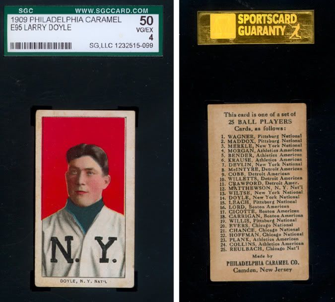
Here's the E95. SGC even missed it:
__________________
For information on baseball-related cigarette and tobacco packs, visit www.baseballandtobacco.com. Instagram: @vintage_cigarette_packs
|
|
#5
03-31-2011, 02:17 PM
|
||||
|
||||
|
I have a feeling he won't get his asking price.
|
|
#6
03-31-2011, 02:40 PM
|
||||
|
||||
|
What the....? Isn't that Cubs lettering way too dark for the uniform? The Chicago underneath is about the right shade for the uniform, but the Cubs?? No way.
How or why anyone would want to make this stuff up, is baffling to say the least, but you've got to know that an ungraded example, like this, isn't going to get any bids. Everything else about the card looks authentic and I would consider this a real misprint, if it wasn't so unreal. If this can't get an A for authentic, it at least deserves an A for creativity.
|
|
#7
03-31-2011, 03:10 PM
|
||||
|
||||
|
I asked if he would take 30k and his response was that I have no knowledge.
Thanks for the offer but I am more so looking for someone who has knowledge of this set and can offer some information. Thanks - obuckeyenut
|
|
#8
03-31-2011, 03:28 PM
|
||||
|
||||
|
This looks like the rare "fountain pen" version. Seriously, how can anyone mistake this for a legit misprint? You would think he could provide a decent scan for a $60k item. Wonder why it isn't graded? This seems to be an experience seller who would know that an "authentic" grade would greatly improve the value.
Let's see - not graded, poor scan? Haven't we been through this before? Rick
__________________
Rick McQuillan T213-2 139 down 46 to go. Last edited by buymycards; 03-31-2011 at 03:36 PM.
|
|
#9
03-31-2011, 03:32 PM
|
||||
|
||||
|
I think he just put a high price to attract attention. From his description, he seems to just want info regarding possibility of legit variation vs. selling. Similar to how some auction houses put items up on e-bay at ridiculous prices for purposes of advertising their own auctions, rather than sell at the listed price. Maybe he's scamming, maybe not, but you would think if he "created" this variation, he would have started it out priced more reasonably. JMHO
Mike
|
|
#10
03-31-2011, 03:46 PM
|
||||
|
||||
|
No way that was done by a press.It looks like a 7 year old just playing with his cards with a pen.
|
|
#11
03-31-2011, 08:12 PM
|
||||
|
||||
|
__________________
T206Resource.com
|
|
#12
03-31-2011, 08:52 PM
|
||||
|
||||
|
obuckeyenut must really be Jim Tressel looking to earn some money that he'll need to pay some NCAA fines!

|
|
#13
03-31-2011, 09:00 PM
|
||||
|
||||
|
Yep, that doesn't even match the darker uniform lettering, like I thought it might.
The Chicago underneath seems to match waay better, which would be rare enough, so why bother doctoring a card that is already rare, unless you're totally clueless? Oh well, my imagination was sparked for a few seconds anyway.
|
|
#14
03-31-2011, 09:40 PM
|
||||
|
||||
|
Well he thinks it's good, since he asked I let him know others thought it might be written with fountain pen and didn't think it was good, I advised he get it graded by psa or sgc asap to see what they think since he thinks it is legit. His response was-
All of the Tinker Hands on Knees cards have CUBS written across the chest. So there for it was not written with fountain pen.
|
|
#15
03-31-2011, 11:05 PM
|
|||
|
|||
|
Jon,
Same kid back in 1909 must have done my E95 example too...somebody was busy during class...   Cheers, John P.S. If anyone has that Doyle I would love to make an offer to have him with the Hoffman I think would be cool. Last edited by wonkaticket; 03-31-2011 at 11:07 PM.
|
|
#16
04-01-2011, 05:01 PM
|
||||
|
||||
|
Can someone tell me why they think there isn't an underlying "CHICAGO"
Tsaiko said: "Isn't that Cubs lettering way too dark for the uniform? The Chicago underneath is about the right shade for the uniform, but the Cubs?? No way." ...but nobody disputes the Cubs lettering is real. Then T206Fiend said: "No way that was done by a press.It looks like a 7 year old just playing with his cards with a pen." ...but here I agree with what Tsaiko said, i.e., that the Chicago underneath is about the right shade and style for the uniform. Isn't it possible that that was from the original photo, and that most Tinkers have that part erased before the printer would place the brown CUBS on top? I just don't see it as obviously fake, guys. Maybe a well done fake -- given it is not slabbed, etc. -- but not obvious to me at all.
__________________
Galleries and Articles about T206 Player Autographs www.SignedT206.com www.instagram.com/signedT206/ @SignedT206
|
|
#18
04-01-2011, 06:20 PM
|
||||
|
||||
|
I agree with T206Collector. I'm not sure what to make of this one either. I do know that the team name "add-ons" were somewhat popular back in the day though. Here's an example that I have. Bob Wicker, if anyone was wondering. I think it's safe to say this one was post-production.
Last edited by JeremyW; 04-01-2011 at 06:36 PM.
|
|
#19
04-01-2011, 07:02 PM
|
||||
|
||||
|
for the record-I think the card is good-I would need to hold it to be sure. It appears the Chicago is under the Cubs-asking price is ridiculous just so the seller can show it and maybe get opinions and maybe even a ridiculous offer.
Cubs looks to be in the right place and right color but what do I know.. ")
__________________
T206Resource.com
|
|
#20
04-01-2011, 09:59 PM
|
|||
|
|||
|
I have no idea whether the subject Tinker (HOK) card has been altered, but there is a Schulte (Front View) proof that has "CHICAGO" instead of "CUBS" across his shirt. Owned by K.O. I believe. He wrote about it in an article some years ago.
|
|
#21
04-01-2011, 10:48 PM
|
||||
|
||||
|
Here is a picture of the two cards overlayed. So, the Cubs letters are perfectly in line with typical cards. No doubt about that. One card is actually laid on top of the other card with 50% opacity on the top card. That shows any inconsistencies with the cards.
I think we pretty much knew this from the side by side comparison but wanted to post this since I did it for my own benefit. The out of focus is just because the registration is slightly off 
|
|
#22
04-02-2011, 12:19 AM
|
||||
|
||||
|
The letter placement is right on but seems a little shakey and not smooth like the others. I think it's bunk but tough to say.
|
|
#23
04-15-2011, 09:41 AM
|
||||
|
||||
|
Tinker closeup.jpg
The owner of this card has contacted me and sent scans showing it has been graded 1.5 by PSA. I'm adding comparitive scans of the affected area. I'm in the camp of those who think the eBay listings at $60K was a grab for attention/information rather than for cash. It looks to me like the CUBS was legitimately printed over whatever was originally on the jersey. But it also looks to be like there is a letter or something else after what is purported to be the O of CHICAGO. I'm posting this on my blog to seek further input. In the absence of other examples, I have to think this is an uncatalogable anomaly rather than a true variation, but if more were to surface, I think the hobby would have to consider whether there is a "new" variation among T206. Tinker f and b.jpg
__________________
My (usually) vintage baseball/football card blog: http://boblemke.blogspot.com Link to my custom cards gallery: http://tinyurl.com/customcards
|
|
#25
04-16-2011, 03:03 PM
|
||||
|
||||
|
But it also looks to be like there is a letter or something else after what is purported to be the O of CHICAGO.
I agree w/ Bob on this---What could that possibly be after the O? Certainly looks like another letter. In examining the original I see no hint of a uniform wrinkle in that area. Until this is explained I am still dubious about the card being unaltered in some way.
__________________
I've learned that I don't suffer from insanity, I enjoy it.
|
|
#26
04-16-2011, 04:15 PM
|
||||
|
||||
|
maybe what you believe to be the "O" is actually the "G", with the O to follow.
__________________
Now watch what you say, or they'll be calling you a radical, a liberal, oh, fanatical, criminal Won't you sign up your name? We'd like to feel you're acceptable, respectable, presentable, a vegetable If we are to have another contest in the near future of our national existence, I predict that the dividing line will not be Mason and Dixon's but between patriotism and intelligence on the one side, and superstition, ambition and ignorance on the other.- Ulysses S. Grant, 18th US President.
|
|
#27
04-16-2011, 06:44 PM
|
||||
|
||||
|
That very well could be it! Why wasn't I sharp enough to think of that? But then again, that's why I come here--to learn from all the great thinkers!
__________________
I've learned that I don't suffer from insanity, I enjoy it.
|
|
#28
04-16-2011, 07:43 PM
|
|||
|
|||
|
Quote:
|
|
#29
04-17-2011, 01:45 AM
|
||||
|
||||
|
I sure hope this "thing" is not added to the book... yet
I would never consider that a variation unless I saw 2 of them.... with the same back. Also what does the flip say? Did PSA completely miss the "CHLIOP" or whatever that is, or did they note it on the flip?? Any why cant it be scanned decently?? I have a $50 scanner that can scan super closeup high quality scans, and these images posted are so low quality and way too small.... Last edited by fkw; 04-17-2011 at 01:58 AM.
|
|
#30
04-17-2011, 02:33 AM
|
||||
|
||||
|
I believe that if Tinker had buttoned his jersey to the top, the second "C" would be obvious, the "I" might appear more prominent and that the word Chicago would be clear. I can make out the "A", and as I mentioned before, I believe the "O" that troubles people is actually the "G", with the last letter being the "O", distorted by the wrinkle in the uniform.
According to Okkonen, here is what the Cubs uniform looked like in 1906 (same in '05 with pocket, larger lettering in '07). 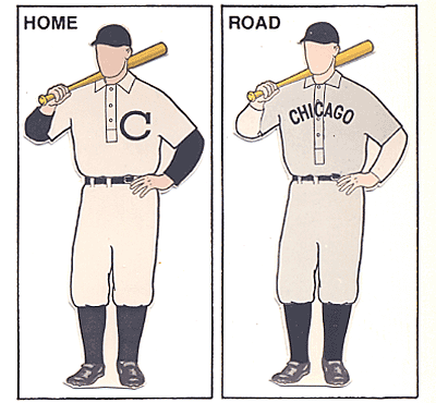 Curiously, the team did not sport "Cubs" on their jerseys in the manner shown on T206 until after 1911, at least in the regular season.
__________________
Now watch what you say, or they'll be calling you a radical, a liberal, oh, fanatical, criminal Won't you sign up your name? We'd like to feel you're acceptable, respectable, presentable, a vegetable If we are to have another contest in the near future of our national existence, I predict that the dividing line will not be Mason and Dixon's but between patriotism and intelligence on the one side, and superstition, ambition and ignorance on the other.- Ulysses S. Grant, 18th US President. Last edited by nolemmings; 04-17-2011 at 02:41 AM.
|
|
#31
04-17-2011, 07:26 AM
|
||||
|
||||
|
All of the Chicago National cards that were issued during the first printing group (150-350) of the T206 set had the "CUBS" logo.
 When the first group of images were discontinued and the next group (350 Only) began production the Chicago National cards featured the vertical "CHICAGO" down the shirt.  This second logo was featured on all other Chicago National cards issued for the remainder of the T206 set. No Chicago National subject featured in the set has "CHICAGO" across the chest. I understand that a Schulte proof with "CHICAGO" across the chest exists and that an early Tinker proof design could of conceivably had "CHICAGO" as well. But I find it highly unlikely that the remnants of a previous design would make it through the proofing process and to production. I honestly don't know what's going on with this card. It's very intriguing. Last edited by Abravefan11; 04-17-2011 at 08:14 AM.
|
|
#32
04-17-2011, 02:48 PM
|
||||
|
||||
|
I just scanned this out of Lew Lipset's Encyclopedia of Baseball Cards Vol.3....the photo in the book is black and white, and my scanner is a dud, but just to compare........
|
|
#33
04-18-2011, 04:19 PM
|
||||
|
||||
|
With about a year until the next deadline, there will be no rush to add the card in question to the T206 listings in the Standard Catalog. I, too, await the confirmation of the existence of one or more additional examples.
Until/unless that happens, this card is an anomaly, not a variation. The scans in mypost are not scans I made. In the case of the CUBS/CHICAGO card, the scan is a blow-up from the scan sent me by the card's owner. The CUBS scan is a blow-up from a card on an auction site. As for the T205 John D./John B. Miller . . . I have submitted that addition for the 2012 book, but since I am not hands-on in regards to changes in the data base, I can't promise it will be included.
__________________
My (usually) vintage baseball/football card blog: http://boblemke.blogspot.com Link to my custom cards gallery: http://tinyurl.com/customcards
|
 |
|
|
 Similar Threads
|
||||
| Thread | Thread Starter | Forum | Replies | Last Post |
| T206 Graded Evers, Tinker, and Chance For Sale + T205 Stone | iggyman | Tobacco (T) cards, except T206 B/S/T | 0 | 01-12-2010 08:17 PM |
| T206 HOF Tinker Bat on Sovereign 460 SGC 50 | Mikehealer | Tobacco (T) cards, except T206 B/S/T | 2 | 08-24-2009 06:58 AM |
| FS: RARE T206 RARE BACKS | Archive | Tobacco (T) cards, except T206 B/S/T | 21 | 11-18-2008 08:37 AM |
| For Trade - Extremely Rare T206 Brown Old Mill | Archive | Tobacco (T) cards, except T206 B/S/T | 0 | 10-23-2008 01:21 PM |
| Just How Tuff T206 Rare Backs Are... | Archive | Net54baseball Vintage (WWII & Older) Baseball Cards & New Member Introductions | 53 | 06-15-2007 08:42 AM |


 Linear Mode

