|
||||||
 |
|
|||||
|
||||||
|
|
|||||
|
|||||||
 |
|
|
Thread Tools | Display Modes |
|
|
|
#1
 04-16-2022, 10:37 PM
|
||||
|
||||
|
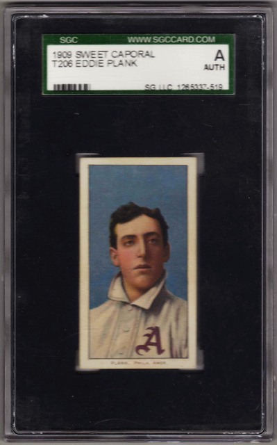
There are subtle differences in the image quality of T206, with the 150 series being superior to the 350 and 460 series overall. However, one card where this 150 vs. 350 difference seems to be on steroids is Eddie Plank. Here is a side-by-side of my 150 with the 350 that just sold at Mile High:
T206 Plank mine vs Mile High comp.jpg I don't have enough T206 to do a side-by-side of individual cards that were printed in both the 150 series and later. If you have enough cards to add some side-by-side scans of the same pose I would like to see them - even if there isn't a very big difference. Please try to make sure the registration is good on both cards and there isn't any fading on either. I don't think they will show the extreme difference in color, contrast, and clarity that Plank does, otherwise I think the 150 vs 350 and 460 difference would be a much bigger deal across the set than it is. Assuming the Plank difference is more extreme, is this why people hypothesized that a broken printing plate may have been why his card was pulled? I never thought much about this, but I always had a visual of this theory requiring a cracked/gouged/chipped and therefore unusable plate, but were people actually referring to the change in image quality as the argument for a broken plate? I am not arguing that Plank was pulled because of damage to the plate - just wondering about the origins of that idea.
__________________
Collection: https://www.flickr.com/photos/132359235@N05/sets/ Ebay listings: https://www.ebay.com/sch/harrydoyle/...p2047675.l2562 
|
|
#2
04-17-2022, 06:11 AM
|
|||
|
|||
|
For starters....the "Broken Plate" explanation regarding Plank is a myth that goes back to Circa 1970's.
Years ago, my research indicated that Plank was vehemently anti-tobacco (in any form). And, this is why his T206 card was removed. I posted a thread on Net54 stating this. Anyhow, here is my SWEET CAP 150 Eddie Plank compared with my Hal Chase.    TED Z T206 Reference . Last edited by tedzan; 04-17-2022 at 06:38 PM. Reason: Corrected typo.
|
|
#4
04-17-2022, 07:09 AM
|
||||
|
||||
|
A lot of people claim the difference in the quality/clarity of the images between the 150's and 350's is from the wearing down of the plates. I'm not a believer of that theory, if that was true you would see some of the 150's that were printed near the end that look like the 350's and I've never noticed anything like that and with the Plank's I don't think his 150 plate got used enough to come close to wearing it down.
I think it probably has to do with using a different press or printing method or something else. To me the difference in the 150 and 350 Cicottes is similar to the planks. [IMG]  [/IMG] [/IMG]I have quite a few 150/350's that I'll post later
|
|
#5
04-17-2022, 07:22 AM
|
||||
|
||||
|
I wonder if it could have anything to do with the amount/quality of the inks used?
It seems like something that a large corporate enterprise would look into during a product life cycle, using either less ink or ink of a cheaper quality to save $$ on the printing process...
__________________
___________________ T206 Master Set:103/524 T206 HOFers: 22/76 T206 SLers: 11/48 T206 Back Run: 28/39 Desiderata You are a child of the universe, no less than the trees and the stars; you have a right to be here. And whether or not it is clear to you, no doubt the universe is unfolding as it should. With all its sham, drudgery, and broken dreams, it is still a beautiful world. Strive to be happy.
|
|
#6
04-17-2022, 08:47 AM
|
||||
|
||||
|
Quote:
Here are a few more 150/350 pairs, all the 150's are on the left and the 350's are on the right [IMG]  [/IMG] [/IMG][IMG] 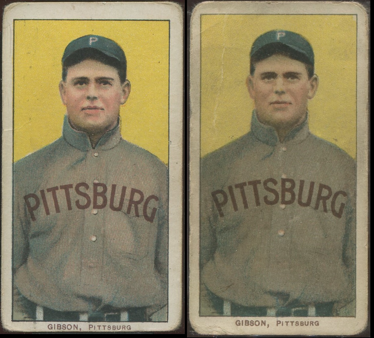 [/IMG] [/IMG][IMG] 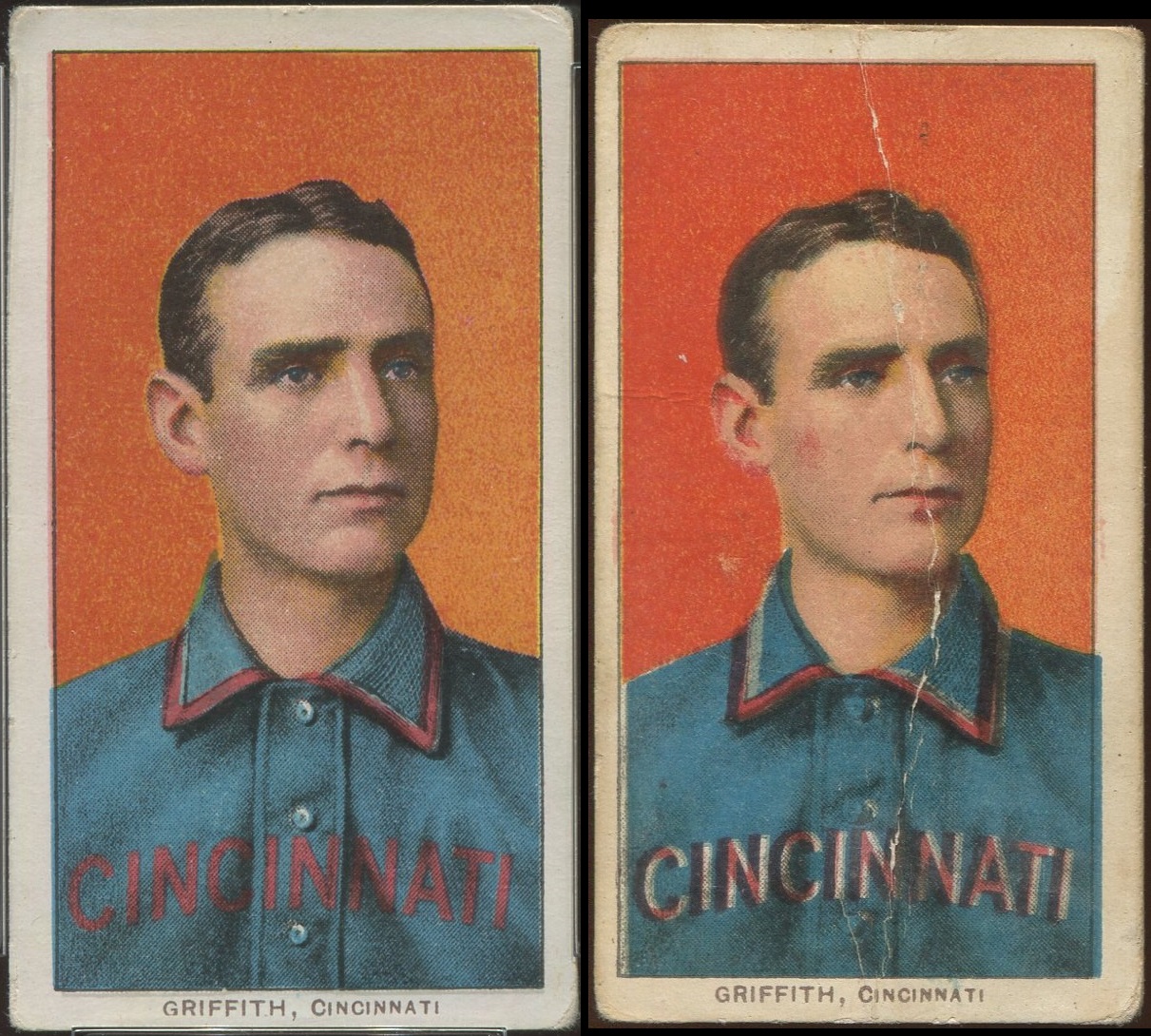 [/IMG] [/IMG]
|
|
#7
04-17-2022, 07:50 AM
|
|||
|
|||
|
Quote:
|
|
#8
04-17-2022, 02:01 PM
|
|||
|
|||
|
Quote:
Chris Four corners of my Plank were restored. I've no problem with that. I waited years to acquire this Plank to complete my SWEET CAPORAL Factory #30 set. That is what I love about completing sets. You have certain goals to attain. I've a nice-looking image. And I don't mind that it is graded an "A". Hey, an "A" in this case = "Affordable". The closest comparable image to Plank in the 150/350 series is Crandall. The majority of the Crandall cards have a lighter blue colored background. And, a few others have a darker blue background similar to my Plank.   TED Z T206 Reference . Last edited by tedzan; 04-18-2022 at 09:05 PM. Reason: Corrected typo.
|
|
#10
04-17-2022, 07:58 PM
|
|||
|
|||
|
Alot of things can affect color or how we perceive it. The perception bit is more on modern cards, but can affect T206s a little.
The plates do wear over time, and on a large print run may be used until the quality of the image becomes unacceptable. A century plus after the fact it's almost impossible to tell if a difference is plate wear or something else. The worn plates (actually thick stone slabs) were then resurfaced and and the next job or the same would be laid out with transfers printed from a master plate. Most other tings mentioned may aslo contribute to the appearance being different. Inking levels, how the press operator that day mixed the ink, how much water was used to dampen the plate, and how much it did or did not dry between wetting and inking. The makeup of the inks could also be different. Many inks were a colorant in a hardening base. Some bases harden glossy, others are less glossy. And the years around 1910 were also times of change from natural dyes and colorants to chemical ones which were less expensive. Bright red is probably cochineal, the pink probably one of the chemical colorants. One of the biggest reasons is one we've occasionally touched on, that the art and halftones were reworked between the 150s and 350s. If you look at the scans Pat posted, you can see some small but clear differences between the 150's and 350's. On Davis, where his hip shows on the right - the halftone dot pattern is very solid on the 150, and faint on the 350. There are also differences in where the undrlying colors like light blue, gray and peach appear under the halftone on the uniform. On Dooin, the halftone is very solid on the left side of the face on 150. The lines indicating the jersey opening are more well defined compared to the 350. The P on the uniform is halftone on the 150, but more solid on the 350. That difference could be plate wear or water/inking levels. But it could also be a difference in the masters. Crandall has lots of differences. And looking at the lower right, the two 150's are also different from each other. In general, the black layer on the 350's is less opaque than on the 150's. This may be a change from carbon (either lampblack or carbonblack) as the colorant to a chemical colorant. And that change may be why they changed the halftones between series.
|
|
|
|
 Similar Threads
|
||||
| Thread | Thread Starter | Forum | Replies | Last Post |
| T206 Wagner and Plank - They both didn't want their image on Tobacco cards | mrvster | Net54baseball Vintage (WWII & Older) Baseball Cards & New Member Introductions | 55 | 03-21-2022 02:46 PM |
| FS: Lot of 4 Charlie Hemphill Broken Plate examples | Gradedcardman | T206 cards B/S/T | 0 | 03-24-2019 02:44 PM |
| Wanted - Eddie Plank Original Wire Photo or Other Interesting Eddie Plank Item | Bengfield | Baseball Memorabilia B/S/T | 0 | 12-13-2016 04:15 PM |
| CollectorFocus Image Quality | mintacular | Net54baseball Vintage (WWII & Older) Baseball Cards & New Member Introductions | 0 | 04-13-2012 09:15 AM |
| Broken Image Links | Archive | Net54baseball Vintage (WWII & Older) Baseball Cards & New Member Introductions | 5 | 03-06-2008 04:59 PM |


 [/IMG]
 [/IMG]
 [/IMG]
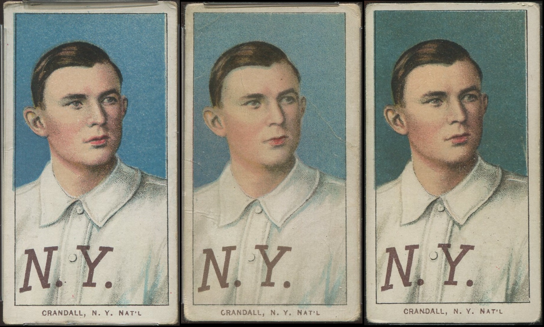 [/IMG]

 Hybrid Mode
