|
||||||
 |
|
|||||
|
||||||
|
|
|||||
|
|||||||
 |
|
|
Thread Tools | Display Modes |
|
#1
 03-26-2020, 09:54 PM
|
|||
|
|||
|
Since the link won't work well for my spreadsheet on 49 Leaf, I'll do it the hard way. Screenshot and crop....
Master set and completist collectors- don't look. Really. I spent a lot of time finding images from a bunch of places, my cards, ebay, here, maybe an auction or two. Generally - Column 1 is shaded hats, no lines between shoulders on portraits or bat ends on ones with bats Column 2 is unshaded hats with lines Column 3 is the bright pink ones Column 4 is sort of miscellaneous. Column 5 with one exception is ones with orange/yellow backs instead of green Which would usually be missing blue, but obviously isn't. Some images weren't good with color, so some of the pinks look more red, but I think none are actually red. To be replaced with better images eventually. It's a work in preogress, and isn't perfect, but hey, it's 49 leaf if it was perfect it wouldn't seem right  I didn't find varieties for every card. I expect eventually there will at least be normal ones and bright pink ones since they were all on one sheet. There are at least 3 different press runs, with a few transitional types. I say generally, because some aren't quite in the right place. I need additional columns, but I'll probably do that once I get more pics. I was looking at the colors used, but really they're all a version of CMYK so that column will be deleted. Card numbers are there, just off the left side of the pic. The left column that's visible is just Excels line numbers. Anyway, here's the first few. And , as I was worried would be the case, the boards resizing of even smaller files makes it so some of the details don't show.  Last edited by steve B; 04-02-2020 at 08:34 PM. 
|
|
#5
03-27-2020, 11:21 PM
|
|||
|
|||
|
Quote:
|
|
#6
03-27-2020, 11:24 PM
|
|||
|
|||
|
Quote:
The second Hermanski I'm pretty sure isn't one I've seen. Is it missing the red/Magenta? Or is it just weird like the ones with gold instead of green backgrounds.
|
|
#7
03-28-2020, 10:04 AM
|
|||
|
|||
|
Hi Steve
I have lots of these color variations....I'll start with my Blue LEAF's. 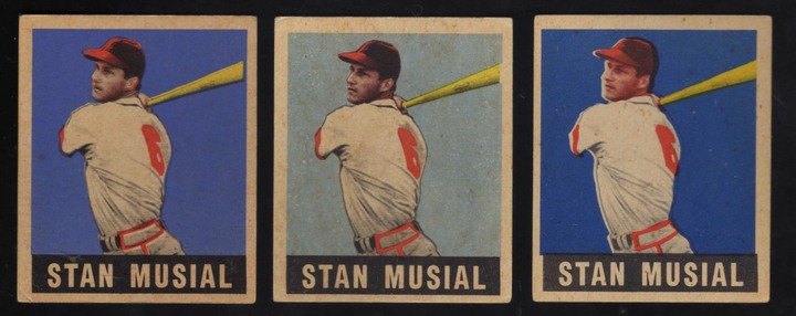 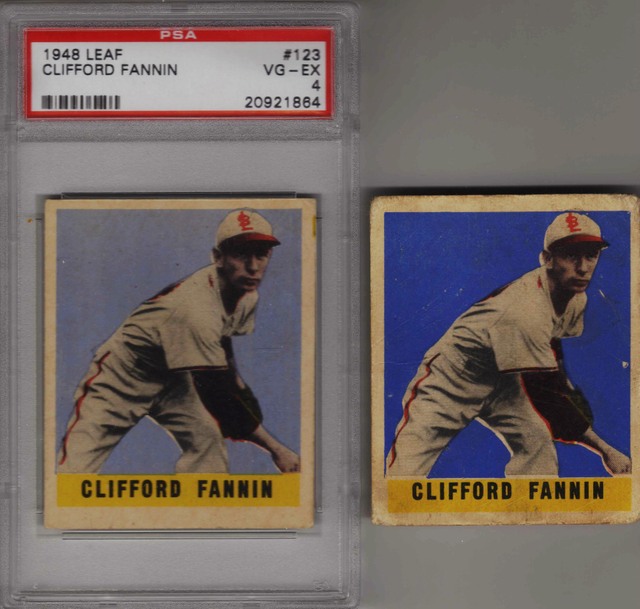 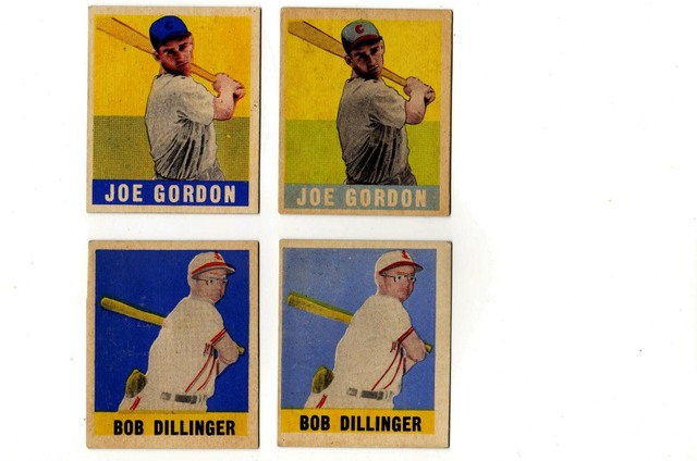 And then, there is BLUE or no BLUE. 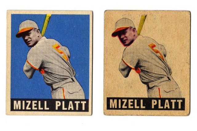 TED Z T206 Reference .
|
|
#8
03-28-2020, 05:36 PM
|
|||
|
|||
|
|
|
#9
03-29-2020, 09:59 PM
|
|||
|
|||
|
Cool stuff Ted.
Other than the obvious ones like magenta/Pink, or the gold colored backgrounds I didn't get into the color differences much Hopefully once I get the full size images going, it will be a bit more useful. Most of what I focused on was stuff like In your scans where Kiner has a line of color above the bat or not, And Stirnweiss hat. I think there was only 2-3 cards I didn't find some sort of major difference. Interestingly, some of the bark blue/light blue does follow the other differences, so usually if it has say a shaded hat, it will also have a blue that's a bit lighter. I tried linking directly to the pics last night, and since OneDrive hashes the file name the board won't display the picture since it thinks it's not a jpg.
|
|
#10
03-30-2020, 08:41 PM
|
|||
|
|||
|
|
|
#11
04-01-2020, 10:08 AM
|
|||
|
|||
|
Love this set. Neat to see the different versions side by side.
Something Ive always wondered about these color variations - did they all come off the printer like that, or are there environmental conditions (light, moisture, chemicals, soaking) over the last 70 years that account for some of them?
|
|
#12
04-01-2020, 01:16 PM
|
|||
|
|||
|
Quote:
Twenty-one of the 23 cards, which I have posted (so far) in this thread, are original cards from 1949 LEAF wax-packs.....when I collected these cards as a youngster in 1949. I'd say most color variations found in these cards are NOT due to "environmental, chemicals, or otherwise" factors. These variations were printed as such in the LEAF factory.  . .  TED Z T206 Reference .
|
|
#13
04-01-2020, 11:45 PM
|
|||
|
|||
|
Quote:
|
|
#24
04-03-2020, 08:12 AM
|
|||
|
|||
|
Quote:
Thats so incredible Ted. I knew you pulled that 52 Mantle yourself, didnt realize you go back even further than that! Maybe someday I can have the same stories for my 88 Donruss cards  . .
|
|
#25
04-03-2020, 02:09 PM
|
|||
|
|||
|
Quote:
Jgrace I'm fortunate having grown-up at a great time to acquire all these classic cards and see some great Baseball games (live or on TV). And more important, lucky enough to have a Mom and Aunt, who saved all my Sportscards, Lionel trains, Stamp collection, etc. when I was away for 4 years in the US Air Force. TED Z T206 Reference .
|
|
#26
04-03-2020, 02:23 PM
|
|||
|
|||
|
Ted, do you recall if the bright pink ones came out early or late?
I'm thinking they were the first ones, followed by red (probably after kids complained) Then by the ones without the extra lines (Maybe to save on ink?) But being Leaf, that could be way off.
|
|
#27
04-03-2020, 05:19 PM
|
|||
|
|||
|
Quote:
Excuse me, but I have to differ with you. I went thru 75 of my original 1st series LEAF BB cards, and all the "reds" are RED. For example, here are Ruth and Williams... Furthermore, I checked out my original LEAF Boxing cards. The 1948-1949 set of Boxers was initially issued in the Fall of 1948 (White backs). These cards were very-very popular, so LEAF continued issuing them into the beginning of 1949. This is evident since the 1949 issued cards have Gray backs (similar to the 1949 LEAF BB cards). Having said all that, the Boxing cards with red backgrounds are all RED. My thinking regarding the BB color variations is that these cards are most likely the result of sloppy printing practices during the end press runs. 1949 LEAF  . .  1948-1949 LEAF   TED Z T206 Reference .
|
|
#28
04-03-2020, 09:19 PM
|
|||
|
|||
|
I have a few of the pink ones, (Actually the Magenta from the CMYK) And they are definitely bright pink. I've actually sought them out at times because I think they're a bit harder to find.
I have some boxing too, and haven't seen pink on any of those. It's a good point that boxing was 48 and continued into 49, so that makes the pink ones a bit more of a puzzle. The inks would have been mixed by hand by the press operator. Starting with the basic Cyan Yellow and Magenta different colors are made by adding a little of other colors. Usually enough is mixed for the day or shift, or if the job is small, by the job. Like the blues, they all start with the same cyan base, lighter ones get a bit of white, darker a bit of black. The darkness/lightness seems so far to match with the particular plate differences, so I don't think they're mistakes other than just plain sloppiness. Why they would just use the Magenta straight when they'd been mixing red for a while maybe even a year or so is a mystery. The transitional types where they have one type for a couple colors and a different type for another are actually quite hard to find. Last edited by steve B; 04-03-2020 at 09:20 PM. Reason: Forgot the picture DOH!
|
|
#29
04-04-2020, 11:37 AM
|
||||
|
||||
|
First of all, thank you Steve for making these images larger. I see what you're trying to do here now. For example, the Jackie Robinson in the middle has a pinkish face, and when I scroll up I see that the Appling and Mize cards have pinkish faces as well. However, not all the cards I see in this column seem to match.
Anyways, I do think it would be great if we could group all these cards like what you're trying to do now, but it's a lot more complicated than you think. Let's take a look at the following Robinson, for example:  This card also has a pinkish face, but the cap is different. The blue color that was used does not match the one you have posted. Furthermore, you can also see all the details on the cap (lines and shading). Yours doesn't have this either. So, where exactly would we place this card on your spreadsheet? 
|
|
#30
04-04-2020, 11:33 PM
|
|||
|
|||
|
Quote:
Some of the pink cards were difficult to tell, either because of some difference or the colors on the scan weren't great. Robinson was one of the tough ones. The pink example I used I identified from the print flaw at the left, which is pink. First glance, I'd put it in column one, shaded hat no lines at the side. But, yes, the face is really pinkish. If it is, it would be a transitional type. And to make it more interesting, a sort I hadn't found before, using a column 1 style for everything except the pink. The best example of transitional types so far is Jensen. Column 1 has red that almost covers the cap and light blue that matches it. Column 2 has the same red, but a cut down cap. Column 3 is pink, that is cut away from the cap Column 4 is red that is cut away from the cap. And it's entirely possible that none of them really belong in column 1 - there may be a little extra detail under the brim, but the hat has no shading. I went to the images I'd saved for Robinson, and only one is high resolution. It appears as if the shaded hat version may be screened differently than the others, but since the other two are lower res, I can't be certain. Overall, it is a work in progress. Until I can find more images of transitional types it will be hard to put each one into a category. And some of the cards I didn't see any notable differences.
|
|
#32
04-06-2020, 03:04 PM
|
||||
|
||||
|
Quote:
Anyways, like I said, I do find it interesting what you're trying to do here, but I don't think you'll be able to figure anything out. It looks like the guys who printed these cards were DRUNK on the job. Last edited by samosa4u; 04-06-2020 at 03:05 PM. Reason: Spelling
|
|
#33
04-06-2020, 10:26 PM
|
|||
|
|||
|
Quote:
The ones with and without the lines at the side are also easy as long as there's somewhere that line would be. The ones I have in columns 1 and 3 were the "normal" ones. The ones I call transitional weren't common. The Hermansk Spelling is as far as I can tell always pink, except for that one weird one in col 5.
|
|
#34
04-06-2020, 10:53 PM
|
|||
|
|||
|
I'll throw in a few more......
  And a magenta Hopp.. .plus a front image on the back of another Hopp.  TED Z T206 Reference .
|
|
|
|
 Similar Threads
|
||||
| Thread | Thread Starter | Forum | Replies | Last Post |
| 49 Leaf common numbers spreadsheet | steve B | Net54baseball Vintage (WWII & Older) Baseball Cards & New Member Introductions | 12 | 03-26-2020 08:26 PM |
| Same Picture, Different Years... How Common is This? | STL1944 | Postwar Baseball Cards Forum (Pre-1980) | 9 | 06-04-2017 12:58 PM |
| WTB 60 Leaf high numbers | hoot-owl | 1950 to 1959 Baseball cards- B/S/T | 0 | 02-14-2015 11:47 AM |
| FOR SALE: 1949 Leaf Baseball Common/Minor Star lot of 30 (30% of set) G/VG | NewEnglandBaseBallist | 1920 to 1949 Baseball cards- B/S/T | 2 | 01-15-2010 01:22 PM |
| A Common sells for 4.8 times guide, fetches $3005 | Archive | Net54baseball Vintage (WWII & Older) Baseball Cards & New Member Introductions | 1 | 08-17-2006 09:40 AM |


 . .
. . 
 Linear Mode

