Quote:
Originally Posted by jimonym

And even if it was an ink distribution problem, wouldn't there be Ritchey cards with no dark green grass (meaning that no Dark Blue ink at all reached the paper)?
|
There could be some Ritchey's that never received the Dark Green (or Dark Blue) print run, though I've never seen one. I don't think the variations are because of an absence, but rather a lighter or heavier application of the color.
After posting about how the heavier color moves from the bottom to the top of the card last night and giving it a lot of thought I'm now wondering if it's just a resistance issue.
If the ink in the T206 process took the path of least resistance and there was a varying amount of ink used in the application, a color such as the dark green (or dark blue) would show up always on the area meant for the heaviest amount of ink, and less often for the area meant for the least amount of that color.
I haven't had the chance to look at as many examples of other T206's as I have the Ritchey but I think there are other cards that have variances but just not to the degree of the Ritchey, or with a contrast as noticeable as the Dove.
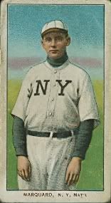
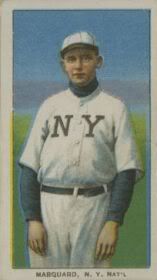
Here are a couple of Marquard Hands At Thighs that have a similar background to Ritchey with a noticeable difference in the amount of dark green (or dark blue) ink. Again not as big a variance as Ritchey.