Quote:
Originally Posted by samosa4u

It's a nice-looking card, yes, but the guy on it looks nothing like Mantle!
Here, look again and compare:


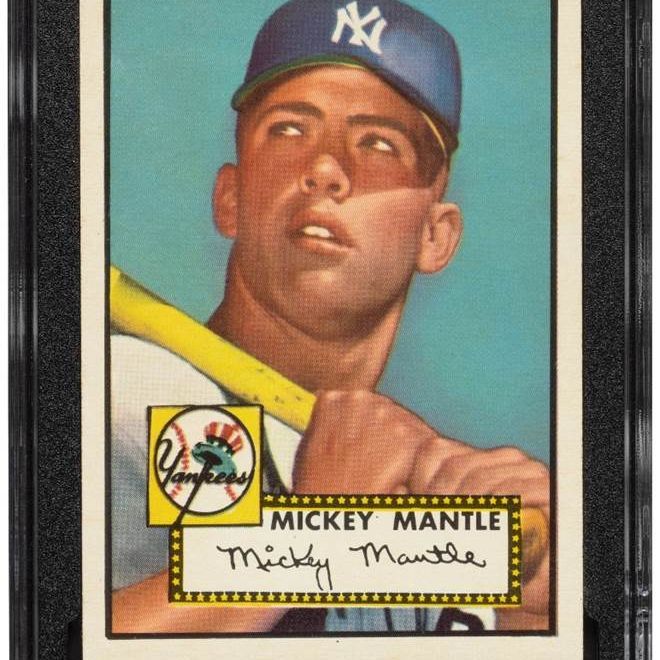
Shape of the head is wrong ... skin color wrong ... ears are too big ... teeth too big ... |
Id agree. Judged on the aesthetics alone and not what we know of the card - I dont think it looks fantastic. But of course its iconic, and has been for a long time, so most of that is just out the window at this point.
The 68 Topps Ryan / Koosman is another example of a card like that. I wont call it downright ugly, but its certainly not the prettiest card ever made. But its become an icon unto itself, so nobody really cares.
The one card you actually hear this subject discussed around a lot is the 63 Rose. Arguably the ugliest pricey card ever made
Sent from my iPad using Tapatalk