|
||||||
 |
|
|||||
|
||||||
|
|
|||||
|
|||||||
| View Poll Results: I | |||
| like the Gypsy Queen Ruth |
|
40 | 28.37% |
| don't like the Gypsy Queen Ruth |
|
61 | 43.26% |
| don't really care either way |
|
40 | 28.37% |
| Voters: 141. You may not vote on this poll | |||
 |
|
|
Thread Tools | Display Modes |
|
#1
 09-17-2012, 07:11 PM
|
||||
|
||||
|
Taken only for what it is, and forget about the asking price, do you like this card?
I should state that the question is pertaining only to the way it looks, not the manufactured rarity aspect of it or anything else. (I have no affiliation with the seller whatsoever) http://www.ebay.com/itm/4-10-BABE-RU...item41693a5279 . .
__________________
Leon Luckey www.luckeycards.com Last edited by Leon; 09-17-2012 at 07:28 PM. 
|
|
#2
09-17-2012, 07:18 PM
|
|||
|
|||
|
voted don't like only because Ruth didn't pertain to that era and it is kind of a crappy picture to boot. May also be the scan
|
|
#3
09-17-2012, 07:20 PM
|
||||
|
||||
|
Once I dismiss the intentional manipulation of the number of copies printed to create value, yes, I do find the image of Babe and the overall style of the card to be well done.

Last edited by Bocabirdman; 09-17-2012 at 07:21 PM.
|
|
#4
09-17-2012, 07:34 PM
|
||||
|
||||
|
Not a big fan of that image...really a poor representation/execution of the Bambino...there's got to be a better way to spend $250...
__________________
M@tt McC@arthy I collect Hal Chase, Diamond Stars (PSA 5 or better), 1951 Bowman (Raw Ex or better), 1954 Topps (PSA 7 or better), 1956 Topps (Raw Ex or better), 3x5 Hall of Fame Autographs and autographed Perez Steele Postcards. You can see my collection by going to http://www.collectorfocus.com/collection/BigSix.
|
|
#5
09-17-2012, 07:47 PM
|
||||
|
||||
|
I like it, for what it is....I sure wouldn't pay that kind of money for a modern card though.....to each their own.
Sincerely, Clayton
|
|
#8
09-17-2012, 10:44 PM
|
||||
|
||||
|
I voted - don't care.
I like the idea. I think this sort of thing can help promote the vintage card hobby. This particular example does not have a ton of eye-appeal to me. Execution could have been better. Not terrible, but not great. JimB
|
|
#10
09-17-2012, 11:05 PM
|
|||
|
|||
|
I voted that I like the GQ Ruth, but I don't like this leather variation. It gives it that canvas look that ruins the photo. This one is much better:
http://www.ebay.com/itm/2012-Topps-G...item337c263fed
|
|
#11
09-17-2012, 11:36 PM
|
||||
|
||||
|
I agree Matt, the one in the link you posted is better looking to me as well.
Sincerely, Clayton
|
|
#13
09-18-2012, 06:55 AM
|
||||
|
||||
|
I like the original but I like the one Matthew posted even more. And I agree, the thought didn't escape me on it potentially helping the pre-war hobby. I like almost anything that will help folks get excited about our hobby.
__________________
Leon Luckey www.luckeycards.com
|
|
#14
09-18-2012, 08:25 AM
|
||||
|
||||
|
I really like the Gypsy Queen minis. I have several of the Cincinnati Reds cards from this set, including a handful of autographs.
I like the Ruth image and those Mini Leather cards have a really cool texture to them.
|
|
#15
09-18-2012, 01:53 PM
|
||||
|
||||
|
It would be a lot better if it had some saw dust from a game-used bat or something . . .
|
|
#18
09-19-2012, 03:53 AM
|
|||
|
|||
|
Interesting thread. Does anyone with a VCP account have some completed auction realized prices to share for this Ruth and any of the other Pre-war HOFers /10 in that Gypsy Queen mini leather set? It would be nice to know what the market values these cards. Thanks.
|
|
#19
09-19-2012, 08:50 AM
|
||||
|
||||
|
Interesting numbers. I wonder if the card being polled were the one Matthew showed later in this thread, would the numbers be materially different?
__________________
Leon Luckey www.luckeycards.com
|
|
#21
10-07-2012, 05:49 AM
|
||||
|
||||
|
Since I do collect those leather minis, I obviously voted "like."
 I do happen to have that Babe Ruth leather mini #ed 01/10. Overpaid $150 for it but passion made me do it. Actually, there's another Babe Ruth card in the set...the Boston version which has a cooler image: 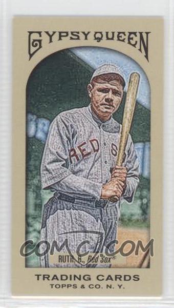 By the way, this set of 350 leather minis happen to be my final collecting project (although, I'm very tempted to go after next year's Gypsy Queen wood minis #ed to 5) and managed to get 156 out of 350 to date...all numbered either 01/10 or 10/10. Just something I really enjoy collecting. Last edited by FrostyCollects; 10-07-2012 at 05:50 AM.
|
|
|
|
 Similar Threads
|
||||
| Thread | Thread Starter | Forum | Replies | Last Post |
| 1962 Topps Babe Ruth Special | GKreindler | Net54baseball Vintage (WWII & Older) Baseball Cards & New Member Introductions | 2 | 07-13-2009 01:31 PM |
| FS/FT 1971 Topps FB SGC Lot of 111 !!! Offers Please. | Archive | Everything Else, Football, Non-Sports etc.. B/S/T | 0 | 03-31-2009 08:12 PM |
| 1950-1980 singles at fair prices | Archive | 1950 to 1959 Baseball cards- B/S/T | 1 | 09-27-2008 05:20 PM |
| 1950-1980 singles(baseball) | Archive | 1950 to 1959 Baseball cards- B/S/T | 0 | 06-15-2008 10:08 PM |
| UPDATED 1951-1969 BASEBALL SINGLES FS | Archive | 1950 to 1959 Baseball cards- B/S/T | 0 | 05-04-2008 10:12 AM |


 Linear Mode

