|
||||||
 |
|
|||||
|
||||||
|
|
|||||
|
#1
 07-17-2021, 01:09 PM
|
||||
|
||||
|
This is just my opinion here, and to each his own.
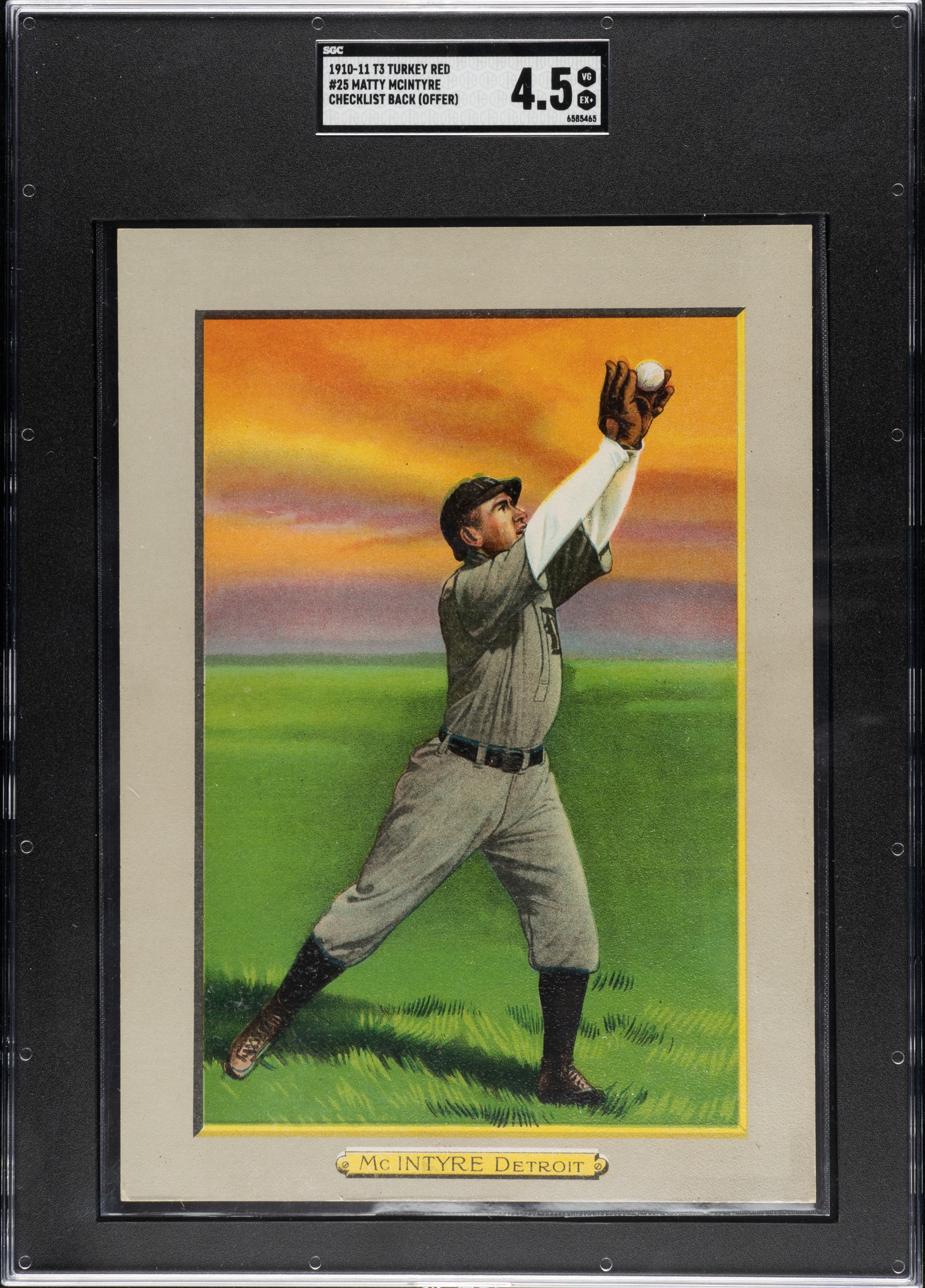
I can't help noticing (I have in fact noticed for decades) that some card sets have truly beautiful artwork in the days before color photography became prevalent, and some, quite frankly, contain examples that are somewhat hideous. I like to think that the good Lord blessed me with exquisite taste, you, on the other hand, might think somewhat differently. Here are some examples of what I would classify as "The Good". To me, these are as beautiful (perhaps even more so) as a color photograph, if that technology had existed when these cards were originally distributed, and were no doubt reproduced from actual photography: 
|
|
#2
07-17-2021, 01:28 PM
|
||||
|
||||
|
Now, for some examples of what I consider to be less-than-beautiful card art. Some of these are held in VERY high esteem, but they are to me nevertheless less than flattering depictions of the subject. Some of these are nothing less than cartoonish. These are the cards I consider to be among "The Bad" and "The Ugly". Yes, some of these I actually possess despite my criticisms of the artwork, but others, such as 1952 and 1953 Topps Mickey Mantle, are simply beyond my means. I cannot help but wonder what it is about these cards that would drive someone to shell out the kind of money they sell regularly for. You could by a 1968 hemi Dodge Charger in mint condition for what the 52 Mantle goes for. The Payne-Walsh double folder is another example. What was the artist thinking here? The Walsh depiction is just nuts. Remember the old Puppet Master films? He looks like that guy with the big shoulders and tiny head. And what's going on with Roy Campanella? I guess he had a large head, but that tiny hat looks borderline ridiculous:
Last edited by jingram058; 07-17-2021 at 01:44 PM. Reason: I cannot spell
|
|
#3
07-17-2021, 01:37 PM
|
|||
|
|||
|
There is certainly an aesthetic appreciation for the cards and the composition of the images. I think the photo/gold leaf combo of the T204 Ramly's are amazing, T205's are much fancier than the T206's (though I like the t206's more), Diamond Stars are the best "Art Nouveau" Card hands down, and I think the 1949 Leaf cards are an amazing nod to contemporary Pop art that was emerging at that time, though I am convinced the guys who were on press were drunk most of the time. 1965 Topps is the embodiment of a baseball card in my book, followed by the 1956 Topps. Everything after 1986 is tough to look at, the dawn of the glossy gold stamped crap.
|
|
#4
07-17-2021, 01:38 PM
|
||||
|
||||
|
"Truly beautiful artwork" brings this card immediately to mind. It's not mine, but I wish I owned one.
 and sometimes the classics are classics for a reason. 
__________________
successful deals with hcv123, rholmes, robw1959, Yankees1964, theuclakid, Brian Van Horn, h2oya311, thecapeleague, Gkoz316, chesbro41, edjs, wazoo, becollie, t206kid, vintageismygame, Neal, bradmar48, iconsportscards, wrapperguy, agrebene, T3fan, T3s, ccre, Leon, wolf441, cammb, tonyo, markf31,gonzo,scmavl & others currently working on: E101 (33/50) T3 set (104/104), complete! T205 set (108/221) '33 Goudey collecting W600s, Walter Johnson Last edited by chadeast; 07-17-2021 at 01:56 PM.
|
|
#5
07-17-2021, 07:36 PM
|
||||
|
||||
|
Mr Carter had(at times!?) a Lasor beam eye'
__________________
Life's Grand, Denny Walsh
|
|
#7
07-18-2021, 02:02 PM
|
||||
|
||||
|
Quote:
__________________
Thanks all Jeff Kuhr https://www.flickr.com/photos/144250058@N05/ Looking for 1920 Heading Home Ruth Cards 1917-20 Felix Mendelssohn Babe Ruth 1921 Frederick Foto Ruth Joe Jackson Cards 1916 Advertising Backs 1910 Old Mills Joe Jackson 1914 Boston Garter Joe Jackson 1915 Cracker Jack Joe Jackson 1911 Pinkerton Joe Jackson Shoeless Joe Jackson Autograph
|
|
#8
07-18-2021, 02:54 PM
|
|||
|
|||
|
Quote:
__________________
Successful transactions with: Bfrench00, TonyO, Mintacular, Patriots74, Sean1125, Bocabirdman, Rjackson44, KC Doughboy, Kailes2872
|
|
#9
07-18-2021, 03:36 PM
|
||||
|
||||
|
Here's a post-war "The Good, the Bad and the Ugly" thread that didn't get too much traction, but it follows the same theme with regards to specific players...
https://www.net54baseball.com/showthread.php?t=249319
__________________
All the cool kids love my YouTube Channel:
Elm's Adventures in Cardboard Land  https://www.youtube.com/@TheJollyElm Looking to trade? Here's my bucket: https://www.flickr.com/photos/152396...57685904801706 I was such a dangerous hitter I even got intentional walks during batting practice. Casey Stengel Spelling "Yastrzemski" correctly without needing to look it up since the 1980s. Overpaying yesterday is simply underpaying tomorrow. 
|
|
#10
07-18-2021, 04:29 PM
|
||||
|
||||
|
Quote:
If you're not talking about graded cards or card graders, or "the National", or if you aren't in the clique, it seems that threads go nowhere around here anymore.
|
|
#12
07-18-2021, 05:36 PM
|
|||
|
|||
|
Always enjoyed the '50 Bowman (football as well). Though there are naturally so many amazing examples from pre and early post war.
On the other side, the '48 Leaf is awful
|
|
#13
07-19-2021, 07:17 AM
|
||||
|
||||
|
Agree with the OP on those earlier Mantles. He could have his own good bad and ugly post.
The good  I never understood why this card doesn't get more love. It is his rookie card and an example of good artwork. Along with the 1953 Bowman and 1965 Topps, his best looking cards in my opinion. The bad 1953 Topps is just bad artwork. Most of the cards in the set are poor representations of the subjects and amatuerish in my opinion. The ugly The 1952 Topps is just plain ugly. Giving Mantle a yellow bat makes no sense to me. Also another weak Topps design.
|
|
#14
07-19-2021, 12:13 PM
|
||||
|
||||
|
I was actually surprised to not see a 1951 Bowman Paul Richards mentioned in anything.
__________________
- Justin D. Player collecting - Lance Parrish, Jim Davenport, John Norlander. Successful B/S/T with - Highstep74, Northviewcats, pencil1974, T2069bk, tjenkins, wilkiebaby11, baez578, Bocabirdman, maddux31, Leon, Just-Collect, bigfish, quinnsryche...and a whole bunch more, I stopped keeping track, lol.
|
|
#15
07-19-2021, 12:19 PM
|
||||
|
||||
|
The Good.
-
|
 |
|
|
 Similar Threads
|
||||
| Thread | Thread Starter | Forum | Replies | Last Post |
| The Good, the Bad and the Ugly | JollyElm | Postwar Baseball Cards Forum (Pre-1980) | 14 | 01-02-2018 04:25 PM |
| Mantle Good, Bad, or Just Plain Ugly?? | ruth-gehrig | Autograph Forum- Primarily Sports | 7 | 12-14-2015 07:43 PM |
| Good, Bad or Ugly? | Exhibitman | Autograph Forum- Primarily Sports | 0 | 03-20-2013 11:18 AM |
| FS: M116-The Good, the Bad and the Ugly | sox1903wschamp | Pre-WWII cards (E, D, M, W, etc..) B/S/T | 5 | 12-11-2009 11:11 AM |
| good, bad, and ugly | Archive | Net54baseball Vintage (WWII & Older) Baseball Cards & New Member Introductions | 2 | 11-20-2003 02:12 PM |


 Linear Mode

