|
||||||
 |
|
|||||
|
||||||
|
|
|||||
|
|
|
#1
 09-09-2021, 09:37 PM
|
||||
|
||||
|
Quote:
Awesome card! I think there is no right answer for the 54 Banks. I think whatever you think looks great is the right answer for you, and whatever the grading companies think be damned. That said, I would love to know how they determine the centering scale for this card. Sent from my iPhone using Tapatalk 
|
|
#2
09-09-2021, 10:27 PM
|
|||
|
|||
|
To me it looks like almost every Banks Rookie no matter which way it is centered has the very top of the letters of BANKS cut off.... you can notice especially on the S. The only one Ive seen on here that doesnt qualify for that is the giant one that Stan posted above. Its more of a printing problem then a centering issue for this..... what say the rest of you? I dont see this on other random Topps 1954s but I havent checked intensively yet.....
|
|
#3
09-10-2021, 05:04 AM
|
|||
|
|||
|
Quote:
|
|
#4
10-11-2021, 12:34 PM
|
||||
|
||||
|
I have some new entrants to consider!
I recently received this one from ZiggerZagger:  1954_Banks_1 by boosandpearl, on Flickr 1954_Banks_1 by boosandpearl, on Flickrand bought this one off ebay 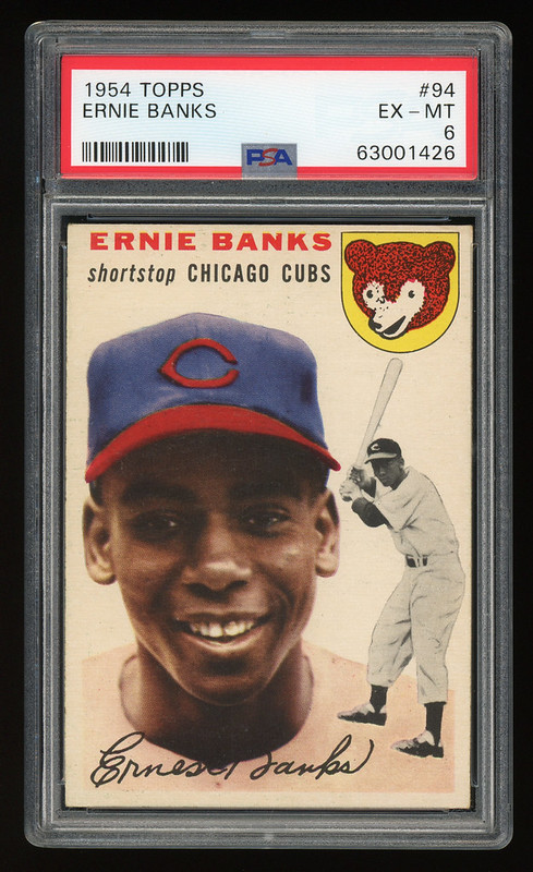 1954_Banks2_1 by boosandpearl, on Flickr 1954_Banks2_1 by boosandpearl, on FlickrI think both have strong centering, with the more recent one being a bit better. I plan to only keep one and would love to hear thoughts from the seasoned vets on the board.
|
|
#5
10-11-2021, 06:53 PM
|
|||
|
|||
|
There are a few ways to ensure a properly centered Banks IMO.
1) Check the bottom boarder, this should align with the right and left boarders. 2) The cubs logo should be an equal distance from the right boarder as the bottom right boarder. This ensures a 90 degree straight cut card. 3) Top/Bottom centering- The bottom boarder should be equal to the space above Ernies name. Also, the cubs logo should have an equal amount of boarder on the top and the right side, another check for a properly cut card. Another consideration is that the right edge of the cubs logo should be parallel to the right boarder. 4) Ernie Banks name is often cut off at the top of the card, this is a result of poor printing, not reflective of the card being miscut or off center. In general since its a common printing issue most folks ignore it. 5) The black and white image shouldnt be factored into the centering as its a secondary image layered on top of the primary image and was done so purposefully to overlap the primary boarder. A centered card will have the rear of Banks near the right boarder and there will be some white space, however, less boarder than the primary image. My attached card is shifted to the left probably 60/40ish but looks good top to bottom. The left/right off centering is consistent from top to bottom based on the width of the boarder between the cubs logo and right boarder being the same as that at the bottom boarder. You really cant go wrong with any Banks rookie but they sure look extra amazing centered!
|
 |
|
|
 Similar Threads
|
||||
| Thread | Thread Starter | Forum | Replies | Last Post |
| 1954 topps #128 Hank Henry Aaron HOF RC no creases decent centering SGC A nice card | Republicaninmass | 1950 to 1959 Baseball cards- B/S/T | 24 | 12-05-2021 07:32 AM |
| top-bottom centering on 1954 Topps | darwinbulldog | Postwar Baseball Cards Forum (Pre-1980) | 4 | 02-17-2020 06:58 AM |
| WTB 1954 Topps Banks | Peter_Spaeth | 1950 to 1959 Baseball cards- B/S/T | 0 | 02-17-2016 01:17 PM |
| FS 1954 Topps Kaline RC $200 50/50 centering | jjcollects | 1950 to 1959 Baseball cards- B/S/T | 1 | 08-17-2013 12:36 PM |
| 1954 Topps Al Kaline PSA 5 1954 Topps Ernie Banks PSA 3 MC | Sean1125 | Ebay, Auction and other Venues Announcement- B/S/T | 0 | 05-18-2013 10:00 AM |


 Hybrid Mode
