|
||||||
 |
|
|||||
|
||||||
|
|
|||||
|
|
|
#1
 07-31-2021, 08:43 AM
|
||||
|
||||
|
Quote:

|
|
#2
07-31-2021, 08:49 AM
|
|||
|
|||
|
Overrated 1952 Topps
Underrated 1954 Bowman Favorite 1957 topps Least 1962 topps
|
|
#3
07-31-2021, 09:21 AM
|
||||
|
||||
|
Overrated: 1954 topps.
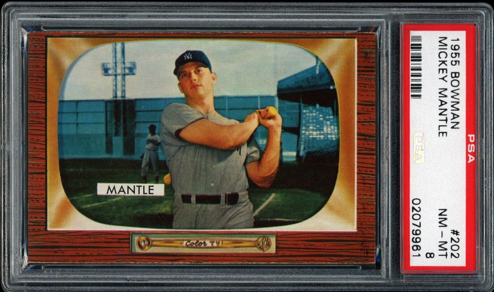
I think the artwork is fine, I don't like how the cards are cut however and nothing outside of Aaron is particularly interesting to me from the set. I think Bowman's 1954 set is far superior. Underrated: 1952 Berk Ross. I love this set of cards. It has a hell of a selection of players, and even though prices have climbed a bit, It's not too well known of a set so it's still affordable. Favorite: 1954 Red Heart and 1951 Bowman Very hard to choose the favorite, so I chose two. 1952 topps is up there for me as well, especially since I started working on the set but the artwork from the 1954 Red Heart and 1951 Bowman puts them both above the 1952 set for me. Least Favorite: 1955 Bowman Solely because we were robbed of a Mantle in the beautiful 1955 art style, and while the tv set has grown on me, I still can't bring myself to fully like it.
__________________
Successful Deals With: charlietheexterminator, todeen, tonyo, Santo10fan Bocabirdman (5x), 8thEastVB, JCMTiger, Rjackson44 Republicaninmass, 73toppsmann, quinnsryche (2x), Donscards.
|
|
#4
08-01-2021, 07:49 AM
|
||||
|
||||
|
Quote:
__________________
Read my blog; it will make all your dreams come true. https://adamstevenwarshaw.substack.com/ Or not...
|
|
#5
08-01-2021, 08:24 AM
|
||||
|
||||
|
Quote:

__________________
Successful Deals With: charlietheexterminator, todeen, tonyo, Santo10fan Bocabirdman (5x), 8thEastVB, JCMTiger, Rjackson44 Republicaninmass, 73toppsmann, quinnsryche (2x), Donscards.
|
|
#6
07-31-2021, 09:24 AM
|
|||
|
|||
|
Quote:
|
|
#7
07-31-2021, 04:30 PM
|
|||
|
|||
|
Quote:
")
|
|
#8
08-11-2021, 09:47 AM
|
|||
|
|||
|
I don't have one favorite set, but I do have favorites. And I could choose other sets for some of these.
That being said: Overrated: I'm going to say, Topps cards after 1974. When the '74's came out, I thought to myself, "Yeah well, they're nice enough, but they're too similar to the '73's with the white border". I stopped collecting after '74. While 1975 was a little different, Topps got into this white border thing. There wasn't enough of a difference really, in my opinion, between the sets. One could kind of make that argument about 1954 - 1956, and to some degree 1968-69. But the white border thing just went on and on. They got too generic. Underrrated: The 1968 Topps set. I have a sentimental feeling about the set, because it was the first I really collected. I had collected a little bit in previous years, but '68 I really amassed a lot of cards. I wish I could describe the feeling that I got from looking at all the different cards. MLB was all new to me and each card had a feeling about it. From looking at the blue of the Dodgers team and the colors of the Pirates team card, to the cards of Herman Franks and Alvin Dark. I loved the backs of those cards as well. Oh, Ed Mathews has 509 home runs...he must be good! Each card was a world unto itself. The burlap borders were just fine with me, thank you very much. Favorite: There are so many great sets. As I said, I could never just pick one. At this moment I'm feeling the 1969 Topps. I could also have put this under "Underrated". What an amazing design, and the pictures - they got them so right. The set is sort of an offshoot of the 1968 set, but it sort of clarifies that set. Again, some of the photos are great. The World Series run from that year was also one of their best, if not their best. Least favorite: 1962 Topps. I was just never into the wood grain border thing. The cards are somber and not uplifting at all. If I had been collecting then, I would have been hoping and waiting for a better design the next year! Last edited by jgannon; 08-12-2021 at 09:01 AM.
|
|
#9
08-12-2021, 07:51 AM
|
||||
|
||||
|
Yeah, the wood grain sets don't do it for me at all. 1955 B, 1962 T, even 1987 T, none of them. If they never do that style again I won't miss it.
__________________
Read my blog; it will make all your dreams come true. https://adamstevenwarshaw.substack.com/ Or not...
|
|
#10
08-12-2021, 08:33 AM
|
|||
|
|||
|
The appeal of the 62s extends far into the future
https://r.search.yahoo.com/_ylt=A0ge...j3NMDzGroMPdY-
|
|
#11
08-12-2021, 09:26 AM
|
||||
|
||||
|
Overrated: 1952/1953 Topps.
I don't care for the art look. Give me photos. Underrated: 1963 Fleer. Nice design. I wish they would have had the opportunity to issue a complete set before the bully jumped in. Favorite: 1961, 1962, & 1963 Post. These are the cards I collected as a kid. Went to the commissary with my mom to pick out cereal boxes based on the cards I needed. Of the three years, the '63 have my favorite design. Least Favorite: See Overrated.
__________________
M.!.c.h.@.3.L. . H.v.n.T _____________________________ Don't believe everything you think
|
|
#12
08-12-2021, 10:49 AM
|
|||
|
|||
|
Topps did not enjoin the Fleer 63 effort. There are several FTC proceedings in that period that discuss Fleer's complaint's about Topps' anti competitive behavior. Topps mostly prevailed. There are also sales figures in them indicating the Fleer 63 set did not sell well. A second series was originally planned and dropped.
The Topps contracts with players were exclusive only as to marketing the player's image with gum and confections, hence the Leaf 1960 marbles and Fleer 1963 cookies. It appears when it came to horrible gum or tasteless cookies, the market picked gum I agree with you Mike that the 63 Fleer set is a very nice set, but like the great Bowman 1953 Color set which was also truncated, it was not a market success at the time Last edited by ALR-bishop; 08-12-2021 at 11:01 AM.
|
|
#13
08-12-2021, 07:26 PM
|
|||
|
|||
|
Quote:
|
|
#14
08-12-2021, 07:39 PM
|
||||
|
||||
|
Quote:
|
 |
|
|
 Similar Threads
|
||||
| Thread | Thread Starter | Forum | Replies | Last Post |
| Which Play Ball set is your favorite, and which one is your least favorite? | brianp-beme | Net54baseball Vintage (WWII & Older) Baseball Cards & New Member Introductions | 17 | 02-20-2019 02:18 PM |
| Which regular issue Topps set is your favorite/least favorite. | Cardboard Junkie | Postwar Baseball Cards Forum (Pre-1980) | 32 | 03-18-2013 11:14 AM |
| overrated and underrated | Touch'EmAll | Watercooler Talk- ALL sports talk | 25 | 09-24-2012 12:26 PM |
| Show your favorite card in your not so favorite holder | Archive | Net54baseball Vintage (WWII & Older) Baseball Cards & New Member Introductions | 12 | 05-06-2008 11:38 AM |
| What are your favorite cards of your favorite players? | Archive | Net54baseball Vintage (WWII & Older) Baseball Cards & New Member Introductions | 47 | 04-13-2002 04:12 PM |


 Hybrid Mode
