|
||||||
 |
|
|||||
|
||||||
|
|
|||||
|
#251
 03-29-2015, 08:12 PM
|
||||
|
||||
|
Nice finds Cliff and Joe.

|
|
#252
03-30-2015, 04:24 PM
|
||||
|
||||
|
This '62 Ruth is interesting for a couple of reasons. It is not only a green tint variation card, but it is also so miscut that it shows part of card #176 Eddie Yost (which is a pose variation) on it. A pretty cool find for any Dodgers error/variation collectors out there.
62ruthmc.jpg
__________________
All the cool kids love my YouTube Channel:
Elm's Adventures in Cardboard Land  https://www.youtube.com/@TheJollyElm Looking to trade? Here's my bucket: https://www.flickr.com/photos/152396...57685904801706 I was such a dangerous hitter I even got intentional walks during batting practice. Casey Stengel Spelling "Yastrzemski" correctly without needing to look it up since the 1980s. Overpaying yesterday is simply underpaying tomorrow. 
|
|
#253
04-02-2015, 09:46 AM
|
||||
|
||||
|
Speaking of MC, here is a 69 T #232 with some sort of factory note along the left edge. Not sure what "slit b" stands for. Somewhere between a third to a half of the copies of this card that are OC r/l have this note (or parts of this note) on the left side edge.
|
|
#254
04-02-2015, 02:03 PM
|
|||
|
|||
|
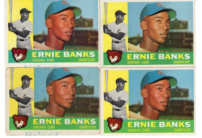
It reminds me of the notation on some of the 1960 Topps Banks cards
|
|
#255
04-09-2015, 11:46 AM
|
||||
|
||||
|
Had not noticed the excess red below the border on this 72 #574 card before...while appearing in varying degrees, very few if any copies on ebay have this excess red, while about half on COMC do.
|
|
#256
04-09-2015, 01:26 PM
|
|||
|
|||
|
Checked the one in my set and it has a red line that is above rather than below the black border line
|
|
#257
04-09-2015, 01:48 PM
|
||||
|
||||
|
Nice Al, I did not notice a variation of a excess red above the black line when searching for copies of the red line below the border(could have missed some copies though), so looks like you may have found an even tougher print variation of this card to chase ....please post a pic!
|
|
#258
04-12-2015, 11:57 PM
|
||||
|
||||
|
Notice that the right border on Joe Coleman's 78 Topps card is red as opposed to pink like the other three sides. I have yet to find a variation with all four sides pink. If one exists my opinion is that it is quite scarce.
__________________
COLLECTING BROOKLYN DODGERS & SUPERBAS
|
|
#259
04-13-2015, 11:10 AM
|
|||
|
|||
|
I was aware of the font size variation, but this one (on the right) has me scuppered. I have periodically checked Ebay and COMC, unable to locate another. Perhaps someone more familiar with the print process could educate me as to what happened here? Thanks...
__________________
Successful deals with dkbobasa, Mintacular, Hangman, Donscards, Bocabirdman, Goferboy00, Digdugdig, jimivintage, baseballart, jimmysuitcase, 39special, smokeyburgess, scooter, shorttmail66, KCDoughboy, Andrew1975, t206fix, Eggoman, others. Member of OBC. www.oldbaseball.com
|
|
#260
04-13-2015, 11:33 AM
|
||||
|
||||
|
Quote:

__________________
COLLECTING BROOKLYN DODGERS & SUPERBAS
|
|
#261
04-13-2015, 11:53 AM
|
||||
|
||||
|
Quote:
Last edited by savedfrommyspokes; 04-13-2015 at 11:55 AM.
|
|
#262
04-13-2015, 03:06 PM
|
|||
|
|||
|
Seems harder to find one without the red than with it, and the red line seems to wander some
|
|
#263
04-13-2015, 03:24 PM
|
||||
|
||||
|
Quote:
|
|
#265
04-13-2015, 06:48 PM
|
||||
|
||||
|
Quote:
|
|
#266
04-15-2015, 09:49 AM
|
|||
|
|||
|
That's another registration difference. With the red printed where it should be the extra line is below the frame If the red is printed shifted up the line will be above the frame.
Steve B
|
|
#267
04-17-2015, 08:35 PM
|
||||
|
||||
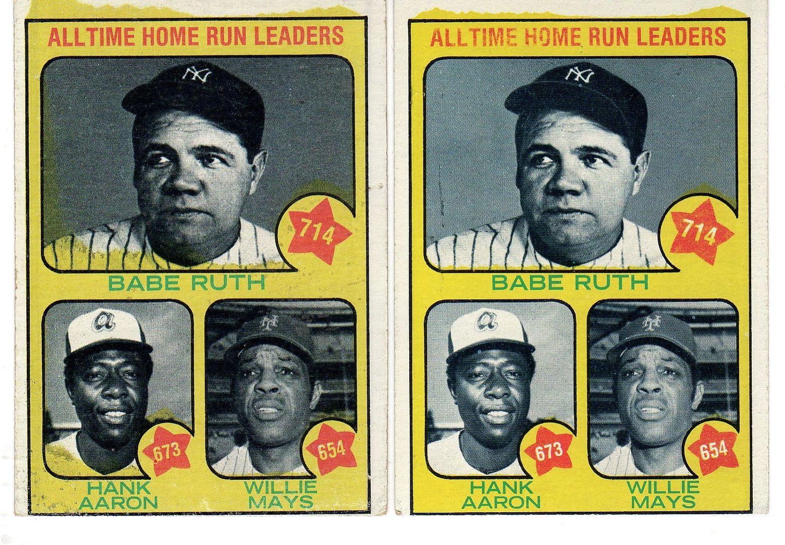
.jpg?id=8177b355-eef2-436d-bdef-bf5c1a95dc18&size=original) 1973 Topps #1 - All Time Home Run Leaders (Babe Ruth, Hank Aaron, Willie Mays) Courtesy of COMC.com Not mine, but I thought this card depicting Babe's booger would be of interest.. ;-)
__________________
-- PWCC: The Fish Stinks From the Head PSA: Regularly Get Cheated BGS: Can't detect trimming on modern SGC: Closed auto authentication business JSA: Approved same T206 Autos before SGC Oh, what a difference a year makes.
|
|
#268
04-18-2015, 09:25 AM
|
|||
|
|||
|
|
#269
04-19-2015, 04:17 PM
|
||||
|
||||
|
Unlike most of my other crappy printing flaw "error" cards, I believe this one is a bona fide variation. Apparently, the early printing of the 1973 Topps Al Kaline card had a spring training photo of him with a band-aid on his forehead, someone at Topps spotted it and had it airbrushed out.
|
|
#270
04-19-2015, 06:05 PM
|
||||
|
||||
|
That certainly appears to be a true variation Cliff, nice job. I have not looked yet, but what pct of the copies of this card have the band-aid?
|
|
#271
04-19-2015, 06:18 PM
|
||||
|
||||
|
Quote:
|
|
#272
04-20-2015, 08:13 AM
|
|||
|
|||
|
Good one Cliff
|
|
#273
04-20-2015, 05:36 PM
|
||||
|
||||
|
Not to rain on the parade or anything, but I've had the Kaline card (actually 2 of them) in my Vintage Errors and Variation FT thread for a long time now. Yesterday I resuscitated the thread in the BST section, for anyone looking to trade for that card.
__________________
All the cool kids love my YouTube Channel:
Elm's Adventures in Cardboard Land https://www.youtube.com/@TheJollyElm Looking to trade? Here's my bucket: https://www.flickr.com/photos/152396...57685904801706 I was such a dangerous hitter I even got intentional walks during batting practice. Casey Stengel Spelling "Yastrzemski" correctly without needing to look it up since the 1980s. Overpaying yesterday is simply underpaying tomorrow.
|
|
#274
04-20-2015, 07:07 PM
|
||||
|
||||
|
Quote:
|
|
#275
04-22-2015, 11:24 AM
|
|||
|
|||
|
I can attest to Cliff's prior recognition of the Kaline variant. After he posted it I told him I was looking for one and he pointed out he had sent me one quite awhile back ( no charge by the way). I looked in my set and there it was. It is depressing getting old.
 It is not the first variant Cliff has sent me without charge. There have been several. It is not the first variant Cliff has sent me without charge. There have been several.And, I appreciate it when folks post variants here, even if they might have shown up elsewhere, because it is valuable having one thread where you can search for examples. Darren does have a lot of great variations listed in his BST thread. Definitely worth a look
|
|
#276
04-22-2015, 11:51 AM
|
||||
|
||||
__________________
Read my blog; it will make all your dreams come true. https://adamstevenwarshaw.substack.com/ Or not...
|
|
#277
04-22-2015, 02:26 PM
|
|||
|
|||
 ....I don't know how something like this could have happened but a green uniform might have been a big hit in a town like Boston. ...
|
|
#278
04-22-2015, 08:51 PM
|
||||
|
||||
|
Quote:
 . .
|
|
#280
04-24-2015, 02:52 PM
|
|||
|
|||
|
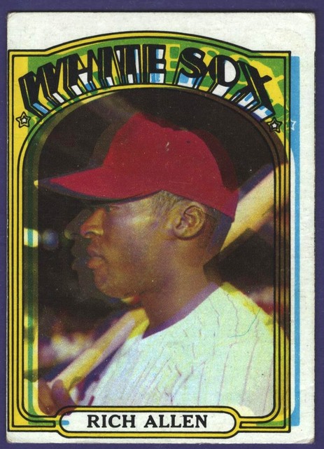
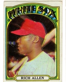
I have a large number of 1972 with poor registration, including the Allen, but Adam's is a "super" example
|
|
#281
04-27-2015, 04:06 PM
|
||||
|
||||
|
I've always loved the shot on this '73 Speier card and found this wrong back for a pittance, so I grabbed it up
73speierwrongback.jpg
__________________
All the cool kids love my YouTube Channel:
Elm's Adventures in Cardboard Land https://www.youtube.com/@TheJollyElm Looking to trade? Here's my bucket: https://www.flickr.com/photos/152396...57685904801706 I was such a dangerous hitter I even got intentional walks during batting practice. Casey Stengel Spelling "Yastrzemski" correctly without needing to look it up since the 1980s. Overpaying yesterday is simply underpaying tomorrow.
|
|
#282
04-27-2015, 05:15 PM
|
|||
|
|||
|
If you want to trade that 1973 wrong back, just let me know.
Thanks.... Tom
|
|
#283
04-28-2015, 06:07 PM
|
||||
|
||||
|
Quote:
__________________
All the cool kids love my YouTube Channel:
Elm's Adventures in Cardboard Land https://www.youtube.com/@TheJollyElm Looking to trade? Here's my bucket: https://www.flickr.com/photos/152396...57685904801706 I was such a dangerous hitter I even got intentional walks during batting practice. Casey Stengel Spelling "Yastrzemski" correctly without needing to look it up since the 1980s. Overpaying yesterday is simply underpaying tomorrow.
|
|
#284
05-02-2015, 03:55 PM
|
||||
|
||||
|
I love the Mets, I love 1972, I love high numbers, I love the 'TRADED' subset and I love errors
72fregosimc.jpg Talk about having it all!!!
__________________
All the cool kids love my YouTube Channel:
Elm's Adventures in Cardboard Land https://www.youtube.com/@TheJollyElm Looking to trade? Here's my bucket: https://www.flickr.com/photos/152396...57685904801706 I was such a dangerous hitter I even got intentional walks during batting practice. Casey Stengel Spelling "Yastrzemski" correctly without needing to look it up since the 1980s. Overpaying yesterday is simply underpaying tomorrow.
|
|
#285
05-03-2015, 04:49 PM
|
|||
|
|||
|
Yall have some cool stuff on here! Here are my 1970 print vars:
Yankee TC and Mullena are way off register. The Repoz is off register, but not to the same degree. The Mike Lum has some serious magenta bleed. The Hiatt Patek May and Ray all have sizable portions of the end of the sheet. The Christian is my favorite. How many times can you get 3 cards in one? Last edited by Laxcat; 05-03-2015 at 06:02 PM. Reason: Description
|
|
#286
05-08-2015, 10:42 AM
|
|||
|
|||
|
I have considered whether this card involves a true variation, one in which Topps made an effort to minimize the bat between Mantle's legs in later runs, and did it in different degrees. But the fact there are so few of the minimized cards seems to argue against it. Why would such a change be made only near the end of the print run ?
|
|
#287
05-08-2015, 06:15 PM
|
||||
|
||||
|
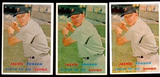
Quote:
The image shows that the overall color of the card on the left is all out of whack. The yellow is significantly duller and it's missing some red (magenta) ink, among possibly other things, as compared to the middle and right cards. That probably explains what's going on here.
__________________
All the cool kids love my YouTube Channel:
Elm's Adventures in Cardboard Land https://www.youtube.com/@TheJollyElm Looking to trade? Here's my bucket: https://www.flickr.com/photos/152396...57685904801706 I was such a dangerous hitter I even got intentional walks during batting practice. Casey Stengel Spelling "Yastrzemski" correctly without needing to look it up since the 1980s. Overpaying yesterday is simply underpaying tomorrow.
|
|
#289
05-09-2015, 01:39 PM
|
|||
|
|||
|
This card has two slightly different but related recurring print defects. The most common one involves a red and blue line to upper right of lower left front logo. A card without those two marks is harder to find. The third version involves the red line version smudged with some of the red in the white pants of the guy to the left. That seems to be the toughest, but have seen a few of them. Top one is clean. 2nd one has the red and blue lines. The 3d has the red in the pants
|
|
#290
05-10-2015, 10:50 AM
|
|||
|
|||
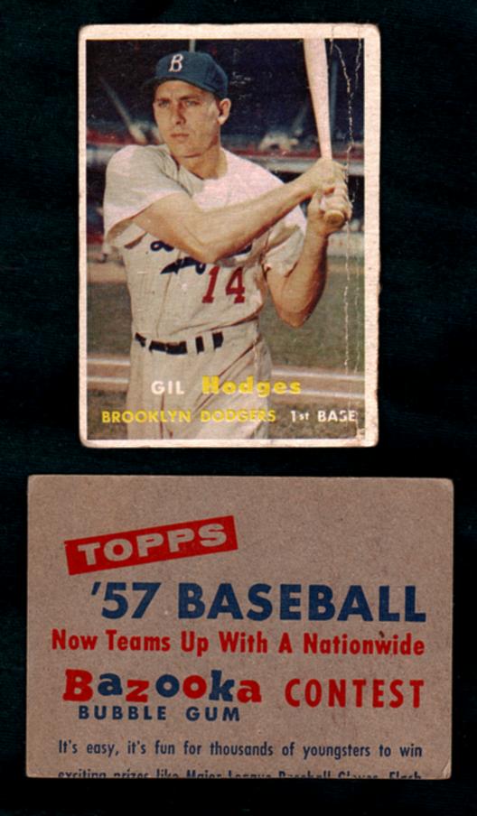 ...anyone ever seen 1957 Topps with a back like this --I assume it's a factory cut because it's miscut just like ninety per cent of all '57 Topps were.... ..
|
|
#291
05-10-2015, 11:41 AM
|
||||
|
||||
|
Quote:
|
|
#293
05-10-2015, 12:04 PM
|
|||
|
|||
|
Oh , okay.....I've seen three-card strips reputed to be ''Samples'' but I 've never seen the backs;.anyone have one or know about the 3-card strip backs ?
...thanks
|
|
#294
05-10-2015, 12:05 PM
|
||||
|
||||
|
Quote:
Last edited by bnorth; 05-10-2015 at 12:07 PM.
|
|
#295
05-10-2015, 05:13 PM
|
|||
|
|||
|
i think you can find them from 53 to 67. I have several. Trying to get one for each of my sets. Anthony, Griffins on the board, has a great run for both Topps and Bowman. If you keep a search for Topps or Bowman Salesman sample, you will find them on eBay, usually partially cut like this one. They are most valuable if the 3 card strip is uncut. The next factor involves whether a star card is pictured on the strip. Less valuable is a star on the back. The backs do not usually match the front players. Two card backs are advertising with one player back from the set. Here is back of my 59 Salesman Sample
Last edited by ALR-bishop; 05-10-2015 at 06:49 PM.
|
|
#296
05-13-2015, 05:39 PM
|
||||
|
||||
|
__________________
All the cool kids love my YouTube Channel:
Elm's Adventures in Cardboard Land https://www.youtube.com/@TheJollyElm Looking to trade? Here's my bucket: https://www.flickr.com/photos/152396...57685904801706 I was such a dangerous hitter I even got intentional walks during batting practice. Casey Stengel Spelling "Yastrzemski" correctly without needing to look it up since the 1980s. Overpaying yesterday is simply underpaying tomorrow.
|
|
#297
05-16-2015, 06:53 AM
|
||||
|
||||
|
I'm really starting to dig wildly miscut cards. Here are a few more from 1970, including HOF'er Maz
70mazetcmc.jpg
__________________
All the cool kids love my YouTube Channel:
Elm's Adventures in Cardboard Land https://www.youtube.com/@TheJollyElm Looking to trade? Here's my bucket: https://www.flickr.com/photos/152396...57685904801706 I was such a dangerous hitter I even got intentional walks during batting practice. Casey Stengel Spelling "Yastrzemski" correctly without needing to look it up since the 1980s. Overpaying yesterday is simply underpaying tomorrow.
|
|
#298
05-22-2015, 04:00 PM
|
|||
|
|||
|
Someone mentioned this one on CU. Recurring print defect, not scarce
|
|
#299
05-22-2015, 09:54 PM
|
|||
|
|||
|
73 Miscuts
|
|
#300
05-24-2015, 07:27 PM
|
||||
|
||||
|
Pseudo shameless plug
for anyone interested, a lot of the cards I posted in this thread are now available for trade in my new Errors & Variations thread in the B/S/T. Check it out.
__________________
All the cool kids love my YouTube Channel:
Elm's Adventures in Cardboard Land https://www.youtube.com/@TheJollyElm Looking to trade? Here's my bucket: https://www.flickr.com/photos/152396...57685904801706 I was such a dangerous hitter I even got intentional walks during batting practice. Casey Stengel Spelling "Yastrzemski" correctly without needing to look it up since the 1980s. Overpaying yesterday is simply underpaying tomorrow.
|
 |
|
|
 Similar Threads
|
||||
| Thread | Thread Starter | Forum | Replies | Last Post |
| 1966 Topps High # Print Variations | 4reals | Postwar Baseball Cards Forum (Pre-1980) | 9 | 04-27-2014 07:05 PM |
| Are these variations or print defects? | savedfrommyspokes | Postwar Baseball Cards Forum (Pre-1980) | 16 | 02-09-2013 12:52 PM |
| Well known print defects. Do variations exist without? | novakjr | Postwar Baseball Cards Forum (Pre-1980) | 9 | 01-28-2011 05:32 PM |
| Finally confirmed - d311 print variations exist! ("bluegrass" variations) | shammus | Net54baseball Vintage (WWII & Older) Baseball Cards & New Member Introductions | 8 | 09-03-2010 08:58 PM |
| Wanted: T206 Print Variations and Errors | Archive | Tobacco (T) cards, except T206 B/S/T | 1 | 01-04-2007 08:23 PM |


 Linear Mode

