|
||||||
 |
|
|||||
|
||||||
|
|
|||||
|
#2051
 04-01-2022, 06:08 PM
|
||||
|
||||
|
Quote:
__________________
interesting to some absolute garbage to others. - Error cards and variations are for morons, IMHO. 
|
|
#2052
04-01-2022, 06:36 PM
|
|||
|
|||
|
It looks diagonal like a logo...also that he was only on the Astrosseems strange, why did the airbrush on the cap to all black? The jersey looks like a H or A(Amarillo) and 64 on Colts? Perhaps old photo for '69
In any case, if you see any with less, pls share here...seems strange for the others in the set that year (popovich and perronoski) that Topps didn't black out the master...maybe they did at some point in printing, vs extra black at the end/final print? Sent from my SM-G996U using Tapatalk
|
|
#2054
04-01-2022, 06:49 PM
|
||||
|
||||
|
Quote:
__________________
interesting to some absolute garbage to others. - Error cards and variations are for morons, IMHO. Last edited by Cliff Bowman; 04-01-2022 at 07:10 PM. Reason: Correction
|
|
#2056
04-01-2022, 08:07 PM
|
||||
|
||||
|
Quote:
|
|
#2057
04-01-2022, 09:12 PM
|
|||
|
|||
|
Quote:
|
|
#2058
04-02-2022, 10:07 AM
|
|||
|
|||
|
Quote:
|
|
#2059
04-02-2022, 11:01 AM
|
||||
|
||||
|
Quote:
Stop it would ya?!?! You must be on a mission to bring to light every Cardinals print variation that I don't have in order to put a damper on my day! I hate you! (in a light-hearted, hobby sort of way!) 
|
|
#2060
04-03-2022, 10:47 AM
|
|||
|
|||
|
Quote:
|
|
#2061
04-03-2022, 06:10 PM
|
||||
|
||||
|
I posted this bizarre one in the pickups thread, but Joe feels more at home here...
1970toppsfb150namathMISCUT.jpg
__________________
All the cool kids love my YouTube Channel:
Elm's Adventures in Cardboard Land https://www.youtube.com/@TheJollyElm Looking to trade? Here's my bucket: https://www.flickr.com/photos/152396...57685904801706 I was such a dangerous hitter I even got intentional walks during batting practice. Casey Stengel Spelling "Yastrzemski" correctly without needing to look it up since the 1980s. Overpaying yesterday is simply underpaying tomorrow. 
|
|
#2062
04-04-2022, 01:51 PM
|
|||
|
|||
|
I have found that there are 4 variations to this card. 2 front variations with normal backs and 2 back variations with normal fronts.
Front #1: The Yellow blob in the Yankees "Y" letter and on his face has a normal (no slash in record line) on back. Front #2: The blue line above the "EE" in Yankees has a normal (no slash in record line) on back. Both of the back variations have the normal front: Back #1: The slash in the record line is broken into two parts and is thin. It also misses the "G" in Batting. Back #2: The slash in the record line is a single slash and is wider than the broken, thin slash. And it touches the "G" in Batting. That is all I have found so far. Both backs variations are shown below Al's cards: 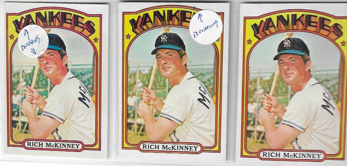
__________________
Man proposes and God disposes. U.S. Grant, July 1, 1885 Completed: 1969 - 2000 Topps Baseball Sets and Traded Sets. Senators and Frank Howard fan. I collect Topps baseball variations -- I can quit anytime I want to.....I DON'T WANT TO. Last edited by butchie_t; 04-04-2022 at 01:52 PM.
|
|
#2064
04-15-2022, 06:13 PM
|
|||
|
|||
|
649T
1) Dot next to "To", dot above "3" in "3rd Base" and Curley mark in banner (Shown) 2) Dot above "3" in "3rd base" 3) No dots, no Curley mark I believe the dot next to To is always paired with the Curley mark in banner.
|
|
#2068
04-17-2022, 02:44 PM
|
|||
|
|||
|
I just added the 72 Jim Hickman Yellow Team variation to my collection. I finished the base set last week and my master set is done now with this acquisition. A little corner ding but well centered and nice. SWEET!
__________________
Man proposes and God disposes. U.S. Grant, July 1, 1885 Completed: 1969 - 2000 Topps Baseball Sets and Traded Sets. Senators and Frank Howard fan. I collect Topps baseball variations -- I can quit anytime I want to.....I DON'T WANT TO.
|
|
#2069
04-17-2022, 02:53 PM
|
|||
|
|||
|
Congrats Butch
|
|
#2071
04-19-2022, 12:31 PM
|
|||
|
|||
|
I have been on the lookout for the following 73 Topps cards with border gaps:
128 Ted Sizemore 504 Ed Williams 508 Gates Brown 596 Red Sox Team Card So far, I have not run across any of the gapped versions. My questions to the variation experts here are: For 128, 504, and 508. Are the border gaps on these respective cards the same type of many of the others? Double gap or single gap, or is the gap completely different for these cards? For 596 is the border gap on this card the same as it is on the Giants Team Card or is the gap break in another location on the border? Have not seen any of the above so far and am wondering, frankly, if I am looking at the cards wrong or assuming that the breaks are basically the same. A little help please. Thanks, Butch And if someone here has some extras hanging out on their end, I am happy to entertain a trade or a purchase. Along with the Reuss and Fosse smudged versions. Condition is not a condition for these specimens. Regards.....
__________________
Man proposes and God disposes. U.S. Grant, July 1, 1885 Completed: 1969 - 2000 Topps Baseball Sets and Traded Sets. Senators and Frank Howard fan. I collect Topps baseball variations -- I can quit anytime I want to.....I DON'T WANT TO. Last edited by butchie_t; 04-19-2022 at 01:29 PM. Reason: getting the card number right for Gates Brown.
|
|
#2072
04-19-2022, 01:14 PM
|
|||
|
|||
|
I think the Williams was listed in the SCD Standard Catalog before Bob Lemke quit doing border gaps. By Gates Brown do you mean 508. On Williams and Brown the gaps are on both the left and right as is the case for many of the 73 gap issue cards
I do not have a gap for Sizemore, maybe Cliff does. I do have the two below. Note the cleaner version has a green streak in upper left just below white border 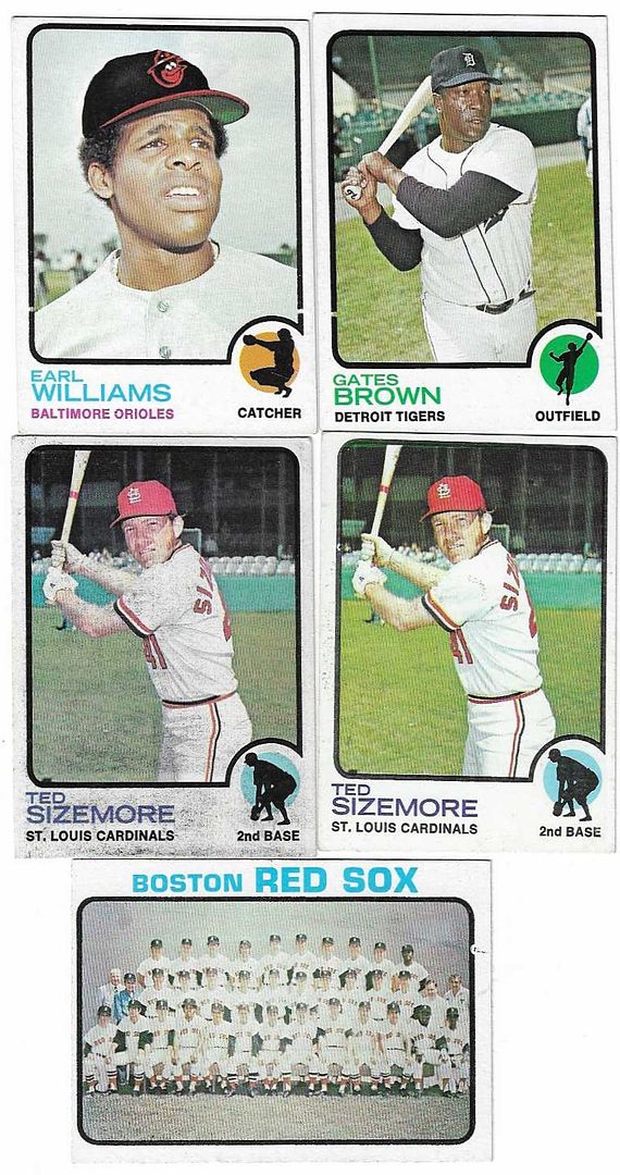
|
|
#2073
04-19-2022, 01:29 PM
|
|||
|
|||
|
Thanks Al. My finger did not go far enough to the right to get Gates card number. 508 is correct.
Thank you for posting these pictures, this helps quite a bit. And now that I see the Boston Team Card, I can pick that one up pretty quickly. I had seen that variation previously but just was not sure that was it. Most appreciated on my end. Cheers, Butch
__________________
Man proposes and God disposes. U.S. Grant, July 1, 1885 Completed: 1969 - 2000 Topps Baseball Sets and Traded Sets. Senators and Frank Howard fan. I collect Topps baseball variations -- I can quit anytime I want to.....I DON'T WANT TO.
|
|
#2074
04-19-2022, 01:41 PM
|
||||
|
||||
|
Im not aware of a border break on the Sizemore but I have seen several plagued with ink issues, many cards on the first series sheet have ink problems. I always thought of the 73 Red Sox Team card as more of a comet streaking across the card but I guess it could be considered a border break.
__________________
interesting to some absolute garbage to others. - Error cards and variations are for morons, IMHO.
|
|
#2075
04-19-2022, 01:45 PM
|
|||
|
|||
|
Quote:
Regards, Butch
__________________
Man proposes and God disposes. U.S. Grant, July 1, 1885 Completed: 1969 - 2000 Topps Baseball Sets and Traded Sets. Senators and Frank Howard fan. I collect Topps baseball variations -- I can quit anytime I want to.....I DON'T WANT TO.
|
|
#2076
04-19-2022, 03:06 PM
|
|||
|
|||
|
Hi the Williams and Brown are the same; a black gap on the mid bottom left and right side. I have the brown listed in a border break lot on ebay. I probably have the williams around somewhere as well.
I believe the Sizemore error is the red laser across the top? I am not familiar with the red sox error but I will look into it. Best, Ed Sent from my SM-G996U using Tapatalk
|
|
#2078
04-19-2022, 03:17 PM
|
|||
|
|||
|
Quote:
Butch,
__________________
Man proposes and God disposes. U.S. Grant, July 1, 1885 Completed: 1969 - 2000 Topps Baseball Sets and Traded Sets. Senators and Frank Howard fan. I collect Topps baseball variations -- I can quit anytime I want to.....I DON'T WANT TO.
|
|
#2079
04-20-2022, 11:46 PM
|
||||
|
||||
|
Quote:
__________________
interesting to some absolute garbage to others. - Error cards and variations are for morons, IMHO. Last edited by Cliff Bowman; 04-20-2022 at 11:57 PM. Reason: Grammar
|
|
#2080
04-24-2022, 11:51 AM
|
|||
|
|||
|
Cliff, please check your DM inbox. I’m interested in a few of the cards you have posted.
Regards, Butch
__________________
Man proposes and God disposes. U.S. Grant, July 1, 1885 Completed: 1969 - 2000 Topps Baseball Sets and Traded Sets. Senators and Frank Howard fan. I collect Topps baseball variations -- I can quit anytime I want to.....I DON'T WANT TO. Last edited by butchie_t; 04-24-2022 at 11:52 AM.
|
|
#2081
04-24-2022, 06:36 PM
|
|||
|
|||
|
1965 Topps #2
There's a dotted slash by Cowan's name on back, and I recently found this one that also has a red line below Aaron's picture. I assume it is some sort of cutting indicator, but most copies of this card off-center to where this would be visible do not have this line.
|
|
#2082
05-02-2022, 08:14 PM
|
||||
|
||||
|
Just started going through a 5K box of 70's commons and found these. I'm not sure if they're recurring or if they have been posted in this thread.
img804.jpg img805.jpg img806.jpg
|
|
#2083
05-03-2022, 07:04 AM
|
||||
|
||||
|
|
|
#2084
05-03-2022, 12:42 PM
|
|||
|
|||
|
I received this in yesterday's mail. It was after our mail carrier delivered a 1953 Bowman Pee Wee Reese to the wrong address. This happens OFTEN with mail. Our street has a similar name to a street a couple of blocks over so I guess it requires a PhD to get it correct. It is laughable that they have to send people like me (and the other person) this sticker to put in my mailbox to tell the carrier to make sure the mail is correct. Does anyone else have an stories similar to this?
|
|
#2085
05-03-2022, 01:00 PM
|
|||
|
|||
|
At first I assumed this was some sort of postal variation
|
|
#2089
05-03-2022, 03:49 PM
|
|||
|
|||
|
This version of 1961 #520 Joe Cunningham, with what looks like a red apostrophe after "Joe", is tougher than the card without it, but is found without a lot of trouble. There's some on eBay right now.
In hand, examining up close, it really looks like an apostrophe and not stray ink. If it was an apostrophe that was then removed, it would be a 'true variation'. If it is not and just looks like one, it would be a 'recurring print defect'. I needed it either way.
|
|
#2090
05-05-2022, 05:36 PM
|
||||
|
||||
|
I found this Mike Phillips in my 77 Topps
img808.jpg and while looking for others like it I found this "checkered" variation, I couldn't find any others so I'm not sure if it could be the scan (it doesn't seem like it is) has anyone seen any other 77 Topps with this? 001.jpg
|
|
#2091
05-07-2022, 03:31 AM
|
|||
|
|||
|
yes, this leader card is at the bottom of one slit on the 1st series printing.
|
|
#2092
05-09-2022, 10:07 AM
|
||||
|
||||
|
1961 Topps Norm Larker #130
Top of card can is found with missing blue ink (sky) due to a horizontal white bar. I believe later in the print run they attempted to disguise this by washing out the sky and making the top all white. Or it could just be less blue ink?  Sent from my iPhone using Tapatalk
__________________
COLLECTING BROOKLYN DODGERS & SUPERBAS
|
|
#2093
05-09-2022, 01:23 PM
|
|||
|
|||
|
Good one Joe
Just bought this from fellow board member. Not sure if it has been posted before or not, The red line in bottom below glove is not common but not scarce either 
|
|
#2094
05-10-2022, 12:47 PM
|
|||
|
|||
|
I consider different stocks to be a variation, and so this isn't a RPD for me, but I think many of you guys are doing RPD's and not doing stock variations. You pick if this counts
I think every white back card of Alston has this frame gap in the top left, and all the cream back cards don't have the gap. The cream back is a little easier in series 1 but the white back/frame gap card isn't difficult at all. I'm pretty sure this is a clue to which stock was the initial run, I have most of series 1 with both backs but haven't finished hunting down all the RPD's with both backs and observed enough to know if they probably don't exist with a certain back. I do think Alston here implies that the two stocks were not done at the same time.
|
|
#2095
05-10-2022, 12:51 PM
|
|||
|
|||
|
#197 Dick Selma can be found with this little mark at top from the printing sheet, if it is cut off center a little bit (not all cards with more space at top show it, actually very few of them do). I wouldn't technically consider this a recurring defect or a print variation, but it seems close enough to note and the kind of thing we like here. It was worth .50 to grab one and add a notation in my spreadsheet.
|
|
#2096
05-10-2022, 01:30 PM
|
|||
|
|||
|
Quote:
Mike
|
|
#2097
05-10-2022, 01:45 PM
|
|||
|
|||
|
I generally pursue stock differences if recognized in the Standard Catalog or by PSA. But for 68 while I did the MB set I have not pursued the other back color differences in that set. I gave up on 1991 Topps a free pursuing different backs for awhile. I know there are many differences in many sets but at my age I am starting to wind down on the pursuit of variants. However I enjoy seeing all the stuff you and others post here
|
|
#2098
05-10-2022, 09:00 PM
|
|||
|
|||
|
Quote:
|
|
#2099
05-10-2022, 09:03 PM
|
|||
|
|||
|
Quote:
I'm getting pretty deep into the Milton Bradley's, mostly stuck on the 22 Hot Rod cards in the set. They aren't any rarer, but people just don't bother to sell them since they aren't worth much. I need the Ryan still....
|
|
#2100
05-11-2022, 12:38 PM
|
|||
|
|||
|
This one is interesting, to me anyway. Bowman 1950 cards 181 to 252 can be found with or without the copyright on the back. Cards with no copyrights are tougher, and no copyrights from 181 to 210 are very tough to find.
Card 245 Papai can be found not only with copyright and without, but also with a blue arc on the bottom front. The arc versions are scarce but occur on both the copyright and no copyright versions, which is what I found interesting. I think Thomas may have posted the arc version previously 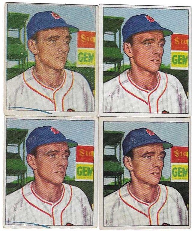 
Last edited by ALR-bishop; 05-11-2022 at 01:02 PM.
|
 |
|
|
 Similar Threads
|
||||
| Thread | Thread Starter | Forum | Replies | Last Post |
| 1966 Topps High # Print Variations | 4reals | Postwar Baseball Cards Forum (Pre-1980) | 9 | 04-27-2014 06:05 PM |
| Are these variations or print defects? | savedfrommyspokes | Postwar Baseball Cards Forum (Pre-1980) | 16 | 02-09-2013 11:52 AM |
| Well known print defects. Do variations exist without? | novakjr | Postwar Baseball Cards Forum (Pre-1980) | 9 | 01-28-2011 04:32 PM |
| Finally confirmed - d311 print variations exist! ("bluegrass" variations) | shammus | Net54baseball Vintage (WWII & Older) Baseball Cards & New Member Introductions | 8 | 09-03-2010 07:58 PM |
| Wanted: T206 Print Variations and Errors | Archive | Tobacco (T) cards, except T206 B/S/T | 1 | 01-04-2007 07:23 PM |


 Linear Mode

