|
||||||
 |
|
|||||
|
||||||
|
|
|||||
|
#101
 03-04-2010, 10:46 PM
|
||||
|
||||
|
A day without matzoh ball soup is like a day without sunshine.

|
|
#102
03-06-2010, 11:18 AM
|
||||
|
||||
|
Couldn't have said it better myself, David!
__________________
Check out my baseball artwork: www.graigkreindler.com www.twitter.com/graigkreindler www.facebook.com/graigkreindler
|
|
#103
03-29-2010, 01:04 PM
|
||||
|
||||
|
Hey guys,
I finally got these back from the photographers (it's about time). I'm at the point where I've been looking at these for so long, I just can't even tell how I feel about them anymore. I've been color correcting them a little bit in Photoshop the past hour, and I think what I have is pretty close to the reality of the darn things, though they could probably benefit from some more tweaking. Anywho, the first is based off of Conlon's famous photo of Joe Jackson from the Polo Grounds during the 1913 season. I felt like it was necessary to not keep the stands as blurry as Conlon's camera showed them to be, as that's the true sign of the painting being done from a photograph. So, what's there are the simple structures that appeared in the ballpark that year, most notably the front row (which at the time, was painted white, but would be replaced by white marble a few years later). The second is of Honus Wagner lacing one into the outfield against the Chicago Cubs at the West Side Grounds. I'm a bit unsure as to what the exact date is, but I know it's sometime during the 1909 season. This one also had some tough issues with the stands, as I found out that when the place was remodeled in 1908, the grandstand (along with most of the other features of the ballpark) was painted red. Using that color and making it sit back enough behind Wagner was NOT easy. I hope I succeeded. And last is the weird assignment, a scaled up version (5.5"x10") of the famous T206 Wagner card, specifically the SGC 40 that was brokered by Memory Lane last summer. There were a few tough things going on with this painting, one being the recreation of the moire pattern, which I could only suggest without driving myself absolutely bonkers. Also, trying to get that damn orange right also proved to be tough. After having the original card scanned, then sent to me, then printed out, you can imagine that there would be some color shifts in the whole process. And, now that you're all viewing it on different computer screens, it's probably still not right. But, hopefully the client is happy with how it looks in person!! So, any crits/problems/tomatoes/comments/suggestions are appreciated. Always!! Thanks, Graig 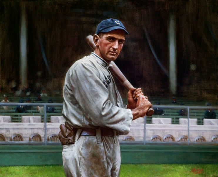 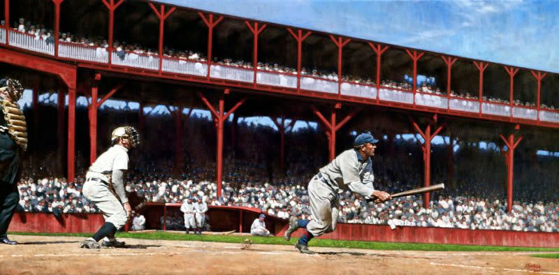 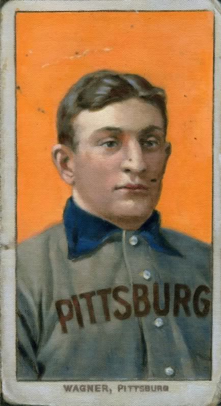
__________________
Check out my baseball artwork: www.graigkreindler.com www.twitter.com/graigkreindler www.facebook.com/graigkreindler
|
|
#104
03-29-2010, 02:01 PM
|
||||
|
||||
|
...as usual, Graig.
|
|
#105
03-29-2010, 02:20 PM
|
||||
|
||||
|
Graig,
Here goes: To me painting the baseball card is a waste of your incredible talents. It becomes even more obvious when you compare to the other two. I guess we all have our customers to satisfy. To each his own I guess. You did a very nice job though. The Wagner...I just can't imagine it looked any better on the day it happened. The color really makes these images come alive. They seem less like memories of bygone days and more like real events. The Jackson....Spectacular!!!!!!!! The glove and pants look like real leather and fabric, respectively. The hands are so lifelike. The intensity of the face is fantastic. It is just an amazing painting. Certainly close to the Mathewson. Pardon me a sec...I have to get a thesaurus so I don't keep repeating the same superlatives about your work. Mark
__________________
My signed 1934 Goudey set(in progress). https://flic.kr/s/aHsjFuyogy Other interests/sets/collectibles. https://www.flickr.com/photos/96571220@N08/albums My for sale or trade photobucket album https://flic.kr/s/aHsk7c1SRL
|
|
#106
03-29-2010, 11:16 PM
|
||||
|
||||
|
Thanks, David!!
Mark, I'm so glad you dig the first two, as I'm not as happy with these photographs as I normally am. But it's good to know they still look alright. Now, I just have to completely believe that! In regards to the Wagner piece, well it's interesting that you say that. It's definitely not something that I would ever really pick to paint. I mean, the card is iconic and all, but to me, just trying to replicate that is really boring (just don't tell that to the client). I would be MUCH more excited if I was trying to bring to life Horner's actual photo, even down to some colored background. I feel like it would be cool to try and paint Wagner (and the rest of them) in that kind of studio environment. Even though the north light that was probably used in them might not be incredibly exciting, it's still light. To me, that stuff gets completely lost in the card lithograph. Not that the lithograph is bad by any means, but I'm sure you understand. I think in the end though, you're right, it's not the kind of thing I would normally do. I'm still debating whether I'll even have it up on my website! Thanks so much for chiming in, I really appreciate it.
__________________
Check out my baseball artwork: www.graigkreindler.com www.twitter.com/graigkreindler www.facebook.com/graigkreindler
|
|
#107
03-31-2010, 11:16 AM
|
||||
|
||||
|
With that T206 Wagner commission?? Oh this would have made for SUCH a cool piece!
Paint Honus posing in the artist's studio for the portrait that was used to make the card. Now, while the original was a Horner cabinet (is that right?), wouldn't that be a fun piece, to re-create a scene where the T206 card was being painted, and Honus himself was sitting for the work in the studio? That way you could have taken license with the rest of his body and clothing as he sat there, as well as re-created what an artist's studio might have looked like at the time! It would be like taking a picture of the scene when the card was created. Well, maybe that's a little corny or folksy, but you could probably have some fun with that. could probably apply that concept to some other baseball scnes of the past century as well...might require some thought, though. excellent work, once again, by the way. and thank you again for continuing to share these and your thoughts with us...
__________________
www.thetriple-l.com
|
|
#108
03-31-2010, 11:24 AM
|
||||
|
||||
|
Jason,
I agree with you 199%. 1999% even. I actually brought that up to the client when he approached me, but he didn't seem interested. For whatever reason, I guess he had some money and just wanted to have somewhat of a companion piece to his friend's (who bought the SGC 4), as he couldn't afford the $925,000 for another one. But what you bring up is actually what I plan on doing. I really like the idea of doing the original photos used for cards, especially that Horner portrait. Painting the actual scene of Honus sitting there having his photo taken is MUCH more appealing than painting the card itself. I know that I'll also do a painting of the image used for the '52 Topps Mantle and treat it the same way. It's cool to take those iconic images and paint them as they were seen with human eyes, not through a camera, or on a card. Now, I just need to find the time to do all of this stuff!! Either way, thanks for the input, as well as the compliments. I'm just so glad that people don't yell at me for wasting space on the board! I'll keep posting as long as you will keep enjoying it. Which I hope you will. Graig
__________________
Check out my baseball artwork: www.graigkreindler.com www.twitter.com/graigkreindler www.facebook.com/graigkreindler
|
|
#109
03-31-2010, 09:50 PM
|
||||
|
||||
|
Quote:
|
|
#110
04-01-2010, 11:29 AM
|
||||
|
||||
|
Graig's work is exemplary and incredible, and he certainly isn't wasting space. Honestly tho, the comments about criticisms and I hope I'm doing the picture Justice do get a bit old.
I mean, I know there's being modest, but lets not get crazy. An Incredible talent is just that.
|
|
#112
04-01-2010, 12:44 PM
|
||||
|
||||
|
seriously though I think you are my official fave baseball painter. There are a few other good painters out there but yours seems to lack pretentiousness which seems to be quite a hard thing to accomplish. I can actually look real quick at one of your paintings and for a second make myself think its a real picture. Keep up the good work!
|
|
#113
04-01-2010, 02:52 PM
|
||||
|
||||
|
Thanks for those nice words, milkit1. I'm hoping to have some smaller things for sale in the future, though I just don't know when. I'm pretty backed up on commissions so there's not much time lately to do stuff for the inventory. Every now and then though, I'll start something small to have a nice break from whatever I'm painting, and can come back to it for a couple of hours every so often. And I promise, one day it will be a Hal Chase!
__________________
Check out my baseball artwork: www.graigkreindler.com www.twitter.com/graigkreindler www.facebook.com/graigkreindler
|
|
#115
04-02-2010, 09:56 AM
|
||||
|
||||
|
to depict him standing over by the bleachers, taking money from some gangster, with his glove sticking out his back pocket, and holding a bat on his shoulder with the other hand...
") or awaiting a throw at first from one of his infielders, deliberately standing a few inches off the bag, while several bills are seen poking out his back pocket... 
__________________
www.thetriple-l.com
|
|
#116
04-02-2010, 08:46 PM
|
||||
|
||||
|
Downright stupified. That Wagner batting absolutely jumps off the canvas. If Honus doesn't look 3D like he's ready to jump out of that picture, I'll eat my hat. You, sir, do phenominal work. If I had a place worthy of your artwork, you would most certainly be commisioned. Fantastic work. Thank you so much for sharing.
|
|
#118
04-08-2010, 12:38 PM
|
||||
|
||||
|
Hey guys,
Here's what's on the easel right now. And though it's not baseball, I thought y'all might dig it anyways. It's still in progress, and at 40" x 56", there's been a lot of surface area to work with. 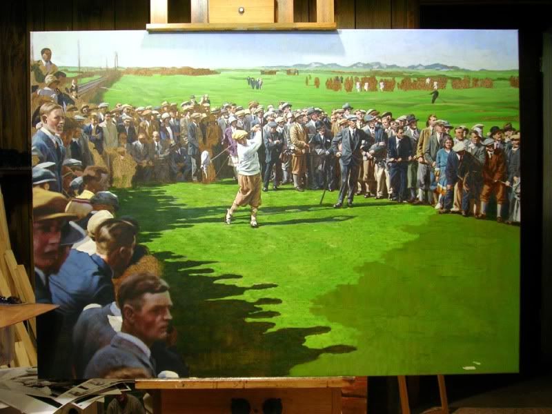 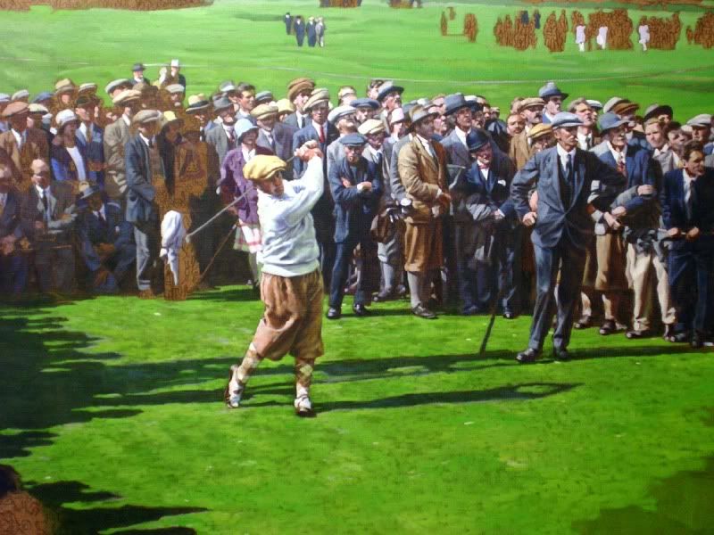 The scene depicts Bobby Jones teeing off at the 17th hole at St. Andrews during the 1927 British Open. To his left (also in front of the crowd) is his partner Mark Seymour. As he did the year prior, Jones would go on to win the British championship that day (July 16) with a total of 285. It was commissioned by Golf Links to the Past, a store at the Lodge at Pebble Beach, where the Open will be in a little over two months. It's been a bit of a challenge, since they're so many figures for one, and, I've never done a golf painting before. And of course, there's a pretty strict deadline on the painting, and I only have a few more weeks to finish it. Also, I don't know if any of you guys are on Facebook or anything, but as a bit of shameless promotion, become a fan of me!! That is, if you actually are. http://www.facebook.com/pages/Graig-...0599933?ref=ts Thanks everyone! Graig
__________________
Check out my baseball artwork: www.graigkreindler.com www.twitter.com/graigkreindler www.facebook.com/graigkreindler
|
|
#119
04-08-2010, 12:45 PM
|
||||
|
||||
|
Quote:
__________________
[I]"When you photograph people in colour you photograph their clothes. But when you photograph people in B&W, you photograph their souls." ~Ted Grant Www.weingartensvintage.com https://www.facebook.com/WeingartensVintage http://www.psacard.com/Articles/Arti...ben-weingarten ALWAYS BUYING BABE RUTH RED SOX TYPE 1 PHOTOGRAPHS--->To add to my collection
|
|
#120
04-10-2010, 10:23 AM
|
|||
|
|||
|
Quote:
http://bid.robertedwardauctions.com/...x?itemid=14429
|
|
#121
04-13-2010, 09:06 PM
|
||||
|
||||
|
Graig, terrific work! If (and I just may!) I printed a color picture of the scans u've put up in this thread, they'd look better than any other sports photo or card that i own! Especially the matty, jackson, and wagner batter. They are truly amazing!
Keep the scans coming, very enjoyable! Rob 
|
|
#122
04-13-2010, 11:15 PM
|
||||
|
||||
|
Thanks for the compliments, Rob! I'm glad you're enjoying the work!! Now, if I can only get the paintings to rise in price like the original cards of the guys you just mentioned.
__________________
Check out my baseball artwork: www.graigkreindler.com www.twitter.com/graigkreindler www.facebook.com/graigkreindler
|
|
#123
04-27-2010, 06:24 PM
|
||||
|
||||
|
Hey all,
I've been working on this Gehrig piece a bit, and it's almost there. The surface is a little bit smoother than I normally like, so the paint is handling itself a little differently than what I'm used to, but I think I'm starting to pull it out. 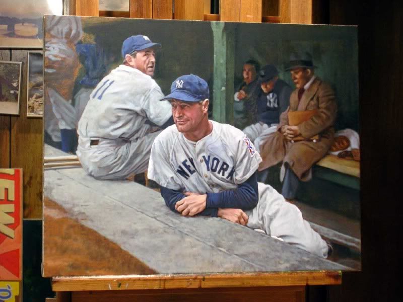  I'm starting to think that a whole series on Gehrig's day at Briggs might be just as powerful as one from his farewell day. Actually, I'm sure I'll end up doing all of them anyways. That is, when I get the time. I'll be getting the Bobby Jones painting professionally shot later this week, so I'm hoping to have that posted soon as well. From then on, more commissions, including some for fellow board members. Hope y'all dig! Graig
__________________
Check out my baseball artwork: www.graigkreindler.com www.twitter.com/graigkreindler www.facebook.com/graigkreindler
|
|
#124
04-27-2010, 06:28 PM
|
||||
|
||||
|
Quote:
WOW dude....this is going to be a good one....
__________________
[I]"When you photograph people in colour you photograph their clothes. But when you photograph people in B&W, you photograph their souls." ~Ted Grant Www.weingartensvintage.com https://www.facebook.com/WeingartensVintage http://www.psacard.com/Articles/Arti...ben-weingarten ALWAYS BUYING BABE RUTH RED SOX TYPE 1 PHOTOGRAPHS--->To add to my collection
|
|
#125
04-28-2010, 12:07 PM
|
|||
|
|||
|
I am in awe every time I check this thread out.
I know the web can't possibly do these justice, and I can't even imagine how impressive these must be seeing them in person. Please keep sharing your work here. It is truly appreciated. Thank you.
|
|
#126
04-28-2010, 12:45 PM
|
||||
|
||||
|
Your work is amazing. As one poster said previously, it looks like I could crawl into the painting with the subject.
|
|
#127
04-28-2010, 10:25 PM
|
||||
|
||||
|
Thanks for the wonderful compliments, guys. I'll certainly keep posting, as long as you keep enjoying, or something...
The below painting is one that I started last summer, and abandoned for some time to make room for other projects. It depicts Bob Feller moments after throwing a one-hitter (the seventh of his career - tying Addie Joss) against Boston on July 31, 1946. He's seen shaking the hand of first-sacker Heinz Becker, as they're approached by catcher Jim Hegan. The game took place in old League Park, which has been an absolute b*tch to research!! Anywho, the photographs really suck, so pardon their quality. There was a little tilt in the canvas, so that I wasn't contending with any hot-spots. Either way, I hope y'all dig it!! And of course, any critiques are more than welcome. Graig 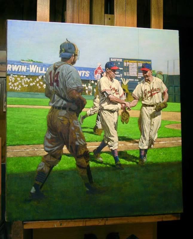 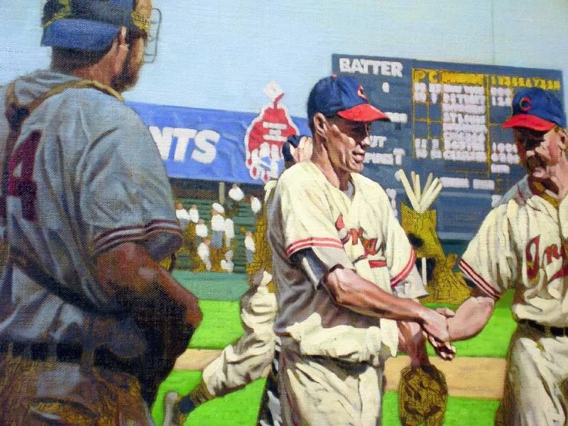
__________________
Check out my baseball artwork: www.graigkreindler.com www.twitter.com/graigkreindler www.facebook.com/graigkreindler
|
|
#128
05-07-2010, 05:28 PM
|
|||
|
|||
|
It's funny that the last post mentions Addie Joss because I think the famous panoramic of the Joss benefit game would make an incredible painting (though it would be an ENORMOUS amount of work). But it's got everything--the crazy cast of characters (Young, Jackson, Johnson, Baker, Cobb, etc.), the great expressions, dirty uniforms, and the super-funky warping of perspective that came from how they shot panoramics (in a semicircle around the rotating camera). Plus I'd love to see the image in color...
http://sports.ha.com/common/view_ite...3&Lot_No=19707 Can't think of anyone who could do more justice to it than you either, Greg. Fantastic work!
__________________
Thank you, Jonathan Scheier Cataloger - Consignment Director Heritage Auctions (www.HA.com) JonathanS@HA.com 1-800-872-6467 X1314 Consign to auction at http://sports.ha.com/consign Connect with Heritage at http://sports.HA.com/Connect
|
|
#129
05-07-2010, 05:29 PM
|
|||
|
|||
|
Sorry, I meant Graig! Spelling was never my strong suit...
__________________
Thank you, Jonathan Scheier Cataloger - Consignment Director Heritage Auctions (www.HA.com) JonathanS@HA.com 1-800-872-6467 X1314 Consign to auction at http://sports.ha.com/consign Connect with Heritage at http://sports.HA.com/Connect
|
|
#130
05-07-2010, 05:57 PM
|
||||
|
||||
|
Jonathan,
WOW! I agree that would make an awesome painting. Graig would probably just have to take a couple of months off from work to do it. No sweat  Damn it would be sweet though. Mark
__________________
My signed 1934 Goudey set(in progress). https://flic.kr/s/aHsjFuyogy Other interests/sets/collectibles. https://www.flickr.com/photos/96571220@N08/albums My for sale or trade photobucket album https://flic.kr/s/aHsk7c1SRL
|
|
#131
05-07-2010, 11:31 PM
|
||||
|
||||
|
No worries on the spelling, Jonathan!
That photo is killer. I can't even imagine what it would have to translate to when it would make its way to a canvas. With those dimensions, putting it to a vertical size I would like, the final proportions would be somewhere in the 30"x154" range. That's one big wall. But in all seriousness, it would be a pretty darn cool image to attempt. The amount of information in the stands and all is just as amazing as the characters on the field. I've always loved how Cobb looked in that borrowed Cleveland uniform, too. They're some other really nice photos of this day, including a team shot of the All-Stars, and some action stuff from the game. The latter pieces I've seen in an old Hunt Auction if I remember correctly. I'd love to get my hands on hi-res scans of those!!
__________________
Check out my baseball artwork: www.graigkreindler.com www.twitter.com/graigkreindler www.facebook.com/graigkreindler
|
|
#132
05-17-2010, 10:09 AM
|
||||
|
||||
|
Hey guys,
I'll have some work to post later today if all goes according to plan with the mail, but in the meantime, check this out if you're interested: http://www.youtube.com/watch?v=njurj5OcQgM And 'yes', I am that short. Ben, Jimmy, and Todd can vouch. Graig
__________________
Check out my baseball artwork: www.graigkreindler.com www.twitter.com/graigkreindler www.facebook.com/graigkreindler
|
|
#134
05-17-2010, 10:27 AM
|
||||
|
||||
|
Dude,
That was awesome. After so many emails, posts, etc it's nice to hear the voice behind it. Next up the "Kreindler Method of Painting". Think Bob Ross with happy little fans. Mark
__________________
My signed 1934 Goudey set(in progress). https://flic.kr/s/aHsjFuyogy Other interests/sets/collectibles. https://www.flickr.com/photos/96571220@N08/albums My for sale or trade photobucket album https://flic.kr/s/aHsk7c1SRL
|
|
#135
05-17-2010, 11:13 AM
|
||||
|
||||
|
Quote:
Great YouTube interview! Thanks for providing the link for us to check out... I noticed that your Ernie Banks painting graces the current cover of the SCD. Nice!!
|
|
#136
05-17-2010, 03:51 PM
|
||||
|
||||
|
Thanks for the kind words, guys! What's weird is that my voice was a little deeper in this video than in real life, and I guess they didn't air all of my self-deprecating comments. Which is probably a good thing. Reality television has yet to rear its ugly head into the studio.
And god help us all if they provide me with a forum to teach painting. I suppose I could include 'happy little pinstripes', 'friendly little Gem Razor Blade signs', and 'naughty little Conlons'...or something...how many people would actually watch it, though? By the way, how do the paintings look in SCD? A fellow board member told me about the issue a few days ago, and I didn't have any idea that T.S. O'Connell was using them - not that mind!
__________________
Check out my baseball artwork: www.graigkreindler.com www.twitter.com/graigkreindler www.facebook.com/graigkreindler
|
|
#138
05-17-2010, 09:00 PM
|
||||
|
||||
|
Thanks, Sean!!
Here's that darn Bobby Jones painting that took forever. Here hes teeing off at the 17th on the Old Course at St. Andrews. The date is July 16, 1927, and it's the final round of the British Open, which he would ultimately win with a score of 285. 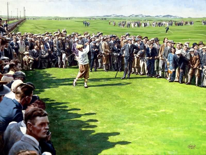 It was a commission for Golf Links of the Past (http://www.golfspast.com/), as they will have it on display when the PGA starts at Pebble Beach in a couple of weeks. I would imagine that they're going to gouge the price, but I guess that's what happens in the gallery market. Anywho, hope you guys dig it! Graig
__________________
Check out my baseball artwork: www.graigkreindler.com www.twitter.com/graigkreindler www.facebook.com/graigkreindler
|
|
#139
05-17-2010, 10:24 PM
|
||||
|
||||
|
Graig, your representations of light are just amazing.
(You wouldn't be channeling Rembrandt just a bit, would you?)
|
|
#140
05-17-2010, 10:47 PM
|
||||
|
||||
|
Quote:
|
|
#141
05-17-2010, 11:27 PM
|
||||
|
||||
|
Thanks so much, David. That's really the most important thing to me (well, that and the research). I just want these paintings to have breathable air and real light. Rembrandt was certainly a master of that, and I definitely put him on a high pedestal.
And Jimmy, as per usual, you're too kind. You are talking about bowel movements, right?
__________________
Check out my baseball artwork: www.graigkreindler.com www.twitter.com/graigkreindler www.facebook.com/graigkreindler Last edited by GKreindler; 05-17-2010 at 11:30 PM.
|
|
#142
05-17-2010, 11:37 PM
|
||||
|
||||
|
Quote:

|
|
#143
05-18-2010, 07:44 AM
|
||||
|
||||
|
Jimmy,
Now thats a really crappy comment. Graig, I have to agree with Jimmy. You have posted so many incredible things, I feel like I'm repeating myself every time I compliment your work. Your stuff is just incredible. Mark
__________________
My signed 1934 Goudey set(in progress). https://flic.kr/s/aHsjFuyogy Other interests/sets/collectibles. https://www.flickr.com/photos/96571220@N08/albums My for sale or trade photobucket album https://flic.kr/s/aHsk7c1SRL Last edited by Lordstan; 05-18-2010 at 08:01 AM.
|
|
#145
05-18-2010, 08:20 AM
|
||||
|
||||
|
Quote:
|
|
#146
05-18-2010, 08:34 AM
|
||||
|
||||
|
Graig, what the heck is that guy doing in the upper right at close to a 45 degree angle?? Unrealistic...YOU SUCK!
Your friend, Ben PS: THE SHADOWS ARE TOO REAL!
__________________
[I]"When you photograph people in colour you photograph their clothes. But when you photograph people in B&W, you photograph their souls." ~Ted Grant Www.weingartensvintage.com https://www.facebook.com/WeingartensVintage http://www.psacard.com/Articles/Arti...ben-weingarten ALWAYS BUYING BABE RUTH RED SOX TYPE 1 PHOTOGRAPHS--->To add to my collection
|
|
#147
05-18-2010, 09:08 AM
|
||||
|
||||
|
Graig,
Here is question I wonder about. How to you choose your skin tones? What I mean is that for many of the early players there are no true color pictures to reference. For instance, I can't remember seeing a whole lot of color pics of Gehrig. I think I've seen some of Cobb, Ruth, and Wagner, usually as very old men. Perhaps there is something in the black and white shading that tips you off? Another idea is that you use the colorized cards and pictures as a base. Or do you just keep them sort of neutral skin tone with light and shadow control doing the rest? Just wondering. I just love this thread. Such beautiful things to appreciate. Scott, I get your meaning. I think, beside just talent alone, it's Graig's humbleness about his talent that really set him apart. Praise is a good thing, especially when deserved. Just promise me, Graig, that when you become a rich and famous painter, that you'll still talk to us non creative types.  "We're not worthy!" "We're not worthy!"Mark
__________________
My signed 1934 Goudey set(in progress). https://flic.kr/s/aHsjFuyogy Other interests/sets/collectibles. https://www.flickr.com/photos/96571220@N08/albums My for sale or trade photobucket album https://flic.kr/s/aHsk7c1SRL
|
|
#148
05-18-2010, 02:38 PM
|
||||
|
||||
|
Thanks for all of the wonderful comments, guys (except from you Ben, I hate you ;p ). I honestly do appreciate all of the encouraging things you all say, and I never really get sick of it. I mean, I will admit, it always feels a little weird when someone likes what I do (especially for an artist who deep down thinks he's a fraud), but it's the stuff like that that keeps us creative types from slacking. Or at least, I think it does. There's always been a big perfectionist in me that just needs these paintings to be perfect every time. And in my eyes, they never are. I guess that's why I keep pushing myself. I imagine it's something I'll go through the rest of my life. I guess that's why I freak out so much about the color of a button, an advertisement, a weather forecast, and all of the other intangible stuff. If the viewer enjoys the painting and it brings back great memories, then that's a good thing. But if I can bring them back and really make them feel what's going on in the painting - the sun shining, the crack of the bat, the chatter of the stadium crowd, etc. - then that's just gold.
Now Mark, you raise a good question. There's a lot that goes into it, from both an artistic side and a historical side. The latter is where I start. There have been some color photos/film of those old guys, usually dating back to the late 1930s. It's definitely few and far between, but it's super important. Combine that with a lot of book reading and hypothesizing, I'm able to come up with my base color. Now, that will always vary. Joe DiMaggio had an olive skin tone, while I've read some accounts that Gehrig would sometimes appear to be as dark as an African American. Someone like Red Rolfe would have fairer, pale skin to match his hair. Babe Ruth had a pretty normal, borderline tan complexion throughout his playing career, but when he retired and started playing golf regularly, his skin was almost milk chocolaty. I've actually made a list of player's attributes, stuff that I may have learned from books, seen in films, or have even read on driver's licenses. So, whenever I find something like a hair color, eye color or skin tone reference, it always finds its way into my reference. It's the kind of stuff that's really trivial and means nothing to most, but to me, it's gold! Then artistically, it comes down to knowing that certain areas of a face will have certain variations that are common in most, like having the cheek and nose area be a little deeper and rosier in color, while the chin and jawline become rather neutral as they turn in space. If you notice, people with really dark hair sometimes have stubble that comes in very dark and can sometimes seem to make their jaw almost blue. Sandy Koufax was definitely like that. More important than all of that though comes down to light. Light is what really shapes everything around us, why things look the way they do. You might notice that bright light shining on someone's face will create a larger difference between light planes and dark planes. The shadows will be more crisp, and will contain more reflected light bouncing into them. And depending on whether the sky is completely clear or not, that will affect the modulation of color temperature.a On a completely overcast day, you'll have deeper, earthier tones. Usually shadows will be warmer in temperature, while light planes will usually be cooler, as they're going to reflect a lot of the tones in the sky. You can see that sort of stuff in the Mathewson painting I did, especially in the nose, cheek, and forehead areas. You'll also notice that the separation between light and shade is much less dramatic than when the subject is in direct sunlight, so the shadows will have more of a 'fuzzy' look to them. ... I just realized that this stuff might sound like Greek. But hopefully some of it makes sense. Honestly, there's no set formula for any of this stuff, whether it's a skin tone, a sky color, or edge quality of a form, it all comes from observing real life. Then the hard part is taking all of that knowledge and observation and trying to make something look 3-dimensional on a 2-dimensional surface. Phew!! I'm done. Sorry for the rant. Oh, and don't worry, I don't think I'll ever be rich or famous. Either way, you guys are the people I love talking to. It's just wonderful that there's a forum for people to converse about such passions. One of mine is matzoh ball soup - I don't talk much about that here. But the other is baseball.
__________________
Check out my baseball artwork: www.graigkreindler.com www.twitter.com/graigkreindler www.facebook.com/graigkreindler Last edited by GKreindler; 05-18-2010 at 10:14 PM.
|
|
#149
05-18-2010, 02:51 PM
|
||||
|
||||
|
Wow. Just reading that Graig makes me realize that how little I know about painting. Amazing to hear your descriptions of shadows and facial toning as it relates to the weather. So much goes into your work that I can't even imagine it. No wonder they all look so realistic and as if they could walk right off the canvas. You have an amazing gift and talent! Thank you so much for letting us have a glimse into your world!
|
|
#150
05-18-2010, 02:57 PM
|
||||
|
||||
|
Here we go....fishing for more compliments......HATE is such a weak word.
Quote:
__________________
[I]"When you photograph people in colour you photograph their clothes. But when you photograph people in B&W, you photograph their souls." ~Ted Grant Www.weingartensvintage.com https://www.facebook.com/WeingartensVintage http://www.psacard.com/Articles/Arti...ben-weingarten ALWAYS BUYING BABE RUTH RED SOX TYPE 1 PHOTOGRAPHS--->To add to my collection Last edited by Forever Young; 05-18-2010 at 04:53 PM.
|
 |
| Thread Tools | |
| Display Modes | |
|
|
 Similar Threads
|
||||
| Thread | Thread Starter | Forum | Replies | Last Post |
| 68 Topps 3D Easel | Archive | Postwar Baseball Cards Forum (Pre-1980) | 1 | 04-22-2008 03:17 PM |


 Linear Mode

