|
||||||
 |
|
|||||
|
||||||
|
|
|||||
|
#3
 07-26-2004, 07:15 PM
|
|||
|
|||
|
Posted By: Raymond
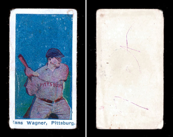
These are 1910 E98 cards. Wagner has a card in the set. Looks like they come with different color backgrounds. 
|
|
#4
07-26-2004, 07:25 PM
|
|||
|
|||
|
Posted By: brian p
This "card" is definitely not an E98--I have never seen any Wagner card with this batting pose before. It almost looks like one of those very realistic fantasy creations that an ebay seller was offering a few months back.
|
|
#8
07-26-2004, 09:07 PM
|
|||
|
|||
|
Posted By: Ryan Christoff
Is it just me, or is there something weird about that font? I can't say for sure, but when you see enough vintage paper items, you tend to notice certain little things that don't seem to match the time period. I don't think I've ever seen a font from that time period that looked like that.
|
|
#10
07-26-2004, 09:50 PM
|
|||
|
|||
|
Posted By: leon
This is one of those I would like to see in person. So far I have not been fooled, in the last few years, by a fake. The scan makes the back look a little white? hmmm.......
|
|
#11
07-26-2004, 09:54 PM
|
|||
|
|||
|
Posted By: petecld
Here's a resized image of what Tim S. sent me.
|
|
#13
07-26-2004, 10:29 PM
|
|||
|
|||
|
Posted By: Harry
It was also blank backed, had bright colors and the same font. I do not remember who the card pictured. The owner (Ron Vidro?) did not know what it was. I went back later in the show to look at it again and he said that he had sold it to another dealer.
|
|
#14
07-26-2004, 11:30 PM
|
|||
|
|||
|
Posted By: Paul
I find it odd that the caption extends left to right beyond the picture. I've never seen a card like that. The period at the end of "Pittsburg" is also unusual, as is the full spelling of the city's name. I'm with the rest of you, it doesn't look right.
|
|
#17
07-27-2004, 06:20 AM
|
|||
|
|||
|
Posted By: Gary B.
This card is actually Barbara Streisand's 1977 album "Superman" VERY cleverly disguised to look like a vintage Honus Wagner card.
|
|
#18
07-27-2004, 07:27 AM
|
|||
|
|||
|
Posted By: Dennis
Hi gang. I've just recently began posting here after lurking for many months. I hope I can help others just a fraction as much as this board has helped me. I'm certainly no expert but I do have some knowledge of paper/cardboard characteristics. My passion is for the t205s. They are truly works of art. I, also, think you'll find that I'm pretty outspoken.
|
|
#19
07-27-2004, 09:22 AM
|
|||
|
|||
|
Posted By: leon
Hey Folks,
|
|
#20
07-27-2004, 11:16 AM
|
|||
|
|||
|
Posted By: hankron
An in person examination, in particular a microsocopic examination of the printing/ink, would more than likely determine the card's authenticity/age.
|
|
#21
07-27-2004, 01:58 PM
|
|||
|
|||
|
Posted By: Wesley
Here are Mastro's changes to the description:
|
|
#22
07-27-2004, 07:31 PM
|
|||
|
|||
|
Posted By: Dennis
As I said in my earlier post I'm somewhat outspoken. I also respect and give kudos to the knowledgeable folks on this board. You guys (and girls) have helped me immensely in the past without you ever knowing it. Thank you.
|
|
#24
07-27-2004, 08:01 PM
|
|||
|
|||
|
Posted By: Dennis
Your card is similiar to the Wagner card but with some striking differences. Yours has a black border (off centered) around the red background. Your font is different and appears to be black. There is no "hair" around the the edges and corners. Your border is not lilly white. There is no two-tone background on yours. The Mccormick image is nicely placed within the red background even though there is a lot of red. etc...
|
|
#27
07-27-2004, 11:14 PM
|
|||
|
|||
|
Posted By: bcornell
Art's card looks very similar to Wagner, at least to my eyes... The Mastro Wagner scans are very bright, but the font type and its color look the same. Not sure that that makes them "real", but Leon's point about "computer blah blah" is a good one - if the card was acquired by Egan in the 70's or earlier, it was before anyone had an easy means of faking things.
|
|
#28
07-29-2004, 12:12 PM
|
|||
|
|||
|
Posted By: warshawlaw
is that this card is butt-ugly. I don't know if it is real (I have my doubts, but hey, I've seen other -unc cards before), but I've definitely seen better looking strip cards.
|
|
#29
07-29-2004, 12:50 PM
|
|||
|
|||
|
Posted By: Gary B.
Can a genuine (if it is) Honus Wagner card from the 1910's really be ugly? Realistically, some issues are nicer or much nicer looking than others, but speaking as someone who doesn't yet own a period Honus Wagner card, if I owned this care, i would think it was beautiful.
|
|
#31
07-30-2004, 12:43 AM
|
|||
|
|||
|
Posted By: hankron
As long as its been green, US paper currency have been engravings-- a centries old printing process involving the graphics literally carved into metal printing plates. Current and past advanced forgeries have made made with the same engraving process. Highest quality engraving, such as to make a dollar bill, is both technically difficult, time consuming and an art. Rembrandt was an example of a master engraver.
|
 |
| Thread Tools | |
| Display Modes | |
|
|
 Similar Threads
|
||||
| Thread | Thread Starter | Forum | Replies | Last Post |
| Alright....what are your collecting goals now? | Archive | Net54baseball Vintage (WWII & Older) Baseball Cards & New Member Introductions | 29 | 12-04-2008 05:47 AM |
| Alright! Who's the culprit this time? | Archive | Net54baseball Vintage (WWII & Older) Baseball Cards & New Member Introductions | 21 | 09-02-2007 09:00 PM |
| The Sum of Our Collective Knowledge | Archive | Net54baseball Vintage (WWII & Older) Baseball Cards & New Member Introductions | 43 | 04-15-2007 07:36 AM |
| Help for the Caramel Knowledge Challenged | Archive | Net54baseball Vintage (WWII & Older) Baseball Cards & New Member Introductions | 13 | 01-24-2006 10:22 PM |
| Help you "E" card studs! What is this? E-104-??? | Archive | Net54baseball Vintage (WWII & Older) Baseball Cards & New Member Introductions | 10 | 06-26-2004 12:23 AM |


 Linear Mode

