|
||||||
 |
|
|||||
|
||||||
|
|
|||||
|
|
|
#1
 05-17-2018, 09:53 AM
|
|||
|
|||
|
I would always defer to you expertise on printing issues, Steve. I collect recurring differences in cards whether they are print defects or intended differences.
The latter would be my definition of a "variation" as opposed to a variant. But I include in my personal definition of a variation both changes specifically intended ( like the 59 traded or optioned cards) and changes not specifically intended but resulting from intentional changes in the printing process itself, such as the Mantle and numerous other DP differences, or stock changes, or the 62 green tints. I assume the printers in 56 did not intend the colored line differences, but what did they do that resulted in them, in particular the several different ones that exist for the Williams card 
|
|
#2
05-18-2018, 10:26 PM
|
|||
|
|||
|
The overall process would lead to them, especially in a place that was focused on production over quality.
The color strips on the 56s could come from a couple things. One would be the original pasteup, which I believe Topps did in blocks or strips. So there would be a bit of original art (Using art pretty loosely, whatever you're making a plate of is the "art" even if it's text. ) The team boxes and the name/position box would be glued onto the pictures used for that block. If it's done a bit sloppy the picture shows over the box. Then when you photo the art for color separations, it becomes part of the negative. More likely, it happened while making the raw negatives into the masks - large plate sized opaque paper with an assortment of negatives taped on making one large negative the plate is exposed from. That would probably have had the art for the images initially just as pictures, one plate for each color CMYK at a minimum. The area where the team and name boxes were to go would have probably been blocked off by the mask paper. The Williams strips show some small cropping differences on the image that are consistent with the sort of stripe. The blocks with the information would have been photographed all at once, and small negatives cut out. Then those would be put onto the mask. The easy way is to make a small mask, which will make a non- printed area around the block. Then cut a hole in the negative and tape the small mask with the block into place. But only on the mask for that color or colors. If that small mask was added higher or lower a small bit of the underlying picture would show around the edge. On one, what was left showing was a thin line of blue. On the others, one got a thick line of yellow and Magenta, while the other got all the colors also in a thick line. I believe the different lines aren't different press runs, but are different individual instances on the plate. They would be consistent as long as the same mask was used, even if more than one set of plates was made. None of that would be intentional, just sloppy work. So very similar to the differences on the 52 Mantle. Interestingly, the numbers for the different versions are located slightly differently in relation to the laces. That would probably be from the laces and number being added to the mask individually. That's a good deal of extra work compared to having the number on the original art. It's hard to see a reason to make one left laces and one right, but it was done on all three doubleprints, so maybe it was intentional. A number of 1981 Fleer were done sloppily so the tape holding the negative to the mask shows in the picture. I haven't seen any corrected ones.
|
|
#3
05-18-2018, 11:17 PM
|
||||
|
||||
|
The presence of tape is very prevalent in the 1962 set. Many of the regular cards and green tints have it (although none of the corresponding GT's and regulars have matching tape appearances). On Santo, it is blatantly there in both of the upper corners...
1962santotape.jpg
__________________
All the cool kids love my YouTube Channel:
Elm's Adventures in Cardboard Land  https://www.youtube.com/@TheJollyElm Looking to trade? Here's my bucket: https://www.flickr.com/photos/152396...57685904801706 I was such a dangerous hitter I even got intentional walks during batting practice. Casey Stengel Spelling "Yastrzemski" correctly without needing to look it up since the 1980s. Overpaying yesterday is simply underpaying tomorrow. 
|
|
#4
05-19-2018, 07:09 AM
|
|||
|
|||
|
Steve-- thanks for the tutorial. I always appreciate your insights. However to me that still makes them recurring print defects of a sort
Darren- I had not noticed that one.
|
|
#6
05-19-2018, 09:53 AM
|
||||
|
||||
|
Quote:
https://sports.ha.com/itm/baseball-c...a/7135-81674.s
|
|
#7
05-20-2018, 12:33 AM
|
||||
|
||||
|
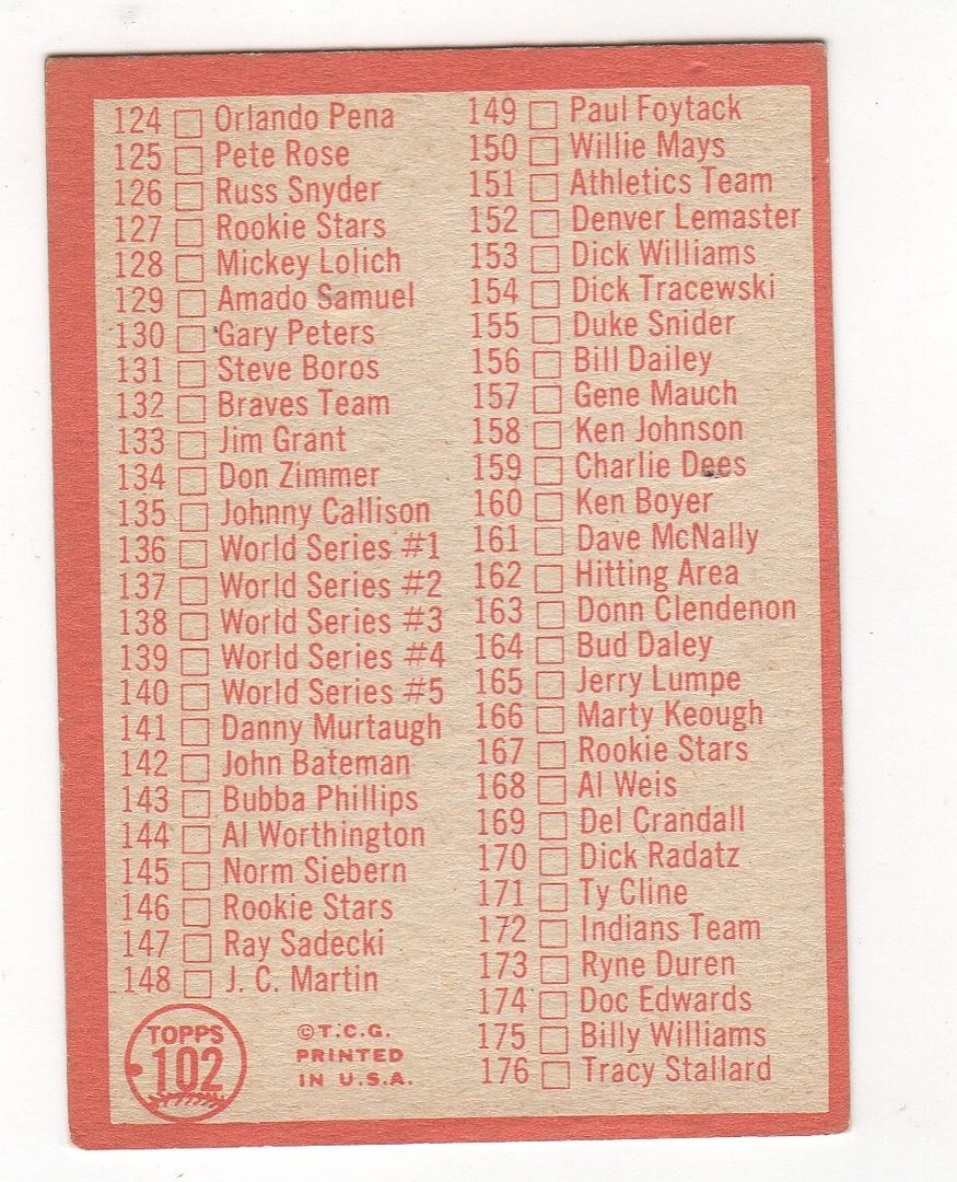
With the 1964 #102 Checklist, the easiest way to immediately see the different versions is to look at the player's mitt near his wrist. As you can see in Sliphorn's pics, one has a fully brown mitt and the other has a strip of the brown missing there. There seems to be an equal number of each version out there, so it definitely fits in with the 'printed in different series' scenario...or they were possibly both printed at the same time on the same sheet in the same series.
__________________
All the cool kids love my YouTube Channel:
Elm's Adventures in Cardboard Land https://www.youtube.com/@TheJollyElm Looking to trade? Here's my bucket: https://www.flickr.com/photos/152396...57685904801706 I was such a dangerous hitter I even got intentional walks during batting practice. Casey Stengel Spelling "Yastrzemski" correctly without needing to look it up since the 1980s. Overpaying yesterday is simply underpaying tomorrow.
|
|
#8
05-19-2018, 09:54 AM
|
|||
|
|||
|
Thomas---can not remember if it was here or somewhere else that is was pointed out that this card has a recurring red dot defect on the back in the number. My red dot version seems to have more spacing on the front. Do you know if those differences coincide ?
Last edited by ALR-bishop; 05-19-2018 at 09:55 AM.
|
|
#11
05-19-2018, 08:47 PM
|
|||
|
|||
|
Quote:
But the bottom of "ies" in series is different, so still a different card.
|
|
#13
05-19-2018, 08:46 PM
|
|||
|
|||
|
Quote:
I'd say we should try for a common set of terms, but I know that getting even common agreement among collectors would be almost impossible.
|
 |
| Thread Tools | |
| Display Modes | |
|
|
 Similar Threads
|
||||
| Thread | Thread Starter | Forum | Replies | Last Post |
| 1966 Topps High # Print Variations | 4reals | Postwar Baseball Cards Forum (Pre-1980) | 9 | 04-27-2014 06:05 PM |
| Are these variations or print defects? | savedfrommyspokes | Postwar Baseball Cards Forum (Pre-1980) | 16 | 02-09-2013 11:52 AM |
| Well known print defects. Do variations exist without? | novakjr | Postwar Baseball Cards Forum (Pre-1980) | 9 | 01-28-2011 04:32 PM |
| Finally confirmed - d311 print variations exist! ("bluegrass" variations) | shammus | Net54baseball Vintage (WWII & Older) Baseball Cards & New Member Introductions | 8 | 09-03-2010 07:58 PM |
| Wanted: T206 Print Variations and Errors | Archive | Tobacco (T) cards, except T206 B/S/T | 1 | 01-04-2007 07:23 PM |


 Hybrid Mode
