|
||||||
 |
|
|||||
|
||||||
|
|
|||||
|
|
|
#1
 12-01-2015, 07:30 PM
|
|||
|
|||
|
?

|
|
#2
12-02-2015, 08:49 AM
|
|||
|
|||
|
Variation - a card that was originally designed to look one way; but the designer of the card changed something and then reprinted it. For example the text on the back of the Page/Sain cards - clearly, intentionally changed by the designer.
Print Errors - registry color shifts, miscut cards, missing colors, extra colors, etc. The thread about the opening of the 1955 Cello pack on the main board shows a print error. The Clemente has a black printing line on the lower right portion of the card. That was not intended by the designed of the card. It resulted from poor printing techniques. It is possible it has been replicated (on this card or another one), but this was not the intent of the manufacturer for the card to look this way. The pack also shows tons of miscut cards. This leads to the Bakep/Herrer cards. These could go either way depending on when the correction was made. For example, it could be the case that the very first card from the very first print run was missing the r/a, and the manufacturer noticed this and corrected it. Or it could be that there was a goof in the printing process somewhere along the lines and this is nothing more than a recurring print error. I tend to think it is the latter - because you have so many gradual variations. But short of knowing when the card came off the line, I'm not sure you can say conclusively. On the flip side, I think one can draw definitive conclusions about the yellow tiger. Even though there are some variations in the amount of orange, you do see that the only color that changes relates to the logo - suggesting a goof that has been corrected. And when you add this to the fact that the grey backs also have the same variation (yellow and orange exist - there is no proof that any in between exist) it is suggestive that there was a conscious change of some sort. (This also suggests that the grey back paper was mixed in a stack with the white back paper, and that the greys were not just printed once by accident - but rather resulted from someone mixing a stack of different paper into the same print run. To my mind, this totally debunks the silly notion that the 52 grey backs are Canadian issues. That only gained credence because some uneducated dealer noticed the similarity with the 54 Canadians and thought they were the same thing. The fact that you have the same error and correction on the card shows that this was all printed at the same place, at the same time). Cheers, Patrick
|
|
#3
12-02-2015, 09:02 AM
|
|||
|
|||
|
On the flip side, I think one can draw definitive conclusions about the yellow tiger. Even though there are some variations in the amount of orange, you do see that the only color that changes relates to the logo - suggesting a goof that has been corrected. And when you add this to the fact that the grey backs also have the same variation (yellow and orange exist - there is no proof that any in between exist) it is suggestive that there was a conscious change of some sort
COME ON PATRICK You can clearly see from a mile away there is red missing on House's throat, making a green streak! Upon closer inspection it will reveal it is most missing the red ink in a splotch pattern. 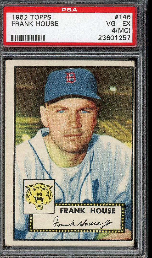 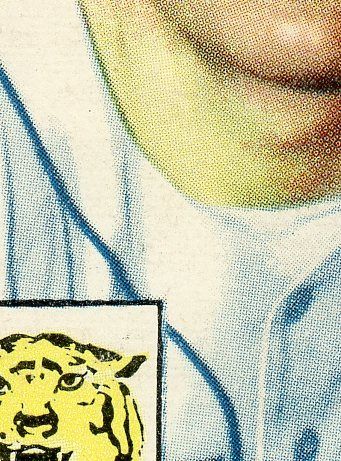
__________________
"Trolling Ebay right now" © Always looking for signed 1952 topps as well as variations and errors Last edited by Republicaninmass; 12-02-2015 at 09:04 AM.
|
|
#4
12-02-2015, 10:32 AM
|
|||
|
|||
|
Good point Ted. But the hat clearly has the full red on it.
So whether the change is defined as the logo or some area larger than the logo, the printer clearly did not like the look of the card, and took a step to correct it. Thus this is a variation, not print error. Cheers, Patrick
|
|
#5
12-02-2015, 10:47 AM
|
|||
|
|||
|
Great post Patrick. Agree with you for the most part. Your paragraph on the gray area is the key. Any print not a registration error could be a variation if it was an early defect that was noticed and corrected. Most are likely just a temporary recurring print defects. But in most cases we will never know.
Another gray area for me is double prints and second print runs. In many double prints there are cropping or other front or back differences that were not intended specifically but did result from decisions about layout or the printing process. The 52 double print differences or the 63 double print differences highlighted by George Vrechek are examples. The 62 greenies ( non pose variants ) and 68 Milton Bradley's are other gray areas. So also stock differences in the same series of several Topps sets I collect any variation listed by SCD, Beckett or the Registry. I also collect recurring print defects or odd print defects that appeal to me. I just refer to them as variants. My definition would be somewhat broader. A variation is a card that differs from it's common counterpart either because the manufacturer decided to make specific changes to the card for some reason, or intentionally made changes to the sheet layout or printing process that resulted in such differences, intended or not. I wonder about the Campos black star because of the partials. But no matter what we think, if PSA slabs a 61 Fairly noting an errant green smudge on the back, or fails to note the House difference or the front Campos defect, it has to be recognized there is no real hobby standard And keeping up with all the possibilities across a full run of Topps, Bowman and Fleer sets is a chore. Fun though Last edited by ALR-bishop; 12-02-2015 at 02:47 PM.
|
|
#6
12-03-2015, 08:45 AM
|
|||
|
|||
|
By the way, there are miscuts to the same side on eBay that do not have the notation and from the examples in the thread the location of the notation may not always be the same. What if some sheets have it and others not ? Intentional ?. If the location differs is that intentional ?
 On the Banks cards I have and have seen the notation usually appears in the same location, but not all miscuts have it.
|
|
#7
12-03-2015, 09:14 AM
|
|||
|
|||
|
Miller would have been printed 3 times on the sheet. So you would only expect 1 of 3 Miller cards with the same level of miscut to have the "Sect II" showing. I would actually bet that the "Sect II" would even be less than that though because the cutter would see that mark when he was cutting - and could align the cut better.
Cheers, Patrick
|
|
#8
12-03-2015, 09:43 AM
|
|||
|
|||
|
Patrick---what is your view on my personal expanded definition above ?
I know little about the printing processes and sheet layouts so always appreciate such input from folks like you and Steve Last edited by ALR-bishop; 12-03-2015 at 09:45 AM.
|
 |
| Tags |
| 1961, prooff, rare, topps, variation |
| Thread Tools | |
| Display Modes | |
|
|
 Similar Threads
|
||||
| Thread | Thread Starter | Forum | Replies | Last Post |
| E90-1 Miller Red Sunset Variation | pkaufman | Net54baseball Vintage (WWII & Older) Baseball Cards & New Member Introductions | 16 | 08-26-2015 03:41 PM |
| 1961 Topps #405 Lou Gehrig Benched "black tooth" variation? | swarmee | Postwar Baseball Cards Forum (Pre-1980) | 8 | 08-01-2015 07:16 AM |
| New 1961 Variation | JollyElm | Postwar Baseball Cards Forum (Pre-1980) | 6 | 08-23-2014 09:16 PM |
| 1961 Topps #516 checklist variation | kzgnc6 | Postwar Baseball Cards Forum (Pre-1980) | 5 | 04-08-2010 08:59 PM |
| Seeking opinions on T213-2 Lajoie variation | Archive | Net54baseball Vintage (WWII & Older) Baseball Cards & New Member Introductions | 14 | 12-05-2007 03:30 PM |


 Hybrid Mode
