|
||||||
 |
|
|||||
|
||||||
|
|
|||||
|
|
|
#1
 04-30-2013, 07:08 PM
|
||||
|
||||
|
Quote:
Actually most of the T205 subjects are in fact dead. I admire the realism and the gold coffins. The set was simply issued prematurely. 
__________________
RAUCOUS SPORTS CARD FORUM MEMBER AND MONSTER FATHER. GOOD FOR THE HOBBY AND THE FORUM WITH A VAULT IN AN UNDISCLOSED LOCATION FILLED WITH WORTHLESS NON-FUNGIBLES 274/1000 Monster Number 
|
|
#3
04-30-2013, 09:04 PM
|
||||
|
||||
|
Maybe you didn't notice but the T205s have a rich gold border and have nice bio/stats backs whereas the T206s have dull beige/white border and plain ad only backs, plus the T205 minor leaguer sub-set add another dimension to this set. So while some might appreciate "action" (and that's a stretch) of T206s there are at least 2 other reasons why T205s are attractive, plus they are more affordable. There are many "E" card sets that are barely distinguishable from T206s where as T205s are one of a kind with their gold border
Last edited by mintacular; 04-30-2013 at 09:05 PM.
|
|
#4
04-30-2013, 09:33 PM
|
|||
|
|||
|
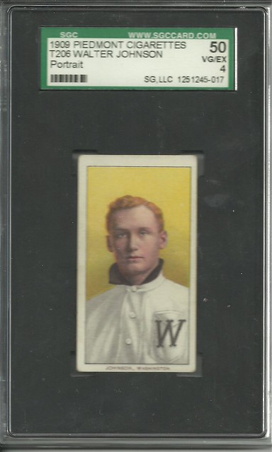
I really dig the portraits.
__________________
http://www.flickr.com/photos/themessage94/ Always up for a trade. If you have a Blue Weiser Wonder WaJo, PM/Email Me! Last edited by Jlighter; 04-30-2013 at 10:25 PM.
|
|
#5
05-01-2013, 11:13 AM
|
||||
|
||||
|
Quote:
__________________
$co++ Forre$+
|
|
#6
05-01-2013, 11:38 AM
|
||||
|
||||
|
This collection of T205 criticisms is wonderful. I wholeheartedly agree that T205s:
- are the weirdest looking cards - remind me of looking into a funeral home - creep me out - are unattractive to me - give me a sick feeling in my stomach - have no positive in their images - have never caught my eye - are like a bad video game drawing - show chip and wear - I am less enthused by - look funny with the floating heads - don't look so good With respect to T206s, I do not think you can just divide them between so-called action poses and the portraits. Some action poses are really breathtaking, like the aforementioned Leifield:  And I've always loved the Howard:  But my favorite T206 has long been the Matty portrait:  Even though it is only a portrait, the color is so vibrant and rich, without being as over-loaded with flair like its T205 cousin. Still, I will concede that this T205 Blackburne is one of my favorite signed pre-war cards in my collection: 
__________________
Galleries and Articles about T206 Player Autographs www.SignedT206.com www.instagram.com/signedT206/ @SignedT206
|
|
#9
05-01-2013, 12:41 PM
|
||||
|
||||
|
Blackburne
With bat-tin down collars. Still hate that format, but still love the mud.
__________________
RAUCOUS SPORTS CARD FORUM MEMBER AND MONSTER FATHER. GOOD FOR THE HOBBY AND THE FORUM WITH A VAULT IN AN UNDISCLOSED LOCATION FILLED WITH WORTHLESS NON-FUNGIBLES 274/1000 Monster Number Last edited by frankbmd; 05-01-2013 at 12:41 PM.
|
|
#10
05-01-2013, 01:20 PM
|
||||
|
||||
|
Quote:
__________________
$co++ Forre$+
|
|
#11
05-01-2013, 08:13 PM
|
||||
|
||||
|
best looking front IMHO is ...
|
|
#12
05-02-2013, 10:54 AM
|
||||
|
||||
|
Adrian, I'm a bit of a mixed bag on this subject.
I'm putting together a T206 HOF set with an emphasis on the portraits. However, I am not getting portraits of Huggins, Matthewson and Lajoe simply because I don't care for the way they look in those. Matthewson (dark cap), Lajoe (w/ bat) and Huggins (2 hands) I find much nicer and in the case of Huggins the two hands version seems to be how he is mostly represented in the sport/hobby. As for 205's I like the American Leauge and Minor League subsets, but don't care for the National league cards. The one exception would be the Matty. I wish that was the portrait in the 206 set! Last edited by brob28; 05-02-2013 at 10:55 AM.
|
|
#13
05-01-2013, 02:02 PM
|
||||
|
||||
|
I was more tounge in check with my bashing comment. The rest is true though. I love all cards but only collect one set that appeals to me. I will say a high grade 205 looks better than most 206's regardless of grade.
__________________
Andrew Member since 2009
|
|
#14
05-01-2013, 06:22 PM
|
||||
|
||||
|
I'm going to be contrary. Love T205s, especially the AL with diamonds, gloves, and bats. The NL not so much. What was American Tobacco supposed to do- issue another T206? This was a wild new design with bios on the back. Neat. They really dropped the ball on T207s which I collect also. As far as T206 I think the portraits are superb. Most of the action poses are good, but there are a few dogs in there.
__________________
T206-520/524 T205-209/221 T207-68/200 T213-2 -65/185 E90-1 102/120 Topps 1954,1959,1964 Bowman 1954 complete Deals competed with: jb217676, marcdelpercio, dog*dirt, srs1a, KennyCole, ullmandds, RCMcKenzie, edhans, dboneesq, mybuddyinc, nineunder71, uke, T206kid, & more
|
 |
| Thread Tools | |
| Display Modes | |
|
|
 Similar Threads
|
||||
| Thread | Thread Starter | Forum | Replies | Last Post |
| T206 HOF action pose lot of 15 sold | drdduet | Tobacco (T) cards, except T206 B/S/T | 2 | 04-19-2010 10:50 AM |
| wtb: t206 hof action poses...around G | chaddurbin | Tobacco (T) cards, except T206 B/S/T | 1 | 09-28-2009 01:17 AM |
| t206 portraits and action poses | Archive | Net54baseball Vintage (WWII & Older) Baseball Cards & New Member Introductions | 23 | 04-03-2008 02:32 PM |
| WTB: t206 joe kelley, johnny evers (portrait), & john mcgraw (portrait) | Archive | Tobacco (T) cards, except T206 B/S/T | 0 | 02-16-2007 08:06 AM |
| T206 colors missing scraps versus issued cards | Archive | Net54baseball Vintage (WWII & Older) Baseball Cards & New Member Introductions | 15 | 02-10-2006 01:59 AM |


 Hybrid Mode
