|
||||||
 |
|
|||||
|
||||||
|
|
|||||
|
#1
 12-06-2018, 05:36 AM
|
||||
|
||||
|
A previous post that mentioned the airbrushing of the 1958 Topps Gino Cimoli baseball card got me to thinking, what is the worst airbrushed baseball card that you have encountered. I'll start with this one. The whole thing is basically airbrushed, from the cap that was added to the coloring of the entire uniform.

|
|
#3
12-06-2018, 08:06 AM
|
||||
|
||||
|
I think there are many candidates for the wost, so I'll let others chime in there. I will say I think the BEST (and honestly the only airburshed card I can think of that I care for at all...) is the '72 Topps Nolan Ryan.
This is also interesting in that by the time Ryan played in the regular season with the Angels in '72, they were no longer using this cap - had moved onto the capital A version that they then used for much longer. There are a few unearthed pictures I've seen recently with Nolan wearing the authentic version of the cap that was airbrushed, so I'm guessing it must have been used in spring training in 1972...
__________________
Postwar stars & HOF'ers. Cubs of all eras. Currently working on 1956, '63 and '72 Topps complete sets.
|
|
#4
12-06-2018, 03:52 PM
|
||||
|
||||
|
Paying a lot for a 1971 Dick Williams high number just always seemed wrong to me because of the kindergarten art project job of airbrushing they did on his hat...
s-l1600-3.jpg I absolutely love the beautifully majestic shot on the 1973 Frank Robinson card, but they didn't even attempt to add the Angels logo to it, they just opted to simply erase the "Dodgers" from his jersey and let it ride... s-l1600-4.jpg
__________________
All the cool kids love my YouTube Channel:
Elm's Adventures in Cardboard Land  https://www.youtube.com/@TheJollyElm Looking to trade? Here's my bucket: https://www.flickr.com/photos/152396...57685904801706 I was such a dangerous hitter I even got intentional walks during batting practice. Casey Stengel Spelling "Yastrzemski" correctly without needing to look it up since the 1980s. Overpaying yesterday is simply underpaying tomorrow. 
|
|
#5
12-06-2018, 10:11 PM
|
|||
|
|||
|
Not sure if this can even be considered an air brush. It looks like a full on painting! I wondered about this card and how they didn't have a single shot of this guy? Of course, this was a year before I started buying cards, so the first bad one's I saw were that previously mentioned Minton and the equally horrible Mike Paxton from the same set.
__________________
Looking for: Unique Steve Garvey items, select Dodgers Postcards & Team Issue photos
|
|
#6
12-06-2018, 11:33 PM
|
||||
|
||||
|
I think every 1977 Seattle Mariner card qualifies.
|
|
#7
12-07-2018, 09:07 AM
|
||||
|
||||
|
Here's another that's hard to look at...
__________________
Successful transactions with: Chesboro41, jimivintage, Bocabirdman, marcdelpercio, Jollyelm, Smanzari, asoriano, pclpads, joem36, nolemmings, t206blogcom, Northviewcats, Xplainer, Kickstand19, GrayGhost, btcarfango, Brian Van Horn, USMC09, G36, scotgreb, tere1071, kurri17, wrm, David James, tjenkins, SteveWhite, OhioCard Collector, sysks22, ejstel. Marty
|
|
#8
12-07-2018, 01:21 PM
|
||||
|
||||
|
What a great topic! There are so many to choose from. The 1952 Topps set is gold mine of bad cap logos ...
|
|
#9
12-07-2018, 03:05 PM
|
||||
|
||||
|
Quote:
__________________
Postwar stars & HOF'ers. Cubs of all eras. Currently working on 1956, '63 and '72 Topps complete sets. Last edited by jchcollins; 12-07-2018 at 03:07 PM.
|
|
#10
12-07-2018, 03:30 PM
|
|||
|
|||
|
Maybe this would be better classified as the most strategic rather than the worst
 Sometimes it takes practice to get it just right  Sometimes they spawn an entire production line  One the brushers missed 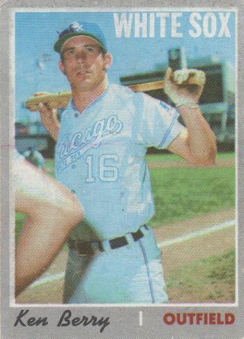 A brusher with a sense of humor ? 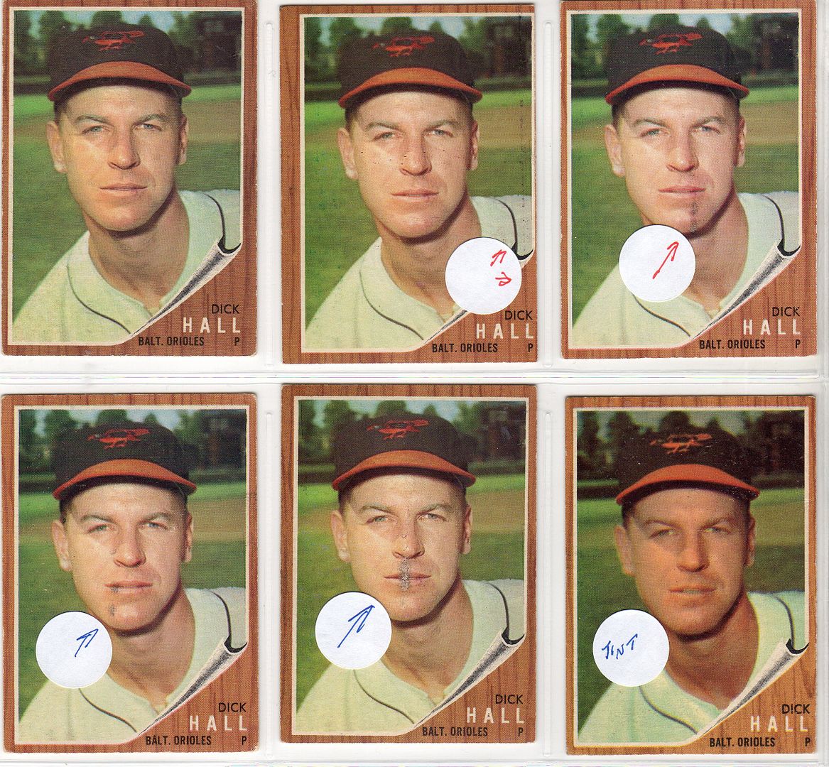 A brusher who did not know how the brush    My 2 favorite bad ones 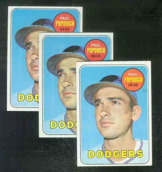 
Last edited by ALR-bishop; 12-07-2018 at 03:58 PM.
|
|
#11
12-07-2018, 11:13 PM
|
||||
|
||||
|
Quote:
__________________
Working Sets: Baseball- T206 SLers - Virginia League (-1) 1952 Topps - low numbers (-1) 1953 Topps (-54) 1954 Bowman (-2) 1964 Topps Giants auto'd (-2)
|
 |
|
|
 Similar Threads
|
||||
| Thread | Thread Starter | Forum | Replies | Last Post |
| Worst Gehrig card ever? | Snapolit1 | Net54baseball Vintage (WWII & Older) Baseball Cards & New Member Introductions | 20 | 03-06-2017 06:21 PM |
| Worst player name ever for a baseball card | Aquarian Sports Cards | Net54baseball Vintage (WWII & Older) Baseball Cards & New Member Introductions | 67 | 03-02-2017 06:35 AM |
| Worst Last Card? | scmavl | Postwar Baseball Cards Forum (Pre-1980) | 25 | 09-02-2011 05:05 AM |
| What's The Worst Looking Card Ever? | quinnsryche | Net54baseball Vintage (WWII & Older) Baseball Cards & New Member Introductions | 42 | 04-27-2011 08:38 AM |
| What is your worst conditioned card ? | Archive | Net54baseball Vintage (WWII & Older) Baseball Cards & New Member Introductions | 7 | 08-08-2005 10:11 AM |


 Linear Mode

