|
||||||
 |
|
|||||
|
||||||
|
|
|||||
|
#1
 10-02-2016, 01:15 PM
|
||||
|
||||
|
Without the aid of foil, refractor material, Photoshop, etc. Many cards from the late 1800s and early 1900s are just flat out gorgeous. What card type is your favorite, and why?
__________________
Tanner Jones - Author, Confessions of a Baseball Card Addict - Available on Amazon www.TanManBaseballFan.com Last edited by mouschi; 10-02-2016 at 01:15 PM. 
|
|
#2
10-02-2016, 01:18 PM
|
||||
|
||||
|
T205's are works of art. Beautiful colors, delecate gold borders, artistic frames on the minor league cards, 1st cards to have stats & bios. They simply have it all
young.jpg
__________________
Successful transactions with: Drumback, Mart8081, Obcmac, Tonyo, markf31, gnaz01, rainier2004, EASE, Bobsbats, Craig M, TistaT202, Seiklis, Kenny Cole, T's please, Vic, marcdelpercio, poorlydrawncat, brianp-beme, mybuddyinc, Glchen, chernieto , old-baseball , Donscards, Centauri, AddieJoss, T2069bk,206fix, joe v, smokelessjoe, eggoman, botn, canjond Looking for T205's or anything Babe Ruth...email or PM me if you have any to sell. Last edited by EvilKing00; 10-02-2016 at 01:24 PM.
|
|
#3
10-02-2016, 01:26 PM
|
||||
|
||||
|
dbl post
__________________
Successful transactions with: Drumback, Mart8081, Obcmac, Tonyo, markf31, gnaz01, rainier2004, EASE, Bobsbats, Craig M, TistaT202, Seiklis, Kenny Cole, T's please, Vic, marcdelpercio, poorlydrawncat, brianp-beme, mybuddyinc, Glchen, chernieto , old-baseball , Donscards, Centauri, AddieJoss, T2069bk,206fix, joe v, smokelessjoe, eggoman, botn, canjond Looking for T205's or anything Babe Ruth...email or PM me if you have any to sell. Last edited by EvilKing00; 10-02-2016 at 01:26 PM.
|
|
#4
10-02-2016, 01:33 PM
|
||||
|
||||
|
There's some really cool pre-war designs out there! Here's my favorites:
-1914-15 Cracker Jack... absolutely stunning cards. -1934-36 Diamond Stars - Pieces of Art! (my only one is here: http://imgur.com/a/H8uyJ , file too large to attach ) -Zeenuts, 1912 Homerun Kisses, D310's and 1911 Big Eaters - Really cool cards, they have a nice, simple design with a focus on the players. Zeenuts are extra awesome from 1911-1923, the years after that IMO aren't as nice. -Owen
__________________
1955 Topps 171/206 
|
|
#11
10-02-2016, 04:13 PM
|
||||
|
||||
|
Not a fan of cartoon looking cards so a lot of the T206, T205, etc cards fall into that category for me but some of the portraits are pretty well done.
I prefer real photos and high detail lithography. N162, some of the T3 cards (there are a few ugly T3's as well... Burns, Gibson, Smith, & the Schmidt pose always kinda bugged me), Old Judge Cabinets (if the pose is a good one), N28, and 1911 Zeenuts are some of my favorites.
__________________
Check out my YouTube Videos highlighting VINTAGE CARDS https://www.youtube.com/channel/UCbE..._as=subscriber ebay store: kryvintage-->https://www.ebay.com/sch/kryvintage/...p2047675.l2562
|
|
#12
10-02-2016, 04:35 PM
|
|||
|
|||
|
Quote:
I'd say 1941 Play Ball and Buchner Gold Coins are my next two.
__________________
Check out https://www.thecollectorconnection.com Always looking for consignments 717.327.8915 We sell your less expensive pre-war cards individually instead of in bulk lots to make YOU the most money possible! and Facebook: https://www.facebook.com/thecollectorconnectionauctions
|
|
#13
10-02-2016, 05:51 PM
|
|||
|
|||
|
Quote:
__________________
T205 (208/208) T206 (520/520) T207 (200/200) E90-1 (120/121) E91A/B/C (99/99) 1895 Mayo (18/48) N28/N29 Allen & Ginter (100/100) N162 Goodwin Champions (32/50) N184 Kimball Champions (38/50) Complete: E47, E49, E50, E75, E76, E229, N88, N91, R136, T29, T30, T38, T51, T53, T68, T73, T77, T118, T218, T220, T225 www.prewarcollector.com
|
|
#15
10-02-2016, 07:57 PM
|
|||
|
|||
|
T3 turkey reds.
Colors, size, backgrounds, beautiful cards.
|
|
#16
10-02-2016, 08:25 PM
|
||||
|
||||
|
I like cards whose design is evocative of the era in which they were made. The 1935 Diamond Stars get points from me for their sort of art deco aesthetic.
Not pre-war, but 1949 Leaf is probably my favorite set of all. Little bits of pop art on baseball cards (these ones are actually a bit ahead of their time, aesthetically speaking). Another favorite, albeit for different reasons, are the Exhibits. I like the action photographs that have the background airbrushed out. They are sort of like idealized images of these guys, baseball and nothing else.
|
|
#18
10-02-2016, 08:40 PM
|
||||
|
||||
|
I would also give props to T205 for the design, the gold borders, and for being one of the first card issues to have stats on the back.
Another prewar design that I find striking is the one found on N43. Related to the design on N28's and N29's, it's like taking one of those cards and placing it on a tastefully designed lithographic background. The N43 Buck Ewing has always been a favorite card, and, although I don't own any, I've always liked the similar N36 set which featured American Indians... 
|
|
#19
10-02-2016, 09:46 PM
|
||||
|
||||
|
Easy selection for me. To have virtually every star of the day portrayed via a Horner portrait is pretty special. 12 players for each of the 16 teams are included in the set. Here are a couple of outstanding examples.
|
|
#20
10-02-2016, 11:29 PM
|
||||
|
||||
|
Here is my list of favorite vintage bb card designs:
N162 Goodwin Champions - check out Ted's set he has posted on various occasions...it is tough to top the design and artistry. The Kelly is one of my all time favorites. T212 Obak - 1910 and 1911 issues. Some collectors like the typically more muted 1909 set, but I have always been drawn to the blaze of colors that are present in many of the backgrounds of the two later issues. T3 - I don't collect bigger cards, but the artwork of some of these cards is improved by the bigger size of this issue, which gives it a huge advantage over the normal sized small issues of the era. W503 - Simple design that has the benefit of incredibly sharp photos. I especially like some of the action shots. R327 Diamond Stars - the first set I ever attempted to complete because the art deco backgrounds just drew me into trying to collect them all. I am still short a few, because I never saw the need to collect the last 12 duplicated artwork cards. Brian (only some of these good bad boys are mine) Last edited by brianp-beme; 10-03-2016 at 12:27 AM.
|
|
#21
10-03-2016, 08:14 AM
|
||||
|
||||
|
Great looking cards by all. My favorite, or at least one of them
, has always and will always be T205. These are from my last collection. How can you have a better looking vintage card I really don't know. 
__________________
Leon Luckey www.luckeycards.com
|
|
#23
10-03-2016, 03:45 PM
|
||||
|
||||
|
It's hard to beat the Turkey Reds or the Cracker Jacks.
|
|
#24
10-03-2016, 03:53 PM
|
||||
|
||||
|
t205 are works of art that just can't be correctly emulated by mass producers of cards now. When reprints or emulated sets (such as topps 205) can't match the beauty of the original that is impressive to me.
The Allen and Ginters are a great set. It shows the popularity of the design when modern collectors have been collecting Topps' modern variation for 11 years now.
__________________
https://www.flickr.com/photos/bn2cardz/albums
|
|
#25
10-03-2016, 05:31 PM
|
||||
|
||||
|
Cracker Jack and T3's are phenomenal.
__________________
Just a dad trying to figure out how to build a collection his kids will take interest in. Interests: HoF, Grover Hartley, Cleveland, Jim Thome, Jose Ramirez, Akron Zips, Historically Significant Figures Cooperstown Project Progress: 194/351 - 55.27% Follow along and see what I need here. YouTube Channel: Collecting America's Pastime Last edited by CollectingAmericasPastime; 10-03-2016 at 05:33 PM.
|
|
#26
10-03-2016, 05:31 PM
|
||||
|
||||
|
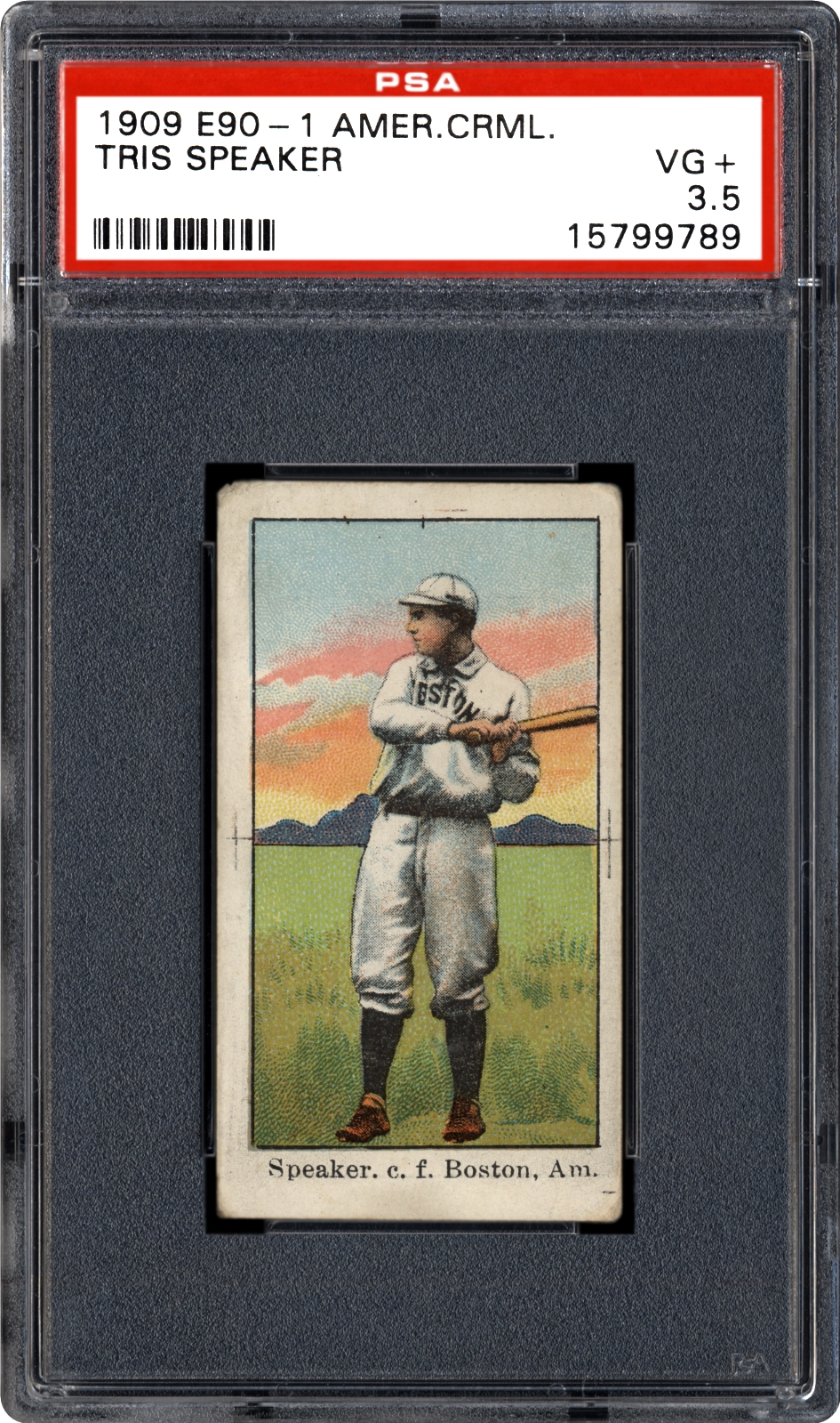
1909 E90-1 is VASTLY underrated. I love the background colors/scenery in this set.
__________________
Just a dad trying to figure out how to build a collection his kids will take interest in. Interests: HoF, Grover Hartley, Cleveland, Jim Thome, Jose Ramirez, Akron Zips, Historically Significant Figures Cooperstown Project Progress: 194/351 - 55.27% Follow along and see what I need here. YouTube Channel: Collecting America's Pastime Last edited by CollectingAmericasPastime; 10-03-2016 at 05:32 PM.
|
|
#28
10-04-2016, 12:08 AM
|
||||
|
||||
|
I think from pure aesthetics, I gotta go with N162 (wish the baseball set was bigger)
Goodwin%20Champions%20Anson%2022%20legendary%202004.jpg N162 Tim Keefe.jpg ... but from the cool and unique category, I love the triple folders. There's so much great stuff going on, including multi player cards (many ideal matches like Speaker/Wood or dual HOFer), nice color portraits, great actual (not just posed) action shots, and the great period write ups. T202 Cobb Jennings HA.jpg T202 Speaker Wood SGC50.jpg T202 Cobb Moriarty, Cobb Steals Third SGC.jpg
|
|
#30
10-04-2016, 10:18 AM
|
||||
|
||||
|
I think E97's are underappreciated:
|
|
#31
10-04-2016, 08:47 PM
|
||||
|
||||
|
I like the T202 triple folders. You get the brilliance of the T205s on the end panels, alongside a beautiful in-action photograph in the middle.
The T3s are in a category of their own and I love them. The T201 double folders don`t get as much respect owing to the simplistic artwork, but I find them very visually appealing too. The background imagery - mostly simple fences and grandstands - is pretty neat. And the 1935 Diamond Stars are my favorite 1930s set, the art-deco style artwork is just perfect for evoking that era.
__________________
My blog about collecting cards in Japan: https://baseballcardsinjapan.blogspot.jp/
|
|
#33
10-05-2016, 12:37 AM
|
||||
|
||||
|
Do you actually like the design of these? They seem rather crudely done, but each to his own.
|
|
#34
10-05-2016, 12:59 AM
|
||||
|
||||
|
I'm pretty sure he wouldn't be posting those Cabanas if he didn't think they looked good. I like them a lot. Definitely not crude to me.
My other submissions would be the 1913 Zeenuts, because sepia and baseball cards are a match made in heaven. And also the D381 Fleischmann Bakery series, because I'd argue there's no set that did a better job of capturing the personalities of the players like this set. The photography seems way ahead of its time
|
|
#35
10-05-2016, 08:46 AM
|
|||
|
|||
|
1933 DeLong and it's not even really close in my opinion.
|
|
#37
10-05-2016, 03:13 PM
|
||||
|
||||
|
I have to say I love the T4 Obak, but right up there is the T211 and D310. Oh, and who can forget the E222?
__________________
Ed Collecting PCL, Southern Association, and type cards. http://hangingjudgesports.com
|
|
#40
10-06-2016, 08:13 PM
|
|||
|
|||
|
I fell in love with this recently, and I paid the most I've ever paid for a card for it. 1910 Tip Top Bread. They only did the world champions team from 1909---the Pittsburgh Pirates The design in the background, even after a hundred years, gives a shimmer to the card.
 Sent from my SAMSUNG-SM-G530AZ using Tapatalk
|
|
#42
10-06-2016, 09:03 PM
|
|||
|
|||
|
Quote:
I really only like the National League portraits in T205. The American League cards with the frames is just too busy.
|
|
#44
10-11-2016, 05:18 PM
|
||||
|
||||
|
T202s are kind of awkward shaped though. Otherwise, I agree, great cards...
Quote:
__________________
Leon Luckey www.luckeycards.com
|
|
#46
10-13-2016, 12:05 PM
|
|||
|
|||
|
1937 Wheaties Series 9
37 wheaties.jpg and my favorite, although I could only find an incomplete card of it- Carl Hubbell... hubbell.jpg
__________________
Member of OBC (Old Baseball Cards), the longest running on-line collecting club www.oldbaseball.com
|
|
#48
10-14-2016, 07:11 AM
|
||||
|
||||
|
The 1920's are frequently overlooked as far as design is concerned:
E120 is simple but elegant. WALTER JOHNSON 1922 E120 American Caramel - PSA-5.jpg
__________________
. "A life is not important except in the impact it has on others lives" - Jackie Robinson If you have a chance to make life better for others and fail to do so, you are wasting your time on this earth.- Roberto Clemente
|
|
#49
10-14-2016, 03:59 PM
|
||||
|
||||
|
Quote:
|
|
#50
10-14-2016, 04:23 PM
|
|||
|
|||
|
Quote:
|
 |
|
|
 Similar Threads
|
||||
| Thread | Thread Starter | Forum | Replies | Last Post |
| Box design cards | craigpw | Modern Baseball Cards Forum (1980-Present) | 19 | 01-04-2015 06:31 PM |
| Box design cards | craigpw | Postwar Baseball Cards Forum (Pre-1980) | 1 | 01-03-2015 12:04 PM |
| CardTarget's new design | CardTarget | Net54baseball Vintage (WWII & Older) Baseball Cards & New Member Introductions | 2 | 06-05-2013 01:26 PM |
| Baseball Card Design | Archive | Net54baseball Vintage (WWII & Older) Baseball Cards & New Member Introductions | 0 | 08-19-2008 08:45 PM |
| Graphic Design | Archive | Everything Else, Football, Non-Sports etc.. B/S/T | 0 | 05-17-2005 10:40 PM |


 Linear Mode

