|
||||||
 |
|
|||||
|
||||||
|
|
|||||
|
#1
 08-31-2007, 11:03 AM
|
|||
|
|||
|
Posted By: dennis
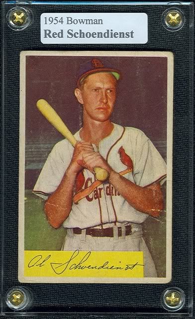
after looking at the B&W photos on the "look familiar" thread here, i've come to the conclusion that the 1954 bowman is intentionaly colored as it is as to give it a different look than the '53s. IMO it gets little collector respect because it followed the '53 Bowman color set,which is heralded as the most beautiful post war set ever. do you agree or do you feel it is really not a very atractive set,hastily put together on the cheap and just poor colorization.i would especially like to hear comments from people who collected this set as a kid in 1954. what did you think when you first viewed these cards over 50 years ago??? 
|
|
#2
08-31-2007, 03:10 PM
|
|||
|
|||
|
Posted By: Paul S
Nice timing. I'd been thinking about this set lately, as there's been a little action surrounding it here. I didn't begin to collect them until about 1967, when I really began to put together cards from all the different years. I am always going back and forth about how much I like them (or not.) I'm in a positive frame of mind now about them, but two things usually hold me in check: the combination of there being no real action pictures -- they just look too static for my taste, and whatever the process was that gave them that "pastel" look which diluted any sharpness in the photo. What I like about them most, I guess, is that they put me in a time and place. Not easy for me to dislike any card.
|
|
#5
08-31-2007, 07:13 PM
|
|||
|
|||
|
Posted By: boxingcardman
Furillo and Reese. Dead centered, stellar colors, booming gloss, etc. I wanted them in those black holders for display.
|
|
#6
08-31-2007, 07:17 PM
|
|||
|
|||
|
Posted By: Chris Counts
I always figured Bowman went to the hand-colored photos in '54 because the process was cheaper. The fact that Bowman issued its black and white series '53 after its color series leads me to this conclusion. I've also read on several occassions that Bowman invested heavily in the '53 set and lost a lot of money in the process. Regardless, the '54 and '55 sets pale in comparison to the '53 set, in my opinion. In defense of the '54 and '55 sets, I believe the sets Bowmans issued from 1950 to 1953 contain more great images and better artwork than any other comparably large sets in baseball card history, so they had a hard act to follow ...
|
|
#7
08-31-2007, 07:20 PM
|
|||
|
|||
|
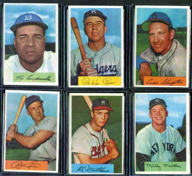
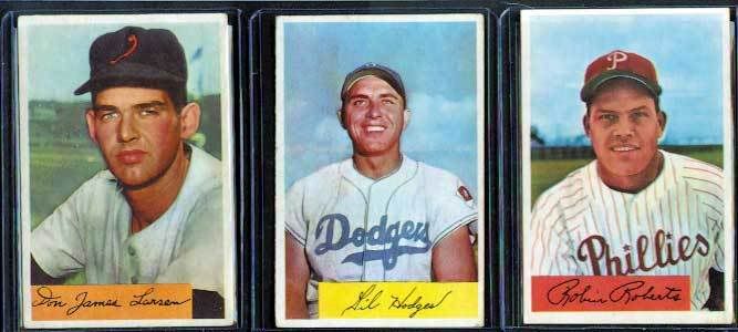
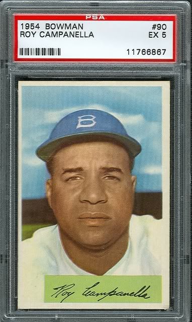
Posted By: Paul S
Here's some of my HOFers. I'm beginning to come to the conclusion that 54 Bowman looks very spiffy in a VG condition but doesn't hold as much eye appeal as other years do once they start to go somewhat South. BTW that's a cat hair on the Campy, not a scratch on the card.
|
|
#11
09-02-2007, 06:10 PM
|
|||
|
|||
|
Posted By: Paul
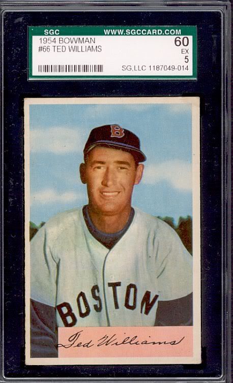
I've always felt that the 54 Bowmans have some of the best pictures in any card set -- the Reese, Furillo, Williams, Mantle, and Snider are all outstanding. But that stupid rectangular box really brings down the overall appeal of the set in my opinion.
|
|
#12
09-03-2007, 08:29 PM
|
|||
|
|||
|
Posted By: John Harrell
was the 54 Bowmans. I started collecting with both the 52 Topps and Bowman sets when I was 6 or 7 but really got hooked on the 54 Bowmans, especially the players' pics and backgrounds, compared to the 54 Topps or 53 Bowmans. The 55 Bowman tv sets were horrible by comparison. Even today, I still have a special place in my heart for the 54 Bowmans. Brings back memories of going to the mom and pop grocery on the corner by my grammar school and spending part of my lunch money on cards. I liked the 54 Topps Scoop cards too.
|
|
#17
09-04-2007, 07:26 PM
|
|||
|
|||
|
Posted By: Paul S
Dave -- I think that weird "beanie" look is a bit of the distorted fisheye effect that occurs when a camera lens is held too close to the subject being photograph. Sort of like a door peephole. It also gives his face somewhat enlarged features, especially around the nose. Odd angle too.
|
|
#18
11-17-2007, 05:26 PM
|
|||
|
|||
|
Posted By: Fred Y
|
|
#19
11-18-2007, 07:46 AM
|
|||
|
|||
|
Posted By: Dave Hornish
The 54's get no love. Although I like the 53's and 55's better the 54's are still quite nice. I'm a fan of all the Bowman sets, even the 48's and 49's. Their Football and Non Sports cards are in the visual porn category as well mostly.
|
|
#20
11-18-2007, 09:02 AM
|
|||
|
|||
|
Posted By: Paul S
Dave, I'm with you on everything you said. I didn't know that about George Moll and the advertising connection -- makes sense to me. Now, I love '53 Topps as much as the next person but can you imagine what the '50 and '51 Bowman's would have looked like if they'd have been that same size?
|
 |
| Thread Tools | |
| Display Modes | |
|
|
 Similar Threads
|
||||
| Thread | Thread Starter | Forum | Replies | Last Post |
| 8 1952 bowmans | Archive | 1950 to 1959 Baseball cards- B/S/T | 1 | 03-12-2009 08:27 AM |
| Show your 1955 bowmans | Archive | Football Cards Forum | 7 | 10-20-2008 11:41 AM |
| 1951/1952 Bowmans | Archive | Postwar Baseball Cards Forum (Pre-1980) | 2 | 10-14-2008 11:15 AM |
| how do you store your bowmans? | Archive | Postwar Baseball Cards Forum (Pre-1980) | 2 | 06-06-2008 10:34 PM |
| 1952 Bowmans for sale | Archive | 1920 to 1949 Baseball cards- B/S/T | 0 | 02-17-2006 11:49 AM |


 Linear Mode

