|
||||||
 |
|
|||||
|
||||||
|
|
|||||
|
#1801
 08-09-2021, 09:30 PM
|
||||
|
||||
|
I am looking for my 70 Joe Coleman and havent found it yet but I found some missing 76 Topps cards while searching for it, including this Blue Dots Dave Lopes Record Breaker that I will post as soon as my home computer comes back on.
__________________
interesting to some absolute garbage to others. - Error cards and variations are for morons, IMHO. 
|
|
#1802
08-09-2021, 09:51 PM
|
||||
|
||||
|
I found the 1970 Topps Joe Coleman, it clearly has a word printed in the blue sky that starts with DE, goes into Colemans face and then ends to the right in the sky. I will post a scan as soon as my computer comes back into service.
__________________
interesting to some absolute garbage to others. - Error cards and variations are for morons, IMHO.
|
|
#1803
08-09-2021, 10:47 PM
|
||||
|
||||
|
Quote:
__________________
interesting to some absolute garbage to others. - Error cards and variations are for morons, IMHO.
|
|
#1804
08-09-2021, 11:05 PM
|
||||
|
||||
|
Here is the 70 Topps Joe Coleman with writing in the sky, I'm guessing it is 'DETROIT', maybe from the Tigers team card. The only reason I knew about this card was that someone listed a PSA 8(?) 1970 Topps Joe Coleman on eBay and described it as a print error and wanted something like $50 for it. I looked for another one cheaper and found this one right away, but it must be rare because I looked through a few hundred 70 Topps Coleman cards on the web very recently and couldn't find another one.
__________________
interesting to some absolute garbage to others. - Error cards and variations are for morons, IMHO.
|
|
#1805
08-10-2021, 06:38 AM
|
|||
|
|||
|
Neat card Cliff
|
|
#1806
08-10-2021, 07:37 AM
|
||||
|
||||
|
I think I figured out where the DETROIT came from on the 1970 Topps Joe Coleman card, it was still on the printing plate from a 1969-70 Topps Basketball Detroit Pistons card. If someone could post a scan of a 1969-70 Topps Basketball Detroit Pistons card I would appreciate it because my Xfinity box is fried and I cant get on my home computer.
__________________
interesting to some absolute garbage to others. - Error cards and variations are for morons, IMHO.
|
|
#1807
08-10-2021, 07:37 AM
|
||||
|
||||
|
Quote:
|
|
#1808
08-10-2021, 07:59 AM
|
||||
|
||||

Last edited by bobsbbcards; 08-10-2021 at 08:00 AM.
|
|
#1809
08-10-2021, 08:01 AM
|
||||
|
||||
|
I am very certain that it was printed on the card and is residual from a 1969-70 Topps Basketball Detroit Pistons card that was still on the printing plate, similar to the 1967 Topps Baseball 2nd Series cards that can be found with those fold out comic book images on the front. Unfortunately my home computer is down and I cant show a scan of a 1969-70 Topps Basketball Detroit Pistons card, Im just glad I was able to get it to work last night and post the scan of the Coleman card.
__________________
interesting to some absolute garbage to others. - Error cards and variations are for morons, IMHO.
|
|
#1810
08-10-2021, 08:02 AM
|
||||
|
||||
|
Thank you, Mr. Fisk 😊.
__________________
interesting to some absolute garbage to others. - Error cards and variations are for morons, IMHO.
|
|
#1811
08-10-2021, 06:56 PM
|
|||
|
|||
|
Bob is useful now and then
|
|
#1812
08-10-2021, 10:16 PM
|
|||
|
|||
|
That's very strange!
For the early printing done from stones they erased them and reused them, but I'm having a hard time seeing how the coated aluminum plates used in the 60's-70's could have been resurfaced or rexposed to make a different plate. I wonder if they were using old partly printed sheets somewhere in the production process. Or maybe using a blanket that was so worn the image was still there, worn into it from a previous job? Or..... just maybe they used old plates for the glosscoat? (This may now be common as the presses make the plate digitally without needing to mount a new one)
|
|
#1813
08-11-2021, 05:06 AM
|
||||
|
||||
|
Very similar error to what happened with Magic: The Gathering card game 20 years ago.
https://www.misprintedmtg.com/peanuts
__________________
-- PWCC: The Fish Stinks From the Head PSA: Regularly Get Cheated BGS: Can't detect trimming on modern SGC: Closed auto authentication business JSA: Approved same T206 Autos before SGC Oh, what a difference a year makes. Last edited by swarmee; 08-11-2021 at 05:06 AM.
|
|
#1814
08-15-2021, 07:58 PM
|
||||
|
||||
|
I've been looking for this Kaline Band Aid card on and off for a few years since learning about it on Net54. It showed up on ebay a few days ago for a really good price. Excited to get it.
I don't remember hearing about this card back in the day (collecting in the 1970s/1980s), when it seemed like there was lots of attention on error cards. Was this card well-known/collected for years? Or did it only more recently get attention?
|
|
#1815
08-15-2021, 08:14 PM
|
|||
|
|||
|
Quote:
|
|
#1816
08-15-2021, 08:23 PM
|
||||
|
||||
|
Quote:
__________________
-- PWCC: The Fish Stinks From the Head PSA: Regularly Get Cheated BGS: Can't detect trimming on modern SGC: Closed auto authentication business JSA: Approved same T206 Autos before SGC Oh, what a difference a year makes.
|
|
#1817
08-15-2021, 09:13 PM
|
||||
|
||||
|
Quote:
__________________
interesting to some absolute garbage to others. - Error cards and variations are for morons, IMHO.
|
|
#1818
08-16-2021, 02:22 PM
|
||||
|
||||
|
Quote:
I will point out this card is cursed!! Seemingly every time I put one of mine out there for trade or sale, some sc_mbag comes out of woodwork trying to take it off of my hands for nothing. All they see are dollar signs and nothing else matters. They usually take the exact same approach, from pretending their interest is tepid by saying they 'might' be interested in the card, to pretending it's not worth anything by saying, "You know, elm, you and I are probably the only ones who collect this guy," to offering me nothing but crap for it, to spewing out the hatred when I don't fall for their obvious BS. It's like they're reading from the same script. They want the card and it doesn't matter one bit that I don't want (can't use, etc.) what they insist I take for it. I just laugh and think, "What the hell is wrong with these people??!!" Sorry for the rant, but this card is just a grief maker!! Whenever I get a PM with the subject line being "1973 Kaline," I just think, "Crap, here we go again!!" Hopefully, your results will vary. ")
__________________
All the cool kids love my YouTube Channel:
Elm's Adventures in Cardboard Land  https://www.youtube.com/@TheJollyElm Looking to trade? Here's my bucket: https://www.flickr.com/photos/152396...57685904801706 I was such a dangerous hitter I even got intentional walks during batting practice. Casey Stengel Spelling "Yastrzemski" correctly without needing to look it up since the 1980s. Overpaying yesterday is simply underpaying tomorrow. 
|
|
#1819
08-16-2021, 02:42 PM
|
||||
|
||||
|
Thanks, guys. The card is much nicer that I had expected to find and will hang out on a shelf with my other favorite error/variation (1989 Fleer Randy Johnson(s)). I'm also pennant collector and I do collect pennant errors/variations. Hopefully I don't taint this card thread by posting one pennant here.
|
|
#1820
08-16-2021, 03:50 PM
|
||||
|
||||
|
Quote:
|
|
#1821
08-16-2021, 05:49 PM
|
||||
|
||||
|
Quote:
I know exactly how you feel...I posted a 69 567 no black outline card one time and got the same type of ridiculous messages in regards to it. Heard some great stories though...entertaining even.
|
|
#1822
08-20-2021, 11:48 AM
|
||||
|
||||
|
I don't know if this has been reported, but I noticed this variation on the 1955 Elmer Valo. At the bottom of the front the red box corner, lower right is clipped off in the variation. On the back of the variation his batting average doesn't have a decimal point (.280) but is shown as 280.
|
|
#1823
08-20-2021, 12:18 PM
|
||||
|
||||
|
Unless they are already known, its incredible that either one of those on the 55 Valo went undiscovered for 66 years. Theyre both new to me.
__________________
interesting to some absolute garbage to others. - Error cards and variations are for morons, IMHO.
|
|
#1824
08-20-2021, 04:06 PM
|
||||
|
||||
|
Quote:
|
|
#1825
08-20-2021, 07:21 PM
|
||||
|
||||
|
Quote:
|
|
#1826
08-26-2021, 07:01 PM
|
|||
|
|||
|
..
Both vars :  ...White uniforms -brown grass and blue uniforms -green grass ..
|
|
#1827
08-26-2021, 09:36 PM
|
|||
|
|||
|
I do think you can find at least two versions of every 57 card with coloring differences such as this one. I think someone offered a bunch of examples in this or another thread
|
|
#1828
08-27-2021, 04:27 PM
|
|||
|
|||
|
Quote:
..  ..A true master set of 1957 Topps is now up to 800 or so.... ..
|
|
#1829
08-28-2021, 09:24 AM
|
|||
|
|||
|
Quote:
|
|
#1830
08-29-2021, 09:14 PM
|
|||
|
|||
|
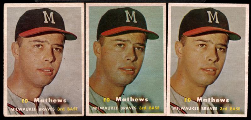
Several years have "blue tints" like this; where it's not just a color being darker in a print run but the color present in places it should not be. 1968 football and 1971 football are pretty obvious, 1967 baseball has them in at least a couple of the series.
1957 has at least two of each card, some have red tint, blue tint and a "proper" one. I count these as true variations, though it makes my spreadsheets a pain to manage sometimes.
|
|
#1831
08-29-2021, 09:23 PM
|
|||
|
|||
|
And while I'm thinking about 1967 Topps and happen to have my box out:
139 Dalton Jones - Blue line in top border or correct. 198 Chuck Hiller - Blue line in bottom border, or correct. 323 Herhbserger - Blue in team name on front extends low (not the color layer being mis-set), or correct 326 - Uecker, white line through position, height and and birth year on back. Tough. 382 Dave Mcnally can be found with a white line through the first line of his text biography write up on back. Also green smear in the lower left of his stat boxes, as well as the known purple object variation. Some are tough. 399 Worthington - Green hangs below the black divider at top of the stat area, or correct. 403 Dick Nen - Green spots on both arms, or correct. Not the easiest. 412 astro's Rookies - some copies show the edge of a stat box on the back right, even when they are not at all miscut to show an adjacent card. Easy 438 Chuck Dobson - several versions with the cartoon white extending high, extra white and green squiggly shapes below the cartoons, green ink bleed into the cartoon, Athletics logo on front extending low. At least 5 combinations I can show them but Net54 hates iPhone pics and requires a downsizing process that takes too much time and ruins the quality a lot. Apologies if I missed these being publicly known, I don't think any of them are.
|
|
#1832
08-30-2021, 08:34 PM
|
||||
|
||||
|
Part of A in BASE missing. Recurring.
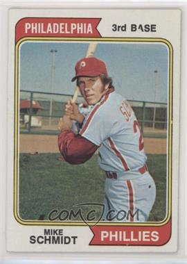 1974 Topps - [Base] #283 - Mike Schmidt Courtesy of COMC.com Yellow bleed throughout card and above border (similar to 1973 Topps Nolan Ryan blue bleed) 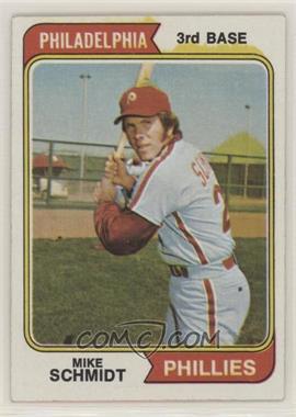 1974 Topps - [Base] #283 - Mike Schmidt Courtesy of COMC.com And although Post-1980, Cal Ripken Jr after just eating a ballpark hotdog (Via blowout): https://www.blowoutforums.com/showthread.php?t=1483713 Not sure if it's just a big fisheye defect or a recurring.
__________________
-- PWCC: The Fish Stinks From the Head PSA: Regularly Get Cheated BGS: Can't detect trimming on modern SGC: Closed auto authentication business JSA: Approved same T206 Autos before SGC Oh, what a difference a year makes. Last edited by swarmee; 08-30-2021 at 08:36 PM.
|
|
#1833
08-30-2021, 09:13 PM
|
||||
|
||||
|
Quote:
__________________
interesting to some absolute garbage to others. - Error cards and variations are for morons, IMHO.
|
|
#1834
09-01-2021, 08:46 AM
|
|||
|
|||
|
Quote:
|
|
#1835
09-01-2021, 10:18 AM
|
|||
|
|||
|
This is a good one, and not hard to find
Last edited by ALR-bishop; 09-01-2021 at 10:18 AM.
|
|
#1837
09-04-2021, 11:54 AM
|
|||
|
|||
|
The three shades of Leron Lee. The green around his name has three shades. light / dark / darker. The dark/darker is easier to notice in hand not as much here.
1975 Topp L Lee REV.jpg
|
|
#1838
09-04-2021, 11:56 AM
|
|||
|
|||
|
Lindy McDaniel the Royal A.
I guess a fleck of paper blocked the ink from getting on the card. 1975 Topps L McDaniel.jpg
|
|
#1839
09-05-2021, 04:16 PM
|
|||
|
|||
|
Sorting through some 1973's and saw this Billy Wilson #619 with the bottom of the baseball solid black (below the number). Out of 10 or so I have 2 like this.
The ink and print looks all the same...ie no variation in the laces tint when looked at in the light vs the black ink shining (if it was colored in) Can anyone else confirm the variation? Best, Ed  Sent from my SM-G996U using Tapatalk
|
|
#1840
09-05-2021, 05:05 PM
|
||||
|
||||
|
Quote:
__________________
interesting to some absolute garbage to others. - Error cards and variations are for morons, IMHO.
|
|
#1841
09-11-2021, 01:55 PM
|
|||
|
|||
|
Quote:
Good on you! And I will keep looking too. I may have to be satisfied with a bootleg picture of Joe. :-) Cheers, B.T. Last edited by butchie_t; 09-11-2021 at 01:56 PM.
|
|
#1842
09-15-2021, 03:39 PM
|
|||
|
|||
|
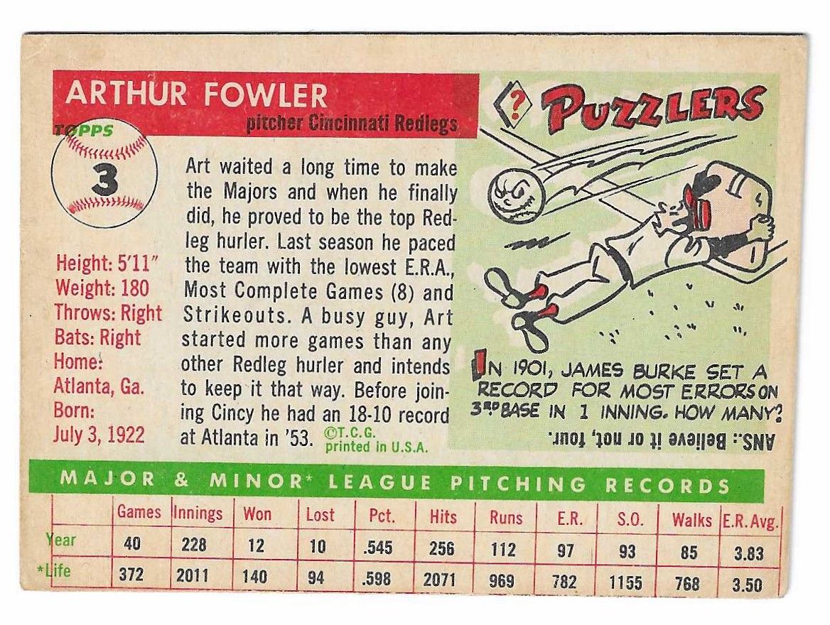
Was going through a stack of 1955 Topps and came across this printing error on the back of the Fowler card. The words "Year," & "Life" are at the top and printed in black ink not green. The word "Topps" is printed not in the baseball but just below it. And to Top it off the title bar is printed below the Stats line. The cartoon says ? Puzzlers. I suppose the real puzzle is how this happened.
Thanks for looking, Joe
|
|
#1843
09-15-2021, 04:20 PM
|
||||
|
||||
|
The green screen went over the sheet when it was an inch out of alignment. The words at top are actually from the bottom of the card above it. Cool find, though is it just a bad registration issue.
__________________
-- PWCC: The Fish Stinks From the Head PSA: Regularly Get Cheated BGS: Can't detect trimming on modern SGC: Closed auto authentication business JSA: Approved same T206 Autos before SGC Oh, what a difference a year makes.
|
|
#1844
09-15-2021, 05:09 PM
|
|||
|
|||
|
Good one Joe
|
|
#1845
09-18-2021, 01:46 PM
|
||||
|
||||
|
I don't remember if this one has been mentioned here or not, Topps replaced Ed Bouchee with a second Jim Bunning on the 1958 Second Series sheet creating a double print of Bunning, making a photo cropping variation similar to the eleven double printed cards in the 1963 Topps Fifth Series sheet. The pinstripe hits the Tigers emblem in the center of the circle and the T on his uniform is cut off at the end on one version, the second version has the pinstripe more to the left hitting the Tigers emblem circle and the end of the T on his uniform is visible.
__________________
interesting to some absolute garbage to others. - Error cards and variations are for morons, IMHO.
|
|
#1846
09-18-2021, 02:21 PM
|
|||
|
|||
|
Either you or someone else told me about this one because I have both.
Still looking and hoping for a pulled Bouche proof
|
|
#1847
09-21-2021, 02:39 PM
|
|||
|
|||
|
Not in the same League as Joe's above but maybe an honorable mention
|
|
#1848
09-22-2021, 07:28 PM
|
||||
|
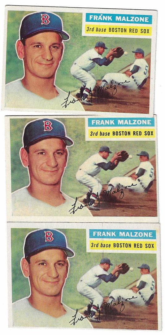
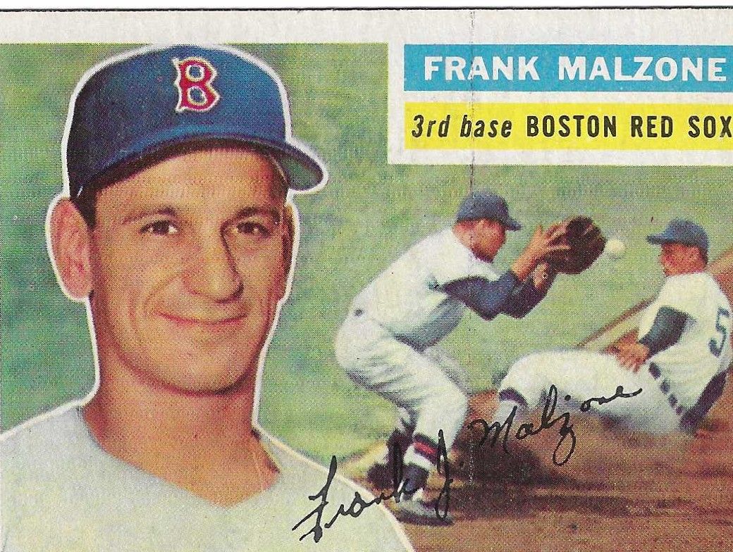
||||
|
Each of these three versions: no blob, small blob, larger blob, are fairly common. Malzone was double-printed, but I don't know why there would be three versions (and maybe more).
https://www.net54baseball.com/attach...1&d=1632360416 Always looking for 1956 salesman samples, miscuts, sheet cuts, printer's defects, panels, overprints and other errors.
|
|
#1849
09-28-2021, 12:58 PM
|
|||
|
|||
|
My group of Malzones. Blob at top. Then faded blob. Then no blob. But my no blob seems to have another defect. It is not a crease but maybe an after production mark rather than a printing defect
|
|
#1850
09-29-2021, 04:38 PM
|
||||
|
||||
|
I know this one has been discussed before, so forgive me. We all know that the vast majority of 60's era Topps checklists had multiple variations, as some (most) appeared across two series' printings and they occupied multiple positions on the print sheets themselves. This led to slight (but distinct) differences in the cropping of pictures and whatnot.
Well, I finally made an animated gif of the 1969 Topps #412 Mickey Mantle Checklist to highlight the differences in that particular card...  To distinguish the two, I refer to them as 'high chin' and 'low chin.' (I guess I should've went with something more clever like 'hi-hat,' but as usual, the drummer gets ignored.) On normal size cards, the most obvious tell is the sky above the Mick. One looks huge, while the other is more of a sliver. Besides the chin and sky, there are other strange things afoot, too. The yellow rectangles are significantly different across the two printings, as the 'high chin' has much larger and fuller boxes, with only a hair's width separating them. And the 'low chin' version has the "SPECIAL!" area awkwardly tilted, as the rest of the line of text is pretty level. If I had to guess, I would assume that there is probably at least one more (real, cropping oriented) version of this card. Edited to add: Whoops! Forgot to mention that I know these are the Boswell (on back) variations, but I was doing this as a front-only way to distinguish the versions. The 'low chin' versions (big sky) are the ones with the fully intact Boswell name on back.
__________________
All the cool kids love my YouTube Channel:
Elm's Adventures in Cardboard Land https://www.youtube.com/@TheJollyElm Looking to trade? Here's my bucket: https://www.flickr.com/photos/152396...57685904801706 I was such a dangerous hitter I even got intentional walks during batting practice. Casey Stengel Spelling "Yastrzemski" correctly without needing to look it up since the 1980s. Overpaying yesterday is simply underpaying tomorrow. Last edited by JollyElm; 09-29-2021 at 08:25 PM.
|
 |
| Thread Tools | |
| Display Modes | |
|
|
 Similar Threads
|
||||
| Thread | Thread Starter | Forum | Replies | Last Post |
| 1966 Topps High # Print Variations | 4reals | Postwar Baseball Cards Forum (Pre-1980) | 9 | 04-27-2014 06:05 PM |
| Are these variations or print defects? | savedfrommyspokes | Postwar Baseball Cards Forum (Pre-1980) | 16 | 02-09-2013 11:52 AM |
| Well known print defects. Do variations exist without? | novakjr | Postwar Baseball Cards Forum (Pre-1980) | 9 | 01-28-2011 04:32 PM |
| Finally confirmed - d311 print variations exist! ("bluegrass" variations) | shammus | Net54baseball Vintage (WWII & Older) Baseball Cards & New Member Introductions | 8 | 09-03-2010 07:58 PM |
| Wanted: T206 Print Variations and Errors | Archive | Tobacco (T) cards, except T206 B/S/T | 1 | 01-04-2007 07:23 PM |


 Linear Mode

