|
||||||
 |
|
|||||
|
||||||
|
|
|||||
|
|
|
#1
 01-07-2015, 09:08 AM
|
||||
|
||||
|
There are certain cards that are so unappealing to me that I can't bring myself to own one. I see them posted, offered in major auctions and I instantly move on. There are certainly a lot of ugly cards out there, but some are actually coveted by collectors. Sorry, but I'm not spending good cash for a card i don't like, no matter how iconic. I know...to each his own and beauty is in the eye of the beholder. All in good fun....you take these cards, I'll move on:
1)1909 E90-1 Joe Jackson Wanna last longer during sex? Try putting one of these dogs on the bedside table to take your mind off things!! The only reason people own this card ....is to tell other people they own the card. Now take a hard look then list it on Ebay with all the others. 2)1952 US Caramel Babe Ruth " Look fellas my hat is 3 sizes too small" I love this set, but the Ruth is awful. Babe Nerd....there i said it! 3)1909 E91 Christy Mathewson I'm a Mathewson collector and refuse to acknowledge this card. Comic picture of someone with zero resemblance of the man. At least my crummy strip cards try to look like the player. I don't get it and always pass! 4)1933 DeLong Lou Gehrig Ugly card. Cartoon background with bizarre image of Gehrig batting. I think the top and bottom of him are from two different images. I tried to do this batting swing/pose and pulled something in my low back. Ill take the 33 Goudey thank you 5)1938 Goudey Heads Up Joe DiMaggio The person responsible for this set was fired the next day,right??.....Right??? I know many will disagree. Ugliness IS in the eye of the beholder 
|
|
#6
01-07-2015, 09:23 AM
|
||||
|
||||
|
Agree with 4 of the 5 mentioned but I think the US Caramel Ruth is a great card.
I would add Johnson hands at chest which looks nothing like him, CJ Jackson for same reason, E90-1 Mathewson for same reason, N28 Anson for same reason.
__________________
Four phrases I nave coined that sum up today's hobby: No consequences. Stuff trumps all. The flip is the commoodity. Animal Farm grading. Last edited by Peter_Spaeth; 01-07-2015 at 09:24 AM.
|
|
#7
01-07-2015, 09:42 AM
|
|||
|
|||
|
While "hate" is a strong word... a card I used to like a lot, that I now can only stare at in a quizzical way...is the T-3 Turkey Red Ty Cobb
Is it just me or is his head way too small proportionally to the rest of him?
|
|
#8
01-07-2015, 02:50 PM
|
||||
|
||||
|
Quote:
My other pet peaves are the Cy Young cards as mentioned. I won't touch E98 due to its being Irv, and the E90-1 (Cleveland) whether Irv or not, looks nothing like Cy, or even a human. His E93 batting pose bugs me too.. Even on his relatively nice cards, Cy definitely could have used some more Matty style "vogueing" since he pretty much always looks like a schlub (T205, T206 glove showing, etc). Thank God American Caramel also made the portrait of Cy in Boston uniform... His T3 and D304 very solid too.
|
|
#9
01-08-2015, 09:02 PM
|
||||
|
||||
|
E90-1 Jax for me too.
I'm all for a regal purple background (love the '33G Gehringer) but the fact he is wearing lipstick, has no nose and bears little resemblance to himself curbs my enthusiasm.
__________________
Check out my aging Sell/Trade Album on my Profile page HOF Type Collector + Philly A's, E/M/W cards, M101-6, Exhibits, Postcards, 30's Premiums & HOF Photos "Assembling an unfocused collection for nearly 50 years."
|
|
#10
01-08-2015, 09:53 PM
|
||||
|
||||
|
Maybe not the iconic...of the iconic...but I've never cared for the following cards:
e90-1 young cleveland...looks like a penguin with those lips! e95 matty e102 look Cobb amongst other issues...too cartoony and way too much background...cobb is little! T206 young throwing...or whatever he's doing and glove shows pose...both...Uuuuuuuggggllllyyyyyy! Last edited by ullmandds; 01-08-2015 at 09:54 PM.
|
|
#11
01-08-2015, 11:08 PM
|
||||
|
||||
|
On the Cobb T3... the artist made the head slightly smaller to give the effect that ol' Ty is leaning back, waiting for the pitch, that's all. Sheesh!
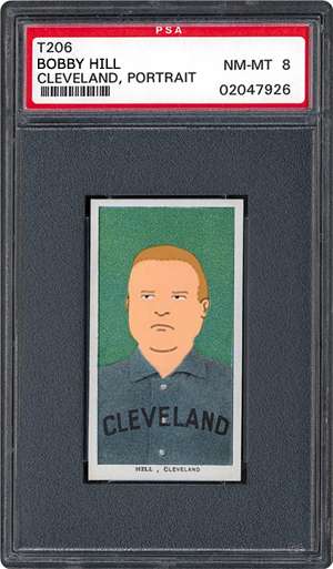
 I've never cared for the T206 Cy Young portrait. Reminds me of Bobby Hill. I'd photoshop Bobby onto the card, but I'm tired. Last edited by CW; 01-08-2015 at 11:09 PM.
|
|
#12
01-09-2015, 01:40 AM
|
||||
|
||||
|
Quote:
__________________
Building these sets: T206, 1953 Bowman Color, 1975 Topps. Great transactions with: piedmont150, Cardboard Junkie, z28jd, t206blogcom, tinkertoeverstochance, trobba, Texxxx, marcdelpercio, t206hound, zachs, tolstoi, IronHorse 2130, AndyG09, BBT206, jtschantz, lug-nut, leaflover, Abravefan11, mpemulis, btcarfagno, BlueSky, and Frankbmd.
|
 |
|
|
 Similar Threads
|
||||
| Thread | Thread Starter | Forum | Replies | Last Post |
| Iconic non Rookie Cards | bn2cardz | Net54baseball Vintage (WWII & Older) Baseball Cards & New Member Introductions | 30 | 09-19-2014 11:59 AM |
| Two things you love about the hobby & Two things you hate | skelly | Net54baseball Vintage (WWII & Older) Baseball Cards & New Member Introductions | 37 | 07-03-2012 09:00 PM |
| cards I hate... | chiprop | Net54baseball Vintage (WWII & Older) Baseball Cards & New Member Introductions | 64 | 09-03-2009 08:51 PM |
| T206 Poll, Love em or hate em | Archive | Net54baseball Vintage (WWII & Older) Baseball Cards & New Member Introductions | 32 | 11-28-2006 07:42 PM |
| Various prewar E, T, and R cards | Archive | 1920 to 1949 Baseball cards- B/S/T | 0 | 11-27-2006 11:18 PM |


 Hybrid Mode
