|
||||||
 |
|
|||||
|
||||||
|
|
|||||
|
|
|
#1
 01-20-2014, 09:35 PM
|
||||
|
||||
|
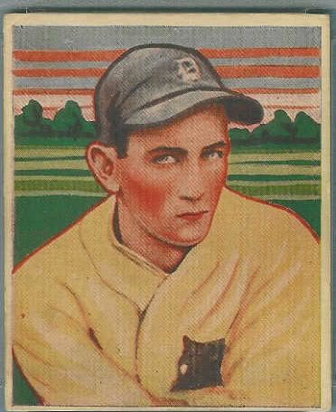
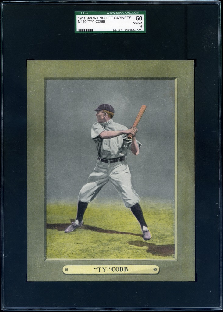
I was looking at some cards of HOFers today, and one really rose above the others; its image struck me like a piece of art. I think cards are not unlike art in general, but the colors of this piece, the way the eyes have such personality, it's just not your average baseball card.
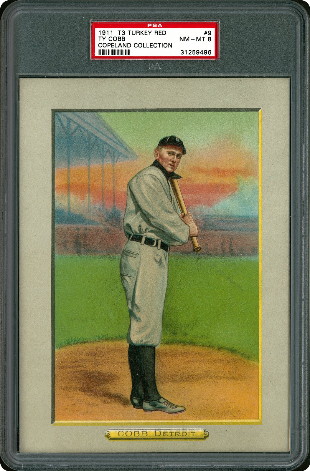
So it got me wondering: what other cards do we have of HOFers, that we feel are in this rarefied class-- that strike us as art, are beautiful on an aesthetic level, but also capture the essence/personality of the player? I'm betting this will be a great way to get put onto some new cards I haven't seen or paid adequate attention to thus far. This was the image that did it for me. It was actually the first Pre War card I ever purchased, because the image made such an indelible impression on me years ago, when I first laid eyes on it. I knew little about Cobb beyond his hitting prowess, and knew nothing about the issue-- other than it was striking and I felt compelled to own one. 
Last edited by MattyC; 01-20-2014 at 09:36 PM. 
|
|
#2
01-20-2014, 09:46 PM
|
||||
|
||||
|
Matt- as you might know, that is the card that was on our first Net54baseball t shirts. That tells you how I feel about it. I think a lot, if not most of us, think of our cards as little works of art. And even though this one is black and white and a photo, it is art to me....

__________________
Leon Luckey www.luckeycards.com
|
|
#3
01-20-2014, 09:59 PM
|
||||
|
||||
|
I never get tired if that one Leon.... Great card. The image in my avatar is one of my faves as well.
__________________
Er1ck.L. ---D381 seeker http://www.flickr.com/photos/30236659@N04/sets/
|
|
#4
01-20-2014, 10:24 PM
|
||||
|
||||
__________________
Check out my aging Sell/Trade Album on my Profile page HOF Type Collector + Philly A's, E/M/W cards, M101-6, Exhibits, Postcards, 30's Premiums & HOF Photos "Assembling an unfocused collection for nearly 50 years." Last edited by HRBAKER; 01-20-2014 at 10:40 PM.
|
|
#7
01-20-2014, 10:41 PM
|
||||
|
||||
|
Always loved Matty's look in this pose. Never thought the T206 white cap (looks boyish) captured Matty's focus like the dark cap... and then the E93adds some fire to it.
T206 Mathewson- N54.jpgE93 Christy Mathewson PSA-3 close.jpg Also really like the E95 Wagner. It has a certain poignancy to it.. maybe a more elegant 1909 equivalent to the 1973 Topps Clemente. E95 Honus Wagner.jpg
|
|
#8
01-20-2014, 10:36 PM
|
||||
|
||||
|
These are two that epitomize "art on cardboard" to me, both commonly seen, but both worthy of mention.
The Mathewson's yellow and blue background shows the beauty of the lithography from the time period, while somehow capturing the grace and dignity of "the Christian Gentleman". (card shown is an E92, but the image exists in other E sets) The Speaker is one of many pieces of art from the T3 Turkey Red set, showing Tris in mid-swing, most likely ready to unleash one of his 792 career doubles (yep, I looked it up!  ). It's a still image, but you can imagine the fluidity and motion of the swing. The intensity in Speaker's face, the ripples in his uniform, and the red socks all come together to form a piece of art on cardboard. ). It's a still image, but you can imagine the fluidity and motion of the swing. The intensity in Speaker's face, the ripples in his uniform, and the red socks all come together to form a piece of art on cardboard.
Last edited by CW; 06-07-2015 at 01:25 AM.
|
|
#9
01-21-2014, 05:59 AM
|
|||
|
|||
|
Quote:
|
|
#10
01-21-2014, 06:40 AM
|
||||
|
||||
|
hand colored masterpiece.
|
|
#11
01-21-2014, 07:10 AM
|
||||
|
||||
|
That Cobb is great. I would love to know what he was grinning about.
__________________
Tackling the Monster T206 = 213/524 HOFs = 13/76 SLers = 33/48 Horizontals = 6/6 ALWAYS looking for T206 with back damage.
|
|
#13
01-21-2014, 06:30 PM
|
||||
|
||||
|
Quote:
 (thanks, btw) (thanks, btw)Quote:
 Quote:
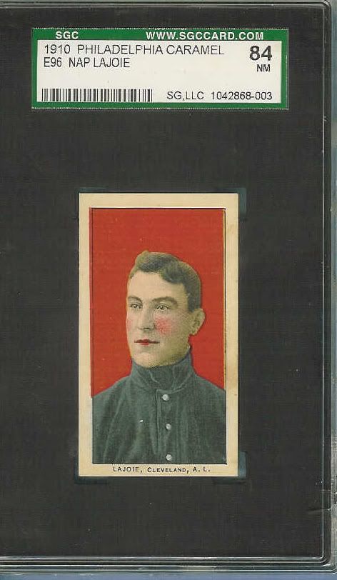
I was also turned onto the Oakes card by this very forum years ago (the old style Net54), and I was turned onto the '33 Goudey Gehringer by the CU forum when someone posted one there years ago. Here's a few more... T216 Tris Speaker (see also E90-1, which is also fairly tough to find) E92 Sherry Magee (almost on par with the Rebel Oakes card) '41 Play Ball DiMaggio '49 Leaf Musial '33 Goudey Gehringer N43 Buck Ewing -- doesn't get much better! Last edited by CW; 01-21-2014 at 10:41 PM.
|
|
#15
01-21-2014, 12:29 AM
|
||||
|
||||
|
The Tris and that red Matty are really powerful images. The T206 dark cap image is beautiful, one of my favorites in the hobby.
That Tris image is mesmerizing, really. Looks like it could come to life if you stare too long. Then again...pot. I think the Tip Top Wagner has such a haunting aspect to it, worth a mention. For Ruth, that 144 has an almost ethereal quality to the uniform. I believe his rookie photo captures his essence the best-- the killer instinct competitive glare is awesome on the RC. Other Ruths just don't show that side of him. Last edited by MattyC; 01-21-2014 at 12:31 AM.
|
|
#16
01-21-2014, 05:08 AM
|
||||
|
||||
|
not my card but ill have one of these eventually
__________________
Successful transactions with: Drumback, Mart8081, Obcmac, Tonyo, markf31, gnaz01, rainier2004, EASE, Bobsbats, Craig M, TistaT202, Seiklis, Kenny Cole, T's please, Vic, marcdelpercio, poorlydrawncat, brianp-beme, mybuddyinc, Glchen, chernieto , old-baseball , Donscards, Centauri, AddieJoss, T2069bk,206fix, joe v, smokelessjoe, eggoman, botn, canjond Looking for T205's or anything Babe Ruth...email or PM me if you have any to sell.
|
|
#17
01-21-2014, 06:54 PM
|
|||
|
|||
|
Here are some through the years
Last edited by rgpete; 01-21-2014 at 06:59 PM.
|
|
#20
01-21-2014, 06:58 PM
|
|||
|
|||
|
I love the colors in this one...may be my favorite card aesthetically speaking
Last edited by Gobucsmagic74; 01-21-2014 at 09:15 PM.
|
|
#22
01-21-2014, 04:29 PM
|
|||
|
|||
|
No way man, that bitch is professionally graded!
|
|
#23
01-21-2014, 05:13 PM
|
||||
|
||||
|
|
|
#24
01-21-2014, 06:06 PM
|
||||
|
||||
|
First off love the topic. I myself went to college to study Graphic Design so I love art and always loved the designs of baseball cards. I have found a bunch of the old school cards that have caught my eye along with many other people. The one set that sticks out is the 1938 Goudey Set. Cartoon-ish but yet the face has the realistic look to it. Then hey who doesn't love the design of the 1934 Goudey Gehrig??? These are yes two of the seats I personally collect but hey come on now who can't agree with me.

__________________
SELLING 1934 GOUDEY PARTIAL SET---CHECK OUT THE THREAD IN B/S/T
|
|
#27
01-22-2014, 08:01 PM
|
||||
|
||||
|
Does anyone own a Miners Extra Cobb? That card belongs in this thread.
Sent from my iPhone using Tapatalk
__________________
Tiger collector Need: Harry Heilmann auto Monster Number 520/520
|
|
#29
01-22-2014, 09:46 PM
|
||||
|
||||
|
I've had this beauty in my collection for 25 years...

__________________
Galleries and Articles about T206 Player Autographs www.SignedT206.com www.instagram.com/signedT206/ @SignedT206
|
|
#32
01-23-2014, 06:50 AM
|
||||
|
||||
|
Not mine, but the first thing to pop into my head:
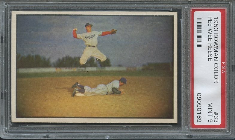 Can't do much better than the iconic '53 Bowman Color Pee Wee Reese.
__________________
Building these sets: T206, 1953 Bowman Color, 1975 Topps. Great transactions with: piedmont150, Cardboard Junkie, z28jd, t206blogcom, tinkertoeverstochance, trobba, Texxxx, marcdelpercio, t206hound, zachs, tolstoi, IronHorse 2130, AndyG09, BBT206, jtschantz, lug-nut, leaflover, Abravefan11, mpemulis, btcarfagno, BlueSky, and Frankbmd.
|
|
#35
01-23-2014, 01:25 PM
|
||||
|
||||
|
That Cobb is quite impressive. I bet it only looks better in person.
__________________
Current Search: Columbus Solons N172: 2/16 (2nd Pose Team Set) Columbus Solons N173 & Proof Photos: 3/? Pre-1950 Cuban Cards: Focus on Billiken, Macionales, & Aguilitas
|
|
#36
01-24-2014, 12:14 AM
|
||||
|
||||
|
Thanks for sharing everyone. Definitely added several new cards to the want list.
Every time I look at these cards, I can't believe that the lithography looks just as good (if not better) as any cards made since then. I wish more pre-war cards had the vibrant and variety of colors, attention to detail, and image quality that the N43's and N162's have.
|
 |
|
|
 Similar Threads
|
||||
| Thread | Thread Starter | Forum | Replies | Last Post |
| Research on Mickey Mantle Post Career Gloves - Please Post Pictures | BigJJ | Net54baseball Sports (Primarily) Vintage Memorabilia Forum incl. Game Used | 0 | 06-12-2013 03:42 PM |
| New blog post; editorial-style post | Zan | Net54baseball Vintage (WWII & Older) Baseball Cards & New Member Introductions | 0 | 09-03-2012 02:16 PM |
| 1962 Post/1963 Post & Jello FS | Archive | 1950 to 1959 Baseball cards- B/S/T | 2 | 04-04-2009 06:34 AM |
| Post the Pride of your Post War Collection | Archive | Postwar Baseball Cards Forum (Pre-1980) | 27 | 09-04-2008 09:54 PM |
| Post your favorite post-war football card(s) | Archive | Football Cards Forum | 11 | 10-09-2007 01:43 PM |


 Hybrid Mode
