NonSports Forum

Net54baseball.com
Welcome to Net54baseball.com. These forums are devoted to both Pre- and Post- war baseball cards and vintage memorabilia, as well as other sports. There is a separate section for Buying, Selling and Trading - the B/S/T area!! If you write anything concerning a person or company your full name needs to be in your post or obtainable from it. . Contact the moderator at leon@net54baseball.com should you have any questions or concerns. When you click on links to eBay on this site and make a purchase, this can result in this site earning a commission. Affiliate programs and affiliations include, but are not limited to, the eBay Partner Network. Enjoy!
Net54baseball.com
Net54baseball.com
ebay GSB
T206s on eBay
Babe Ruth Cards on eBay
t206 Ty Cobb on eBay
Ty Cobb Cards on eBay
Lou Gehrig Cards on eBay
Baseball T201-T217 on eBay
Baseball E90-E107 on eBay
T205 Cards on eBay
Baseball Postcards on eBay
Goudey Cards on eBay
Baseball Memorabilia on eBay
Baseball Exhibit Cards on eBay
Baseball Strip Cards on eBay
Baseball Baking Cards on eBay
Sporting News Cards on eBay
Play Ball Cards on eBay
Joe DiMaggio Cards on eBay
Mickey Mantle Cards on eBay
Bowman 1951-1955 on eBay
Football Cards on eBay

Go Back   Net54baseball.com Forums > Net54baseball Main Forum - WWII & Older Baseball Cards > Net54baseball Vintage (WWII & Older) Baseball Cards & New Member Introductions

Reply
 
Thread Tools Display Modes
  #1  
Old 09-30-2025, 11:28 AM
Lucas00's Avatar
Lucas00 Lucas00 is offline
Lüc@s Dëwėãšę
Member
 
Join Date: Sep 2021
Location: Pennsylvania
Posts: 3,076
Default Iconic cards YOU think are ugly.

I recently saw a new member looking for some iconic cards, and one of them is the e90 Joe Jackson. I have always thought this card of Joe made him look like a Porcelain Doll and was not appealing to me at all. I don't want to make this a fighting thread, just say the card and why you don't like it. If you see your favorite card here that someone else doesn't like, just post your own etc. Just make sure you say why you think the card is ugly.

Another example for me is Babes 1935 goudey 4 in 1. Just a bad photo used (I know it is the same as his green goudey, but the full image helps that out).

__________________
I have done deals with many of the active n54ers. Sometimes I sell cool things that you don't see every day.

My Red Schoendienst collection- https://imageevent.com/lucas00/redsc...enstcollection
Reply With Quote
  #2  
Old 09-30-2025, 11:33 AM
BobbyStrawberry's Avatar
BobbyStrawberry BobbyStrawberry is offline
mªttHǝɯ h0uℊℌ
Member
 
Join Date: Oct 2020
Location: USA
Posts: 3,226
Default

Before I even clicked on this thread I knew e90 Jackson would be mentioned...
__________________
_
Successful transactions with: Natswin2019, ParachromBleu, Cmount76, theuclakid, tiger8mush, shammus, jcmtiger, oldjudge, coolshemp, joejo20, Blunder19, ibechillin33, t206kid, helfrich91, Dashcol, philliesfan, alaskapaul3, Natedog, Kris19, frankbmd, tonyo, Baseball Rarities, Thromdog, T2069bk, t206fix, jakebeckleyoldeagleeye, Casey2296, rdeversole, brianp-beme, seablaster, twalk, qed2190, Gorditadogg, LuckyLarry, tlhss, Cory, zizek
Reply With Quote
  #3  
Old 09-30-2025, 11:38 AM
parkplace33 parkplace33 is offline
Drew W@i$e
Member
 
Join Date: Jul 2018
Posts: 1,639
Default

1933 Goudey Ruth Green and Standing version. The green is not a good image and the standing version is just too tiny and hard to see.

I love the Red and Yellow versions. The others, well, not so much.

Last edited by parkplace33; 09-30-2025 at 11:40 AM.
Reply With Quote
  #4  
Old 09-30-2025, 12:21 PM
Swadewade51's Avatar
Swadewade51 Swadewade51 is offline
W@de J0hns0n
Member
 
Join Date: May 2023
Posts: 319
Default

The 1953 Bowman Pee Wee Reese. It features a terribly posed "action" image, it's blurry no matter how good the registration is, and a really poor card amongst a really beautiful set.
Reply With Quote
  #5  
Old 09-30-2025, 12:45 PM
D. Bergin's Avatar
D. Bergin D. Bergin is offline
Dave
Member
 
Join Date: May 2009
Location: CT
Posts: 7,036
Default

The 1948/49 Leaf Jackie Robinson & Satchel Paige - Just not an attractive set. Prefer the 1949 Bowman for both of them...which is also not a beautiful set...but still a lot nicer then the Leaf.

1963 Topps Pete Rose - Those 4 tiny headed "Rookie Star" cards look atrocious.

1968 Topps Nolan Ryan - just kind of boring in every respect. Appreciate he shares a card with Koosman, who was pretty good himself, but those 68' borders and Nolan looking like he's ALL hat, is not pretty.
__________________
*
*
WAR Hates Dante Bichette!
*
*
So what is it good for?
*
Reply With Quote
  #6  
Old 09-30-2025, 12:46 PM
darwinbulldog's Avatar
darwinbulldog darwinbulldog is offline
Glenn
Glen.n Sch.ey-d
 
Join Date: Mar 2012
Location: South Florida
Posts: 3,520
Default

E90-1 Jackson
T206 Mathewson portrait, white cap
T205 Cobb
1916 M101-4/5 Ruth
1933 Goudey Gehrig
1933 Goudey Ruth #144, #149
1952 Topps Mantle
1986 Fleer Jordan

And, if we're being honest, any Cy Young card that accurately depicts his facial features.
Reply With Quote
  #7  
Old 09-30-2025, 01:00 PM
DeanH3's Avatar
DeanH3 DeanH3 is offline
D/e/@/n H/@/c/k/e/t/t
Member
 
Join Date: Apr 2009
Location: Northern California
Posts: 2,167
Default

I’ve never cared for the ‘32 Caramel Ruth. Not a fan of the pimped hat. lol!
Reply With Quote
  #8  
Old 09-30-2025, 01:02 PM
perezfan's Avatar
perezfan perezfan is offline
M@RK ST€!NBERG
Member
 
Join Date: Apr 2009
Posts: 8,415
Default

Agree on 1986 Fleer Jordan. It just looks cheap and mass-produced. Not even a clear image of Jordan, and is highly overrated. The "Emperors Clothes" comes to mind every time I see it.

Disagree on the Goudey Green Ruth. It's actually my favorite of the four and I really love that shade of green. He looks sick to his stomach in the Red and Yellow versions, and the fully body image is too distant and small, IMHO.
__________________
Be sure to subscribe to my YouTube Channel, The Stuff Of Greatness. New videos are uploaded every week...

https://www.youtube.com/@tsogreatness/videos
Reply With Quote
  #9  
Old 09-30-2025, 01:13 PM
darwinbulldog's Avatar
darwinbulldog darwinbulldog is offline
Glenn
Glen.n Sch.ey-d
 
Join Date: Mar 2012
Location: South Florida
Posts: 3,520
Default

Quote:
Originally Posted by perezfan View Post
Agree on 1986 Fleer Jordan. It just looks cheap and mass-produced. Not even a clear image of Jordan, and is highly overrated. The "Emperors Clothes" comes to mind every time I see it.

Disagree on the Goudey Green Ruth. It's actually my favorite of the four and I really love that shade of green. He looks sick to his stomach in the Red and Yellow versions, and the fully body image is too distant and small, IMHO.
Goudey green Ruth is also my favorite of the four. The yellow one has an aesthetically pleasing palette, but I feel only the green one "captures" him correctly.
Reply With Quote
  #10  
Old 09-30-2025, 01:50 PM
4815162342's Avatar
4815162342 4815162342 is offline
Daryl
Member
 
Join Date: Apr 2009
Posts: 3,823
Default

Quote:
Originally Posted by darwinbulldog View Post
E90-1 Jackson

T206 Mathewson portrait, white cap

T205 Cobb

1916 M101-4/5 Ruth

1933 Goudey Gehrig

1933 Goudey Ruth #144, #149

1952 Topps Mantle

1986 Fleer Jordan


And, if we're being honest, any Cy Young card that accurately depicts his facial features.


Quote:
Originally Posted by perezfan View Post
Agree on 1986 Fleer Jordan. It just looks cheap and mass-produced. Not even a clear image of Jordan, and is highly overrated. The "Emperors Clothes" comes to mind every time I see it.


Disagree on the Goudey Green Ruth. It's actually my favorite of the four and I really love that shade of green. He looks sick to his stomach in the Red and Yellow versions, and the fully body image is too distant and small, IMHO.

You guys accidentally typed “1986 Fleer” instead of “1984 Star.”
Reply With Quote
  #11  
Old 09-30-2025, 02:49 PM
bnorth's Avatar
bnorth bnorth is offline
Ben North
Member
 
Join Date: Jun 2013
Location: South Dakota
Posts: 10,828
Default

The green T206 Cobb is an ugly card. Weirdly love the Red version.
Reply With Quote
  #12  
Old 09-30-2025, 02:53 PM
Brent G.'s Avatar
Brent G. Brent G. is offline
Br.en+ G!@sg0w
Member
 
Join Date: Jun 2024
Location: Indiana native; Illinois resident
Posts: 985
Default

Sorry, but he looks like shit.
Attached Images
File Type: jpg Screenshot 2025-09-30 at 2.50.43 PM.jpg (57.3 KB, 737 views)
__________________
__________________

Collecting Indianapolis-related pre-war and rare regionals, Jim Thorpe items of all kinds, and other vintage thru '80s

Successful deals with Kingcobb, Harford20, darwinbulldog, iwantitiwinit, helfrich91, kaddyshack, Marckus99, D. Bergin, Commodus the Great, Moonlight Graham, orioles70, adoo1, Nilo, JollyElm, DJCollector1, angolajones, timn1, jh691626, NiceDocter, h2oya311, orioles93, thecapeleague, gkrodg00, no10pin, Scon0072, cmoore330, Luke
Reply With Quote
  #13  
Old 09-30-2025, 03:37 PM
Casey2296's Avatar
Casey2296 Casey2296 is offline
Is Mudville so bad?
Member
 
Join Date: Sep 2020
Location: West Coast
Posts: 5,595
Default

[QUOTE=bnorth;2541490]The green T206 Cobb is an ugly card. Weirdly love the Red version.[/QUOTE-
-
Blasphemer!
-
__________________
Phil Lewis


https://www.flickr.com/photos/183872512@N04/
-
Reply With Quote
  #14  
Old 09-30-2025, 03:44 PM
Bliggity's Avatar
Bliggity Bliggity is offline
Dan Bl@u
Member
 
Join Date: Dec 2014
Location: Raleigh, NC
Posts: 950
Default

Ugly background (one of the worst in the art deco sets IMO), and almost always out of registration so Joe D's face looks terrible. Has always been an easy pass for me. Give me the '39 Play Ball Joe D anyday instead, now that's a baseball card! (my avatar agrees)

__________________
Recovering Relapsed set collector.

Last edited by Bliggity; 09-30-2025 at 03:45 PM.
Reply With Quote
  #15  
Old 09-30-2025, 04:04 PM
JJ McGraw's Avatar
JJ McGraw JJ McGraw is offline
M/k& B@y&
Mi,k.e B0y.D
 
Join Date: Nov 2012
Location: Texas
Posts: 545
Default

This 1951 Bowman of Spahn isn’t much better. It’s like it has a wash over it, great pitching stance , but pretty uninteresting and bland…..his 1948 Bowman has to be one of the worst , it’s like part of his prison mug shot portfolio. C Why would someone this was a great shot for a baseball card. I have the 51 already and need to buy the 1948( as I collect Spahn cards) , but I can’t bring myself to spend the money on such an ugly card!
Attached Images
File Type: jpg IMG_9800.jpg (154.4 KB, 707 views)
File Type: jpg IMG_9801.jpg (191.9 KB, 718 views)
__________________
1914-1915 Cracker Jack(72/176)
T206 (433/520)
T205 (65/197)
T3 Turkey Reds (12/126)
1949 Leaf(57/98 , 1 Premium)
New York/San Francisco Giants
Boston Braves
St Louis Browns
Baltimore Orioles
Anything Deadball Era
Reply With Quote
  #16  
Old 09-30-2025, 04:44 PM
LEHR's Avatar
LEHR LEHR is offline
Paul Lehr
Member
 
Join Date: Aug 2012
Location: Utah/Indiana
Posts: 785
Default

I dislike pretty much everything baseball printed in the 1920's aside from some of the exhibits.
Reply With Quote
  #17  
Old 09-30-2025, 06:39 PM
Kevlo17 Kevlo17 is offline
Kevin
Ke.v1n L0we
 
Join Date: Aug 2023
Location: Chicago
Posts: 120
Default

There are a few that come to mind off the top of my head that haven’t been mentioned yet:

1951 Bowman Mays
1949 Bowman Jackie
1952 topps Mays
1914/15 CJ Wagner
The far majority of Mantle Cards
Reply With Quote
  #18  
Old 09-30-2025, 06:47 PM
DHogan's Avatar
DHogan DHogan is offline
Dave
Member
 
Join Date: May 2009
Location: Boston
Posts: 883
Default

W512 Ty Cobb gives me nightmares

Last edited by DHogan; 09-30-2025 at 06:52 PM.
Reply With Quote
  #19  
Old 09-30-2025, 07:07 PM
bnorth's Avatar
bnorth bnorth is offline
Ben North
Member
 
Join Date: Jun 2013
Location: South Dakota
Posts: 10,828
Default

As someone in the GOAT conversation Ted Williams has mostly extremely ugly cards. I have had 8 baseball cut card artwork pieces done and Ted was someone I wanted in that collection. I ended up going with the wrapper from the 59 Fleer set because I couldn't find a card I liked enough. Sorry for the bad picture.
Attached Images
File Type: jpg tedartwork.jpg (121.1 KB, 663 views)
Reply With Quote
  #20  
Old 09-30-2025, 08:49 PM
G1911 G1911 is offline
Gr.eg McCl.@y
 
Join Date: Dec 2015
Posts: 7,487
Default

All the expensive caramel cards that portray players who did not wear women's makeup as if they did.
Attached Images
File Type: jpg phil-caramel-lajoie.jpg (123.1 KB, 599 views)
Reply With Quote
  #21  
Old 09-30-2025, 09:10 PM
JJ McGraw's Avatar
JJ McGraw JJ McGraw is offline
M/k& B@y&
Mi,k.e B0y.D
 
Join Date: Nov 2012
Location: Texas
Posts: 545
Default

Quote:
Originally Posted by G1911 View Post
All the expensive caramel cards that portray players who did not wear women's makeup as if they did.
Maybe with Nap it’s a French thing
__________________
1914-1915 Cracker Jack(72/176)
T206 (433/520)
T205 (65/197)
T3 Turkey Reds (12/126)
1949 Leaf(57/98 , 1 Premium)
New York/San Francisco Giants
Boston Braves
St Louis Browns
Baltimore Orioles
Anything Deadball Era
Reply With Quote
  #22  
Old 09-30-2025, 09:23 PM
Edwolf1963's Avatar
Edwolf1963 Edwolf1963 is offline
Ed Woelfle
Member
 
Join Date: Apr 2009
Location: Buckeye, AZ
Posts: 1,176
Default Spike Shannon

This was always one of my least favorite cards of the T206 set. Looks like an awkward drawing, cartoonish.
Attached Images
File Type: jpg IMG_0685.jpg (136.5 KB, 608 views)
Reply With Quote
  #23  
Old 09-30-2025, 11:13 PM
Balticfox's Avatar
Balticfox Balticfox is offline
V@idotas J0nynas
 
Join Date: Jan 2023
Location: Toronto
Posts: 1,601
Default

Does the card have to be Baseball?


__________________
That government governs best that governs least.
Reply With Quote
  #24  
Old 09-30-2025, 11:42 PM
Tabe's Avatar
Tabe Tabe is offline
Chris
Chr.is Ta.bar
 
Join Date: Aug 2010
Location: Spokane, WA
Posts: 1,517
Default

Quote:
Originally Posted by Brent G. View Post
Sorry, but he looks like shit.

The Graig Kreindler version is so, so much better:

FB_IMG_1759293684365.jpg
Reply With Quote
  #25  
Old 10-01-2025, 05:40 AM
Vintagedeputy's Avatar
Vintagedeputy Vintagedeputy is online now
Jim Reynolds
Member
 
Join Date: May 2019
Location: Glen Allen, Va.
Posts: 1,610
Default

Poor Brooksie.
Attached Images
File Type: jpeg IMG_5719.jpeg (154.6 KB, 577 views)
Reply With Quote
  #26  
Old 10-01-2025, 06:27 AM
jakebeckleyoldeagleeye jakebeckleyoldeagleeye is offline
Member
 
Join Date: Sep 2018
Posts: 386
Default

Being a die hard Detroit Red Wings fan the 1968-69 OPC cards where they stuck Frank Mahovlich's head on the body of Dean Prentice and for Garry Unger's rookie card they stuck his head on Norm Ullman's body.
Oh the good old days of air brushing.
Reply With Quote
  #27  
Old 10-01-2025, 07:39 AM
BillyCoxDodgers3B BillyCoxDodgers3B is offline
Member
 
Join Date: May 2009
Posts: 2,654
Default

Quote:
Originally Posted by jakebeckleyoldeagleeye View Post
Being a die hard Detroit Red Wings fan the 1968-69 OPC cards where they stuck Frank Mahovlich's head on the body of Dean Prentice and for Garry Unger's rookie card they stuck his head on Norm Ullman's body.
Oh the good old days of air brushing.
It's rather pathetic how long they continued to do this. There's a 1984-85 card with Ken Linseman's head atop Mike Krushelnyski's body.
Reply With Quote
  #28  
Old 10-01-2025, 07:41 AM
BillyCoxDodgers3B BillyCoxDodgers3B is offline
Member
 
Join Date: May 2009
Posts: 2,654
Default

Quote:
Originally Posted by Tabe View Post
The Graig Kreindler version is so, so much better:

Attachment 673298
It certainly helps, but even Graig couldn't save that lazy-eyed image. It's just a horrible, horrible card and photo. As an aside, for an autograph collector, it is also a terrible card for that purpose. Naturally, none of this does anything to affect value and demand.
Reply With Quote
  #29  
Old 10-01-2025, 07:43 AM
BillyCoxDodgers3B BillyCoxDodgers3B is offline
Member
 
Join Date: May 2009
Posts: 2,654
Default

Quote:
Originally Posted by Edwolf1963 View Post
This was always one of my least favorite cards of the T206 set. Looks like an awkward drawing, cartoonish.
It reminds me of that Mexican portrait of Christ that was destroyed by the world's worst amateur "restoration".
Reply With Quote
  #30  
Old 10-01-2025, 07:48 AM
BillyCoxDodgers3B BillyCoxDodgers3B is offline
Member
 
Join Date: May 2009
Posts: 2,654
Default

Somebody mentioned their distaste for the T205 Cobb. I suppose this serves to prove that there will always be someone on the other side of any opinion-based discussion. I can't remember hearing anyone else have this opinion, but it's refreshing in spite of my not sharing those feelings.

If I had to explain a collector's appreciation for the artistic beauty of prewar cards, the Cobb is the very example I would point to. That is everything a baseball card from that era should be.
Reply With Quote
  #31  
Old 10-01-2025, 09:05 AM
jsfriedm's Avatar
jsfriedm jsfriedm is offline
Jeremy
Member
 
Join Date: May 2020
Location: Medford, MA
Posts: 326
Default

Some of my top picks were already taken (the Jackson rookie, obviously, the Rose rookie, the CJ Wagners where he looks 90 years old), and I am shocked by some of the picks (T205 Cobb? 1951 Mays? And Ted Williams has some of the most beautiful cards, esp his 1949 Leaf!), but I will throw one more on the pile:

1952 Topps Willie Mays. It still looks to me like they surprised him coming out of the bathroom in a dark clubhouse. I don't get how that was the image they used.
__________________
198/240 1933 Goudeys (Ruth #144, #149, Gehrig #92)
136/208 T205s
47/108? Diamond Stars

Last edited by jsfriedm; 10-01-2025 at 09:06 AM.
Reply With Quote
  #32  
Old 10-01-2025, 09:39 AM
Zach Wheat Zach Wheat is offline
Member
 
Join Date: Apr 2009
Posts: 2,053
Default

Quote:
Originally Posted by BillyCoxDodgers3B View Post
Somebody mentioned their distaste for the T205 Cobb.....
Speaking of Cobb, here is one his ugliest cards. The image is even backwards. His W 516 2-2 card...
Attached Images
File Type: jpg W 516 2-2 Ty Cobb.JPG (31.4 KB, 489 views)

Last edited by Zach Wheat; 10-01-2025 at 09:40 AM.
Reply With Quote
  #33  
Old 10-01-2025, 11:26 AM
Bill77 Bill77 is offline
Bill Avery
Member
 
Join Date: Jun 2015
Location: Wisconsin
Posts: 695
Default

My picks would include the 1956 Topps Mantle, the 1989 Upper Deck Ken Griffey Jr, and the 1993 SP Derek Jeter.
Reply With Quote
  #34  
Old 10-01-2025, 12:16 PM
Touch'EmAll's Avatar
Touch'EmAll Touch'EmAll is offline
Member
 
Join Date: May 2009
Posts: 1,113
Default

I like Mike Schmidt, but I just can't choke down his rookie card. And the 1973 Reggie Jackson is a no go.

Love the '77 Seaver, '74 Ryan, '74 Steve Carlton, '77 Carlton Fisk, '76 Bench.
Reply With Quote
  #35  
Old 10-01-2025, 12:35 PM
jchcollins's Avatar
jchcollins jchcollins is offline
John Collins
Member
 
Join Date: Jan 2015
Location: NC
Posts: 3,701
Default

This to me is always an interesting topic, because a card doesn’t have to be aesthetically ideal to become “iconic.”

Examples to me would include the ‘68 Nolan Ryan RC, and even the ‘52 Topps Mantle. Neither picture just fantastic likenesses of the subjects which make them so expensive, but because they have been so famous / iconic for so long - this as a criteria anymore is out the window for most people. They are famous cards, and will remain that way.

I know a lot of people dislike the ‘63 Rose floating head, and I understand why so it doesn’t bother me - but to me the early Topps multiplayer RC’s are in themselves iconic due to what I will call “period correctness” - if for lack of a better term. No, it’s not great image of Rose, but that’s how Topps treated most all rookies at the time, and the fact that he was just lumped in with 3 other guys to me kind of speaks to the innocence of the time. Clearly had Topps known Pete Rose would turn out to be Pete Rose, he would have gotten his own card. I don’t mind the floating heads, but do think it’s kind of funny that the LL cards like that might be a “cheap” way to get a Mantle or an Aaron or a Mays, but the Rose floating head because it’s a RC is the most expensive Rose out there. You gotta laugh at how things turn out sometimes…


Sent from my iPad using Tapatalk
__________________
Postwar stars & HOF'ers. Cubs of all eras. Currently working on 1956, '63 and '72 Topps complete sets.
Reply With Quote
  #36  
Old 10-01-2025, 03:51 PM
kcohen's Avatar
kcohen kcohen is offline
Ke.n K0hen
 
Join Date: May 2009
Location: Alexandria, VA
Posts: 798
Default

Quote:
Originally Posted by Vintagedeputy View Post
Poor Brooksie.
I once had a conversation with Brooks as to why he looked like that in the photo. He had just finished running sprints and the photographer immediately stuck his camera in his face.
Reply With Quote
  #37  
Old 10-01-2025, 03:51 PM
Luke's Avatar
Luke Luke is offline
Luke Lyon
Member
 
Join Date: Aug 2010
Location: Seattle
Posts: 4,257
Default

I'm absolutely floored that I'm the first person to mention the ugliest card of all time, the T207 Walter Johnson.

This will probably be unpopular, but also t3 Cobb for me. Incredibly beautiful card until you look closely at his face.
Attached Images
File Type: jpg T207 Johnson a.jpg (134.9 KB, 443 views)
__________________
ThatT206Life.com
Reply With Quote
  #38  
Old 10-01-2025, 06:28 PM
DeanH3's Avatar
DeanH3 DeanH3 is offline
D/e/@/n H/@/c/k/e/t/t
Member
 
Join Date: Apr 2009
Location: Northern California
Posts: 2,167
Default

Quote:
Originally Posted by Vintagedeputy View Post
Poor Brooksie.
I always think Peyton Manning everytime I see this card.
Reply With Quote
  #39  
Old 10-01-2025, 08:27 PM
fisherboy7's Avatar
fisherboy7 fisherboy7 is offline
Ben Fisher
Member
 
Join Date: Jul 2014
Posts: 160
Default

I'm actually a fan of a bunch of the cards mentioned in this thread, including the e90-1 Jackson

In my opinion the ugliest prewar sets are the strip cards: W512, W515, and W516 especially. etc. I'll make an exception for W514 which is slightly more appealing but still not great....
Reply With Quote
  #40  
Old 10-02-2025, 07:32 AM
Kutcher55 Kutcher55 is online now
J@son Per1
Member
 
Join Date: May 2020
Posts: 886
Default

Agree most of those strip cards are ugly. Some of the babe Ruth images are comically bad. Would also include the 63 Rose RC in the discussion. Spahn 48 bowman no doubt although Spahn is one of those guys who was so ugly that he was good looking.
Reply With Quote
  #41  
Old 10-02-2025, 08:19 AM
luciobar1980's Avatar
luciobar1980 luciobar1980 is online now
Lucio Barbarino
Lu.cio Barb.arino
 
Join Date: Jul 2017
Location: Troy, NY
Posts: 1,197
Default

Quote:
Originally Posted by Bliggity View Post
Ugly background (one of the worst in the art deco sets IMO), and almost always out of registration so Joe D's face looks terrible. Has always been an easy pass for me. Give me the '39 Play Ball Joe D anyday instead, now that's a baseball card! (my avatar agrees)

I agree.. never liked this card much and can never fathom why it goes for more than the 39! Must be print run, etc, but still!
__________________
~20 SUCCESSFUL BST (1 trade) on Net54
Reply With Quote
  #42  
Old 10-02-2025, 01:40 PM
Johnny630 Johnny630 is offline
Johnny MaZilli
Member
 
Join Date: Nov 2015
Posts: 4,423
Default

The Neck !!
Attached Images
File Type: jpg front.jpg (102.6 KB, 300 views)
Reply With Quote
  #43  
Old 10-02-2025, 07:01 PM
Balticfox's Avatar
Balticfox Balticfox is offline
V@idotas J0nynas
 
Join Date: Jan 2023
Location: Toronto
Posts: 1,601
Default

There's evidence aplenty in this thread for not stressing out to complete sets on which one is working. Acquiring a certain number of ugly cards is understandable if they're part of an attractively priced bulk lot, but why pay up for specific cards if they're ugly?

__________________
That government governs best that governs least.
Reply With Quote
  #44  
Old 10-04-2025, 07:49 AM
puckpaul puckpaul is offline
P.aul Orl,in
 
Join Date: Oct 2012
Posts: 829
Default D304 Wagner

Great set…horrible image. Doesnt look like him at all. Weird stance. Huge square shoulders.

Would still love to own one!
Attached Images
File Type: jpg IMG_0047.jpg (166.1 KB, 195 views)
Reply With Quote
  #45  
Old 10-04-2025, 08:16 AM
BillyCoxDodgers3B BillyCoxDodgers3B is offline
Member
 
Join Date: May 2009
Posts: 2,654
Default

Quote:
Originally Posted by Balticfox View Post
There's evidence aplenty in this thread for not stressing out to complete sets on which one is working. Acquiring a certain number of ugly cards is understandable if they're part of an attractively priced bulk lot, but why pay up for specific cards if they're ugly?

Exactly. Any project is complete once the collector deems it to be. That can be one way of looking at it. It can also be more relaxing if you can allow yourself that freedom, not to mention more cost efficient.
Reply With Quote
  #46  
Old 10-04-2025, 09:24 AM
puckpaul puckpaul is offline
P.aul Orl,in
 
Join Date: Oct 2012
Posts: 829
Default

Completing sets is relaxing. Trying to complete them too. It’s fun and challenging.

Not sure the point of this comment. Stress? What stress? we all have a lot of stress in our lives, completing sets is NOT one of them.
Reply With Quote
  #47  
Old 10-04-2025, 09:47 AM
Jay Wolt's Avatar
Jay Wolt Jay Wolt is offline
qualitycards
Member
 
Join Date: Apr 2009
Location: Gettysburg PA area
Posts: 3,103
Default

Quote:
Originally Posted by Luke View Post

This will probably be unpopular, but also t3 Cobb for me. Incredibly beautiful card until you look closely at his face.
To me the shoes are the worst part of the image

Reply With Quote
  #48  
Old 10-04-2025, 09:51 AM
Balticfox's Avatar
Balticfox Balticfox is offline
V@idotas J0nynas
 
Join Date: Jan 2023
Location: Toronto
Posts: 1,601
Default

Quote:
Originally Posted by puckpaul View Post
Completing sets is relaxing. Trying to complete them too. It’s fun and challenging.

Not sure the point of this comment. Stress? What stress? we all have a lot of stress in our lives, completing sets is NOT one of them.
"Stress out" is probably the wrong term.

Now I've been a completist on the Hockey, CFL and non-sport cards I've been collecting since 1979 when I took up re-amassing the cards of my formative years. But the 2nd series of 1964-65 Topps Hockey Tall Boys and the hundreds of ugly, head shots (many even hatless) included in the 1954-65 Topps Baseball sets have resulted in an attitude adjustment since I retired in 2020. I mean "Hey, why am I forcing myself to pay mega $ for that ugly thing? (e.g. 1960 Roger Maris, 1961 Willie Mays) There are better cards/places on which to spend my money." Yeah, yeah, I guess I won't complete any of those Baseball sets but so what?

__________________
That government governs best that governs least.

Last edited by Balticfox; 10-04-2025 at 10:05 AM.
Reply With Quote
  #49  
Old 10-04-2025, 11:59 AM
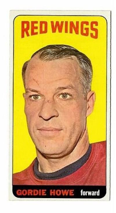
D. Bergin's Avatar
D. Bergin D. Bergin is offline
Dave
Member
 
Join Date: May 2009
Location: CT
Posts: 7,036
Default

Quote:
Originally Posted by Balticfox View Post
Does the card have to be Baseball?


I don't know. It's a scary headshot, but still Mr. Hockey personified as a grizzled old man, with a half smirk that almost says, "I'm bout to break you in two, if you so much as go NEAR those boards around me.".

If we're talking "iconic" cards. His Parkhust Rookie card is pretty atrocious looking.
Attached Images
File Type: jpg 1951GordieHoweParkhurst2949292s-l1600.jpg (204.8 KB, 158 views)
__________________
*
*
WAR Hates Dante Bichette!
*
*
So what is it good for?
*
Reply With Quote
  #50  
Old 10-04-2025, 01:52 PM
brianp-beme's Avatar
brianp-beme brianp-beme is offline
Member
 
Join Date: May 2009
Posts: 8,750
Default

Quote:
Originally Posted by D. Bergin View Post

If we're talking "iconic" cards. His Parkhust Rookie card is pretty atrocious looking.
And he is identified as Gordon Howe on the card...how tastelessly grown-up.

Brian
Reply With Quote
Reply


Posting Rules
You may not post new threads
You may not post replies
You may not post attachments
You may not edit your posts

BB code is On
Smilies are On
[IMG] code is On
HTML code is On

Forum Jump

Similar Threads
Thread Thread Starter Forum Replies Last Post
What Are The Top 10 Most Iconic Baseball Cards Ever? 4815162342 Net54baseball Vintage (WWII & Older) Baseball Cards & New Member Introductions 47 08-16-2025 06:54 PM
Cards becoming iconic polakoff Modern Baseball Cards Forum (1980-Present) 6 03-07-2021 05:51 PM
Iconic cards Jcfowler6 Net54baseball Vintage (WWII & Older) Baseball Cards & New Member Introductions 62 03-26-2018 06:52 PM
10 Most Iconic Cards under $200 jared6180 Postwar Baseball Cards Forum (Pre-1980) 47 07-12-2016 04:01 PM
Iconic non Rookie Cards bn2cardz Net54baseball Vintage (WWII & Older) Baseball Cards & New Member Introductions 30 09-19-2014 11:59 AM


All times are GMT -6. The time now is 02:43 PM.


ebay GSB