|
||||||
 |
|
|||||
|
||||||
|
|
|||||
|
#1
 02-26-2022, 08:36 PM
|
||||
|
||||
|
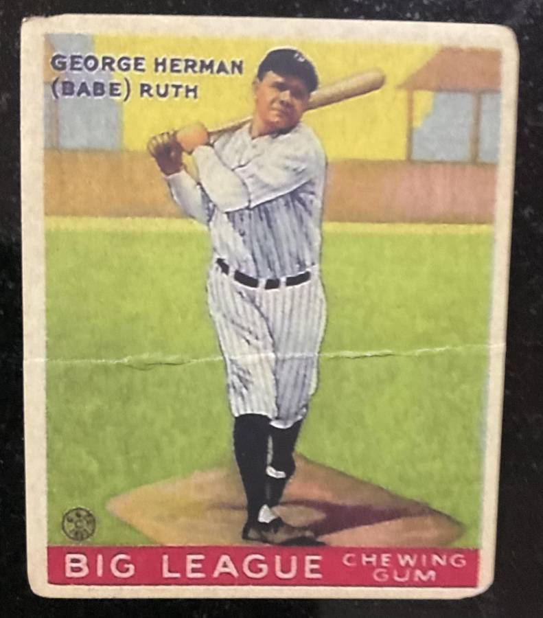
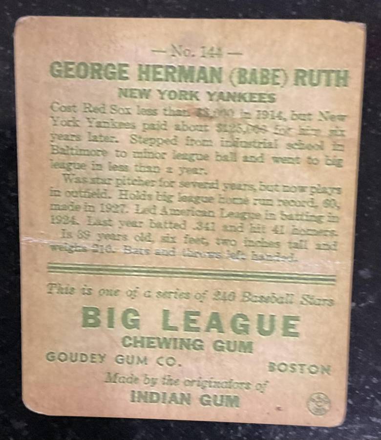
This card is well known to many of you. I do not consider myself an expert on Goudey reprints. I would welcome opinions regarding authenticity vs reprint. My hunch will be withheld until a consensus opinion is voiced. thanks in advance. When I can get the card to my scanner, these sub-optimal images will be replaced. If you care to hazard a value estimate, feel free. With the large transverse crease I'm thinking a value in the $1 to $10000 range is where it should land. The card is not mine ..................... yet.
__________________
RAUCOUS SPORTS CARD FORUM MEMBER AND MONSTER FATHER. GOOD FOR THE HOBBY AND THE FORUM WITH A VAULT IN AN UNDISCLOSED LOCATION FILLED WITH WORTHLESS NON-FUNGIBLES 274/1000 Monster Number Last edited by Leon; 02-26-2022 at 10:27 PM. 
|
|
#2
02-26-2022, 08:40 PM
|
|||
|
|||
|
Methinks reprint for several reasons. No bleed through of ink on the back. Image on front and back print of name looks blurry. Lastly from the scan I see brighter white fibers in the crease and a corner or two which should not be...
__________________
Successful B/S/T deals with asoriano, obcbobd, x2dRich2000, eyecollectvintage, RepublicaninMass, Kwikford, Oneofthree67, jfkheat, scottglevy, whitehse, GoldenAge50s, Peter Spaeth, Northviewcats, megalimey, BenitoMcNamara, Edwolf1963, mightyq, sidepocket, darwinbulldog, jasonc, jessejames, sb1, rjackson44, bobbyw8469, quinnsryche, Carter08, philliesfan and ALBB, Buythatcard and JimmyC so far. Last edited by chalupacollects; 02-26-2022 at 08:41 PM. Reason: added word
|
|
#3
02-26-2022, 08:43 PM
|
||||
|
||||
|
looks fake to me
__________________
https://www.flickr.com/photos/190647741@N04/albums
|
|
#5
02-26-2022, 08:52 PM
|
||||
|
||||
|
Quote:
__________________
Thanks all Jeff Kuhr https://www.flickr.com/photos/144250058@N05/ Looking for 1920 Heading Home Ruth Cards 1920s Advertising Card Babe Ruth/Carl Mays All Stars Throwing Pose 1917-20 Felix Mendelssohn Babe Ruth 1921 Frederick Foto Ruth Rare early Ruth Cards and Postcards Rare early Joe Jackson Cards and Postcards 1910 Old Mills Joe Jackson 1914 Boston Garter Joe Jackson 1911 Pinkerton Joe Jackson
|
|
#6
02-26-2022, 09:22 PM
|
||||
|
||||
|
The card is very fuzzy and overall just not sharp looking at all like the real card. The biggest giveaway to me is when you compare his eyes. The low quality shadow almost makes it look like his eyes are a black void. On a real copy you can see the white in his eyes. They are defined and the shadow looks natural.
His socks and belt should look blue. Not black like this fake. And his shoes should look much more detailed and richer in color. Just a few small things I notice looking at them side by side.
__________________
I have done deals with many of the active n54ers. Sometimes I sell cool things that you don't see every day. My Red Schoendienst collection- https://imageevent.com/lucas00/redsc...enstcollection Last edited by Lucas00; 02-26-2022 at 09:39 PM.
|
|
#7
02-26-2022, 09:31 PM
|
||||
|
||||
|
Dr. Frank, is this a comedy bit? It looks like someone folded it this morning.
__________________
Want to buy or trade for T213-1 (Bob Rhoades) Other Louisiana issues T216 T215 T214 T213 Etc
|
|
#8
02-26-2022, 09:39 PM
|
||||
|
||||
|
Quote:
__________________
RAUCOUS SPORTS CARD FORUM MEMBER AND MONSTER FATHER. GOOD FOR THE HOBBY AND THE FORUM WITH A VAULT IN AN UNDISCLOSED LOCATION FILLED WITH WORTHLESS NON-FUNGIBLES 274/1000 Monster Number
|
|
#9
02-26-2022, 09:46 PM
|
||||
|
||||
|
Horrible
|
|
#10
02-26-2022, 09:46 PM
|
||||
|
||||
|
Quote:
__________________
Want to buy or trade for T213-1 (Bob Rhoades) Other Louisiana issues T216 T215 T214 T213 Etc
|
|
#12
02-26-2022, 09:55 PM
|
|||
|
|||
|
I am no expert, but comparing it to mine, the black pinstripes in the uniform look far more muted in your example, but the red looks several hues darker red than mine. Yours looks closer to maroon, whereas mine is closer to a traditional red. Also, your copyright above "BIG" looks almost black, whereas the color is clearly red in my example, albeit darker than the red bottom border. Maybe a clearer scan would change the analysis, but putting a picture of mine next to your picture suggests yours is fake.
|
|
#13
02-26-2022, 10:28 PM
|
||||
|
||||
|
I took moderator privilege and put a real one under Frank's. Frank's has very white borders, poor lithography and artificial aging, otherwise it's pretty nice.
.
__________________
Leon Luckey www.luckeycards.com Last edited by Leon; 02-26-2022 at 10:30 PM.
|
|
#14
02-26-2022, 10:32 PM
|
||||
|
||||
|
Im no pre-war guy but the unnatural corner wear alone had me saying nice try.
Sent from my iPhone using Tapatalk
__________________
. Infuriating entitled old men since 2022...the eBay Authenticity Guarantee. #itouchmycards
|
|
#15
02-26-2022, 10:41 PM
|
||||
|
||||
|
Unless this is a really horrible Ruth scan the card is definitely a reprint or fake.
__________________
Tony Collecting: 1909-1911 T206 Southern Leaguers 1914 Cracker Jack Set (96 out of 145)
|
|
#16
02-26-2022, 11:47 PM
|
||||
|
||||
|
Frankly Frank, it's a fake fake.
Brian Brain
|
|
#17
02-27-2022, 05:52 AM
|
|||
|
|||
|
Quote:
 The card in this thread is a counterfeit.
__________________
Check out https://www.thecollectorconnection.com Always looking for consignments 717.327.8915 We sell your less expensive pre-war cards individually instead of in bulk lots to make YOU the most money possible! and Facebook: https://www.facebook.com/thecollectorconnectionauctions
|
|
#18
02-27-2022, 08:46 AM
|
||||
|
||||
|
Please do not refer to the card as mine. It hasnt and wont cost me a dime.
Yes, Ive made mistakes, but this is not one of them. Consider this an educational thread. Im helping the hobby one thread at a time.
__________________
RAUCOUS SPORTS CARD FORUM MEMBER AND MONSTER FATHER. GOOD FOR THE HOBBY AND THE FORUM WITH A VAULT IN AN UNDISCLOSED LOCATION FILLED WITH WORTHLESS NON-FUNGIBLES 274/1000 Monster Number
|
|
#19
02-27-2022, 09:05 AM
|
||||
|
||||
|
I say reprint also.
and I also agree that a fake fake would have to be real.
__________________
- Justin D. Player collecting - Lance Parrish, Jim Davenport, John Norlander. Successful B/S/T with - Highstep74, Northviewcats, pencil1974, T2069bk, tjenkins, wilkiebaby11, baez578, Bocabirdman, maddux31, Leon, Just-Collect, bigfish, quinnsryche...and a whole bunch more, I stopped keeping track, lol.
|
|
#20
02-27-2022, 09:54 AM
|
||||
|
||||
|
Gosh it screams "I just printed this today!
The darkness in the cap and leggings and logo/copyright, the whiteness around the letters.
__________________
1916-20 UNC Big Heads collection Headed to LoTG auctions this November fall auction
|
|
#21
02-27-2022, 10:23 AM
|
||||
|
||||
|
Quote:

__________________
RAUCOUS SPORTS CARD FORUM MEMBER AND MONSTER FATHER. GOOD FOR THE HOBBY AND THE FORUM WITH A VAULT IN AN UNDISCLOSED LOCATION FILLED WITH WORTHLESS NON-FUNGIBLES 274/1000 Monster Number
|
|
#22
02-27-2022, 11:45 AM
|
||||
|
||||
|
Quote:
Brian
|
|
#24
02-27-2022, 01:08 PM
|
||||
|
||||
|
Quote:
Thanks for all the input on this thread from all.
__________________
RAUCOUS SPORTS CARD FORUM MEMBER AND MONSTER FATHER. GOOD FOR THE HOBBY AND THE FORUM WITH A VAULT IN AN UNDISCLOSED LOCATION FILLED WITH WORTHLESS NON-FUNGIBLES 274/1000 Monster Number
|
|
#25
02-27-2022, 01:24 PM
|
|||
|
|||
|
Quote:

__________________
Check out https://www.thecollectorconnection.com Always looking for consignments 717.327.8915 We sell your less expensive pre-war cards individually instead of in bulk lots to make YOU the most money possible! and Facebook: https://www.facebook.com/thecollectorconnectionauctions
|
|
#26
02-27-2022, 02:52 PM
|
||||
|
||||
|
This one is an obvious fake. Trouble is, there are any number of fakes or counterfeits out there that are not nearly as obvious as this...the red bleed, the font, the shadow, yada yada yada. Modern day fakes, done right (or wrong), are virtually indistinguishable from the real. I saw one recently (I know personally who submitted it to PSA) that was louped, blacklighted, smell and feel tested, and yet was still deemed as counterfeit, kept by them and not returned to the owner. I have personally seen three others that looked even more fake than this one accepted and graded by PSA and SGC. There are fakes out there that even experts deem real. And therein lies the problem. I put mine, and the COA from Harvey Brandwein from 1988 in the safe deposit box and I am leaving it there for the foreseeable future.
__________________
James Ingram Successful net54 purchases from/trades with: Tere1071 (twice), Bocabirdman (5 times), 8thEastVB, GoldenAge50s, IronHorse2130, Kris19 (twice), G1911, dacubfan, sflayank, Smanzari, bocca001, eliminator, ejstel, lampertb, rjackson44 (twice), Jason19th, Cmvorce, CobbSpikedMe, Harliduck, donmuth, HercDriver, Huck, theshleps, horzverti, ALBB, lrush Last edited by jingram058; 02-27-2022 at 02:53 PM.
|
|
#27
03-02-2022, 06:38 PM
|
||||
|
||||
|
Quote:
.
__________________
Leon Luckey www.luckeycards.com
|
|
#28
03-02-2022, 11:13 PM
|
||||
|
||||
|
I would love to see an actual scan of the card. I am not 100% convinced it is not real. The Dover Reprints were glossy, no?
__________________
( h @ $ e A n + l e y
|
|
#29
03-03-2022, 07:58 AM
|
|||
|
|||
|
It's not a genuine 1933 card. It's a reprint that's been intentionally worn and soiled a bit. That's what you're gonna find if you break that card out.
I think if you illuminate that card while in the slab with a black light, then the card will fluoresce and then that wishing and hoping won't be standing in the way of thinking it's legitimate. A bit of uv light would be easily done... why hasn't that been done? As mentioned above, if you've handled a few Goudey cards you'll soon sense their weight, and you'll recognize the feel of the layered cardstock upon which they're printed. But a downside of having the card in a slab is that you can't touch the card unless you break the card out. A Dover reprint? I'm not sure. They aren't really glossy, but the Dover cards have a look that would seem glossier than Goudey's (which aren't really glossy at all). Dover cards are thinner, easier to slightly bend. Once a reprint card is mistakenly graded/encapsulated, then the likelihood of detecting that diminishes. Whoever has the graded card wants to believe it is what the slip at the top says it is, and anyone who looks at the card will be distracted by looking at the slip. 5 senses... we aren't gonna listen to a card, nor are we gonna taste a card. So that leaves 3 senses to evaluate a card: sight, smell, and touch. Smell is almost a non-factor, but it could be if someone has used a nonpolar solvent that leaves a residue that can be smelled (lighter fluid would be an example, and having smelled that maybe a person would look more closely for signs of why it was used, and also look for fading of bleeding of the print ink). We are down to limiting ourselves to two remaining senses, touch and sight. Once the card gets slabbed then touch is eliminated. Obviously, once a reprint is graded as authentic then it becomes slightly less likely that people will notice that it is a reprint. Do graded cards deserve more scrutiny? Maybe.
|
|
#31
03-03-2022, 02:04 PM
|
||||
|
||||
|
I do not like the focus on the card and it screams of reprint but I do not know how much of that is a poorly lit cell phone pic. The wear to the top two corners from the back and the front certainly suggests, to my eyes, the type of wear that would be present on a Goudey. Also the heavy crease on both the back and front suggest the same. A card with that much wear however would likely not have such white borders. Again I would love to see a scan. A clear scan would be more definitive.
__________________
( h @ $ e A n + l e y
|
|
#32
03-03-2022, 04:07 PM
|
|||
|
|||
|
What led me to believe it was a Dover reprint was the heavy use of black ink. Compare the colors on Ruth's cap, belt and stockings in the reprint to Leon's true and beautiful Babe. The black is much sharper when it should be more of a faded blue. This is more pronounced on Dover CJ reprints, which flooded the market about 20 years ago raw by some of the usual suspects still around today. I stand behind Dover Reprint.
|
 |
|
|
 Similar Threads
|
||||
| Thread | Thread Starter | Forum | Replies | Last Post |
| 1933 Goudey Ruth 144, '34 Goudey Gehrig, '38 Goudey DiMaggio for sale | realbigfatdog | Pre-WWII cards (E, D, M, etc..) B/S/T | 2 | 12-12-2021 05:29 PM |
| Opinion on these recently bought low grade Ruth and Gehrig Goudey - Real or Fake | kevinlenane | Net54baseball Vintage (WWII & Older) Baseball Cards & New Member Introductions | 50 | 11-04-2019 11:00 AM |
| Need opinion on some raw Goudey commons | TheBig6 | Net54baseball Vintage (WWII & Older) Baseball Cards & New Member Introductions | 12 | 02-19-2019 08:54 AM |
| Need Grading Opinion On 1933 Goudey Ruth | btcarfagno | Net54baseball Vintage (WWII & Older) Baseball Cards & New Member Introductions | 22 | 08-07-2018 11:02 PM |
| poor 1933 goudey ruth opinion | richardcards | Net54baseball Vintage (WWII & Older) Baseball Cards & New Member Introductions | 80 | 03-30-2016 08:19 PM |


 Linear Mode

