|
||||||
 |
|
|||||
|
||||||
|
|
|||||
|
#1
 11-20-2017, 07:01 PM
|
||||
|
||||
|
When considering top/bottom centering on a T206, should a card grade higher with perfect 50/50 dimensions, or should there be a slightly larger bottom margin to account for the name and team? For me, a card with around 40/60 centering (the Brown for example, as opposed to the Heinie Wagner which has the writing right on the edge) is ideal. I look for a card that has the same amount of white below the writing as above it. Interested to hear opinions on what gives a card the best “eye appeal” and how that compares to what is considered when assigning a technical grade.
   Sent from my iPhone using Tapatalk
__________________
Instagram: https://www.instagram.com/nufcedcards/ YouTube: https://www.youtube.com/channel/UCOd...OlzJxdgP56pxvg Last edited by Andrew1975; 11-20-2017 at 07:26 PM. 
|
|
#2
11-20-2017, 07:19 PM
|
||||
|
||||
|
Personally, I agree with you. Having the name centered on the bottom border is more eye-appealing than having both borders be equally centered.
Sent from my iPhone using Tapatalk
|
|
#4
11-20-2017, 07:33 PM
|
||||
|
||||
|
Make that 3 that agree. BTW - is that Speaker an American Beauty?
__________________
Successful transactions with: Chesboro41, jimivintage, Bocabirdman, marcdelpercio, Jollyelm, Smanzari, asoriano, pclpads, joem36, nolemmings, t206blogcom, Northviewcats, Xplainer, Kickstand19, GrayGhost, btcarfango, Brian Van Horn, USMC09, G36, scotgreb, tere1071, kurri17, wrm, David James, tjenkins, SteveWhite, OhioCard Collector, sysks22, ejstel. Marty
|
|
#6
11-20-2017, 08:12 PM
|
||||
|
||||
|
Thanks for the input, Gents. Any idea how the TPGs view the issue? Bill, unfortunately, just a Piedmont back on the Speaker (SGC 50/4). It does look a bit thin... The Cobb is extraordinary - beautiful card. That centering, to me, although not “perfect”, is definitely better than that of cards where the lettering is on the edge.
Last edited by Andrew1975; 11-20-2017 at 08:16 PM.
|
|
#8
11-21-2017, 09:16 AM
|
|||
|
|||
|
Quote:
As for PSA, my suspicion is that there is no consensus on what a 50/50 top to bottom centered T206 is and its presently left up to the individual grader. Good question for Mr. Hall or Mr. Orlando.
|
|
#9
11-21-2017, 12:14 PM
|
||||
|
||||
|
I also prefer the higher image, allowing a centered caption at the bottom (as shown with the 3F Brown).
Steve
__________________
Successful BST deals with eliotdeutsch, gonzo, jimivintage, Leon, lharris3600, markf31, Moonlight Graham, Mrc32, sb1, seablaster, shammus, veloce. Current Wantlist: 1909 Obak Howard (Los Angeles) (no frame on back)
|
|
#10
11-22-2017, 09:26 AM
|
|||
|
|||
|
I first compare the top margine with the right and left. To me all should be very close before I'll consider the purchase.
Some that I own are near equal at top, right and left while the bottom may be somewhat wider to allow for the name. If the bottom is too wide or too narrow it is distracting. All of this brings another question to mind, how much more are you willing to pay for a card that meets your requirements?
__________________
Successful transactions with: Double-P-Enterprises, Thromdog, DavidBvintage, Desert Ice Sports, Kurtz Kardz, Cooperstown Sportscards, BBT206 and tenorvox!
|
|
#11
11-24-2017, 02:32 PM
|
||||
|
||||
|
Quote:
 . Apologies for the same old card, will have to get a new one soon. . Apologies for the same old card, will have to get a new one soon.
__________________
Leon Luckey www.luckeycards.com
|
|
#12
11-24-2017, 02:48 PM
|
|||
|
|||
|
Leon, that's exactly what I was talking about! The top, left and right margins are nearly, if not, perfect. I don't think the wide bottom distracts any from the presentablility (is that a word?).
You are right, if you miss out you may never see another that looks so good. I'm not that experienced to know which cards are difficult to find centered. 
__________________
Successful transactions with: Double-P-Enterprises, Thromdog, DavidBvintage, Desert Ice Sports, Kurtz Kardz, Cooperstown Sportscards, BBT206 and tenorvox!
|
|
#13
11-24-2017, 05:02 PM
|
||||
|
||||
|
Criteria for every collector is different so there really is no wrong or right answer when it comes to centering on certain prewar issues such as T206.
First and foremost for me is always image quality (color & registration) Second comes side to side centering (must be somewhat decent) Top to bottom centering I have some give. Fat top borders are welcome if plenty of bottom border remain which actually gives the card some character in my opinion.  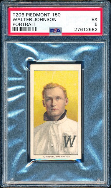 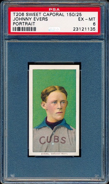
__________________
Tony A.
|
 |
|
|
 Similar Threads
|
||||
| Thread | Thread Starter | Forum | Replies | Last Post |
| t206 Walsh, SGC 30, Great Centering | GregMitch34 | Tobacco (T) cards, except T206 B/S/T | 3 | 03-14-2013 09:59 AM |
| T206 Centering Marks? Red on top | Blitzu | Net54baseball Vintage (WWII & Older) Baseball Cards & New Member Introductions | 7 | 01-09-2012 04:57 PM |
| Question on t206 centering | Archive | Net54baseball Vintage (WWII & Older) Baseball Cards & New Member Introductions | 3 | 03-18-2008 08:53 PM |
| T206 Horizontals for Sale - Great Centering - ALL SOLD | Archive | Tobacco (T) cards, except T206 B/S/T | 2 | 05-31-2007 07:52 AM |
| top to bottom centering t206 | Archive | Net54baseball Vintage (WWII & Older) Baseball Cards & New Member Introductions | 0 | 01-16-2007 04:29 PM |


 Linear Mode

